
3

The Type — 文字 / 设计 / 文化 » 字谈字畅 165:「UI 设计上非常失败的案例」
source link: https://www.thetype.com/typechat/ep-165/
Go to the source link to view the article. You can view the picture content, updated content and better typesetting reading experience. If the link is broken, please click the button below to view the snapshot at that time.

字谈字畅 165:「UI 设计上非常失败的案例」
钱 争予
|
2021/11/23
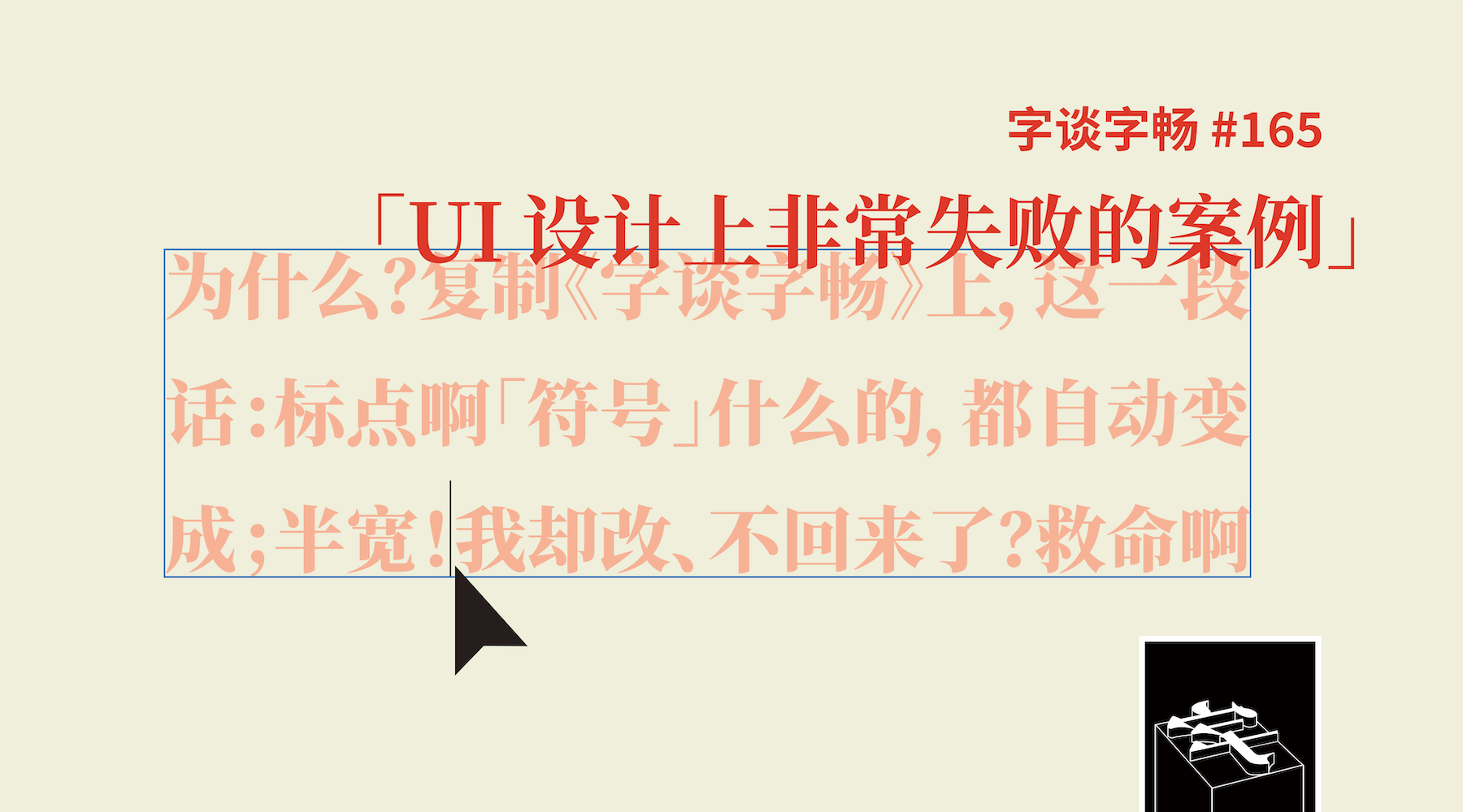
思源黑体、思源宋体的中文标点,在一些排版环境中会显示为半字宽——这样的现象可能也会出现在其他一些 CJK 字体上。如果你曾因此而费解,或许本期节目能给你些许帮助。如果你还对「等比公制字」这样的「Adobe 语」而困惑,那么我们就在今日一小时的闲聊中尝试为你解疑。
- 展览「排版造型 白井敬尚」展期延长至 2021 年 12 月 31 日
- 展览「等待激活 TO BE ACTIVATED」由 3type 与 MORE studio 共同策划,于 2021 年 11 月 6 日至 12 月 12 日在上海 OPEN MORE 空间展出
- 展览「再纺东亚系列一:手中的罗盘」于 2021 年 11 月 27 日至 2022 年 2 月 27 日在香港 CHAT 六厂展出;期间,讲座「文字纺造与织物编写:字体作为媒介」将于 2021 年 12 月 4 日下午 3 时在 CHAT 客厅及线上同时举办
- 兰阳明体开始众筹,截止于 2022 年 1 月 13 日 23 时 59 分;关于兰阳明体的故事,参见 justfont blog (1) (2) (3)
- OpenType 特性:
- 思源黑体和思源宋体都使用了
palt和vpal特性 - macOS 系统的字体面板中内含「字体排印」设置选项,其中调取
palt和vpal特性的选项被翻译做「备选成比例的宽度」 - Adobe Illustrator 中 kerning(「字距微调」)和 proportional metrics(「等比公制字」)相关的设置
- Adobe InDesign 中 kerning(「字偶间距」)和 proportional metrics(「等比量度」)相关的设置
- Eric:字体排印研究者,译者,The Type 编辑
- 蒸鱼:设计师,The Type 编辑
欢迎与我们交流或反馈,来信请致 [email protected]。如果你喜爱本期节目,也欢迎用支付宝向我们捐赠:[email protected]。
欢迎加入 The Type 会员计划,每月可通过会刊获得本节目更多图文扩展阅读,并享受礼品赠送、活动优惠以及购物折扣等权益。
Your browser does not support the audio tag.
你的Email地址将不会被发布或透漏。 标记*的项目为必填项目。
Recommend
About Joyk
Aggregate valuable and interesting links.
Joyk means Joy of geeK