
3

数据可视化之美 -- 以Matlab、Python为工具
source link: https://blog.csdn.net/weixin_45492560/article/details/121309333
Go to the source link to view the article. You can view the picture content, updated content and better typesetting reading experience. If the link is broken, please click the button below to view the snapshot at that time.

数据可视化之美 -- 以Matlab、Python为工具
在我们科研、工作中,将数据完美展现出来尤为重要。
数据可视化是以数据为视角,探索世界。我们真正想要的是 — 数据视觉,以数据为工具,以可视化为手段,目的是描述真实,探索世界。
下面介绍一些数据可视化的作品(包含部分代码),主要是地学领域,可迁移至其他学科。
Example 1 :散点图、密度图(Python)
import numpy as np
import matplotlib.pyplot as plt

# 创建随机数
n = 100000
x = np.random.randn(n)
y = (1.5 * x) + np.random.randn(n)
fig1 = plt.figure()
plt.plot(x,y,'.r')
plt.xlabel('x')
plt.ylabel('y')
plt.savefig('2D_1V1.png',dpi=600)

nbins = 200
H, xedges, yedges = np.histogram2d(x,y,bins=nbins)
# H needs to be rotated and flipped
H = np.rot90(H)
H = np.flipud(H)
# 将zeros mask
Hmasked = np.ma.masked_where(H==0,H)
# Plot 2D histogram using pcolor
fig2 = plt.figure()
plt.pcolormesh(xedges,yedges,Hmasked)
plt.xlabel('x')
plt.ylabel('y')
cbar = plt.colorbar()
cbar.ax.set_ylabel('Counts')
plt.savefig('2D_2V1.png',dpi=600)
plt.show()


Example 2 :双Y轴(Python)
import csv
import pandas as pd
import matplotlib.pyplot as plt
from datetime import datetime

data=pd.read_csv('LOBO0010-2020112014010.tsv',sep='\t')
time=data['date [AST]']
sal=data['salinity']
tem=data['temperature [C]']
print(sal)
DAT = []
for row in time:
DAT.append(datetime.strptime(row,"%Y-%m-%d %H:%M:%S"))

#create figure
fig, ax =plt.subplots(1)
# Plot y1 vs x in blue on the left vertical axis.
plt.xlabel("Date [AST]")
plt.ylabel("Temperature [C]", color="b")
plt.tick_params(axis="y", labelcolor="b")
plt.plot(DAT, tem, "b-", linewidth=1)
plt.title("Temperature and Salinity from LOBO (Halifax, Canada)")
fig.autofmt_xdate(rotation=50)

# Plot y2 vs x in red on the right vertical axis.
plt.twinx()
plt.ylabel("Salinity", color="r")
plt.tick_params(axis="y", labelcolor="r")
plt.plot(DAT, sal, "r-", linewidth=1)

#To save your graph
plt.savefig('saltandtemp_V1.png' ,bbox_inches='tight')
plt.show()

Example 3:拟合曲线(Python)
import csv
import numpy as np
import pandas as pd
from datetime import datetime
import matplotlib.pyplot as plt
import scipy.signal as signal

data=pd.read_csv('LOBO0010-20201122130720.tsv',sep='\t')
time=data['date [AST]']
temp=data['temperature [C]']
datestart = datetime.strptime(time[1],"%Y-%m-%d %H:%M:%S")
DATE,decday = [],[]
for row in time:
    daterow = datetime.strptime(row,"%Y-%m-%d %H:%M:%S")
    DATE.append(daterow)
    decday.append((daterow-datestart).total_seconds()/(3600*24))
# First, design the Buterworth filter
N  = 2    # Filter order
Wn = 0.01 # Cutoff frequency
B, A = signal.butter(N, Wn, output='ba')
# Second, apply the filter
tempf = signal.filtfilt(B,A, temp)
# Make plots
fig = plt.figure()
ax1 = fig.add_subplot(211)
plt.plot(decday,temp, 'b-')
plt.plot(decday,tempf, 'r-',linewidth=2)
plt.ylabel("Temperature (oC)")
plt.legend(['Original','Filtered'])
plt.title("Temperature from LOBO (Halifax, Canada)")
ax1.axes.get_xaxis().set_visible(False)

ax1 = fig.add_subplot(212)
plt.plot(decday,temp-tempf, 'b-')
plt.ylabel("Temperature (oC)")
plt.xlabel("Date")
plt.legend(['Residuals'])
plt.savefig('tem_signal_filtering_plot.png', bbox_inches='tight')
plt.show()

Example 4:三维地形(Python)
# This import registers the 3D projection
from mpl_toolkits.mplot3d import Axes3D
from matplotlib import cbook
from matplotlib import cm
from matplotlib.colors import LightSource
import matplotlib.pyplot as plt
import numpy as np

filename = cbook.get_sample_data('jacksboro_fault_dem.npz', asfileobj=False)
with np.load(filename) as dem:
    z = dem['elevation']
    nrows, ncols = z.shape
    x = np.linspace(dem['xmin'], dem['xmax'], ncols)
    y = np.linspace(dem['ymin'], dem['ymax'], nrows)
x, y = np.meshgrid(x, y)

region = np.s_[5:50, 5:50]
x, y, z = x[region], y[region], z[region]
fig, ax = plt.subplots(subplot_kw=dict(projection='3d'))
ls = LightSource(270, 45)

rgb = ls.shade(z, cmap=cm.gist_earth, vert_exag=0.1, blend_mode='soft')
surf = ax.plot_surface(x, y, z, rstride=1, cstride=1, facecolors=rgb,
                       linewidth=0, antialiased=False, shade=False)
plt.savefig('example4.png',dpi=600, bbox_inches='tight')
plt.show()

Example 5:三维地形,包含投影(Python)
Example 6:切片,多维数据同时展现(Python)
Example 7:SSH GIF 动图展现(Matlab)
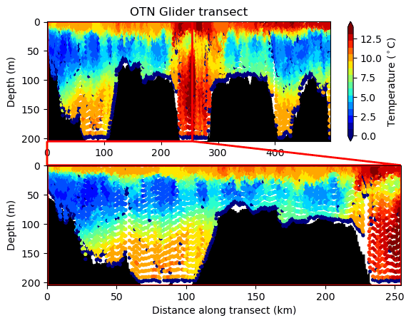
Example 8:Glider GIF 动图展现(Python)
Example 9:涡度追踪 GIF 动图展现

Recommend
About Joyk
Aggregate valuable and interesting links.
Joyk means Joy of geeK