

Multiplatform UI Coding with AvaloniaUI in Easy Samples. Part 1 - AvaloniaUI Bui...
source link: https://www.codeproject.com/Articles/5308645/Multiplatform-UI-Coding-with-AvaloniaUI-in-Easy-Sa
Go to the source link to view the article. You can view the picture content, updated content and better typesetting reading experience. If the link is broken, please click the button below to view the snapshot at that time.

Introduction
After Microsoft discontinued Silverlight, the only multiplatform solutions available for UI programming for all major platforms are Web solutions (JavaScript/TypeScript) and Xamarin. Both are inadequate and represent a huge step backwards from WPF rich UI client solutions as will be explained in detail below.
There is a relatively new open source .NET solution however, Avalonia which closely resembles WPF, in many respects more powerful than WPF and (unlike WPF or UWP) works on any platform - Windows, Linux and MAC (and I tested it myself on each of those platforms). Avalonia also works on the mobile platforms - iOS and Android (I have not tested Avalonia on the mobile platforms yet, so I rely on Avalonia documentation).
Why Avalonia is Going to be a Hit
- Avalonia is completely open source - you can find the source code on Avalonia Source Code released under the least restrictive - MIT license.
- Avalonia is being written in .NET Standard it is 100% compatible with all versions of .NET Core and .NET Framework.
- Avalonia is being developed very fast by extremely bright people all over the globe who are facing the clients and know what the clients need.
- Avalonia has some tooling similar to WPF's snoop which is currently worse than snoop but has essential functionality sufficient for debugging and modifying Avalonia application. Also, considering the speed of positive changes on Avalonia project, such tooling will be improving fast.
- Avalonia has Visual Studio and Rider support for creating XAML files and XAML intellisense, even though Avalonia XAML intellisense is still behind what WPF XAML intellisense can offer.
- WPF and Silverlight frameworks came up with a number of programming paradigms beyond the usual OOP programming paradigms, which allow creating code considerably cleaner and faster by those who understand such paradigms. Among such paradigms, I list the following:
- Visual and Logical Trees
- Attached or Dependency Properties which can be defined outside of the object on which they are used and do not take any extra memory unless they are assigned a non-default value and have a special event to fire when their values change.
- Attached Routed Events that can be defined outside of the objects that fire them and can propagate and be handled up and down on the trees.
- Bindings and the Related MVVM pattern
- ControlTemplates
- DataTemplate
- Styles
- Behaviors - way to modify the behavior of a C# class without modifying the class itself by using the events.
- Avalonia allows creating applications that look and behave the same on different platform, but also supports platform specific customization.
- Several extremely popular .NET open source projects switched from WPF to Avalonia in order to make their products multiplatform - among them projects that I use -
- Avalonia has a decent free public support on Gitter: Avalonia on Gitter and some options to buy commercial support at Avalonia Support
- Avalonia has some documentation on Avalonia Documentation, even though more documentation is necessary especially for those who did not come from WPF background and the purpose of this article is to fill some documentation gap.
Some Shortcomings of Avalonia
Once we spoke of advantages, we should also mention some shotcomings of Avalonia - note that most of them are going to be fixed pretty soon since Avalonia is a fast developing project.
- Documentation is pretty small and aimed primarily at WPF developers. To make the project more popular and more widely accepted, more documentation is needed and the purpose of this article is to address this issue.
- There are some quirks and some behaviors which are slightly different from WPF so that I had to ask questions on gitter on Avalonia UI Discussions or simply go into the Avalonia code in order to figure out how to resolve them.
- Avalonia UI comes with two themes (default and fluent) for its controls and those two themes each have light and dark mode - for anything else and for some more involved controls, the 3rd party commercial controls like Telerik or DevExpress are not available yet. I hope to help addressing this issue myself, as I plan to create some of the flexible open source controls for Avalonia UI. I already created a
CustomWindowwhose header is fully customizable available at NP.Avalonia.Visuals. - Seems like Avalonia is tied to Skia - a 2D Graphics library which means that 3-D graphics cannot be easily added to Avalonia (though almost no one was using WPF 3-D capabilities anyways).
Disadvantages of Web and Xamarin Frameworks for MultiPlatform Development
Web (JavaScript/TypeScript) development has the following disadvantages in comparison to WPF/Avalonia programming:
- Web Development is not compositional. You cannot create a custom control that will consist of several primitives and will display in exactly the same way in different parts of the Web Browser. E.g. you cannot pack HTML5 canvas rectangles into a reusable button control that will show in similar ways in the center of the Web page and at the bottom of it (without some extra customization). Instead, the controls come predefined with the browser with a million ways to customize them (some of the customizations are specific to each browser). An experienced WPF/Avalonia developer can create the required UI control extremely fast with exact UI behaviors requested by the designers and such control will be as reusable and as customizable as the control developer wants it to be. In Web development - creating a re-usable custom control is virtually impossible - you are stuck with customization of already existing controls.
- Very few of the WPF paradigms mentioned above (e.g., bindings and templates) were also implemented by famous Web frameworks, like Angular and React, but none were implemented in such a powerful way as they are in WPF and Avalonia. For example, there is nothing like attached properties, custom routed events, or bindings to the tree ancestor in either Angular or React.
- If you are using web - you'll have a problem splitting the application into multiple windows. Even Visual Studio Code (which is a state of art typescript UI application) does not allow dragging the tabs out of the main window. BTW - if you start a desktop project using JavaSript or TypeScript do not expect to write anything close to Visual Studio Code - I saw a couple of projects with such expectations failing. But creating an application as complex as VSCode is quite achievable using Avalonia.
Now concerning the shortcomings of Xamarin and its successor MAUI.
- Xamarin (and probably MAUI) were explicitly created for building mobile applications without giving much regard to the Desktop applications. Correspondingly, all the comercial Xamarin frameworks, e.g., Telerik or DevExpress are oriented towards mobile development with little regards to desktop development.
- The Xamarin Forms (which is a multiplatform product) usually requires some native programming for the features not covered by Xamarin Forms.
- Xamarin Forms are not compositional - the basic paradigms there are coming from the native controls - buttons, menus and so on. They are also displayed differently on each one of the platforms - which is sometimes desirable and sometime not.
- Xamarin does not implement many of the WPF paradigms listed above.
What You Can Find in this Article
The purpose of this article and its planned follow up article is to fill the gap that people unfamiliar with WPF or Silverlight might have when it comes to programming Avalonia UI. More complex issues will be described in a future article.
All the samples within this article have been tested on:
- Window 10
- Ubuntu 20.4
- Mac Catalina
This article covers only the very basics of Avalonia UI - the building blocks that will become part of any application:
- Creating simple Avalonia applications using the Code Behind. Note - Code Behind is the simplest, but the worst way of building a large application. Do not overuse it! Other ways of connecting the XAML code and the C# code will be shown in future articles.
- The most useful Built-In controls
- The primitives (controls that serve as the primitive building blocks for the composition)
- Panels
- Brushes
- Transforms
The next installment (Part 2) will cover the following topics:
- Visual Trees
- Logical Trees
- Avalonia Development Tool
- Attached, Style and Direct properties
- Bindings
After that I plan to cover also:
DataTemplates,ItemsPresenterandContentPresenter- Calling C# code from XAML (
CommandsandCallActionbehavior) - XAML (reusing XAML via Markup Extensions)
- Styles
- Animations
The article after that will cover more complex topics such as:
- Custom (lookless) controls
ControlTemplates- Behaviors
- IoC with Avalonia
- Arranging Avalonia projects for Prototype Driven Development.
How to Read this Article
This article intends to be a hands on Avalonia tutorial also highlighting Avalonia basic capabilities. It is full of coding examples that I recommend to build and run on your computer. If you want to learn Avalonia functionality well, you should also try to create your own projects and examples similar to those given in this article.
No previous WPF background is necessary to read this article and go over the exercises.
All of the samples in this article were created using Visual Studio 2019, .NET 5.0 and correspondingly C# 9.0 though they can be easily downgraded to previous versions of .NET and C#.
Creating and Running a Simple Avalonia Project using Visual Studio 2019
First, in order to work with Avalonia, you need to install "Avalonia for Visual Studio" extension using your VS extension manager located either under Tools or (for VS2019) under Extensions menu. Find this extension on line and install it. The extension contains templates for various Avalonia related Visual Studio projects, Avalinia specific file types and intellisense for Avalonia XAML files (which are slightly different from WPF XAML files).
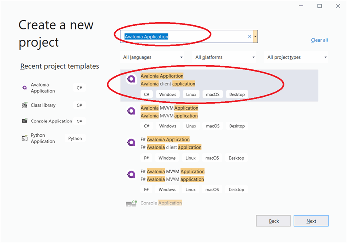
Once you have installed the "Avalonia for Visual Studio" extension, start Visual Studio and choose "Avalonia Application" project type:
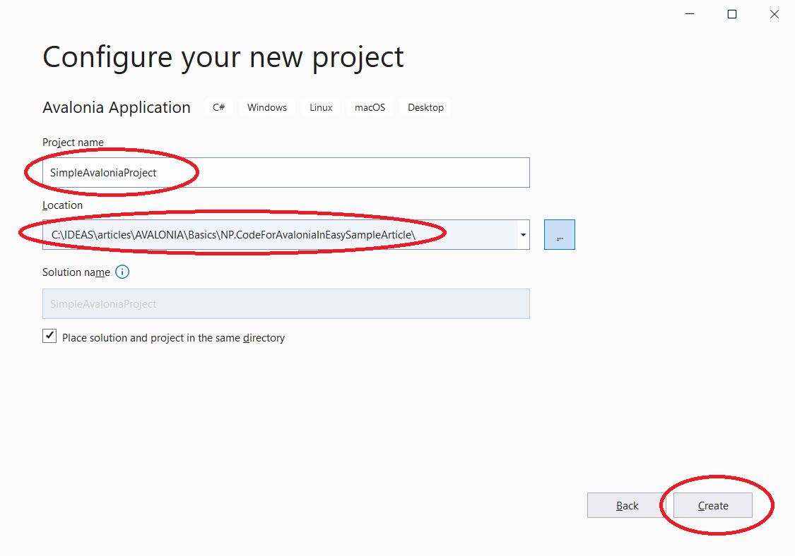
Press button "Next", choose the location and the project name for the project and press button "Create":
The created project will have dependencies on three Avalonia packages - Avalonia, Avalonia.Desktop and Avalonia.Diagnostics:

Also five files containing code are created - App.axaml, App.axaml.cs, MainWindow.axaml, MainWindow.axaml.cs and Program.cs.
Files with ".axaml" extensions are the XAML files renamed to ".axaml" apparently to distinguish them from WPF/UWP ".xaml" files. The Avalonia XAML syntax is very similar to WPF XAML syntax, with some specialty when it comes to the so called Style Selectors (which will be explained in future articles).
Among the five files described above, it is likely you will have to modify MainWindow.axaml and MainWindow.axaml.cs files most, then perhaps slightly change also App.axaml and App.axaml.cs files and you probably won't have to change Program.cs file ever.
Your can run the empty window as it is, but it will be more fun to place some code within the MainWindow.
Open MainWindow.xaml file and replace its content (which by default consists of "Welcome to Avalonia!" text) with the following code:
<Button x:Name="CloseWindowButton"
        Content="Close Window"
        HorizontalAlignment="Center"
        VerticalAlignment="Center"
        Padding="10,5"/>
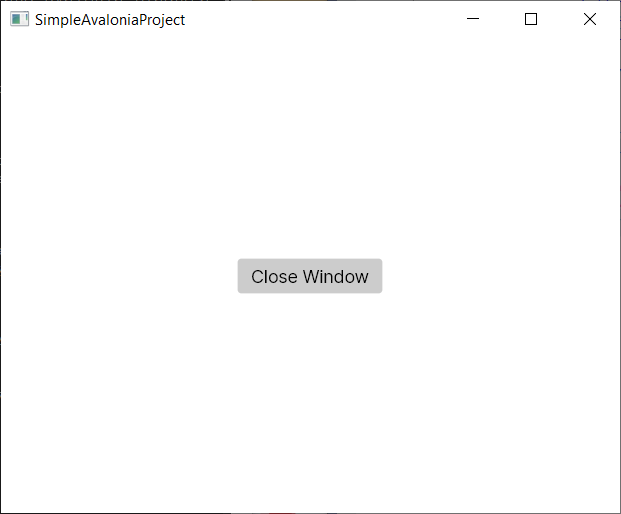
If you run the application now, there will be a Button in the middle of the window (which is ensured by Horizontal and Vertical Alignments - the words "Close Window" will be written in the middle of the button (Button's content) and the margins from the "Close Button" text to the sides of the button will be 10 generic pixels on the right and left and 5 generic pixels at the top and the bottom (specified by the Padding property):
So far so good, but if you press the button, nothing is going to happen. We need to try to connect the button click event to the action that closes the window. In this first sample, we are going to employ the simplest, but also the worst way of achieving such purpose - the code behind. File MainWindow.xaml.cs contains the so called "code behind" - C# code for the MainWindow.xaml file:
public partial class MainWindow : Window
{
    public MainWindow()
    {
        InitializeComponent();
#if DEBUG
        this.AttachDevTools();
#endif
    }

    private void InitializeComponent()
    {
        AvaloniaXamlLoader.Load(this);
    }
}
We named out button "CloseWindowButton". In WPF, the corresponding class member would have been generated. Avalonia, still does not include this feature, but we can easily find the button by adding the following line:
var button = this.FindControl<Button>("CloseWindowButton")
after InitializeComponent(); is called within the constructor.
Then we can add a handler to the button's Click event: button.Click += Button_Click;.
Finally, within the handler we can call Close() method on the window:
private void Button_Click(object? sender, RoutedEventArgs e)
{
    this.Close();
}
You have to have a using Avalonia.Interactivity; statement at the top of the file in order to be able to reference RoutedEventArgs.
The full code for MainWindow constructor and the handler will look like below:
public MainWindow()
{
    InitializeComponent();
#if DEBUG
    this.AttachDevTools();
#endif
    var button = this.FindControl<Button>("CloseWindowButton");

    button.Click += Button_Click;
}

private void Button_Click(object? sender, RoutedEventArgs e)
{
    this.Close();
}
Now if you run the application and press "Close" button, the window will close.
The code for this application is located under NP.Demos.SimpleAvaloniaProject.sln, but if you are new to Avalonia, it is imperative that you should go over the exercise above.
Some Avalonia BuiltIn Controls
Introduction to Avalonia Controls
In this section, I am going to describe some of the Built-in Avalonia controls which are most helpful for building an application. Note that for the sake of brevity, I am not going to describe every built-in control, only those that are most commonly used.
If you want to learn about the rest of the built in controls, you can:
- Download or clone the AvaliniaUI source code from Avalonia Source Code on Github.
- Use Visual Studio to open Avalonia.sln solution from the top level folder.
- Navigate within the solution explorer to
ControlCatalog.Desktopproject under Samples Visual Studio folder. - Make
ControlCatalog.Desktopyour startup project, then build and run it.
The Windows application containing most (if not all) of the built-in controls will popup and you'll be able to see the capabilities of various control. By tracking them in XAML code under Samples/Pages/ Visual Studio folder, you will also be able to see how to create and change properties of those controls.
New control creation and customization will be discussed in future articles as well as the most useful controls ContentPresenter and ItemsPresenter that can give a visual representation to a non-visual object or a collection of non-visual objects correspondingly.
The purpose of this section is to give an overview of the Built-In Avalonia controls, not a detailed description of their capabilities.
Note that Control class in Avalonia is more primitive than the same named class in WPF - Avalonia Control does not have a template. The controls that have templates inherit from TemplatedControl class which implements ITemplatedControl interface. Because of that Avalonia Image, Shape and Panel classes are derived from the Control, not from Visual class (as they are in WPF).
Explanation on what Templates will be provided in future articles.
Built-In Controls Project
In this subsection, we'll describe some of the most useful controls in WPF sense, i.e., templated controls, not more primitive images, shapes and panels.
The code for these subsection is located under NP.Demos.BuiltInControls.sln solution.
Here is what you are going to see if you build and run the solution:
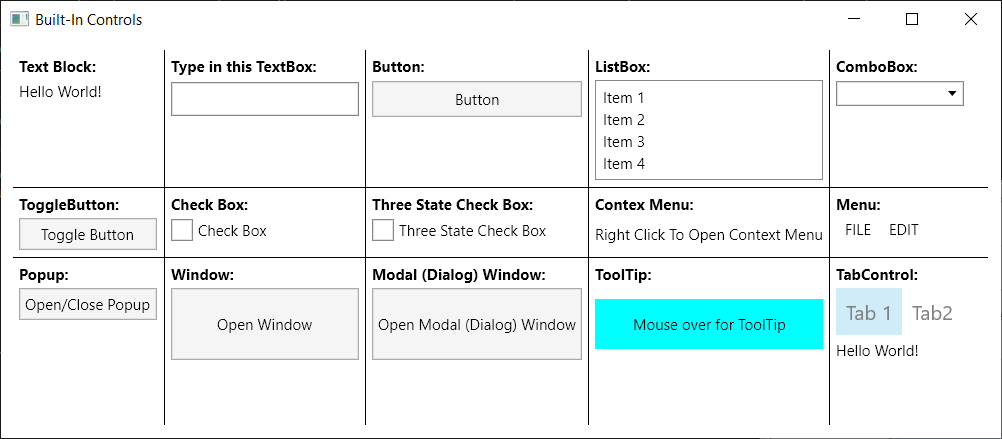
Here, I describe some built-in controls I consider to be most useful. All the code specific to these controls is located within MainWindow.xaml files. Let us go over each one of the controls and describe the XAML code related to them.
TextBlock
TextBlock is the only control from among the controls describes in the section, that cannot be retemplated - it is derived from Control (not from TemplatedControl class). So it is more of a primitive, rather than a composite control in WPF sense, but I placed it here, because it is one of the most important building blocks and (from my viewpoint) should be described first.
TextBlock represents simple text. Its most important property is Text of C# string type. Text contains the text you want to display as the TextBlock.
TextBlock has a lot of properties that allow text customization, including:
Foreground- the color of the textFontSize- self descriptiveFontFamily- specifies the name of the fontFontWeight- usually switches between Normal and Bold - for bold textTextWrapping- specifies if the text should be wrapped to multiple linesTextTrimming- specifies if ellipses ('...') characters should be shown if part of the text is invisible - the text stretches beyond the size of the control
Many of the properties listed above are also applicable to other controls that might have text, e.g., buttons, menus, ListBoxes and so on.
The simple XAML code to create a text block is e.g.:
<TextBlock Text="Hello World!">
TextBox
Here is an image for the TextBox sample:

If you type anything within the TextBox, its property Text will get updated with the typed text.
I used binding to duplicate the text typed within the TextBox by the TextBlock placed underneath. Here is the XAML code:
<Grid Grid.Row="1">
    <Grid.RowDefinitions>
      <RowDefinition Height="Auto"/>
      <RowDefinition Height="Auto"/>
    </Grid.RowDefinitions>
    <TextBox x:Name="TheTextBox"
             Width="150"
             Height="27"
             HorizontalAlignment="Left"
             Grid.Row="0"/>
    <TextBlock Text="{Binding Path=Text, ElementName=TheTextBox}"
               Grid.Row="1"
               Height="17"/>
  </Grid>
</Grid>
We defined the Grid panel with two rows - text box is in the top row (Grid.Row="0") and TextBlock is in the second row (Grid.Row="1").
We bind the Text property of the TextBlock to the Text property of the TextBox (named "TheTextBox" via its x:Name attribute) by using ElementName binding: Text="{Binding Path=Text, ElementName=TheTextBox}". This produces the effect of text below repeating the text entered into the TextBox.
Button
Next control we'll describe is Button:
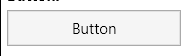
Here is the code for our button:
<Button Content="Button"
      Padding="10,5"
      Grid.Row="1"/>
Padding="10,5" above means that the button extends from its content 10 generic pixels left and right and 5 top and bottom. Grid.Row="1" means that the button is place in the second row of the Grid (the first row is occupied by the header).
Buttons define Click routed event - which is fired when the button is clicked. There are three ways to call C# code on a Button click:
- Using code behind - as was shown in the
NP.Demos.SimpleAvaloniaProjectsample (the worst method to use). - Using its
Commandproperty which can be bound to a View Model property. The View Model property in turn can define the lambda expression to call, when the button is clicked and also the property to control whether the button is enabled or not. This will be describe in detail in future articles. - Using a behavior listening to
Clickrouted event and calling a C# method when the event is fired. (this will also be described later) - this is the best method.
ListBox

ListBox displays a collection of items with capability of selecting one item at a time. If the number of items exceeds the size of the ListBox, it will display the scroll bars.
The best way to use the list box is by binding its Items property to a collection. How to do it will be shown below. In our case, we simply created ListBoxItems within the XAML code to populate it:
<ListBox x:Name="TheListBox">
  <ListBoxItem Content="Item 1"/>
  <ListBoxItem Content="Item 2"/>
  <ListBoxItem Content="Item 3"/>
  <ListBoxItem Content="Item 4"/>
</ListBox>
The most important properties of the ListBox are Items mentioned above and selection related properties: SelectedIndex and SelectedItem. The SelectedIndex of this ListBox is bound to the SelectedIndex of the ComboBox described in the next subsection, so when you change the selected item on each of them, the other will react in the same fashion.
ComboBox

ComboBox is also called DropDownBox in various other frameworks. Just like ListBox it also stores a collection of items, but only selected item is displayed all the time - the other items are only displayed in a popup (or rather drop-down) when the mouse pointer clicks the arrow on its right hand side. The image above displays the ComboBox without a selected item but with the open dropdown. Here is the code that I used to create and populate the ComboBox:
<ComboBox VerticalAlignment="Top"
          Grid.Row="1"
          SelectedIndex="{Binding Path=SelectedIndex, ElementName=TheListBox}">
  <ComboBoxItem Content="Item 1"/>
  <ComboBoxItem Content="Item 2"/>
  <ComboBoxItem Content="Item 3"/>
  <ComboBoxItem Content="Item 4"/>
</ComboBox>
Same as in case of ListBox, ComboBoxes' main properties are Items (to be bound to a collection), SelectedIndex and SelectedItem. The example shows how to bind the SelectedIndex of the ComboBox to that of the ListBox to the left of it: SelectedIndex="{Binding Path=SelectedIndex, ElementName=TheListBox, Mode=TwoWay}", so that when one changes Selection, the other will also change.
ToggleButton

ToggleButton is a control that has two states - Checked and Unchecked controlled by its boolean property IsChecked. Every time the button is clicked, its IsChecked property toggles its value from false to true and vice versa. The button's background changes depending on whether it is checked on unchecked.
<ToggleButton x:Name="TheToggleButton"
              Content="Toggle Button"/>
Again, in order to demonstrate the power of the binding, I bound the ToggleButton's IsChecked property to that of the CheckBox next to it so that they change in sync.
CheckBox

CheckBox is very similar to the toggle button, but looks different (as you can see). Here is the XAML code for CheckBox:
<CheckBox Content="Check Box"
          VerticalAlignment="Top"
          Grid.Row="1"
          IsChecked="{Binding Path=IsChecked, ElementName=TheToggleButton}"/>
You can see the binding that connects its IsChecked property to that of the ToggleButton on its left.
CheckBox also has a switch property IsThreeState and when it is set to true, the CheckBox can switch between three states - false, true and undefined - which corresponds to its IsChecked property set to null:

Here is the code for three state CheckBox:
<CheckBox Content="Three State Check Box"
          IsThreeState="True"/>
ContextMenu

ContextMenu opens up when right mouse button is clicked on some area or control. Here is the code:
<Grid Grid.Row="1"
    Background="Transparent">
<Grid.ContextMenu>
  <ContextMenu Grid.Row="1">
    <MenuItem Header="Item1">
      <MenuItem Header="SubItem1"/>
      <MenuItem Header="SubItem2"/>
    </MenuItem>
    <MenuItem Header="Item2"/>
    <MenuItem Header="Item3"/>
    <MenuItem Header="Item4"/>
  </ContextMenu>
</Grid.ContextMenu>
<TextBlock Text="Right Click To Open Context Menu"
           VerticalAlignment="Center"/>
</Grid>

Menus are usually placed at the top of the window, but can also appear in other places. Here is the XAML code for the Menu sample:
<Menu Grid.Row="1">
    <MenuItem Header="FILE">
      <MenuItem Header="New"/>
      <MenuItem Header="Open"/>
      <MenuItem Header="Save"/>
    </MenuItem>
    <MenuItem Header="EDIT">
      <MenuItem Header="Copy"/>
      <MenuItem Header="Paste"/>
    </MenuItem>
</Menu>
Popup
Popup is a control that opens a light weight window next to the so called popup's PlacementTarget:

Whether the popup is open or not is controled (and reflected) by its IsOpen property which in our case is tied to the IsChecked property of the ToggleButton that controls (and reflects) the popup's state:
<Grid Grid.Row="1">
    <Grid.RowDefinitions>
      <RowDefinition Height="Auto"/>
      <RowDefinition Height="*"/>
    </Grid.RowDefinitions>
    <ToggleButton x:Name="OpenClosePopupButton"
                  Content="Open/Close Popup"/>

    <Popup x:Name="ThePopup"
           Grid.Row="1"
           IsOpen="{Binding Path=IsChecked, ElementName=OpenClosePopupButton, Mode=TwoWay}"
           StaysOpen="False"
           PlacementMode="Bottom"
           PlacementTarget="{Binding ElementName=OpenClosePopupButton}">
      <Grid x:Name="PopupsContent"
            Background="Red"
            Width="150"
            Height="70">
        <TextBlock Text="Popup's Content"
                   HorizontalAlignment="Center"
                   VerticalAlignment="Center"/>
      </Grid>
    </Popup>
</Grid>
We use a two way binding to bind the Popup's IsOpen property to the ToggleButton's IsChecked property so that changing each one of them would affect the other.
StaysOpen property is set to false - meaning that clicking out of the popup area will close the popup.
PlacementTarget property specifies an element with respect to which the Popup is going to be positioned.
PlacementMode="Bottom" means that the Popup will be positioned at the bottom of the placement target.
Window

When you click the button of the "Window" sample, a small window will open.
Here is the XAML code for the window sample:
<Button x:Name="OpenWindowButton"
        Content="Open Window"/>
The C# code that opens the window is hooked via code-behind - not because it is a good way to do it (actually it is the worst as was mentioned above) - but because it is the simplest way and the easiest to understand. Here is the relevant C# code from MainWindow.axaml.cs file:
public MainWindow()
{
    ...

    var openWindowButton = this.FindControl<Button>("OpenWindowButton");

    openWindowButton.Click += OpenWindowButton_Click;
    ...
}
private void OpenWindowButton_Click(object? sender, RoutedEventArgs e)
{
    // Create the window object
    Window sampleWindow =
        new Window
        {
            Title = "Sample Window",
            Width = 200,
            Height = 200
        };

    // open the window
    sampleWindow.Show();
}
In MainWindow's constructor (after the call to InitializeComponent()) we find the button by its name and attach a handler to its Click event. Within that handler, we create the new Window object and call Show() method on it to dispay (open) the window.
Modal Window
Modal Window is also called a Dialog - it is a window that prevents any actions on its ancestor windows until it is closed.

Pressing "Open Modal (Dialog) Window" button will open a dialog window which completely blocks the main window until it is closed. Here is the XAML code:
<Button x:Name="OpenModalWindowButton"
        Content="Open Modal (Dialog) Window"/>
Again, we connect the C# code using the no-good code-behind paradigm:
public MainWindow()
{
    ...

    var openModalWindowButton = this.FindControl<Button>("OpenModalWindowButton");

    openModalWindowButton.Click += OpenModalWindowButton_Click;
}
...
private void OpenModalWindowButton_Click(object? sender, RoutedEventArgs e)
{
    // Create the window object
    Window sampleWindow =
        new Window
        {
            Title = "Sample Modal (Dialog) Window",
            Width = 200,
            Height = 200
        };

    // open the modal (dialog) window
    sampleWindow.ShowDialog(this);
}
The only difference between this and previous samples, is that here we call sampleWindow.ShowDialog(...) method instead of sampleWindow.Show(), passing to it the current window as the parent of the dialog.
ToolTip
ToolTip is the temporary popup that opens next to the mouse pointer over an element that defines that ToolTip:

We define the ToolTip in XAML as following:
<Grid Height="40"
      Background="Aqua"
      ToolTip.Tip="This is the ToolTip">
Most of the time ToolTip is just a text (as in our case) but sometimes it can become more involved as will be described in the future.
TabControl
TabControl allows to display different tabs - each tab containing different content:

Switching between the tabs in our sample will change the displayed text from "Hello World!" to "Hi World!".
Here is the very simple XAML code to achieve that:
<TabControl Grid.Row="1">
    <TabItem Header="Tab 1">
        <TextBlock Text="Hello World!"/>
    </TabItem>
    <TabItem Header="Tab2">
        <TextBlock Text="Hi World!"/>
    </TabItem>
</TabControl>
Avalonia Primitives
Introduction
Primitives are the non-composable Avalonia UI controls (which are not panels either) those that are derived from Control and not from TemplatedControl. In WPF, they would not even be called controls but visuals. One of the primitives was already described above - it is TextBlock element.
Other than TextBlock presented above, the most important primitives are Border, Viewbox, Image and Shapes. Shapes are controls derived from Shape - the most used among them are Path (for any shape), Line, Rectangle and Ellipse.
Primitives Samples Code Location
Code for this section is located under NP.Demos.Primitives solution:

Instead of having one page for every primitive (as in the previous section), I'll be using one tab of the TabControl for every primitive type. This way, we can be a bit more detailed regarding these very important Avalonia basic building blocks.
Primitives Samples
Border
The tab container the Border sample is displayed on the picture above. Here is the XAML code that was used to create such border with the text inside:
<Border Margin="20"
      BorderThickness="10"
      BorderBrush="Red"
      Background="Blue"
      CornerRadius="0, 10, 40, 120">
    <TextBlock Foreground="White"
               FontSize="20"
               Text="Border Example!"
               HorizontalAlignment="Center"
               VerticalAlignment="Center"/>
</Border>
The TextBlock "Border Example" is placed inside the Border - it sets the Border.Child property to be the TextBlock.
BorderThickness="10"- specifies that the size of the real border of theBorderelement.BorderBrush- is the color of the border.Backgroundspecifies the color inside the border.CornerRadius- specifies how round the corners of the border are. I made all 4 corners of different radius on purpose in order to show the full capabilities of theCornerRadiusproperty.
Important Note: I recommend not to set the border Child property, but instead, place the border inside a Grid panel and place the element you want to be inside the border within the same panel as the sibling of the border. This is because of my WPF experience that if the borders get a shadow (and they are often required to) their descendant elements get slightly dithered. However, the elements that are NOT direct descendants of the border will not be affected. I have not tested, how this works in Avalonia yet - this suggestion is based on my WPF experience.
Viewbox
Viewbox is a control that allows to visually shrink or expand everything within it. Just like the border, it has a Child property to place the content in. You can place there any complex visual element or a panel containing a number of visual elements and everything will be visually resized in accordance with Viewbox parameters.
Viewbox will receive the size from its descentants. The Viewbox's child will always shrink to minimal size, allowed by its own descendants even if its HorizontalAlignment and VerticalAlignment properties are set to Stretch. If Viewbox's child does not specify the size and cannot derive the size from its own children, e.g., a Grid without Height and Width and without any children that could define its size, it will shrink to 0 size.
Our example under "Viewbox" tab shows how a labeled TextBox changes when Stretch property of the Viewbox is set to different values. You can play with it yourself by setting the Stretch property on the left to different values and then trying to resize the window.
Here is the code for our Viewbox sample:
<Viewbox x:Name="TheViewBox"
         Stretch="{Binding Path=SelectedItem, ElementName=StretchChooser, Mode=TwoWay}"
         Grid.Column="1">
    <Grid  Width="640"
           Height="238"
           Background="LightBlue">
      <TextBlock FontSize="20"
                 Text="Enter Text: "
                 HorizontalAlignment="Left"
                 VerticalAlignment="Center"
                 Margin="20"/>
      <TextBox Grid.Column="1"
               Width="300"
               FontSize="20"
               Margin="20"
               Text="Hello World!!!"
               HorizontalAlignment="Right"
               VerticalAlignment="Center"/>
    </Grid>
</Viewbox>
And here is how it looks when we shrink the control and Stretch="None".

If the stretch is set to None - the child of the view box will not resize at all - so when you make the window smaller - you will cut into the content of the viewbox as shown above.
Here is the picture for Stretch="Fill":

The width and height of the Viewbox's child resize in proportion to the change of width and size - in our case, we make the width smaller (thinner) and the height - larger. Under "Fill", no original aspect ration (width/height) is preserved, but everything depends on how the Viewbox is resized.
The rest of the possible Stretch values do preserve the aspect ration of the original controls. Here is what happens when we shrink width, but increase the height under Stretch="Uniform":

The control shrinks (or expands) while preserving the original aspect ration so that it all can fit into the space.
Finally, when Stretch="UniformToFill" - the child control still preserves the aspect ration in such a way that one of its dimensions completely fills the space that is given to it and the other dimension is cut - as on the image below - Y dimension fits into the height, while X dimension is cut:

Note that some other primitives - Images and Shapes also have Stretch property that behave in exactly the same ways.
Image
You should play with the Image sample under the Image tab:

Try choosing different Stretch modes and see how the Image resizes differently under each one of them.
Here is the relevant XAML code for the Image sample:
<Grid ColumnDefinitions="Auto, *">
    <StackPanel VerticalAlignment="Top"
        HorizontalAlignment="Center">
      <TextBlock Text="Choose Stretch Type"/>
      <ComboBox x:Name="ImageStretchChooser"
                Items="{Binding Source={x:Type Stretch},
                Converter={x:Static local:EnumTypeToCollectionConverter.Instance}}"
                Width="100"
                Height="30"
                Margin="10"/>
    </StackPanel>
    <Grid Grid.Column="1">
        <Image x:Name="TheImage"
               Stretch="{Binding #ImageStretchChooser.SelectedItem, Mode=TwoWay}"
               Source="/Images/LinuxIcon.jpg"/>
    </Grid>
</Grid>
The most important property defined on Image is Source. In XAML, it points to the actual Image png or jpg or other file: Source="/Images/LinuxIcon.jpg". Note that the image file LinuxIcon.jpg is defined in the same project and its Build Action is AvaloniaResource:

Note that the Source property of the Image class is of type IImage, so if you wanted to assign it in C# code, you'd have to write, e.g.:
Image image = this.FindControl<Image>("TheImage");
var assets = AvaloniaLocator.Current.GetService<IAssetLoader>();
image.Source = new Bitmap(assets.Open
               (new Uri("avares://NP.Demos.Primitives/Images/LinuxIcon.jpg")));
XAML type conversions make the Source assignment considerably simpler, but sometimes, you cannot avoid using C#.
Note that Bitmap is one of the implementations of IImage and this is why the code above works.
The cryptic prefix "avares" in the URL "avares://NP.Demos.Primitives/Images/LinuxIcon.jpg", stands for "Avalonia Resource" and not for the capital of Hyksos in Egypt.
Shapes
Shapes are - various geometric shapes. Here is how Shapes tab looks:

You can play with the Stretch, StrokeThickness and Fill properties. You can see that Rectangle and Ellipse are not affected by Stretch - which makes sense since they are determined by their width and height.
Line and Path are affected by Stretch in pretty much the same way as the Image and Viewbox.
StrokeThickness determines the thickness of the border. Stroke property (of type IBrush) determines the color of the border.
Fill specifies the color of the inside - in our case, when HasFill checkbox is on, the Fill is red, while, when it is not on, the Fill is null (essentially transparent, but also hit test invisible).
Here is the XAML code for the line:
<Line StartPoint="0,0"
      EndPoint="50, 50"
      Grid.Row="1"
      Stretch="{Binding #ShapeStretchChooser.SelectedItem}"
      Stroke="Black"
      Margin="20"
      StrokeThickness="{Binding #ThicknessSlider.Value}"
      Fill="{Binding #HasFillCheckBox.IsChecked,
           Converter={StaticResource FillConverter}}"/>
The major line defining properties are StartPoint and EndPoint which determine the origin and end of the line.
The shape of both Rectangle and Ellipse are determined by their width and height - they should either be specified explicitly or by how much space their container has for them.
Path is the most generic shape. It is determined by its Data property of type Geometry. Creating Geometries for different shapes is a science of its own, and is beyond this tutorial. For ready made geometries, you can go to Material Design Icons, choose the icon you want and check its XAML representation.
Here is the code for our Path sample:
<Path Data="M11.92,19.92L4,12L11.92,4.08L13.33,5.5L7.83,
            11H22V13H7.83L13.34,18.5L11.92,19.92M4,12V2H2V22H4V12Z"
      Stretch="{Binding #ShapeStretchChooser.SelectedItem}"
      Stroke="Black"
      Grid.Row="1"
      Margin="20"
      StrokeThickness="{Binding #ThicknessSlider.Value}"
      Fill="{Binding #HasFillCheckBox.IsChecked, Converter={StaticResource FillConverter}}"/>
The Data is set to some cryptic Geometry string copied from Material Design Icons.
Avalonia Panels
Introduction
Panels are Avalonia primitive controls that serve to arrange other controls placed inside them. Aside from their Background color, panels themselves do not have any visual representation, but they are indispensable for ordering and arranging other controls.
Code for the Panels is located under NP.Demos.Panels.sln solution.
Panels Samples
StackPanel
When you open the application, you are going to land on the StackPanel tab:

There are three square buttons 100x100 generic pixels arranged in a stack - on the left it is a vertical stack, on the right - horizontal.
Here is the XAML code for vertical stack:
<StackPanel Orientation="Vertical"
            Grid.Row="1"
            VerticalAlignment="Top"
            HorizontalAlignment="Left">
  <Button Content="1"
          Width="100"
          Height="100"/>
  <Button Content="2"
          Width="100"
          Height="100"/>
  <Button Content="3"
          Width="100"
          Height="100"/>
</StackPanel>
Orientation="Vertical" is what defines the orientation. Vertical orientation is a default - so the first attribute could have been skipped.
In order to achieve the horizontal orientation displayed on the right, all you need to do is to replace Orientation to be Orentation="Horizontal". This is how the stacking on the right is achieved.
If you resize the window, you can see that when the window gets too small, the ends of the StackPanels are being cut. WrapPanel addresses this problem.
WrapPanel
To to "WrapPanel" tab in order to play with the WrapPanel. If you make it smaller, you'll see that the last item(s) instead of cutting - wrap, the vertical panel wraps last item(s) to the right, and the horizontal - to the bottom:

Net tab displays Grid which is the most complex and useful panel:

Our Grid has 4 rows and 4 columns - here is how they are defined:
<Grid RowDefinitions="80, Auto, *, 2*"
      ColumnDefinitions="80, Auto, *, 2*"
      ...>
The definitions above are allowed due to the Avalonia shortcut for typing the row and column definitions. The usual WPF way is also allowed, here how such definition would look:
<Grid>
  <Grid.RowDefinitions>
    <RowDefinition Height="80"/>
    <RowDefinition Height="Auto"/>
    <RowDefinition Height="*"/>
    <RowDefinition Height="2*"/>
  </Grid.RowDefinitions>
  <Grid.ColumnDefinitions>
    <ColumnDefinition Width="80"/>
    <ColumnDefinition Width="Auto"/>
    <ColumnDefinition Width="*"/>
    <ColumnDefinition Width="2*"/>
  </Grid.ColumnDefinitions>
</Grid>
You can see that Avalonia shortcuts are saving a lot of space.
Here is the intepretations for row height and column width. The first row's (Height="80") height is 80 generic pixels. The second row (Height="Auto") is sized to its content - i.e., its size is determined by what it contains. The third and fourth rows are star rows (Height="*" and Height=2*). Together, all the star rows and columns are taking all the rest of the space that the Grid is allowed to take, and between them the space is destributed based on their star coefficients. Since the last row has coefficient 2, the space allocated to it will always be twice the space allocated to the row before last.
The columns' widths are calculated in exactly the same fashion.
Open the Grid tab of the application and play with it by resizing the window horizontally and vertically.
DockPanel
The DockPanel allows arranging its children next to its sides, while the last child (undocked) will take the rest of the space.
The dock value is determined by DockPanel.Dock attached property which can assume values Left, Top, Right and Bottom.
In our sample, we have 8 buttons arranged clockwise - Left, Top, Right, Bottom and again Left, Top, Right, Bottom and then one last button that takes the rest of the space:

Here is the code for our DockPanel sample:
<DockPanel Margin="20">
  <Button Content="1"
          DockPanel.Dock="Left"
          Width="30"/>
  <Button DockPanel.Dock="Top"
          Content="2"
          Height="30"/>
  <Button DockPanel.Dock="Right"
          Content="3"
          Width="30"/>
  <Button DockPanel.Dock="Bottom"
          Content="4"
          Height="30"/>
  <Button DockPanel.Dock="Left"
          Content="5"
          Width="30"/>
  <Button DockPanel.Dock="Top"
          Content="6"
          Height="30"/>
  <Button DockPanel.Dock="Right"
          Content="7"
          Width="30"/>
  <Button DockPanel.Dock="Bottom"
          Content="8"
          Height="30"/>
  <Button Content="The Rest"/>
</DockPanel>
Note that the widths of the vertically docked buttons and the heights of the horizontally docked buttons is 30.
Canvas
Canvas is the panel which allows placing controls in it by coordinates from the Top Left corner determined by attached properties Canvas.Left and Canvas.Top:

On the canvas above, the button is placed 300 generic pixels to the right and 200 to the bottom from the top left corner. Here is the XAML code:
<Canvas>
  <Button Content="1"
          Width="100"
          Height="100"
          Canvas.Left="300"
          Canvas.Top="200"/>
</Canvas>
RelativePanel
RelativePanel does not exist in WPF. It can be, however, very useful, especially when coding for tablets and phones. It allows specifying location of elements both with respect to the panel and with respect to other named elements within the same panel.
Here is how our RelativePanel sample looks:

RelativePanel provides a lot of so called Attached Properties that allow to choose a position it child with respect to the panel itself or with respect to the other named children of the same panel. Here is the XAML code for the example above:
<RelativePanel Margin="20"
               Background="LightBlue">
  <Button x:Name="Button1"
          Height="50"
          Content="Button1 - TopLeftCorner by default"/>
  <Button x:Name="Button2"
          Height="50"
          RelativePanel.AlignTopWithPanel="True"
          RelativePanel.AlignHorizontalCenterWithPanel="True"
          Content="Button2 - Mid Top"/>

  <Button x:Name="Button3"
          Height="50"
          RelativePanel.AlignBottomWithPanel="True"
          RelativePanel.AlignRightWithPanel="True"
          Content="Button3 - Bottom Right"/>

  <Button x:Name="Button4"
          Height="50"
          RelativePanel.AlignHorizontalCenterWithPanel="True"
          RelativePanel.AlignVerticalCenterWithPanel="True"
          Content="Button4 - Center"/>

  <Button x:Name="Button5"
          Height="50"
          RelativePanel.RightOf="Button4"
          RelativePanel.Below="Button4"
          Content="Button5 - Bottom right from Button4"/>
</RelativePanel>
You can see from this example that one can place the control aligned to any RelativePanel side by using, e.g., RelativePanel.AlignBottomWithPanel and RelativePanel.AlignRightWithPanel property. One can also use properties RelativePanel.RightOf and RelativePanel.Below to place a control to the bottom right of another control.
Avalonia Brushes
Introduction
Just like WPF, Avalonia has:
SolicColorBrushclass for representing single colorLinearGradientBrushclass for representing color changing spacially in one directionRadialGradientBrushclass for representing color changing based on eliptic curves around a certain point.
On top of WPF brushes, Avalonia brushes also have ConicGradientBrush class.
The Brushes sample is located under NP.Demos.Brushes.sln solution:

Brushes
SolidColorBrush
SolidColorBrush is covered by the first two samples: the first one specifies the color by name (Background="Red") and the second - by ARGB values (Background="#FF43A047").
LinearGradientBrush
Here is the XAML for LinearGradientBrush sample:
<LinearGradientBrush StartPoint="0%,0%"
                      EndPoint="100%,100%" >
  <LinearGradientBrush.GradientStops>
    <GradientStop Offset="0" Color="Red"/>
    <GradientStop Offset="0.25" Color="Blue"/>
    <GradientStop Offset="0.5" Color="Brown"/>
    <GradientStop Offset="0.75" Color="Green"/>
    <GradientStop Offset="1" Color="Purple"/>
  </LinearGradientBrush.GradientStops>
</LinearGradientBrush>
Coordinates of Start and End Points are counted from the top left corner of the control (Button in our case). In our case - StartPoint is the top left corner and end point is the bottom right corner (100%, 100% point).
The gradient stops specify the proportional offset along the line segment from the start point to the end point and the colors that should be at the corresponding offsets.
RadialGradientBrush
Here is the XAML for RadialGradientBrush:
<RadialGradientBrush GradientOrigin="25%,25%"
                      Center="50%, 50%"
                      Radius="0.5" >
  <RadialGradientBrush.GradientStops>
    <GradientStop Offset="0" Color="Red"/>
    <GradientStop Offset="0.25" Color="Blue"/>
    <GradientStop Offset="0.5" Color="Brown"/>
    <GradientStop Offset="0.75" Color="Green"/>
    <GradientStop Offset="1" Color="Purple"/>
  </RadialGradientBrush.GradientStops>
</RadialGradientBrush>
RadialGradientBrush has two important points - GradientOrigin and Center. The gradient circles are arranged on the line connecting those two points with the center of the circles converging to GradientOrigin at offset 0 and to Center at offset 1. The size of the circles is controled by Radius (a double between 0 and 1).
The Avalonia RadialGradientBrush is less powerful than that of WPF since WPF allows entering two numbers for radius: RadiusX and RadiusY allowing ellipses on top of the circles.
ConicGradientBrush
Here is the XAML code for ConicGradientBrush:
<ConicGradientBrush Center="30%, 30%"
                    Angle="90">
  <ConicGradientBrush.GradientStops>
    <GradientStop Offset="0" Color="Red"/>
    <GradientStop Offset="0.25" Color="Blue"/>
    <GradientStop Offset="0.5" Color="Brown"/>
    <GradientStop Offset="0.75" Color="Green"/>
    <GradientStop Offset="1" Color="Purple"/>
  </ConicGradientBrush.GradientStops>
</ConicGradientBrush>
In case of ConicRadialBrush, the colors are arranged conicаlly around a certain point specified by the Center property. Angle property specifies the clockwise angle in degrees between the Vertical axis and the first color (color at offset 0) - in our case, it is 90 degrees so the red color starts horizontally.
Avalonia UI Transforms
Transforms allow 2D linear affine transforms on any Avalonia UI controls.
Transforms code is located under NP.Demos.Transforms.sln solution.
RenderTransform vs LayoutTransform
In WPF, every element has the ability to run Render and Layout transforms on it. RenderTransform performs the transform after the layout is completed (without affecting the layout around the control). LayoutTransform performs the layout operations after the new (transformed) control's coordinates are calculated.
Since, RenderTransform is used much more often than LayoutTransform, Avalonia allows to perform RenderTransform on each Avalonia control (same as WPF), but LayoutTransform can only be performed on LayoutTransformControl. If you need to perform LayoutTransform on any control, you can always make it a child of LayoutTransformControl and do the LayoutTransform on that LayoutTransformControl instead as shown in our sample.
Here is what you get if you try to run the sample and change the Rotation angle of the RotationTransform:

You can see that Render Transformed button will show outside of the Grid panel that contains it, while Layout Transformed button will expand its Grid container (container panels are shown in light blue).
Here is the relevant code for the sample:
<Grid Margin="5"
      Grid.Column="2">
  <Grid.RowDefinitions>
    <RowDefinition Height="Auto"/>
    <RowDefinition Height="*"/>
  </Grid.RowDefinitions>
  <TextBlock Text="Render Rotate Transform Sample:"
              Classes="h1"/>

  <Grid Width="200"
        VerticalAlignment="Center"
        Grid.Row="1"
        Background="LightBlue">
    <Button Width="100"
            Height="25"
            RenderTransformOrigin="50%, 50%"
            HorizontalAlignment="Center"
            VerticalAlignment="Center">
      <Button.RenderTransform>
        <TransformGroup>
          <RotateTransform Angle="{Binding Path=Value, ElementName=AngleSlider}"/>
        </TransformGroup>
      </Button.RenderTransform>
    </Button>
  </Grid>
</Grid>

<Grid Margin="5"
      Grid.Column="4">
  <Grid.RowDefinitions>
    <RowDefinition Height="Auto"/>
    <RowDefinition Height="*"/>
  </Grid.RowDefinitions>
  <TextBlock Text="Layout Rotate Transform Sample:"
              Classes="h1"/>

  <Grid Width="200"
        VerticalAlignment="Center"
        Grid.Row="1"
        Background="LightBlue">
    <LayoutTransformControl HorizontalAlignment="Center"
                            VerticalAlignment="Center">
      <Button Width="100"
              Height="25"
              HorizontalAlignment="Center"
              VerticalAlignment="Center"/>
      <LayoutTransformControl.LayoutTransform>
        <TransformGroup>
          <RotateTransform Angle="{Binding Path=Value, ElementName=AngleSlider}"/>
        </TransformGroup>
      </LayoutTransformControl.LayoutTransform>
    </LayoutTransformControl>
  </Grid>
</Grid>
You can see, that in order to achieve the layout transformation, out button is placed inside the LayoutTransformControl and RotateTransform is applied to this LayoutTransformControl and not to the button itself.
Important property of the RotateTransform is angle in degrees which specifies the rotation angle.
TranslateTransform

Changing TranslateTransform's properties X and Y will shift the control by X pixels to the right and Y pixels to the bottom:
<Button Width="100"
        Height="25"
        HorizontalAlignment="Center"
        VerticalAlignment="Center">
  <Button.RenderTransform>
    <TranslateTransform X="{Binding #XSlider.Value}"
                        Y="{Binding #YSlider.Value}"/>
  </Button.RenderTransform>
</Button>
ScaleTransform

Scale transform expands or shrinks the controls horizontally or vertically. Horizontal and Vertical scaling is controled by ScaleX and ScaleY properties correspondingly:
<Button Width="100"
        Height="25"
        Grid.Column="2"
        HorizontalAlignment="Center"
        VerticalAlignment="Center">
  <Button.RenderTransform>
    <ScaleTransform ScaleX="{Binding #ScaleXSlider.Value}"
                    ScaleY="{Binding #ScaleYSlider.Value}"/>
  </Button.RenderTransform>
</Button>
SkewTransform

SkewTransform skews the image horizontally or vertically (or both) depending on its AngleX and AngleY properties:
<Button Width="100"
        Height="25"
        Grid.Column="2"
        HorizontalAlignment="Center"
        VerticalAlignment="Center">
  <Button.RenderTransform>
    <SkewTransform  AngleX="{Binding #SkewXSlider.Value}"
                    AngleY="{Binding #SkewYSlider.Value}"/>
  </Button.RenderTransform>
</Button>
More on the Subject of Transforms
Avalonia has MatrixTransform which is a generic linear affine transform. All the rest of the available Avalonia transforms (rotate, translate, scale and skew transforms) are just private cases of the MatrixTransform. It is rarely used, though, because it is not intuitive.
One can combine multiple transforms by placing them inside TransformGroup object.
Conclusion
The purpose of this article is to make people without WPF background to start using Avalonia for multiplatform coding. This article is dedicated to basic Avalonia building blocks.
I plan to write more articles covering other exciting Avalonia topics, including, but not limited to Bindings, MVVM pattern, Templates, Styles, Behaviors, arranging the code for best coding, etc.
History
- 21st July, 2021: Initial version
Recommend
About Joyk
Aggregate valuable and interesting links.
Joyk means Joy of geeK