

UI & UX micro-tips: Volume nine
source link: https://uxdesign.cc/ui-ux-micro-tips-volume-nine-c1fbee42a51
Go to the source link to view the article. You can view the picture content, updated content and better typesetting reading experience. If the link is broken, please click the button below to view the snapshot at that time.

Responses
Also publish to my profile
There are currently no responses for this story.
Be the first to respond.
You have 2 free member-only stories left this month.
UI & UX micro-tips: Volume nine
A collection of handy tips to help improve your designs instantly
When creating efficient, accessible, and beautiful UIs, it takes only the smallest tweaks to improve your designs.
In this follow-up article I’ve brought you another selection of easy to put into practice UI & UX micro-tips.
Tips that can, with little effort, help improve both your designs, and the user experience.
Quick Note: Want even more UI & UX Micro-Tips? Then check out my previous articles below…
Let’s dive on in…
1. Yup. Whitespace is a design element. So use it well.
Don’t overstuff your designs. Let both your design and user breathe.
Whitespace is as important a design element as typography, colour and imagery to communicate your site or apps message clearly and bring a much better experience for the user.
Just because you have all that screen space available to you doesn’t mean you need to fill every part of it. Use Whitespace well, as you would any other design element.
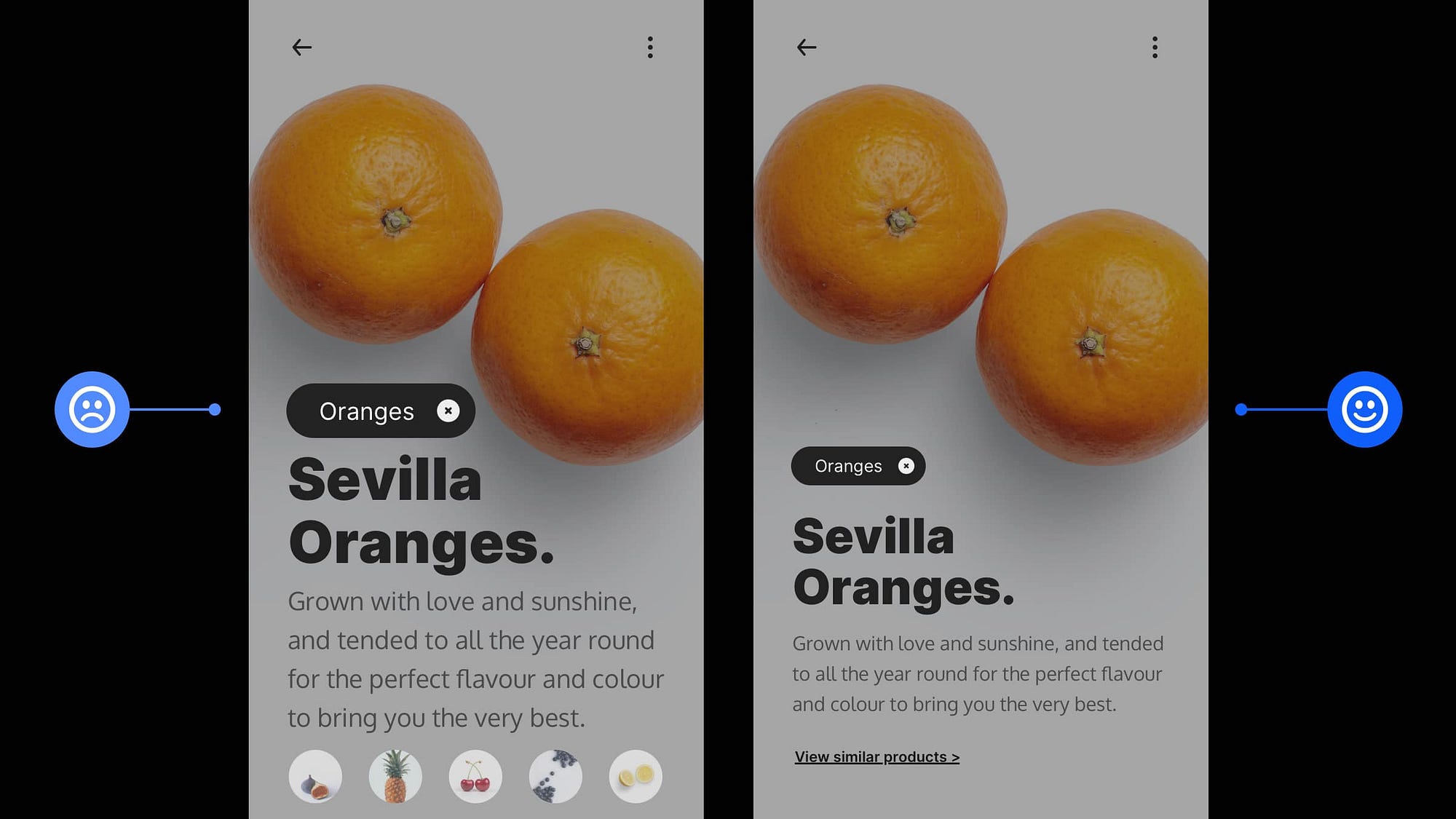
2. Maintain a suitable contrast ratio between light text and images.
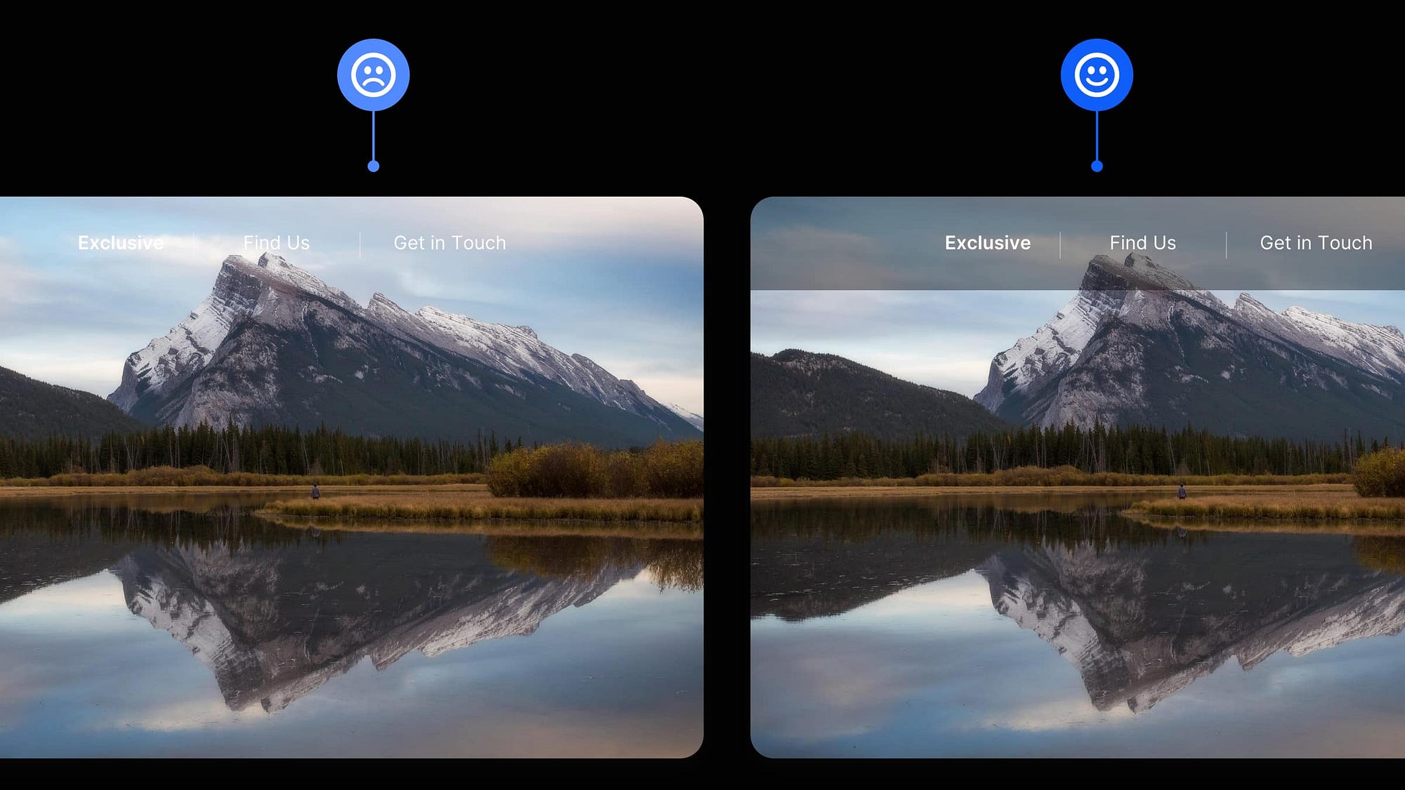
Always check that light text is legible against lighter image backgrounds.
Something as simple as using a slightly opaque dark background behind your text will maintain a nice contrast ratio between those elements.
It also enables you to quickly switch between dark and light images without changing the text colour.
3. Get the perfect Vertical Rhythm for your Headlines and Body Text.

When you want to achieve an excellent Vertical Rhythm, as well as a solid Visual Hierarchy between text elements in your designs, you need to get your Margins just right.
I’ve seen a lot of designs, most typically in article lists, where they’ve applied equal top and bottom margins to headings and, as a result, lost the connection with the body text below it.
I’ll always give more top margin to my headings and a little less at the bottom in cases like these. This makes the connection between the headline and content beneath more robust, and an excellent Vertical Rhythm and Visual Hierarchy is preserved between all articles in a list.
4. To determine the readability of your chosen typeface, use the x-height or Il1 test.

I’ve covered this tip previously, but I just wanted to showcase it again because it can be so darn helpful (again, credit goes to Jessica Hische for the ‘Il1 Test’ tip).
The x-height is the height of a lower-case ‘x’ in relation to an upper-case letter (i.e., T) in the same Typeface.
If your font has a large x-height, it will have considerably better readability, especially when used in long-form body content.
Now, another way to determine the readability of a Typeface is to do the Il1 Test.
With this test, you compare three letters from the same Typeface: Uppercase i (I), Lowercase L (l), and the number one (1).
How different the letterforms look against one another can help determine readability, especially when working with Sans Serif Typefaces.
When choosing a Typeface for your Body text, always aim for the best legibility, either via x-height, Il1, or both.
5. Depending on the size of the text block you use, adjust your line-height accordingly.

Not all line-heights are equal.
When working with text blocks of varying sizes, you need to find the line-height suitable to a specific block.
With a large block of text, for example, adding extra line-height allows the eye to easily distinguish the end of one line from the beginning of the next and move smoothly through the larger passage of text.
And when your text block is nice and short (just 3 or 4 lines) and of a much shorter line length, you can go ahead and stick with its standard line-height or reduce it slightly without worrying about legibility issues.
Tweak those line-heights to fit.
6. Keep your text colour palette simple and just use Tints & Shades.
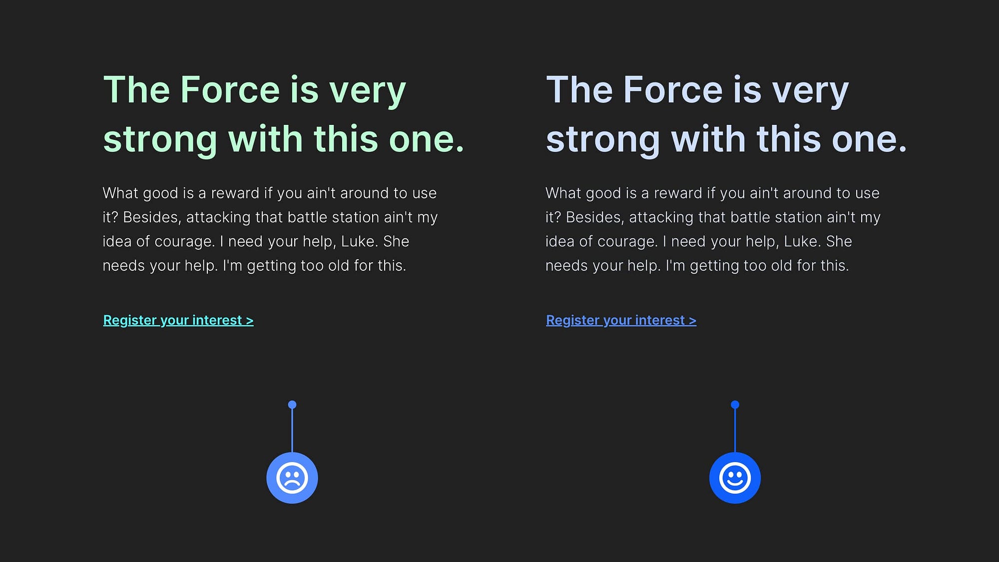
If the project allows, don’t feel that you need to use a crazy amount of different text colour choices to present your message well.
For some, especially when not working from project specs of any kind, finding different colour combinations that work well together can be a struggle.
Save yourself all the stress and look at using tried, and tested Tints (lighter variants) and Shades (darker variants) of something like your Primary colour, for example.
Check out maketintsandshades.com to see how you can make this whole Tints & Shades process even quicker.
I hope with this short collection of tips you’ve realised how the smallest of adjustments to your designs can produce better end-results for both yourself, and your users.
Oh, and by the way, my Design System for Figma; Cabana is now available. Special Offer: Please use the code CABANA35 to receive 35% OFF. ENDING SOON!
Recommend
About Joyk
Aggregate valuable and interesting links.
Joyk means Joy of geeK