

Sharpnado.CollectionView 2.0 is reborn with header/footer and drag and drop
source link: https://www.sharpnado.com/sharpnado-collectionview-2-0-is-reborn/
Go to the source link to view the article. You can view the picture content, updated content and better typesetting reading experience. If the link is broken, please click the button below to view the snapshot at that time.

 https://github.com/roubachof/Sharpnado.CollectionView

Version 2.0 breaking changes: no more HorizontalListView
The mighty Xamarin.Forms HorizontalListView has finally been renamed CollectionView \o/.
Historically, the HorizontalListView, was just uh, and horizontal list view :)
But thanks to the power of UICollectionView and RecyclerView, I quickly extended it with grid layout, list layout, drag and drop, and now with footers/headers.
At this point, the name was pretty misleading, so I had to
All references to HorizontalList has been renamed to Collection, including:
- namespaces
- filename
- class names
HorizontalListViewLayout=>CollectionViewLayoutListLayout=>CollectionLayout
Features
For the newcomers, the sharpnado's CollectionView is featuring:
- Horizontal, Grid, Carousel or Vertical layout
- Drag and Drop
- Grouping with headers and footers
- Reveal custom animations
- Column count
- Infinite loading with
Paginatorcomponent - Snapping on first or middle element
- Padding and item spacing
- Handles
NotifyCollectionChangedActionAdd, Remove and Reset actions - View recycling
RecyclerViewon AndroidUICollectionViewon iOS
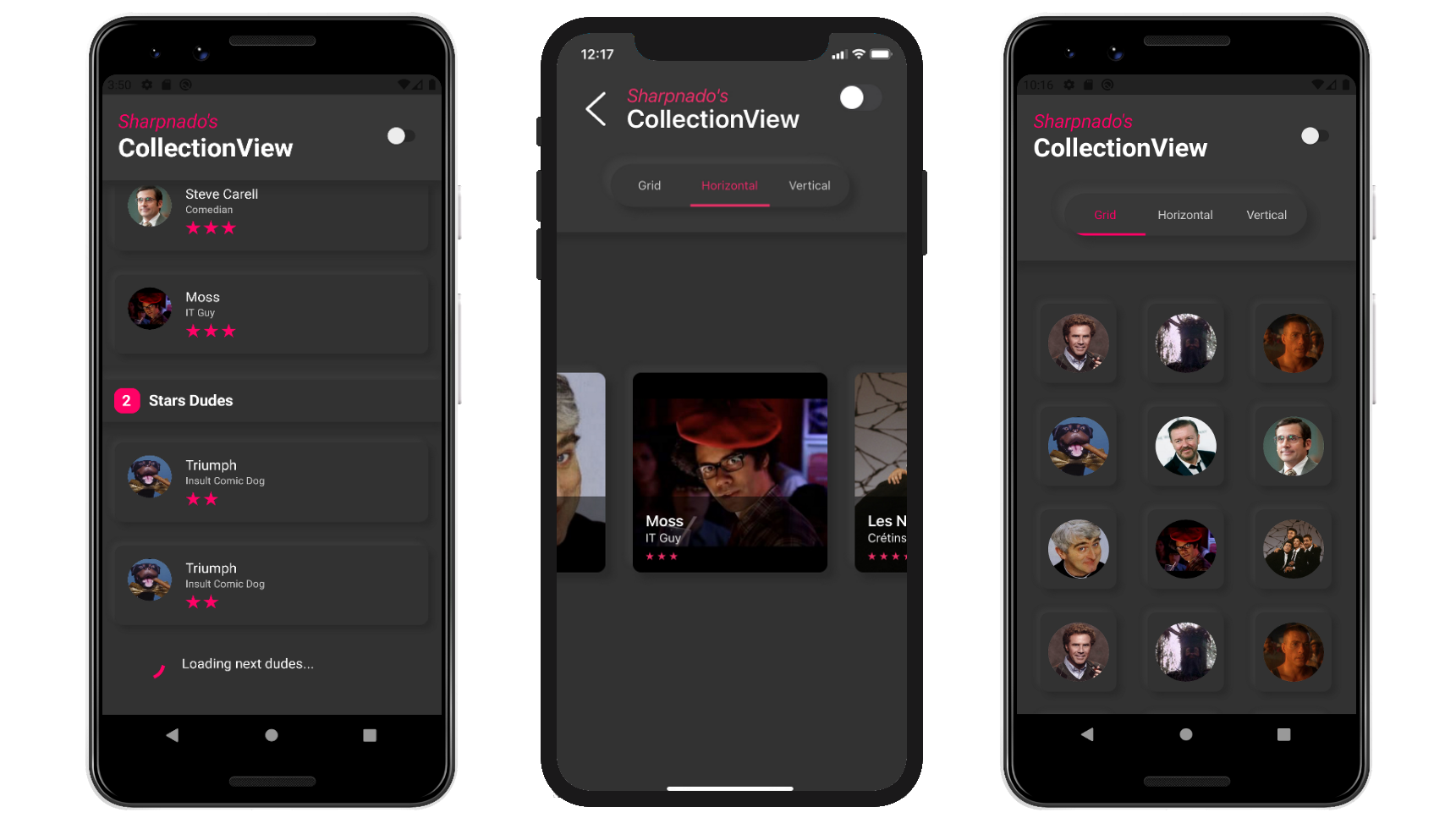
Headers, groups and footers (only for linear layouts)
Since 2.0, you can assign a size to a DataTemplate using the SizedDataTemplate markup extension.
This opens the door to the implementation of header/footer/group headers.
All you have to do is to use a DataTemplateSelector with SizedDataTemplate and set the size of the given DataTemplate.
Let's consider the following screen:
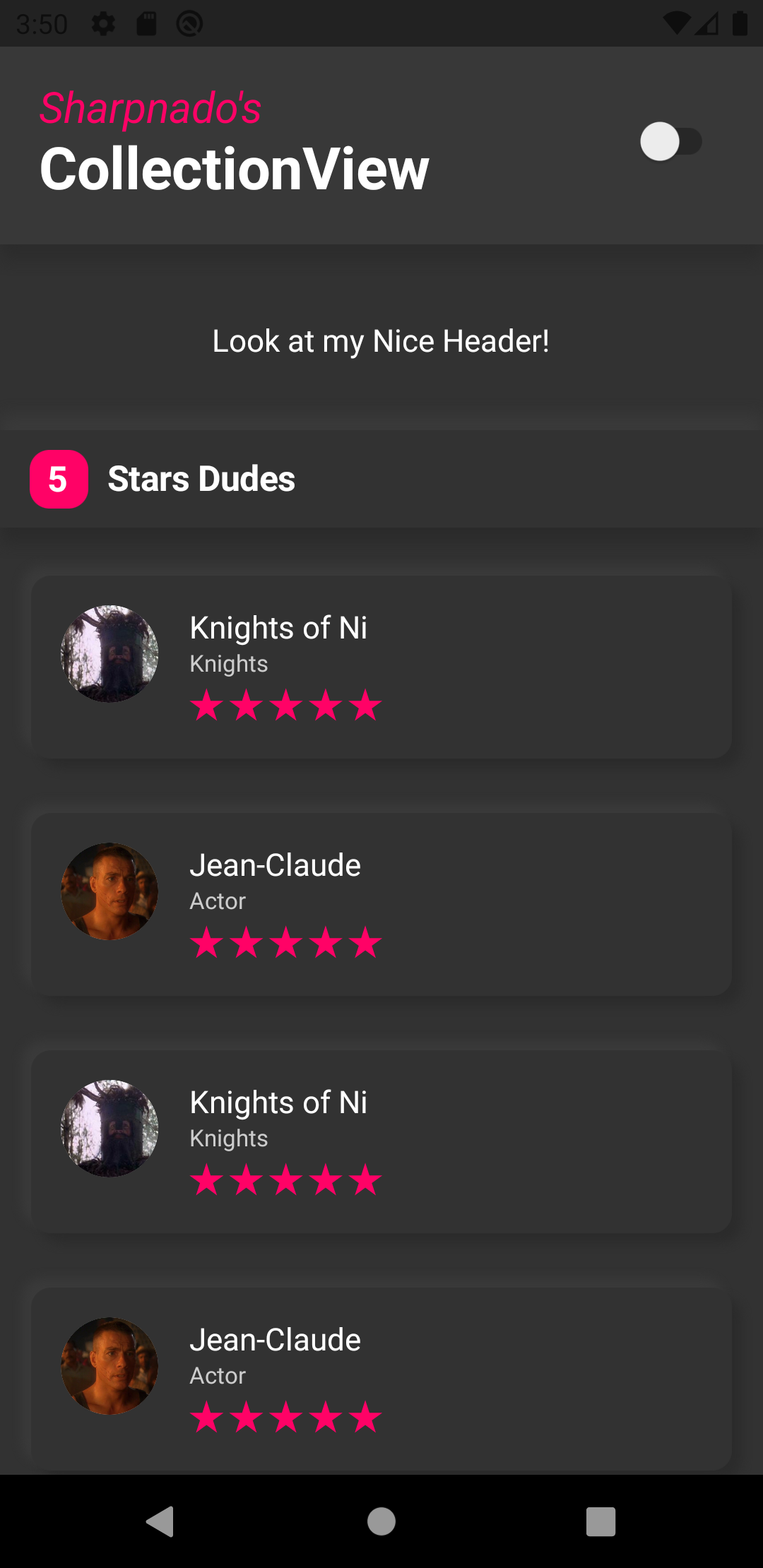
In our example, we want, a header, a footer, but also a group header (items are grouped by silliness degree, their "star" rating).
So we will be using inheritance on the view model side to achieve that:
namespace DragAndDropSample.ViewModels
{
    public interface IDudeItem
    {
    }

    public class DudeHeader : IDudeItem
    {
    }

    public class DudeFooter : IDudeItem
    {
    }

    public class DudeGroupHeader : IDudeItem
    {
        public int StarCount { get; set; }

        public string Text => $"{StarCount} Stars";
    }

    public class SillyDudeVmo : IDudeItem
    {
        public SillyDudeVmo(SillyDude dude, ICommand tapCommand)
        {
            if (dude != null)
            {
                Id = dude.Id;
                Name = dude.Name;
                FullName = dude.FullName;
                Role = dude.Role;
                Description = dude.Description;
                ImageUrl = dude.ImageUrl;
                SillinessDegree = dude.SillinessDegree;
                SourceUrl = dude.SourceUrl;
            }

            TapCommand = tapCommand;
        }

        public bool IsMovable { get; protected set; } = true;

        public ICommand TapCommand { get; set; }

        public int Id { get; }

        public string Name { get; }

        public string FullName { get; }

        public string Role { get; }

        public string Description { get; }

        public string ImageUrl { get; }

        public double SillinessDegree { get; }

        public string SourceUrl { get; }

        public override string ToString()
        {
            return $"{FullName} silly degree: {SillinessDegree}";
        }
    }
}
Then after sorting our collection by rating, we will bind our CollectionView to the SillyPeople list.
public class HeaderFooterGroupingPageViewModel : ANavigableViewModel
{
    public List<IDudeItem> SillyPeople
    {
        get => _sillyPeople;
        set => SetAndRaise(ref _sillyPeople, value);
    }

    private async Task<PageResult<SillyDude>> LoadSillyPeoplePageAsync(int pageNumber, int pageSize, bool isRefresh)
    {
        PageResult<SillyDude> resultPage = await _sillyDudeService.GetSillyPeoplePage(pageNumber, pageSize);

        var dudes = resultPage.Items;

        if (isRefresh)
        {
            SillyPeople = new List<IDudeItem>();
            _listSource = new List<SillyDude>();
        }

        var result = new List<IDudeItem> { new DudeHeader() };
        _listSource.AddRange(dudes);
        foreach (var group in _listSource.OrderByDescending(d => d.SillinessDegree)
            .GroupBy((dude) => dude.SillinessDegree))
        {
            result.Add(new DudeGroupHeader { StarCount = group.Key});
            result.AddRange(group.Select(dude => new SillyDudeVmo(dude, TapCommand)));
        }

        result.Add(new DudeFooter());

        SillyPeople = result;
    }
}
Thanks god for Linq!
You can see how easy it is to order and create our header view models.
Now let's switch to the XAML world!
We create a template for each of our header types:
 <ResourceDictionary>
    <DataTemplate x:Key="HeaderTemplate">
        <sho:DraggableViewCell x:Name="DraggableViewCell" IsDraggable="False">

            <ContentView Margin="0" BackgroundColor="{StaticResource DarkerSurface}">
                <Label
                    Style="{StaticResource TextSubhead}"
                    HorizontalOptions="Center"
                    Text="Look at my Nice Header!" />
            </ContentView>
        </sho:DraggableViewCell>
    </DataTemplate>

    <DataTemplate x:Key="FooterTemplate">
        <sho:DraggableViewCell x:Name="DraggableViewCell" IsDraggable="False">
            <StackLayout
                Padding="30,0,15,0"
                Orientation="Horizontal"
                Spacing="15">
                <ActivityIndicator
                    VerticalOptions="Center"
                    IsRunning="True"
                    Color="{StaticResource Accent}" />
                <Label
                    Style="{StaticResource TextSubhead}"
                    VerticalOptions="Center"
                    Text="Loading next dudes..." />
            </StackLayout>
        </sho:DraggableViewCell>
    </DataTemplate>

    <DataTemplate x:Key="GroupHeaderTemplate" x:DataType="viewModels:DudeGroupHeader">
        <sho:DraggableViewCell x:Name="DraggableViewCell" IsDraggable="False">
            <sho:Shadows x:Name="Shadow" Shades="{StaticResource VerticalNeumorphism}">
                <StackLayout
                    Margin="0,15,0,10"
                    Padding="0"
                    BackgroundColor="{StaticResource DarkerSurface}"
                    Orientation="Horizontal"
                    Spacing="0">

                    <Frame
                        WidthRequest="30"
                        HeightRequest="30"
                        Margin="15,0,10,0"
                        Padding="0"
                        HorizontalOptions="End"
                        VerticalOptions="Center"
                        BackgroundColor="{StaticResource Accent}"
                        CornerRadius="10"
                        HasShadow="False">
                        <Label
                            Style="{StaticResource TextTitle}"
                            HorizontalOptions="Center"
                            VerticalOptions="Center"
                            Text="{Binding StarCount}" />
                    </Frame>
                    <Label
                        Style="{StaticResource TextTitle}"
                        VerticalOptions="Center"
                        Text="Stars Dudes" />
                </StackLayout>
            </sho:Shadows>
        </sho:DraggableViewCell>
    </DataTemplate>

    <DataTemplate x:Key="DudeTemplate">
        <sho:DraggableViewCell x:Name="DraggableViewCell">
            <sho:Shadows
                x:Name="Shadow"
                CornerRadius="10"
                Shades="{StaticResource ThinDarkerNeumorphism}">
                <views:SillyListCell
                    Margin="16,13"
                    BackgroundColor="{StaticResource DarkerSurface}"
                    CornerRadius="10">
                    <views:SillyListCell.Triggers>
                        <DataTrigger
                            Binding="{Binding Source={x:Reference DraggableViewCell}, Path=IsDragAndDropping}"
                            TargetType="views:SillyListCell"
                            Value="True">
                            <Setter Property="BackgroundColor" Value="{StaticResource DarkSurface}" />
                        </DataTrigger>
                    </views:SillyListCell.Triggers>
                </views:SillyListCell>
            </sho:Shadows>
        </sho:DraggableViewCell>
    </DataTemplate>
</ResourceDictionary>
The last step is to make the correspondance between our header view models, and our headers data templates.
For that, we declare our DataTemplateSelector:
public class HeaderFooterGroupingTemplateSelector: DataTemplateSelector
{
    public SizedDataTemplate HeaderTemplate { get; set; }

    public SizedDataTemplate FooterTemplate { get; set; }

    public SizedDataTemplate GroupHeaderTemplate { get; set; }

    public DataTemplate DudeTemplate { get; set; }

    protected override DataTemplate OnSelectTemplate(object item, BindableObject container)
    {
        switch (item)
        {
            case DudeHeader header:
                return HeaderTemplate;

            case DudeFooter footer:
                return FooterTemplate;

            case DudeGroupHeader groupHeader:
                return GroupHeaderTemplate;

            default:
                return DudeTemplate;
        }
    }
}
You can see that all the headers (all the data template with an associated size in fact) need to be a SizedDataTemplate.
Then we just assign a fixed size to each template when we declare our DataTemplateSelector :
<views:HeaderFooterGroupingTemplateSelector
    x:Key="HeaderFooterGroupingTemplateSelector"
    DudeTemplate="{StaticResource DudeTemplate}"
    FooterTemplate="{sho:SizedDataTemplate
        Template={StaticResource FooterTemplate}, Size=60}"
    GroupHeaderTemplate="{sho:SizedDataTemplate
        Template={StaticResource GroupHeaderTemplate}, Size=75}"
    HeaderTemplate="{sho:SizedDataTemplate
        Template={StaticResource HeaderTemplate}, Size=40}" />
We don't have to assign a size to our item template (here the silly dude), it will pick the ItemWidth (for an horizontal layout) or ItemHeight (for a vertical one) size.

You can find this example in the sample project (click on "Header and Grouping Example" button).
Recommend
About Joyk
Aggregate valuable and interesting links.
Joyk means Joy of geeK