
10

WorkOutDoors: New workout features | MacRumors Forums
source link: https://forums.macrumors.com/threads/workoutdoors-new-workout-features.2134687/
Go to the source link to view the article. You can view the picture content, updated content and better typesetting reading experience. If the link is broken, please click the button below to view the snapshot at that time.

WorkOutDoors: New workout features
The new version of WorkOutDoors adds many new features to make it the most powerful and configurable workout app for Apple Watch (IMHO), as well as being the only app that shows a fully functional vector map to aid navigation.
This new thread is all about the new workout features in version 3.0. To read about the existing mapping and GPX route features check out the website: http://www.workoutdoors.net/Maps.html
The new workout features include:
- Completely configurable screens with 4 layouts and 3 different text sizes;
- over 160 live data metrics to choose from, including mini-graphs and buttons;
- ability to define multiple screens and cycle through them during the workout;
- interval alerts for distance, time, steps, ascent, and descent;
- maximum and minimum limit alerts for pace, heart rate, speed, and cadence;
- set a target pace and display the distance and time ahead or behind target;
- show a live icon on the map representing someone moving at target pace;
- manually start new laps or use automatic laps with configurable intervals;
- lap splits available for many metrics and at any time during or after the workout;
- many heartrate zone metrics with user configurable zones;
- much improved analytics screens on both the Watch and the iPhone;
- 3 separate rolling pace metrics with user configurable distance or time windows;
- improved geocaching capabilities including display of groundspeak extensions;
- new workout types: Cross Country Skiing, Paddling, Skating, Surfing, and Golf;
- improved settings screens, all with ability to jump straight back to workout by force pressing;
- now able to lock the screen and/or the crown, to avoid accidental touches;
- tapping a field now shows a full screen description of that field;
- can configure shortcut operations for triple-tapping, quadruple tapping or pressing both side buttons;
- new optional on-screen battery meter;
- many more new features and improvements
These features are detailed in the following posts.
[doublepost=1535620387][/doublepost]New Screen Layouts
You can now choose from 4 screen layouts:
Bottom: Data below the map (as before);
Tower: Between 2 and 4 full width data fields above 2 or 3 data fields (no map);
'L' Shape: Data below and also on the left side of the map;
Grid: 2x4, 2x5 or 3x6 data fields (no map).
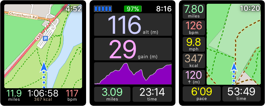
 Each of these formats can be displayed in 3 different text sizes. The smaller the text then the more fields that can be shown and the larger the map (if present). As before, you can always double tap to see a full screen map, and double tap again to see the data again.
[doublepost=1535620569][/doublepost]Configurable Screens
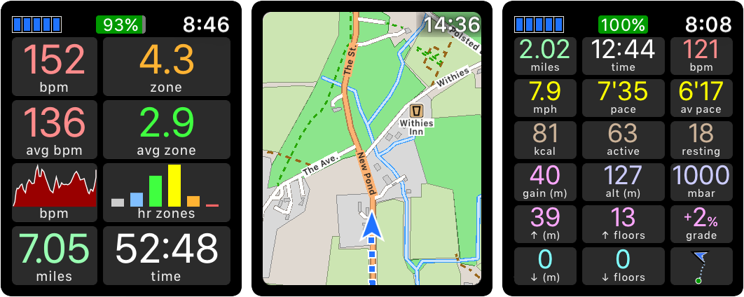
Each activity type has a set of data screens that can be cycled through during a workout by triple tapping anywhere on the display. So for example the default running screens are as follows:
- Overview (data at the bottom)
- Heart Rate (grid layout with no map)
- Target Pace ('L' shape layout)
- Steps (Tower layout with 2 full width fields and 2 smaller ones at the bottom).
 The screens can be easily modified on either the iPhone or the Watch. For example it is very easy to delete the Steps screen or change it to show Elevation information. Or to add a new screen showing the Activity Ring information.
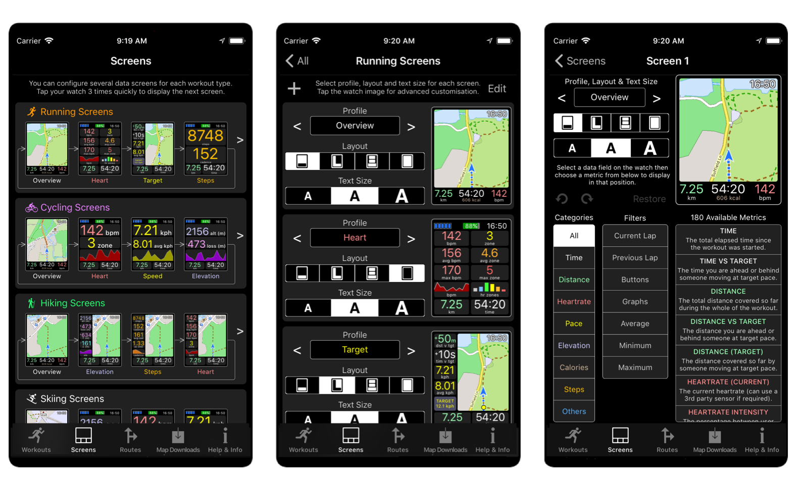 If these screens are not quite what the user wants then they can be customised to show exactly the metrics they require from a pool of over 160 different live fields. These metrics include many types of graphs and charts. The customisation can be performed on either the iPhone or the Watch app.
The metrics also include buttons that provide shortcuts for various operations, including direct access to settings screens of interest. For example the Target screen has a button showing the target pace. If you touch that button for more than 1.5 seconds (to avoid accidental touches) then it displays the target pace settings screen, where you can quickly change the target pace. This is much faster than going via the Settings menu to find that screen.
[doublepost=1535620633][/doublepost]Interval Alerts
You can now configure interval notifications for various properties, such as distance (e.g. every mile), time (e.g. every 5 minutes), steps (e.g. every 1000 steps), calories (e.g. every 100 calories), and distance ascended or descended (e.g. every 100m).
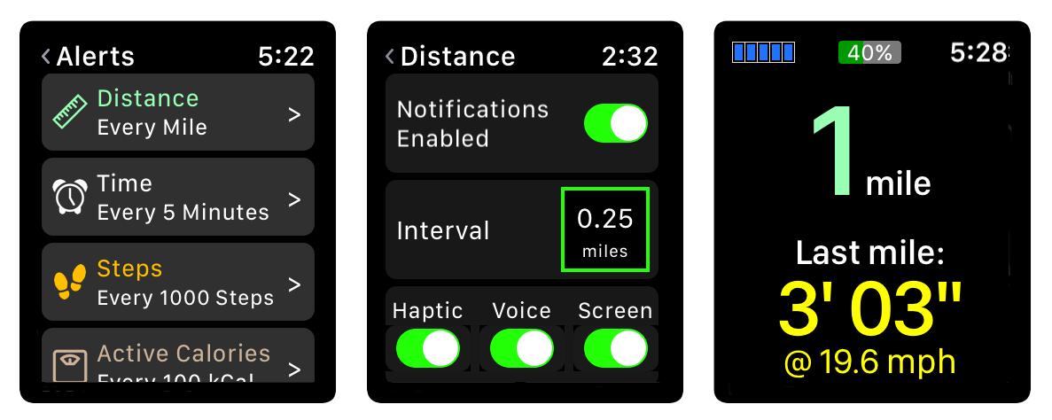 In each case you can control the length of interval (e.g. every 0.25 miles instead of every mile) and also whether or not the notification includes haptics, voice feedback, or on-screen messages when you raise your wrist within a few seconds of the haptic/voice.
[doublepost=1535620697][/doublepost]Limit Alerts
You can also now configure maximum and/or minimum limits for various properties, such as pace, heartrate, cadence and speed. As with notifications you can control whether or not the limit alerts use haptics, voice feedback or on-screen messages.
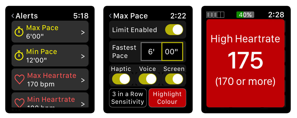 You can control the sensitivity of each limit, in terms of how many consecutive breaches are required before the user is informed. For example if you have a maximum heartrate of 170 configured with a sensitivity requirement of 3 consecutive breaches then 169, 172, 171, 168 will not result in a notification, but 169, 172, 171, 175 will do. You will also get notifications when the property has returned below the limit (or above the limit for minimum limits).
You can also specify the colour that a property is displayed in when a limit is breached. By default these are red (hot) for maximum limits and blue (cold) for minimum limits. This is the background colour in the notification and also in the data fields, which makes it easy to spot limit breaches amongst other data fields.
[doublepost=1535620774][/doublepost]Target Pace
The app now has the ability to set a target pace or speed. The user can then display fields such as the time or distance that you are ahead or behind someone who is moving at the target pace. When you are ahead of the target pace then the fields are shown in green, and when you are behind then they are shown in red. Both of these colours are configurable.
You can also display a yellow circle on the map, indicating whereabouts you or a competitor would be if running at that target pace. By default the yellow dot is shown only if you are viewing a screen configured with the "Target" profile. This is considered Auto mode. The Target Pace settings screen also allows you to switch the dot off, or make it always visible for any profile.
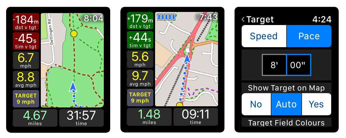 When in auto-rotate mode the GPS location arrow is positioned towards the bottom of the screen to show more of the map ahead of you. However if the target pace dot is displayed and the target is behind you, then the blue arrow will be positioned further up in order to show the chasing target. It will never be displayed higher than the centre of the screen.
I have found this much more useful than I expected. There is something about watching a dot catching you up or moving away that is much more effective as a motivator than just seeing the numbers for the distance or time difference.
[doublepost=1535620848][/doublepost]Rolling Pace
There are three new Rolling Pace and three new Rolling Speed fields. You can configure the periods for each of the fields in the Rolling Pace settings, which are under the Workout settings. These periods can be either time or distance and default to 1 mile / 1 km; 1 minute; and 0.25 miles / 0.25 km.
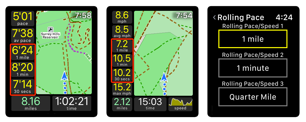 Generally the longer the period then the more accurate the value, whereas the shorter the period then the more responsive it is to speed changes.
These fields were added when I saw that Apple had included Rolling Mile Pace in the Workout app in watchOS 5, but I figured it would be handy to choose the period. There are 3 fields so that users can compare 3 different periods and decide which one is the best for them.
[doublepost=1535620905][/doublepost]Laps
The app now supports both manual and automatic laps. By default laps are automatic and use the same interval as distance notifications (which default to 1 mile or 1 kilometre). There is a "Laps" option in the Workout menu of the Settings that allows you to choose between Manual or Auto laps. If you select manual laps then you should configure a shortcut (for example pressing both side buttons) to start a new lap. Although if necessary then you could include a "new lap" button on the screen.
There are many metrics for laps. Practically every metric that covers a time period will also have versions for the current lap and for the previous lap. For example there are average pace metrics for the whole workout, for the current lap, and for the previous lap.
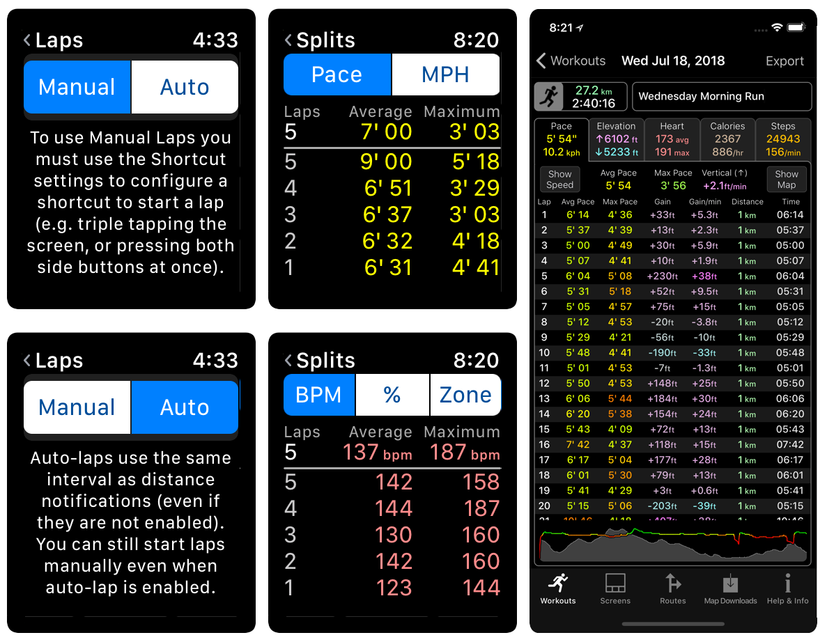 Lap splits can be shown on the watch at any time during the workout by force pressing and selecting Info. This shows a summary screen and a "Pace Splits" button. If you tap a different field on the summary screen (e.g. heart rate) then the button changes to show a "Heart Splits" button. This is explained in more detail in the Watch Analytics section.
The iPhone app allows extensive analysis of lap splits for many different fields, as explained in the iPhone Analytics section.
[doublepost=1535620972][/doublepost]Heart Rate Zones
The new version has two new ways of representing heart rate: intensity and zone. All heart rate values can now be displayed as bpm, intensity or zone.
Intensity is the percentage between configurable minimum and maximum heart rates. These default to 0 and 180, but can be changed by the user on either the iPhone or the watch. For example the maximum is often set to 220 minus the user's age, and the minimum could be changed to the user's resting heart rate if they prefer.
Heart rate zones are based on intensities. The idea is that the body is doing different things in each zone. For example zone 2 is considered the best for burning fat; zone 3 is the best for improving aerobic endurance and zone 4 is for anaerobic endurance. By default zone 0 is below 50%; zone 1 is between 50% and 60%; zone 2 is between 60% and 70% etc. However these values can also be configured by the user.
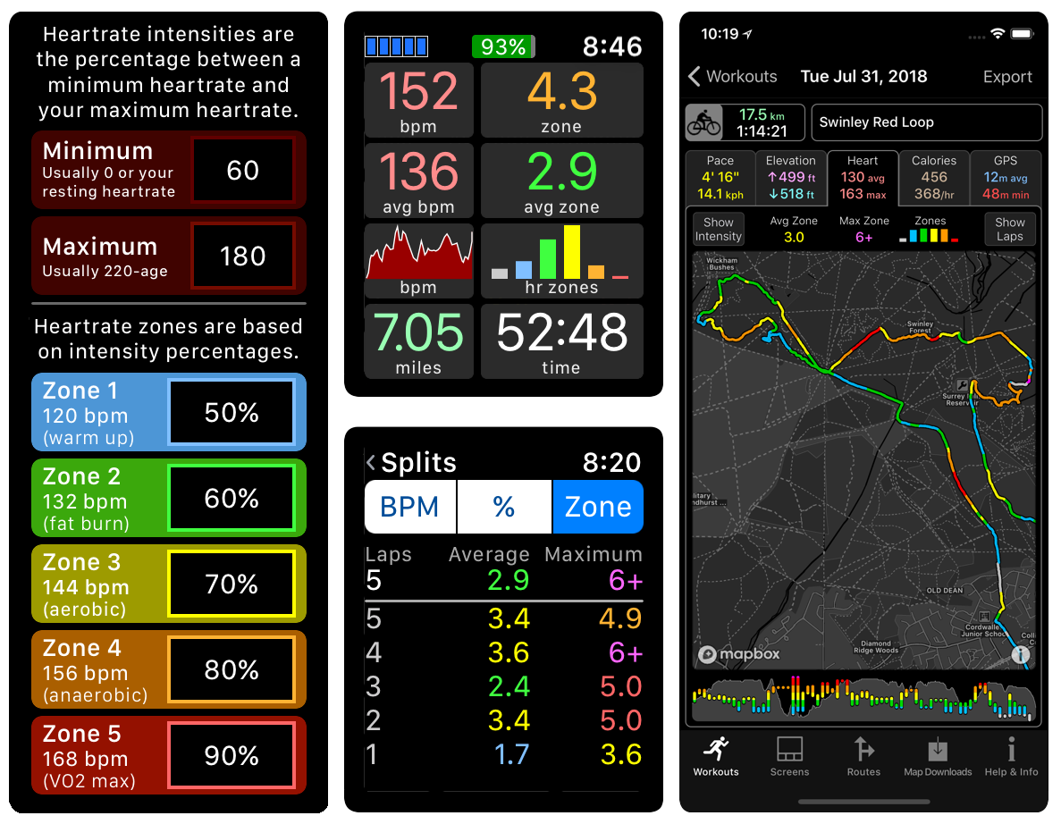 There are also new fields showing the percentage of the workout (or current lap or previous lap) in each zone. For example if you are interested in weight loss then you would be aiming to have a high percentage in zone 2, whereas if you wanted to improve your aerobic fitness then zone 3 would be better. These percentages can be shown as numbers, or as a bar chart showing the amount of time spent in each zone.
This new thread is all about the new workout features in version 3.0. To read about the existing mapping and GPX route features check out the website: http://www.workoutdoors.net/Maps.html
The new workout features include:
- Completely configurable screens with 4 layouts and 3 different text sizes;
- over 160 live data metrics to choose from, including mini-graphs and buttons;
- ability to define multiple screens and cycle through them during the workout;
- interval alerts for distance, time, steps, ascent, and descent;
- maximum and minimum limit alerts for pace, heart rate, speed, and cadence;
- set a target pace and display the distance and time ahead or behind target;
- show a live icon on the map representing someone moving at target pace;
- manually start new laps or use automatic laps with configurable intervals;
- lap splits available for many metrics and at any time during or after the workout;
- many heartrate zone metrics with user configurable zones;
- much improved analytics screens on both the Watch and the iPhone;
- 3 separate rolling pace metrics with user configurable distance or time windows;
- improved geocaching capabilities including display of groundspeak extensions;
- new workout types: Cross Country Skiing, Paddling, Skating, Surfing, and Golf;
- improved settings screens, all with ability to jump straight back to workout by force pressing;
- now able to lock the screen and/or the crown, to avoid accidental touches;
- tapping a field now shows a full screen description of that field;
- can configure shortcut operations for triple-tapping, quadruple tapping or pressing both side buttons;
- new optional on-screen battery meter;
- many more new features and improvements
These features are detailed in the following posts.
[doublepost=1535620387][/doublepost]New Screen Layouts
You can now choose from 4 screen layouts:
Bottom: Data below the map (as before);
Tower: Between 2 and 4 full width data fields above 2 or 3 data fields (no map);
'L' Shape: Data below and also on the left side of the map;
Grid: 2x4, 2x5 or 3x6 data fields (no map).
[doublepost=1535620569][/doublepost]Configurable Screens
Each activity type has a set of data screens that can be cycled through during a workout by triple tapping anywhere on the display. So for example the default running screens are as follows:
- Overview (data at the bottom)
- Heart Rate (grid layout with no map)
- Target Pace ('L' shape layout)
- Steps (Tower layout with 2 full width fields and 2 smaller ones at the bottom).
The metrics also include buttons that provide shortcuts for various operations, including direct access to settings screens of interest. For example the Target screen has a button showing the target pace. If you touch that button for more than 1.5 seconds (to avoid accidental touches) then it displays the target pace settings screen, where you can quickly change the target pace. This is much faster than going via the Settings menu to find that screen.
[doublepost=1535620633][/doublepost]Interval Alerts
You can now configure interval notifications for various properties, such as distance (e.g. every mile), time (e.g. every 5 minutes), steps (e.g. every 1000 steps), calories (e.g. every 100 calories), and distance ascended or descended (e.g. every 100m).
[doublepost=1535620697][/doublepost]Limit Alerts
You can also now configure maximum and/or minimum limits for various properties, such as pace, heartrate, cadence and speed. As with notifications you can control whether or not the limit alerts use haptics, voice feedback or on-screen messages.
You can also specify the colour that a property is displayed in when a limit is breached. By default these are red (hot) for maximum limits and blue (cold) for minimum limits. This is the background colour in the notification and also in the data fields, which makes it easy to spot limit breaches amongst other data fields.
[doublepost=1535620774][/doublepost]Target Pace
The app now has the ability to set a target pace or speed. The user can then display fields such as the time or distance that you are ahead or behind someone who is moving at the target pace. When you are ahead of the target pace then the fields are shown in green, and when you are behind then they are shown in red. Both of these colours are configurable.
You can also display a yellow circle on the map, indicating whereabouts you or a competitor would be if running at that target pace. By default the yellow dot is shown only if you are viewing a screen configured with the "Target" profile. This is considered Auto mode. The Target Pace settings screen also allows you to switch the dot off, or make it always visible for any profile.
I have found this much more useful than I expected. There is something about watching a dot catching you up or moving away that is much more effective as a motivator than just seeing the numbers for the distance or time difference.
[doublepost=1535620848][/doublepost]Rolling Pace
There are three new Rolling Pace and three new Rolling Speed fields. You can configure the periods for each of the fields in the Rolling Pace settings, which are under the Workout settings. These periods can be either time or distance and default to 1 mile / 1 km; 1 minute; and 0.25 miles / 0.25 km.
These fields were added when I saw that Apple had included Rolling Mile Pace in the Workout app in watchOS 5, but I figured it would be handy to choose the period. There are 3 fields so that users can compare 3 different periods and decide which one is the best for them.
[doublepost=1535620905][/doublepost]Laps
The app now supports both manual and automatic laps. By default laps are automatic and use the same interval as distance notifications (which default to 1 mile or 1 kilometre). There is a "Laps" option in the Workout menu of the Settings that allows you to choose between Manual or Auto laps. If you select manual laps then you should configure a shortcut (for example pressing both side buttons) to start a new lap. Although if necessary then you could include a "new lap" button on the screen.
There are many metrics for laps. Practically every metric that covers a time period will also have versions for the current lap and for the previous lap. For example there are average pace metrics for the whole workout, for the current lap, and for the previous lap.
The iPhone app allows extensive analysis of lap splits for many different fields, as explained in the iPhone Analytics section.
[doublepost=1535620972][/doublepost]Heart Rate Zones
The new version has two new ways of representing heart rate: intensity and zone. All heart rate values can now be displayed as bpm, intensity or zone.
Intensity is the percentage between configurable minimum and maximum heart rates. These default to 0 and 180, but can be changed by the user on either the iPhone or the watch. For example the maximum is often set to 220 minus the user's age, and the minimum could be changed to the user's resting heart rate if they prefer.
Heart rate zones are based on intensities. The idea is that the body is doing different things in each zone. For example zone 2 is considered the best for burning fat; zone 3 is the best for improving aerobic endurance and zone 4 is for anaerobic endurance. By default zone 0 is below 50%; zone 1 is between 50% and 60%; zone 2 is between 60% and 70% etc. However these values can also be configured by the user.
Recommend
About Joyk
Aggregate valuable and interesting links.
Joyk means Joy of geeK