

How to create a variant-powered component in Figma
source link: https://uxdesign.cc/how-to-create-a-variant-powered-component-in-figma-184dcadb3aaf
Go to the source link to view the article. You can view the picture content, updated content and better typesetting reading experience. If the link is broken, please click the button below to view the snapshot at that time.

Figma 101 Tutorial Series
How to create a variant-powered component in Figma
A hands-on series for getting started with this powerful design tool.
In this tutorial, I’ll show you how to create a new Floating Action Button Component in Figma, so you can see how easy it is to start building your own components and how to use powerful but sometimes confusing features such as Variants.
Ok. Wow. A Floating Action Button. Well, it’s more about showing you how to create Components with Variants. And like anything, it’s better to start small and then work your way up to bigger things right?
Now. Variants as powerful as they are can be a little confusing the first time you start creating components with them.
But don’t worry, this tutorial will fix any confusion that you might have, and you’ll be Variant ready the next time you create a suitable component.
QUICK NOTE: Download the required Figma file here to follow along with this Tutorial.
(ANOTHER) QUICK NOTE: You can also view the video below (part of the Premium Edition of my Design System for Figma; Cabana) if you prefer to follow along that way…
Let’s start building a Variant-powered Component.
Ok. Firstly.
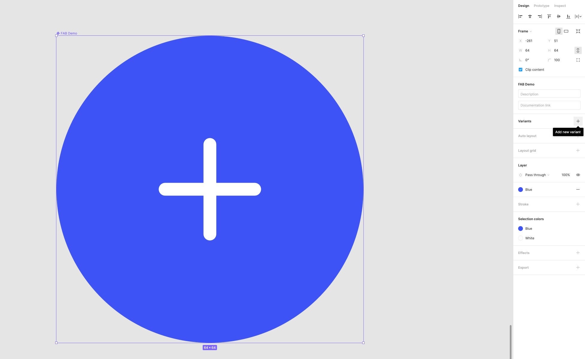
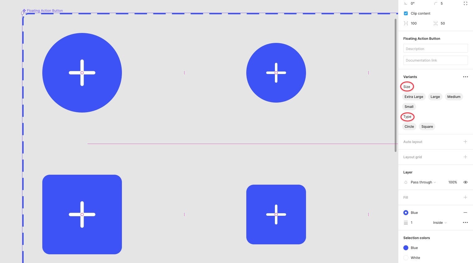
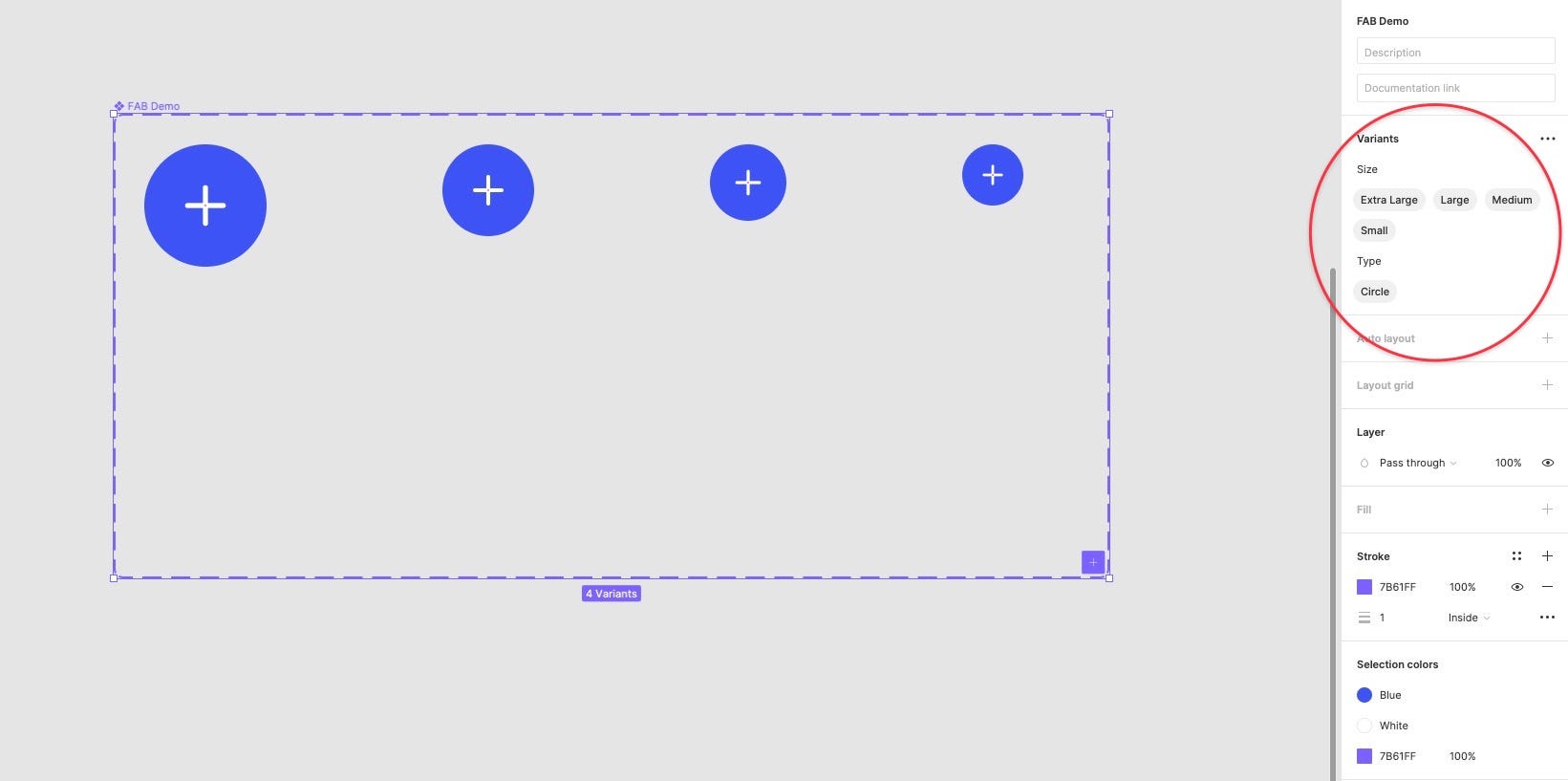
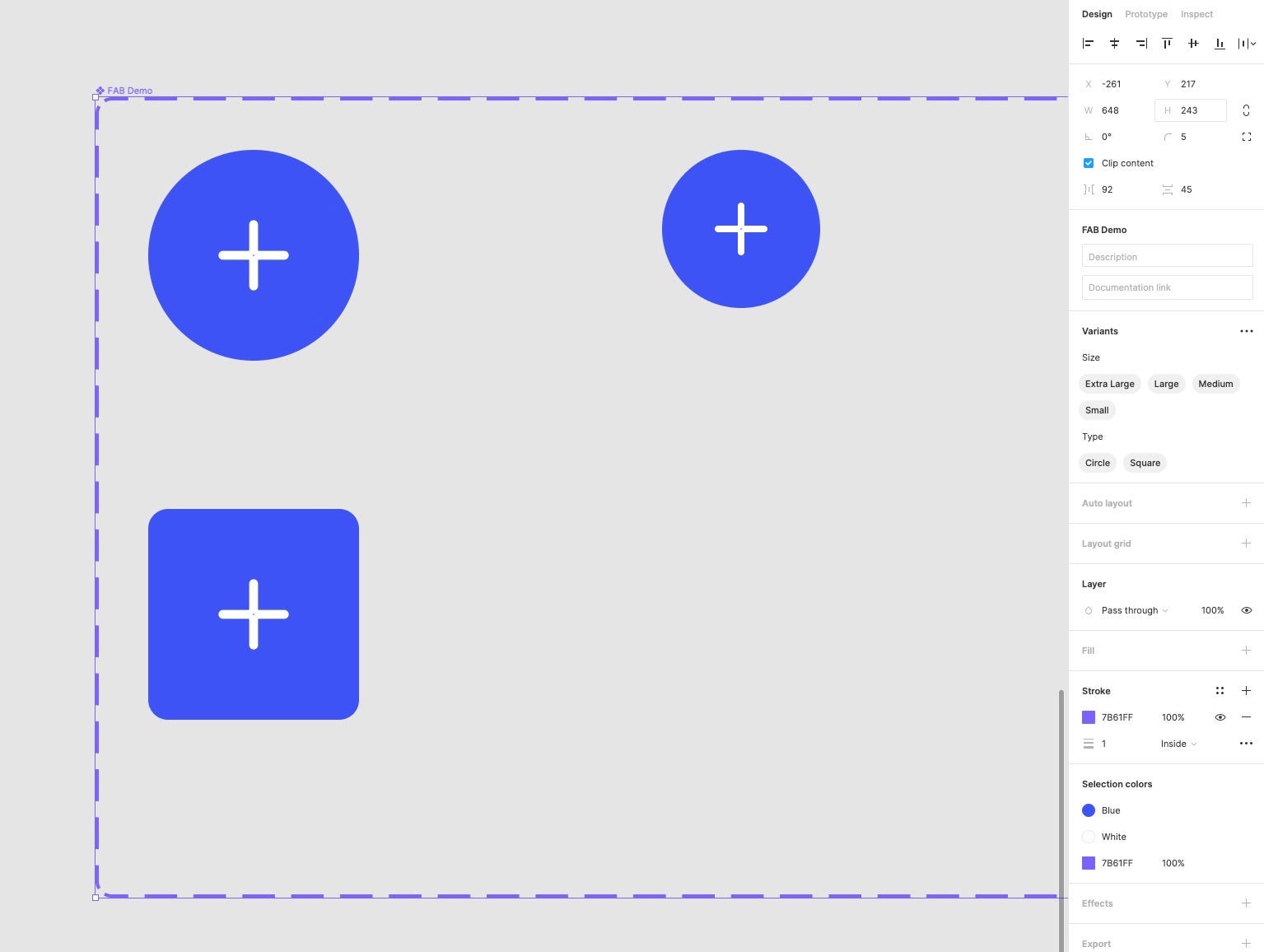
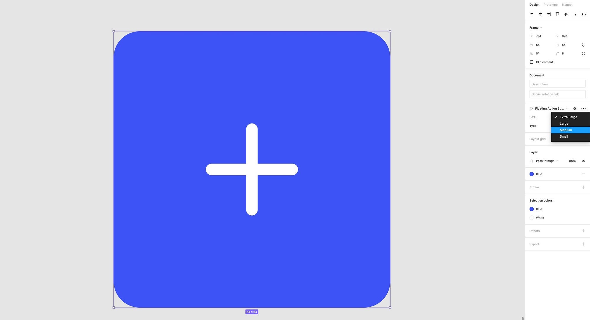
Taking a look at the existing Floating Action Button or FAB Component in the Tutorial file, you’ll see that it’s made up of 8 elements to cater for differing sizes, as well as shape types.
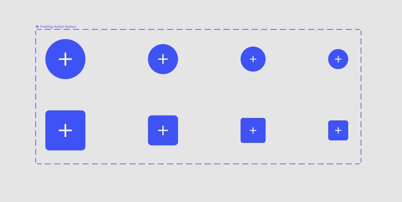
And if you click on the Variant container you’ll see the different Variants shown in the Inspector.
So. How do you put all this together? Let me show you…
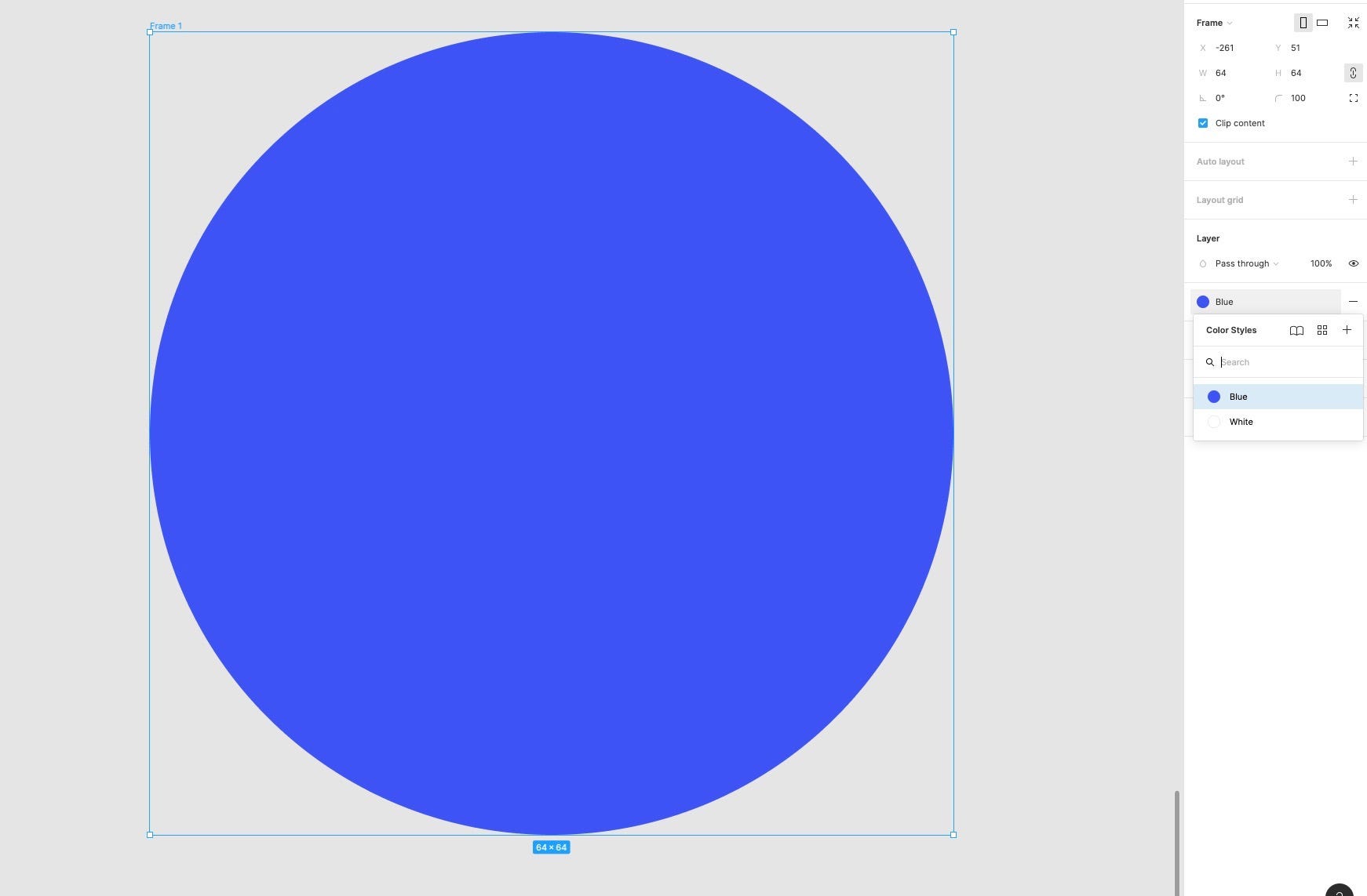
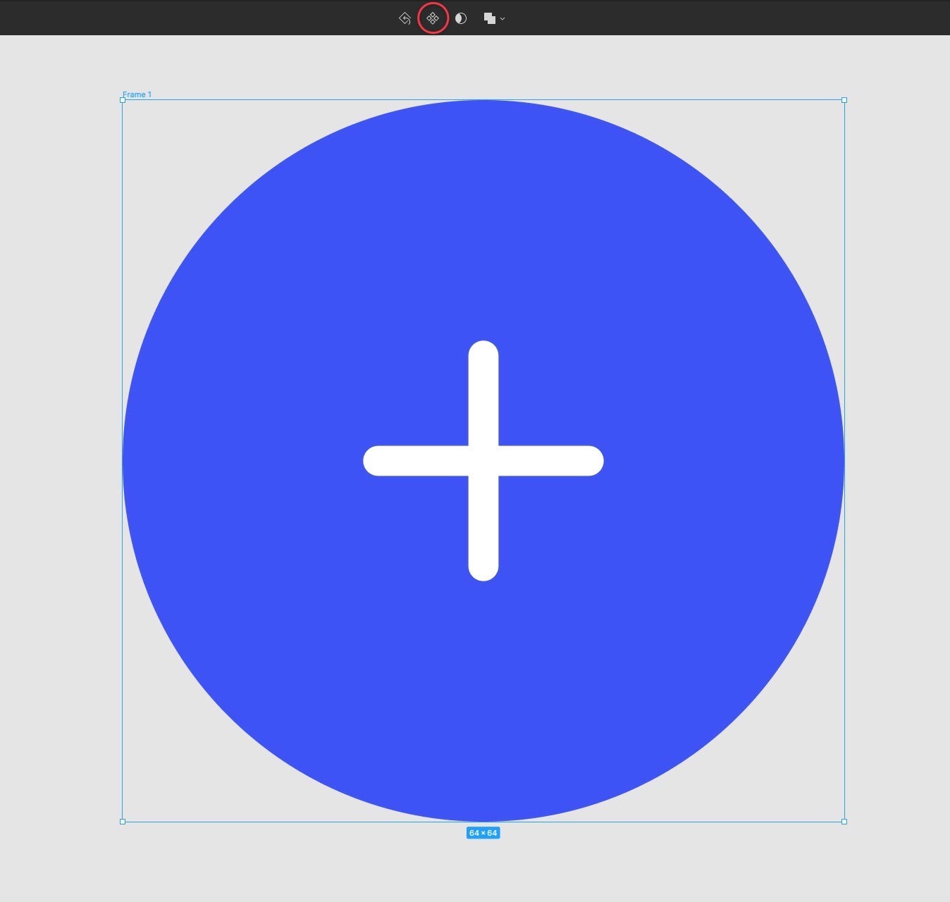
Let’s start with the Extra Large, Circular button first.
Using the Frame tool draw out a Frame 64 by 64, give it a corner radius of 100, and then from the Inspector panel apply the Blue Color Style.
Then from the Assets panel, grab the ‘Math Plus’ icon and drag that into the Frame.
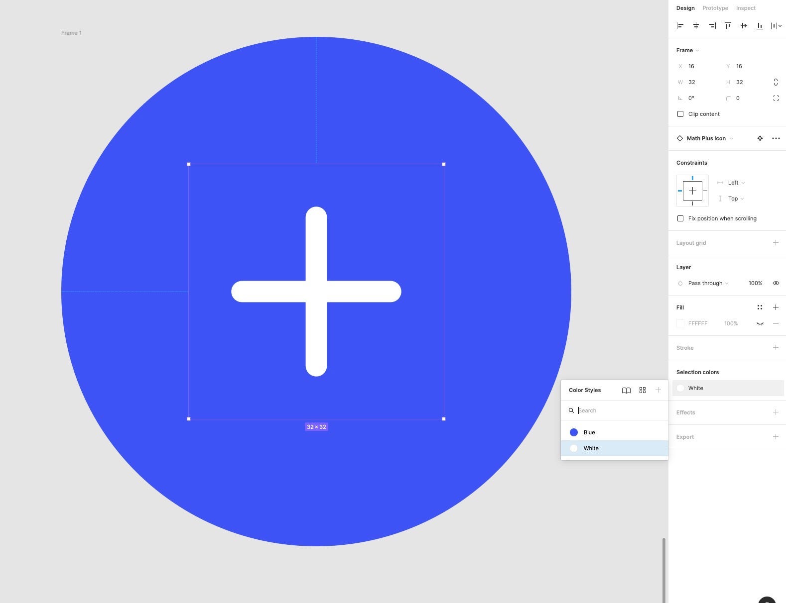
Change the Size of the icon to 32 by 32, align it inside the Frame, and then with it still selected, change its colour to White from the Color Styles in the Inspector.
With the Frame selected, turn it into a Component using the icon in the toolbar, and then rename it to, let’s say, ‘FAB Demo’.

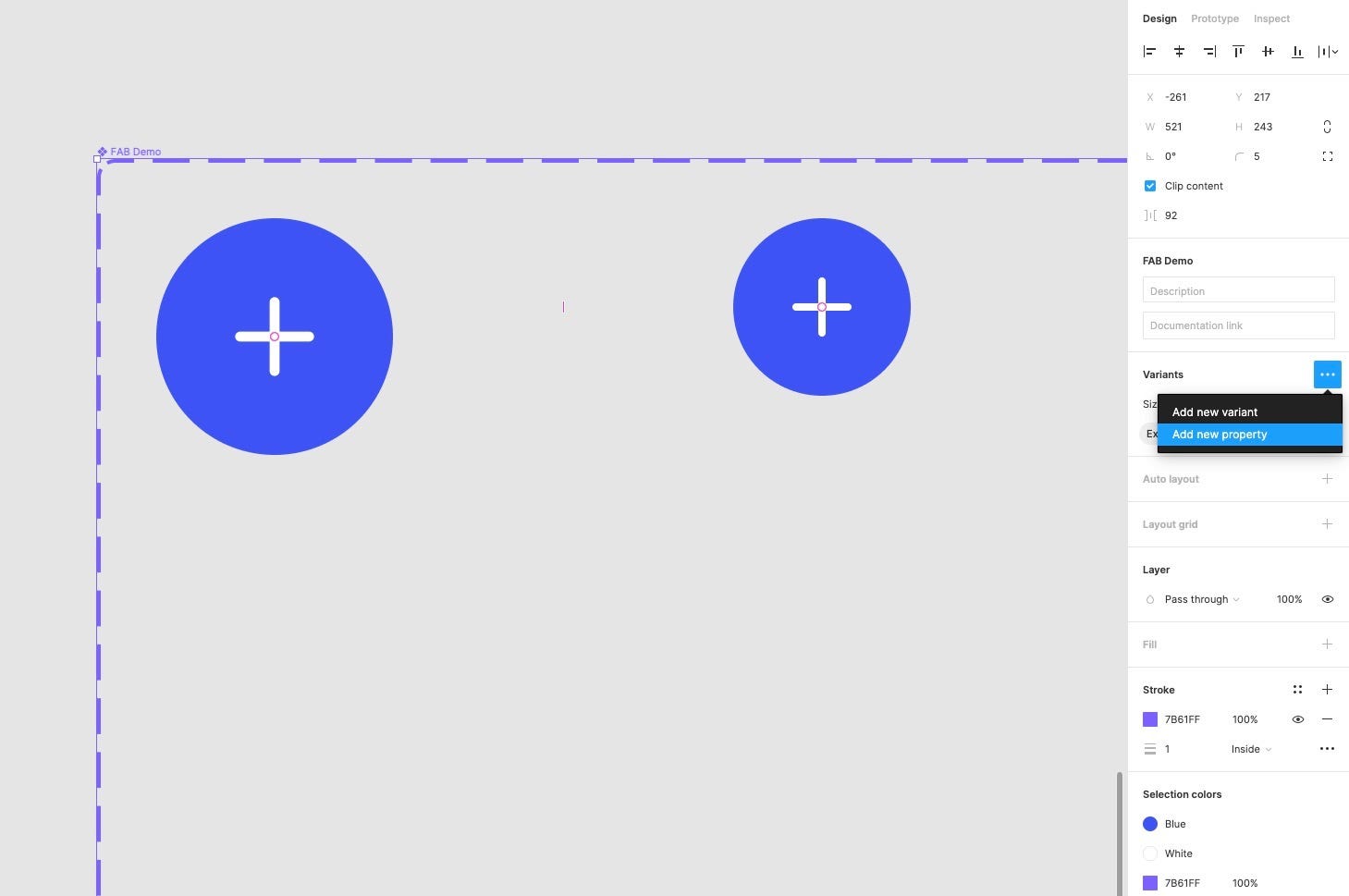
Time to bring on the Variants.
Ok. Let’s do some Variant work on this little button.
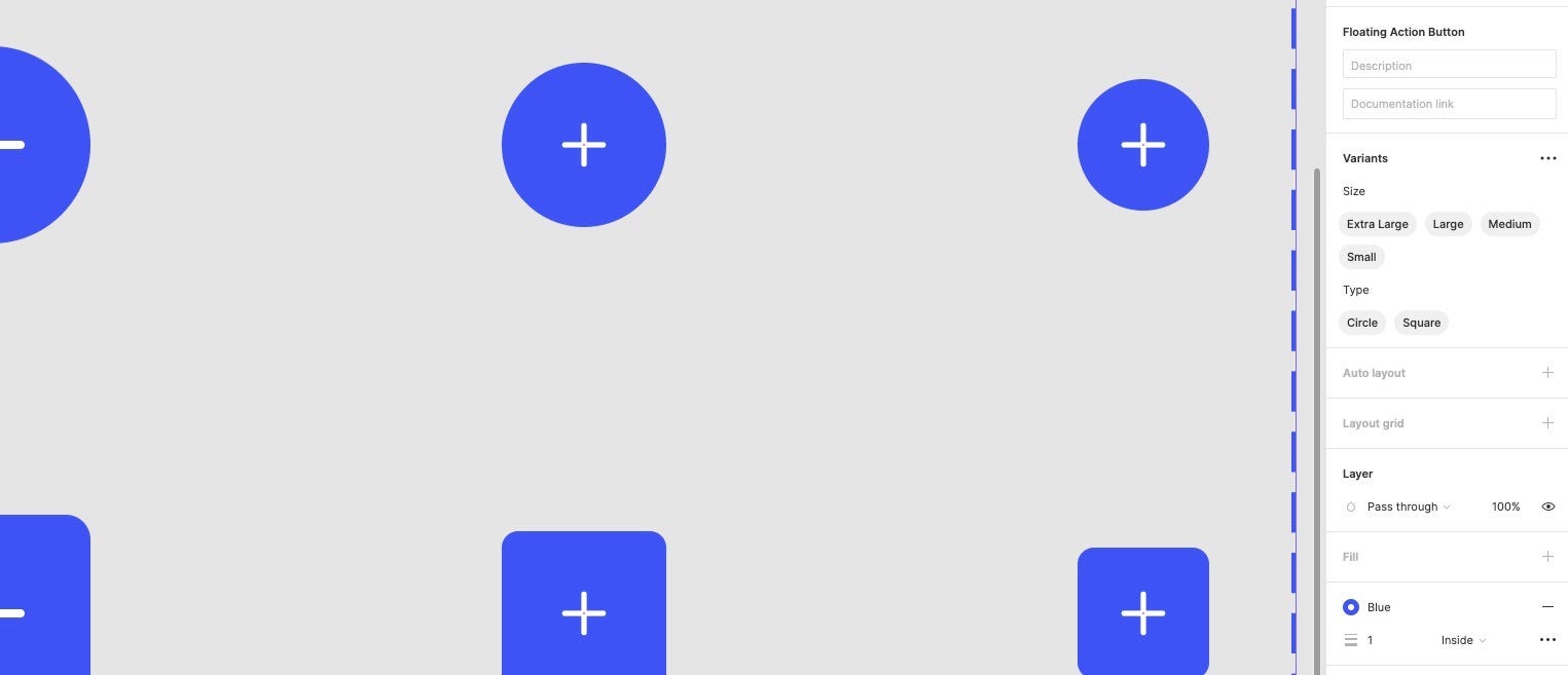
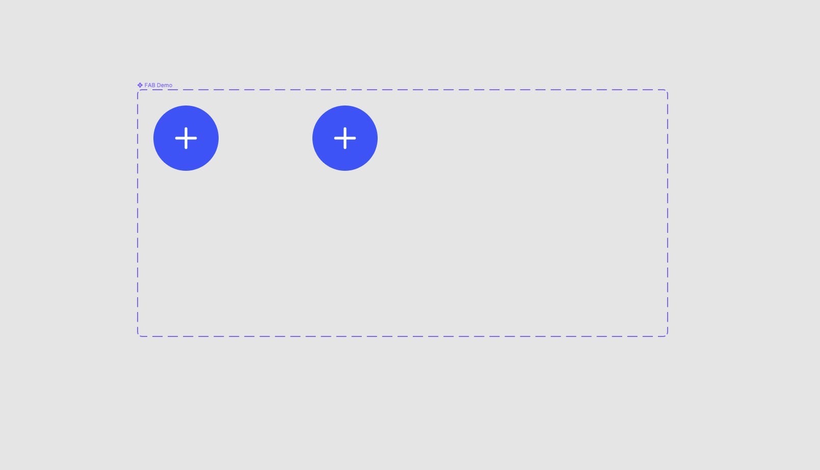
With the Main Component selected, click the Plus icon in the Variants panel of the Inspector to create a new Variant.
Ok. We’re off and ready!
Feel free to drag out the Size of the Variants container, change its colour, and generally move things around until you’re happy with the layout.
Now. With the new Variant selected, use the shortcut K to use the Scale tool and reduce the size of the new Variant down to 48 by 48.
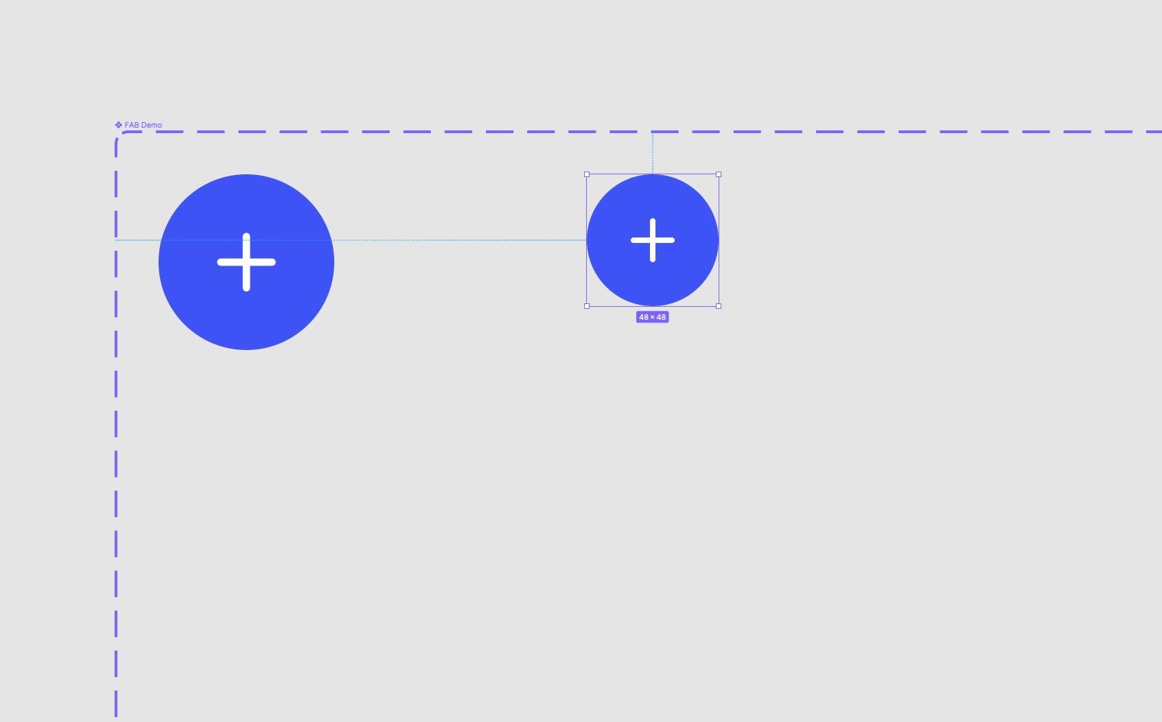
Once you’ve done that, press V to go back to the Move tool.
Get descriptive with your Variant names.
Ok. Let’s see where we’re up to.
Click on the Variants container and take a look at the Variants panel in the Inspector.
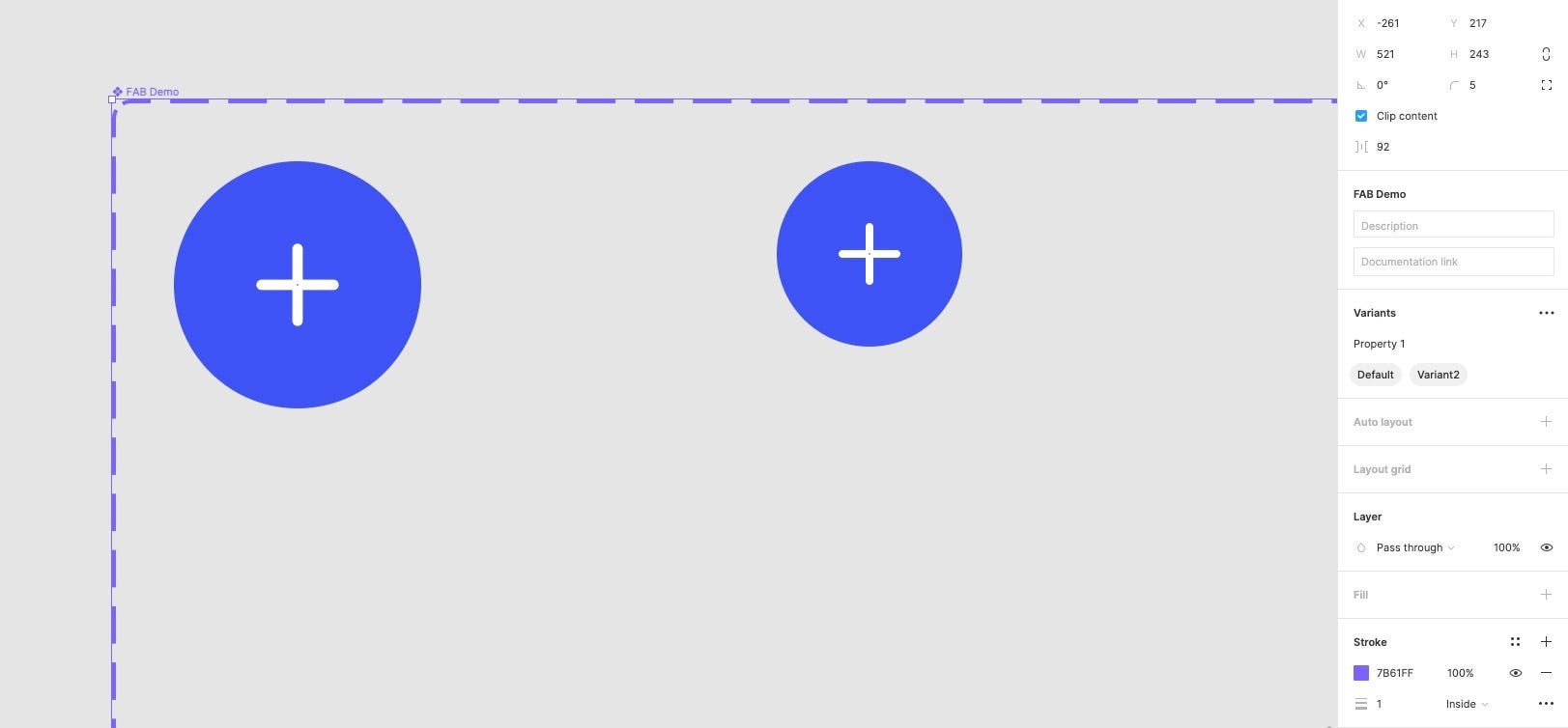
Property 1. Default. Variant2.
Wow. Inspiring.
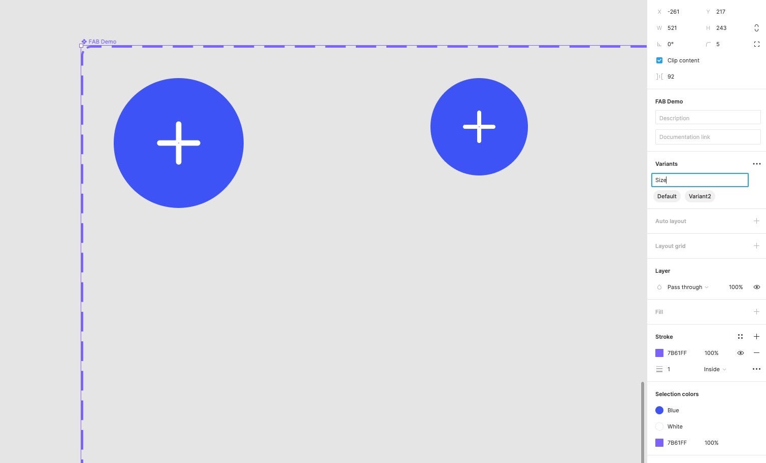
Let’s tweak things to get those property and variant names a little more descriptive shall we?
Now. Referencing the existing Floating Action Button Component, we know we need a Property called Size and one called Type.
Let’s start with the Size first.
Double click on the Property name and change it to Size.
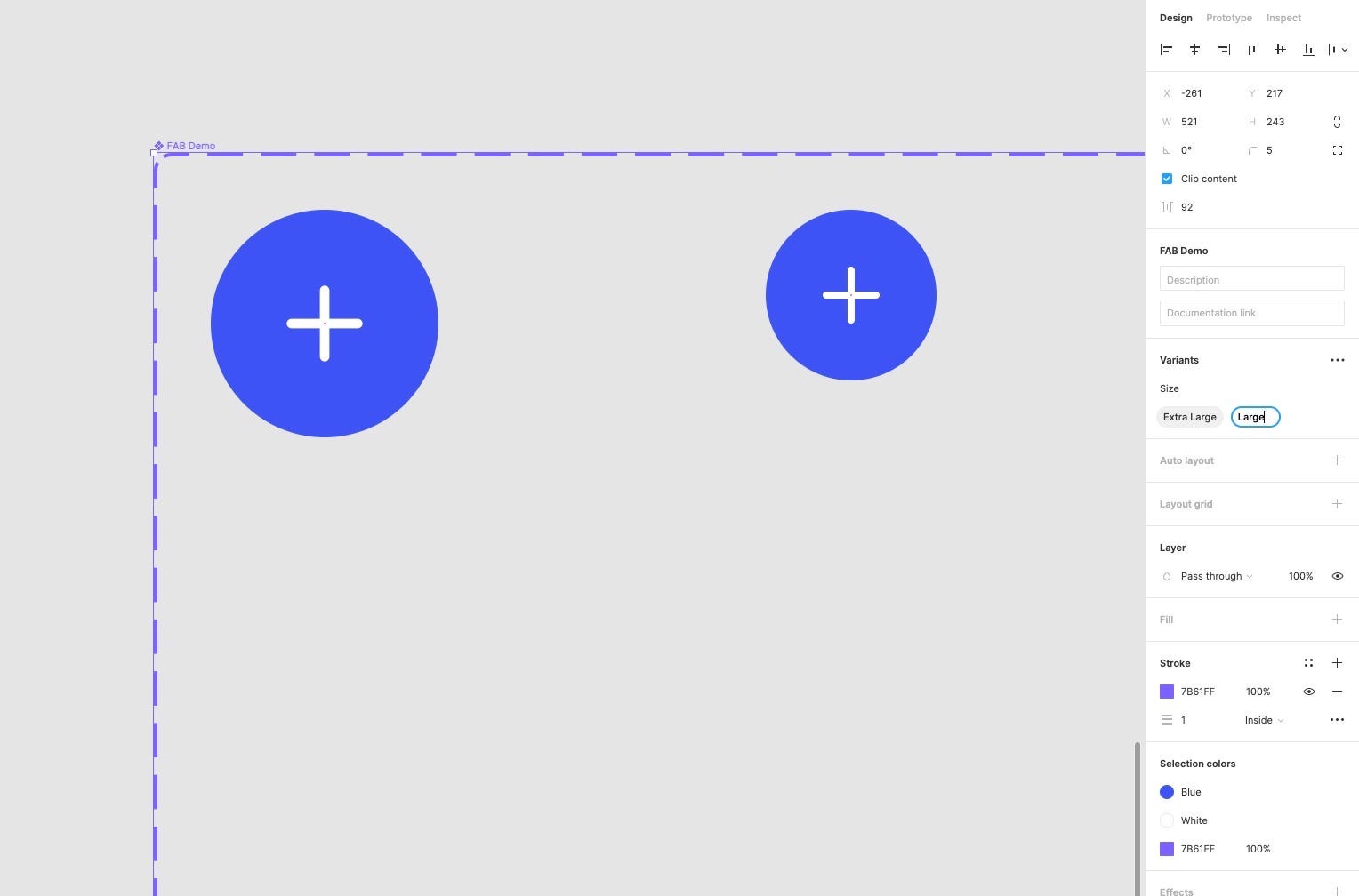
We also know that we need different sizes of buttons, so let’s edit the Variant names too.
Extra Large and Large would be a great place to start.
Now let’s create a Property called Type.
Click Add New Property and name it Type.
Then, to adjust the Variant name, double-click on the Chip and rename it to Circle.
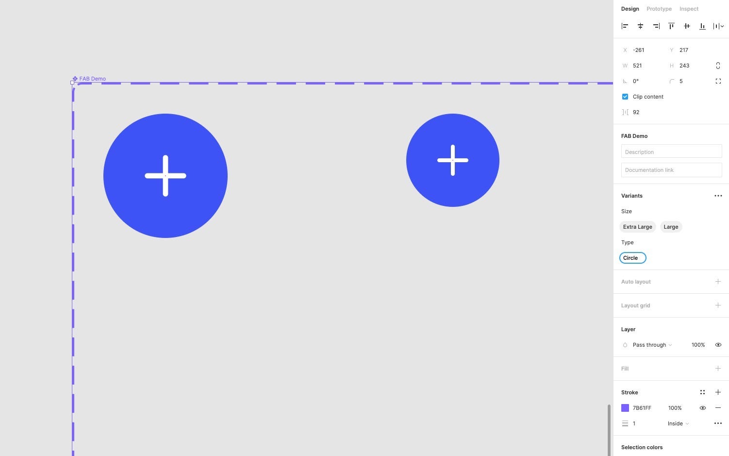
That’s looking a lot better.
Ok, let’s finish up the sizes for the circular shaped button.
With the Large Variant selected, click on the Add Variant icon at the bottom of the container.
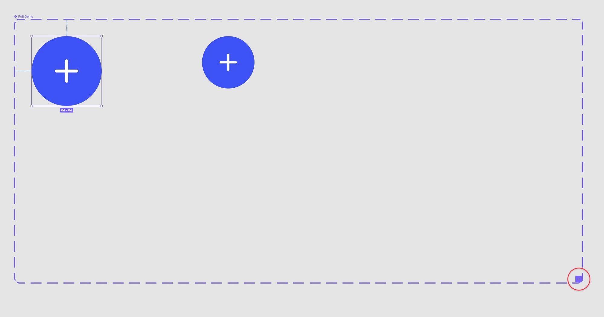
And then use K to Scale it down to 40 by 40.
Don’t forget to press V to switch back to the Move tool.
With this new Variant selected, jump on over to the Variants panel and rename its Size to Medium.
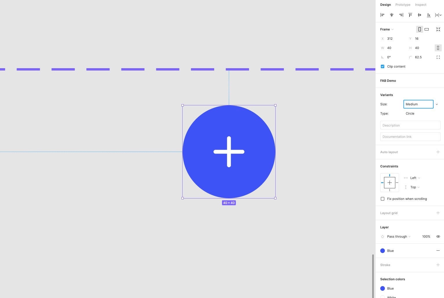
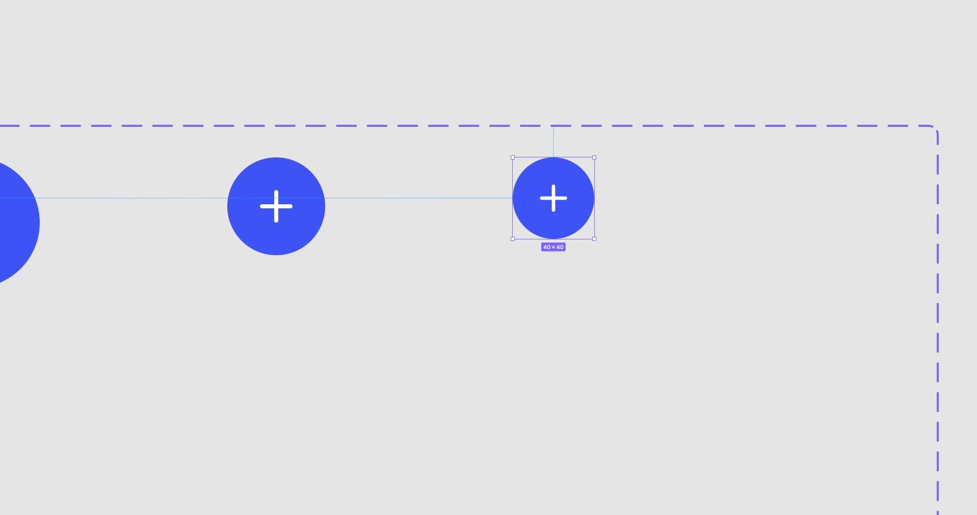
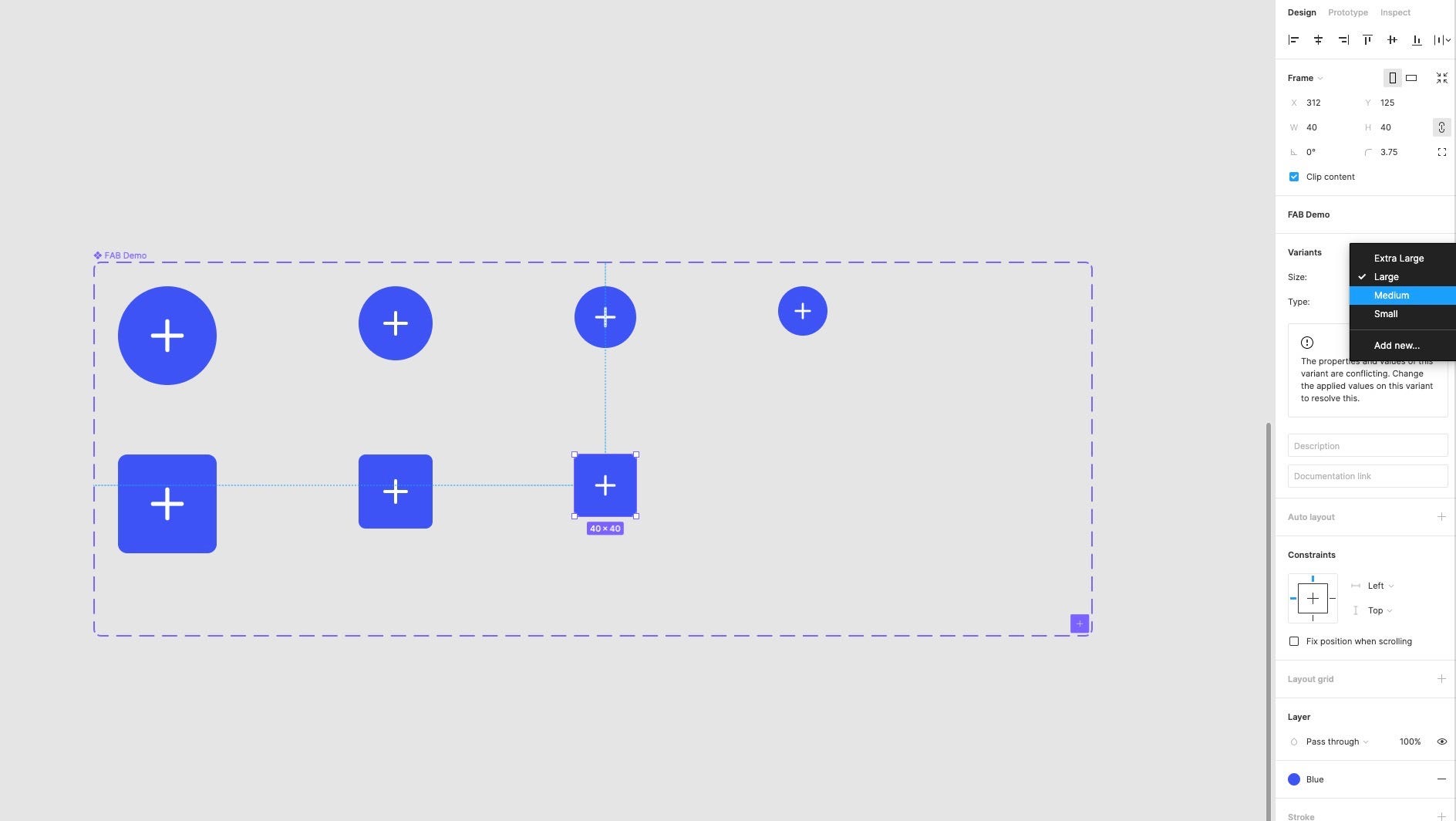
Ok. Let’s get the final size Variant into place.
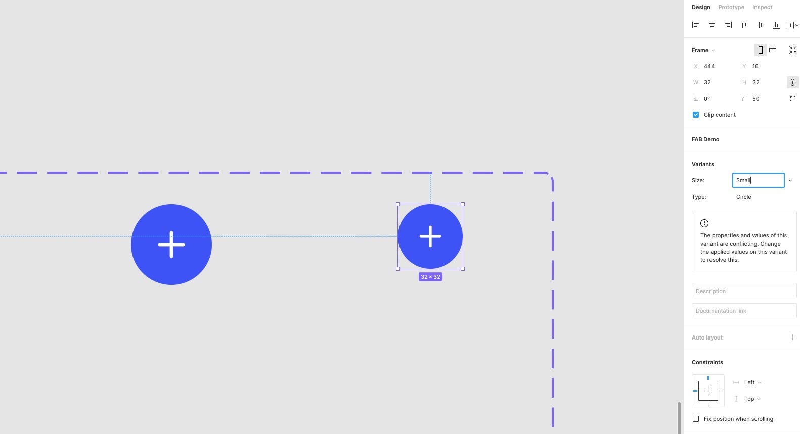
With the previous one selected, click the Add Variant icon, and using K resize it to 32 by 32 and adjust its Size name to Small.
Clicking on the Variants container, you can see that we have all our Circular button Size Variants in place.
Watch out for those Variant conflicts.
Let’s quickly move onto the Square button type Variants.
With the Extra Large button variant selected, click the Add Variant icon.
And. Oh. Figma, we have a problem.
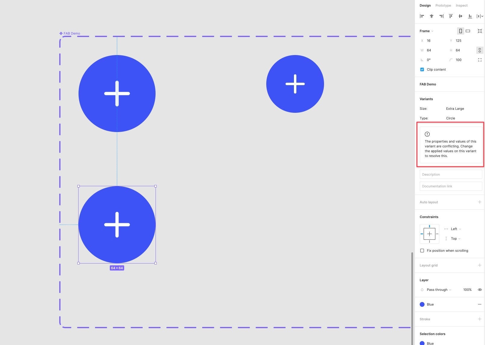
We have two Variants with matching values, which is not cool in the crazy world of Variants.
Let’s fix that real quick.
Well, quickly, with this new Variant added, reduce its Corner Radius to 6. Cool.
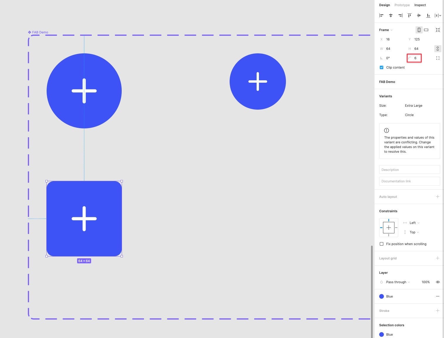
Ok. Let’s fix this Variant conflict.
From the Variants panel, select the Type property, and from the select menu, click Add New.
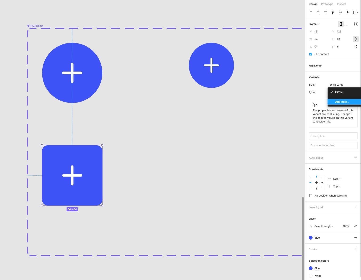
For the new value, simply enter Square.
There we go. A quick name change was all that was needed, and now everything is good in the world.
Just something to note. If at any time you see the following message pop up in the Variants panel, go through your existing Variants and check for any naming conflicts there.
Let’s start wrapping things up here.
Following similar steps to before, let’s create the remaining sizes for the Square shaped button, using the Add Variant option and the trusty Scale tool.
Just remember to select the correct Variant options in the Variants panel, as otherwise, you’ll see that pesky conflict message popping up.
Also, remember to switch back to the Move tool to add a new Variant each time; otherwise, that handy little Add icon won’t appear for some strange reason.
And there we go!
Now jump on over to the Assets panel, drag in your new Component and start tweaking away at those Variants from the Inspector panel.
Ok. So. Initially, setting up new Components with Variants can take some time, there’s no doubt about that, but once they’re in place, the power they wield is fantastic.
Go forth and create some more.
You’re now a Variants master.
Join me soon for the next part of this Figma 101 Series.
Oh, and if you want to really save yourself hundreds of design hours, my Design System for Figma; Cabana is now available. Special Offer: Please use the code CABANA35 to receive 35% OFF.
Originally published at marcandrew.me on October 12th, 2021.
Recommend
About Joyk
Aggregate valuable and interesting links.
Joyk means Joy of geeK