

iPadOS 15 mini-review: It’s all about the home screen
source link: https://arstechnica.com/gadgets/2021/10/ipados-15-mini-review-playing-catch-up-with-the-iphone/
Go to the source link to view the article. You can view the picture content, updated content and better typesetting reading experience. If the link is broken, please click the button below to view the snapshot at that time.

Operating systems —
iPadOS 15 mini-review: It’s all about the home screen
As an addendum to our iOS 15 review, we look at what's new on the iPad.
Samuel Axon - 10/7/2021, 10:33 PM
Last year, Apple released a meaty iOS update for iPhones, but some of the biggest changes didn't make it over to the iPad. This year, the iPhone update is modest—so does that mean that the iPad update is the big one this time around?
Well, that depends on your point of view. iPadOS 15 brings almost everything iOS 15 brought to iPhones, but it also brings those major iOS 14 omissions from last year to the tablet. As a result, iPadOS 15 feels like a significant update if you haven't been using an iPhone lately, but if you've already used iOS 14's new home screen and app library features, it instead ends up feeling like it's late to the party.We published a lengthy, iPhone-focused review of iOS 15 earlier this week. Consider this a short addendum to that review that puts the spotlight on the iPad. Refer to the earlier review for details on new features like Focus that aren't iPad specific or for a list of iPads that are supported by iPadOS 15.
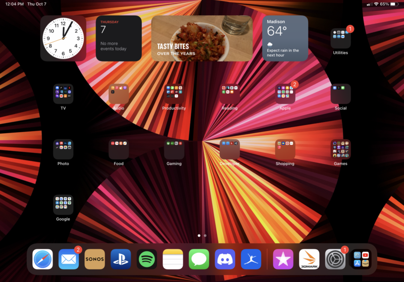
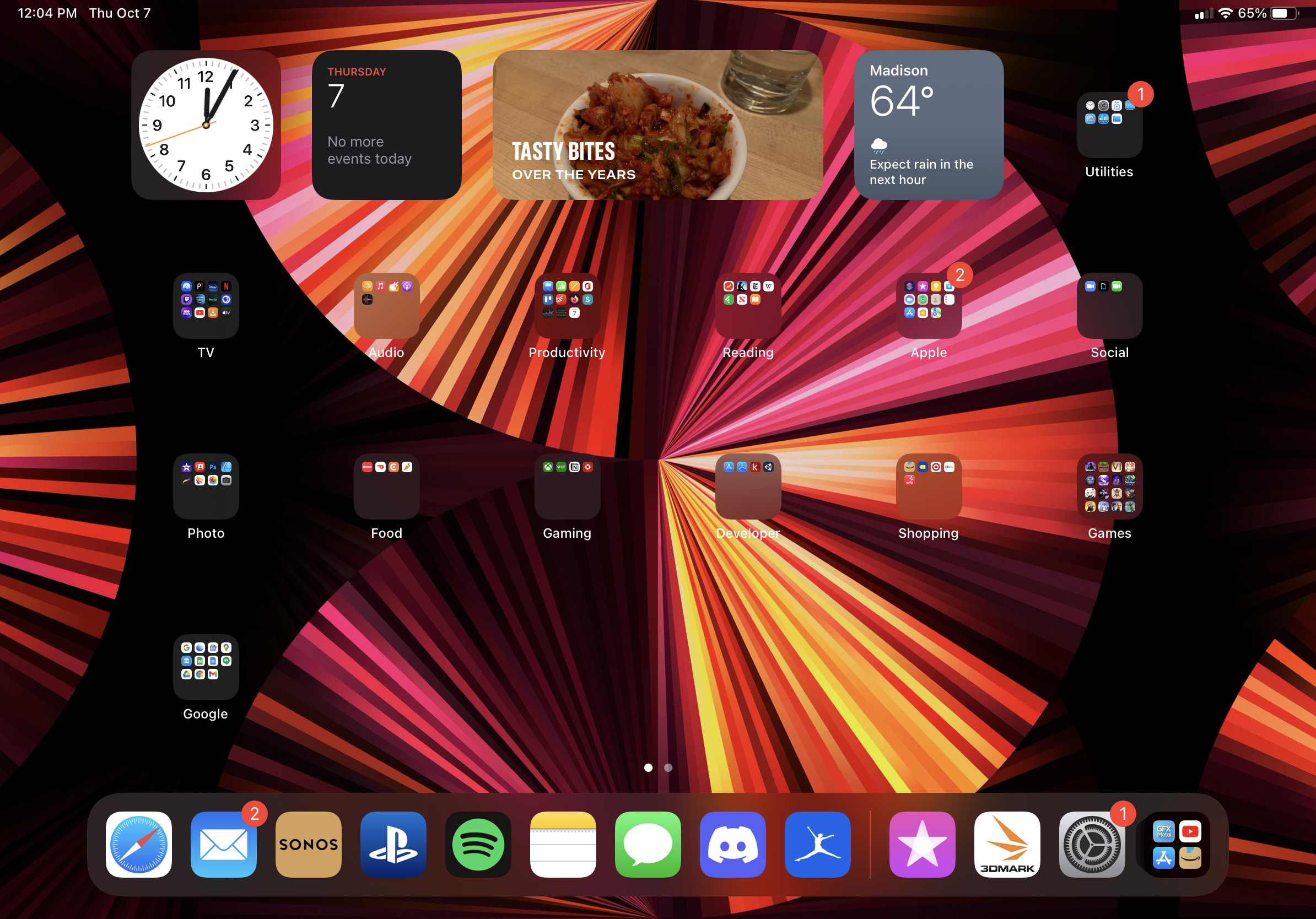
The home screen
Let's start with the home screen, which saw the biggest transformation this year, even though almost everything different about it was already available on iPhones when iOS 14 launched in late 2020.
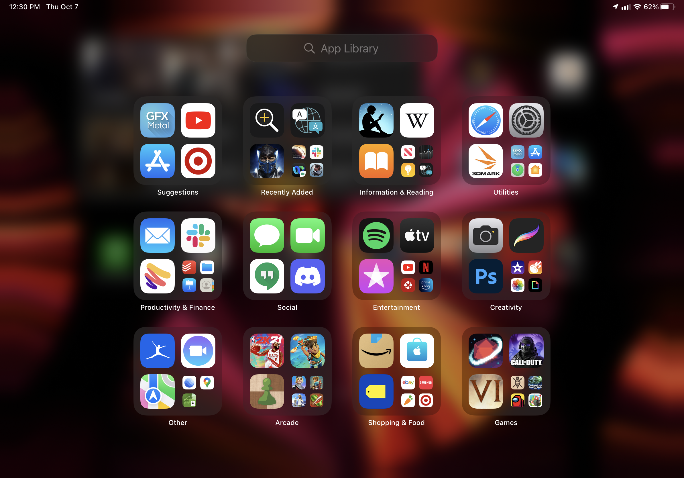
Arguably the most significant introduction to iPadOS 15 is the app library view, which iPhones got last year. Swiping all the way to the right on the home screen will take you here, where you'll find a search field and several folders that contain every app you have installed on your iPad. Unfortunately, as in iOS 14, you can't define these folders yourself; the software generates them automatically.
The real advantage here is that the home screen is no longer the only place you can store apps, which means you can remove apps from the home screen while still keeping them accessible both via Spotlight search and by visiting the app library screen.
AdvertisementSo if you have an app that you use once in a while but not daily—like one to check in on your investment portfolio, perhaps, or an ordering app for a specific restaurant—you can keep that app installed and use it whenever you want but keep your home screen clean and focused.
When you try to delete an app on the home screen, you'll be asked whether you want to fully delete the app or just relegate it to the app library.
Further, you can now hide or show home screen pages, which plays nicely with Focus mode (see the iOS 15 review for details about that; it works the same on the iPad) to give you more home screen customization than you've ever had before.
The iPad also gets something that the iPhone didn't: access to the app library from the dock, which is much more convenient than swiping to the last page on the home screen.
Widgets
The other major addition to the home screen is free-form widget support. The situation with widgets has been a bit strange; home-screen widgets debuted on iPadOS a couple of years past, but this more robust update hit the iPhone first about a year ago and is only just making its way to the iPad with iPadOS 15.
Whereas you could previously place widgets in a predefined place on the very first home-screen page, you can now place them anywhere on the home screen and in several different sizes, including variations for certain widgets that weren't available on the iPhone.
You can either place widgets side-by-side on the home screen alongside app icons, or you can place them in a stack that only occupies as much space as a single widget; you can swipe your finger on it to swap between widgets in that place. This is all just as we saw it on the iPhone when we reviewed iOS 14.
Advertisement
Unfortunately, arranging icons and widgets on the home screen still is a real pain. The "wobble mode" icon-and-widget placement approach and the home screen's cascading list format have got to go; their limitations have only become more apparent as more customization and features have been added.
Still, if you can suffer through the frustration of breaking your layout many times over as you try to get everything where you want it, the combination of widgets and the app library completely changes the way the home screen works on the iPad, if you want it to. (If you don't, you can just ignore it all and use the iPad's home screen just as you always have.)
Multitasking
When Apple announced iPadOS 15, it put multitasking front and center. The new stuff here is mostly comprises more intuitive ways to access features that existed before, but they're all welcome.
The new multitasking button
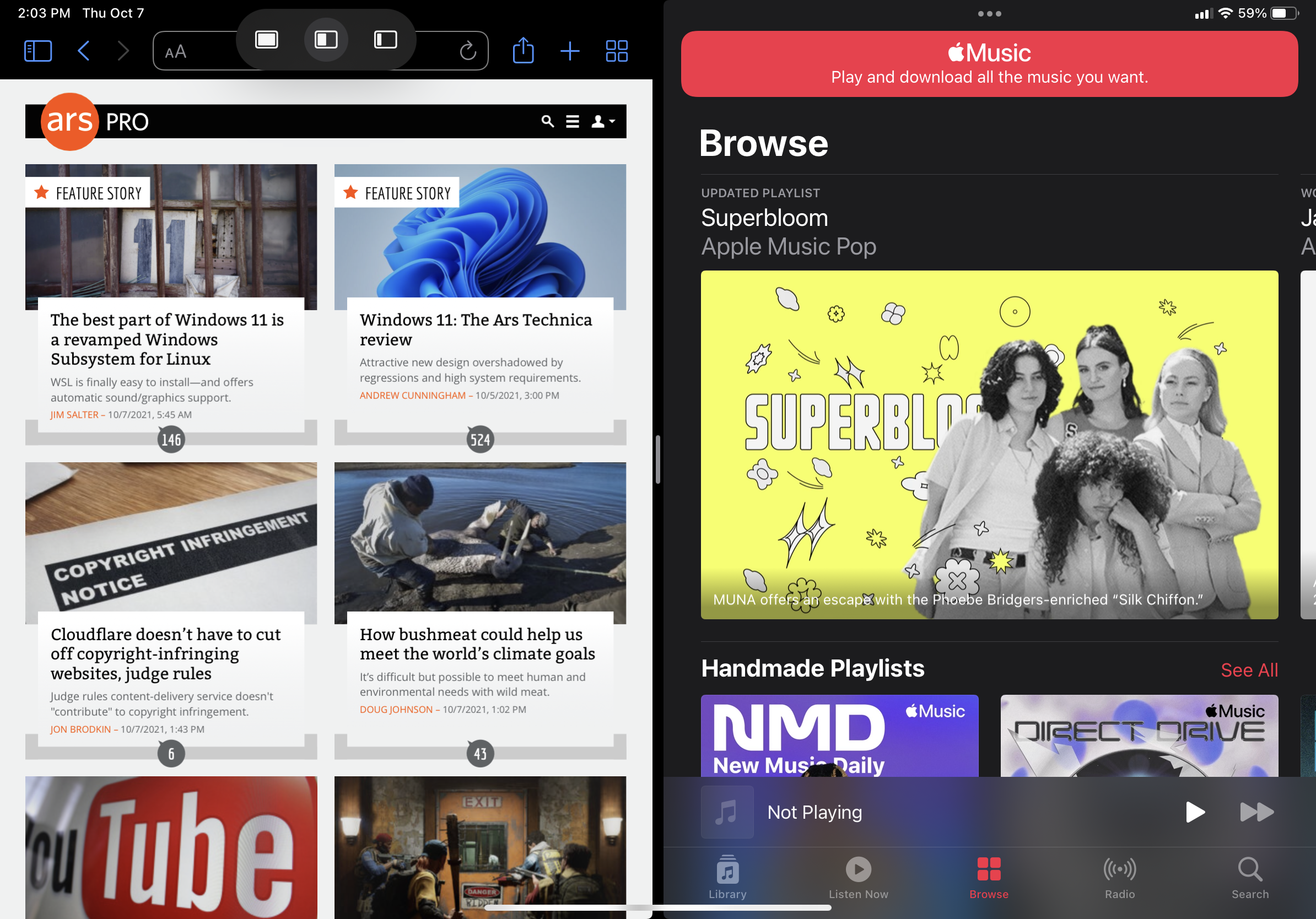
For example, application windows that are in full-screen or split-view mode now have a three-dot ellipsis button at the top. Tapping or clicking that produces a small panel that lets you select either full-screen, split view, or slide over.
Tapping full screen does just what you'd expect; it makes the app full-screen. Tapping split view makes the app occupy half of the screen, then deposits you on the home screen where you can select another app to take up the other half.
Previously, the way into split view was arduous. You would have one app in full screen, then you'd swipe up from the bottom of the screen to bring up the dock, and then you'd long-press an app in the dock and drag it to the side of the screen until it clicked into split view. Needless to say, this method was not the greatest. The new setup is better, and it has the benefit of being intuitive, which the old way wasn't. You'd probably never figure out the old way if you weren't shown.
Finally, tapping or clicking the slide-over button dumps the app into slide over, which puts it in an iPhone app shape and hovers it over your full screen or split-view apps. You can still swipe between slide-over apps, or move them off screen and back on again at will.
Page:
Recommend
About Joyk
Aggregate valuable and interesting links.
Joyk means Joy of geeK