

Bandai Namco is rebranding itself next year; fans don't care for the change | Te...
source link: https://www.techspot.com/news/91534-bandai-namco-rebranding-itself-next-year-fans-dont.html
Go to the source link to view the article. You can view the picture content, updated content and better typesetting reading experience. If the link is broken, please click the button below to view the snapshot at that time.

Bandai Namco is rebranding itself next year; fans don't care for the change
The new logo is supposed to represent a new company purpose
By Cal Jeffrey Today 1:18 PMIn context: Now and then, a company will change its branding. For instance, KFC (formerly Kentucky Fried Chicken) has changed its logo and branding six times since its founding in 1952. These redesigns fly under the radar most of the time, with people only noticing after the fact. That's not the case with a recent Bandai Namco announcement.
Bandai Namco is changing its logo starting next year, and fans aren't impressed. The new logo features a magenta "speech bubble" that looks more like a child's broken model train track at first glance. The company name appears linearly in the neon frame in a plain, rounded, black font. Alternate logos have the tagline: "Fun for All into the Future," one in the linear fashion and another with the company name stacked.
According to a Bandai Namco press release issued Friday, the new logo is supposed to reflect the company's "new purpose." Under the banner, "Fun for All into the Future," the company states its new vision.
"Bandai Namco exists to share dreams, fun and inspiration with people around the world. Connecting people and societies in the enjoyment of uniquely entertaining products and services, we're working to create a brighter future for everyone."
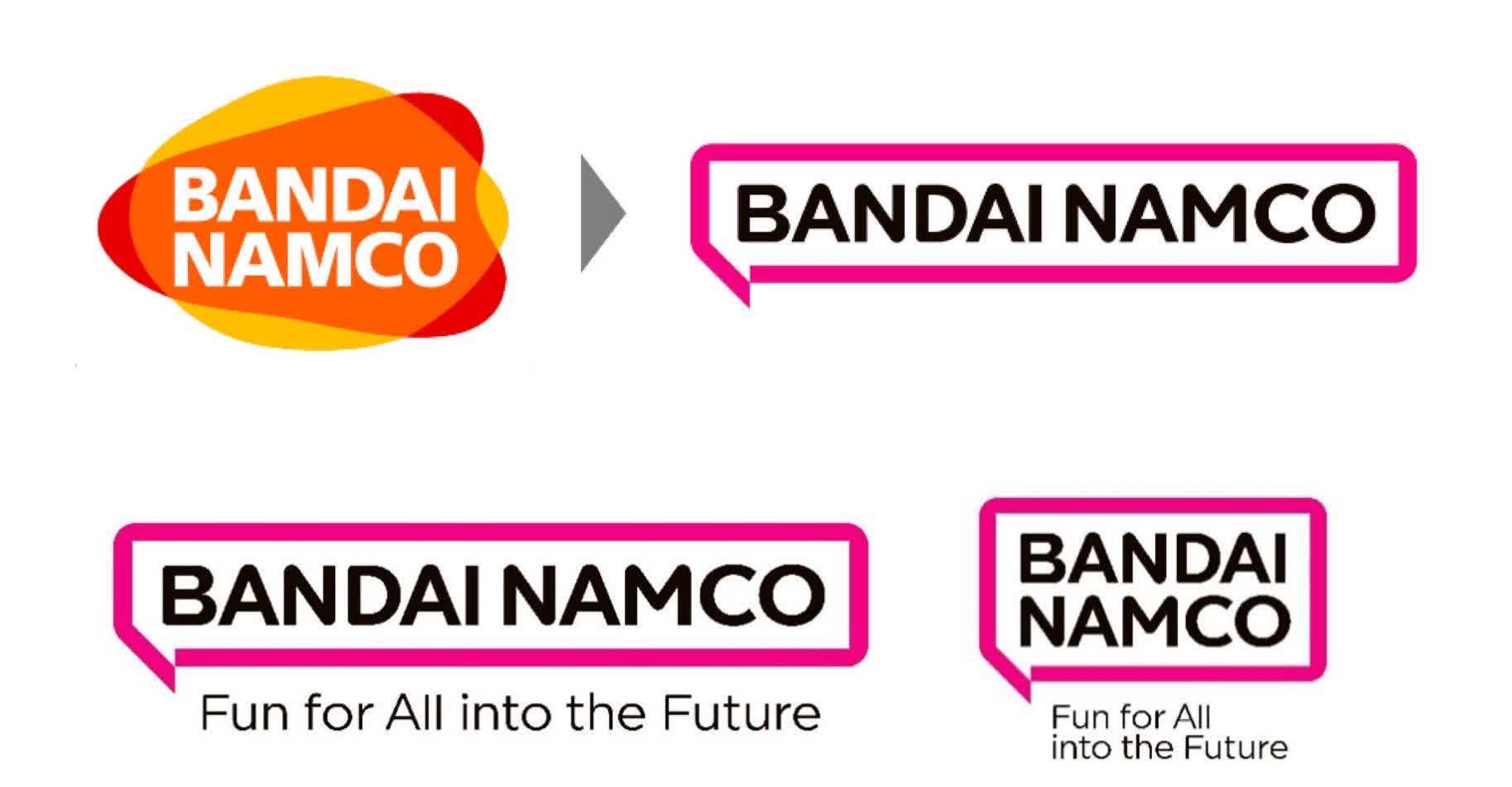
Its current, widely recognized logo was designed in 2005 when Bandai acquired Namco for $1.7 billion. The overlapping colors represented the merging of the two companies.
Bandai Namco says the new logo reflects its reimagined purpose more accurately. The "Fukidashi" (speech bubble) is symbolic of the brand's ability to "connect with people around the world." It also represented the manga culture. It says the magenta-colored motif represents diversity and fun.
Judging by the comments left on the Japanese bulletin board 2ch, fans aren't pleased with the change. Kotaku noted a selection, and most seemed confused or annoyed at the new logo.
"They really thought this was good?" posted one commenter.
"This for real? It's so sh**ty," said another.
Others were more pointed, saying things like, "No personality," "This is so dull," and "It's just letters."
Not all hated it. Some fans said they liked the simple look of the logo. Others were indifferent, "It's fine. I don't really care about logos."
Like it or hate it, Bandai Namco's rebranding begins in April of next year.
Recommend
About Joyk
Aggregate valuable and interesting links.
Joyk means Joy of geeK