

Hoefler&Co &Monotype.
source link: https://www.typography.com/blog/monotype-acquires-hoeflerco?ref=sidebar
Go to the source link to view the article. You can view the picture content, updated content and better typesetting reading experience. If the link is broken, please click the button below to view the snapshot at that time.
Typography for Warren
I’m pleased to announce that today, Hoefler&Co is joining the Monotype family.
It’s been thirty-two years, four months, and fourteen days since I hung out a shingle to announce that The Hoefler Type Foundry was open for business. What started as a sole proprietorship grew into the Hoefler&Co of today, a diversified design and technology practice with an international reach, still dedicated to the invention of original, thoughtful, and hard-working typefaces. Today, millions of designers use our typefaces in their work, and with the addition of Monotype’s experience, resources, and expertise, we look forward to the next million who will make our work a part of their own. And I’m especially pleased to share the news that Monotype plans to distribute our typefaces through its Monotype Fonts offering, making it even easier for creative teams to discover, explore, and deploy the fonts in our collection.
Nothing’s changing at typography.com, where you’ll still find all 1,113 fonts in the Hoefler&Co library, as well as the cloud.typography webfont service, and all the other resources we’ve created for designers and brands. The H&Co team is staying in place, too, and there are yet more typefaces from us that you can look forward to seeing soon. On deck right now are two projects unlike anything we’ve ever done before, yet each in its own way classic Hoefler&Co: one, a historical curio that finally answers a two-hundred-year-old typographic riddle, the other a colossal family of functional typefaces with a positively gonzo character set. I’m excited for these to see the light of day, and as always, I can’t wait to see what you’ll do with them.
In the meantime, I’ll be stepping down from my role in the company, to finally make the time to recharge, reflect, and explore some new ideas. In these past few years, participating in a documentary and using typography to help elect a president have been potent reminders of just how many ways there are for type to make a difference, and just how many people are moved by the splendor of typography.
I am inexpressibly grateful to the many people over these past three decades for whom my work has meant something, and to the talented individuals who have helped make this work possible. First among them is my wife Carleen, who almost twenty years ago took the extraordinary step of coming aboard to help lead a type foundry, and became the CEO who made sure that Hoefler&Co delivered on all of its early promise. To the designers who have trusted their work to my alphabets, the students who have taken the time to write, and the ever-growing community of people around the world who have shared my affection for the craft, I am so deeply thankful. I haven’t decided what the next step of my journey will look like, but I’ll be sharing things on my personal Twitter and Instagram as they develop. Whatever comes next, I know it will involve letters, and I hope it will once again involve you.
Jonathan Hoefler
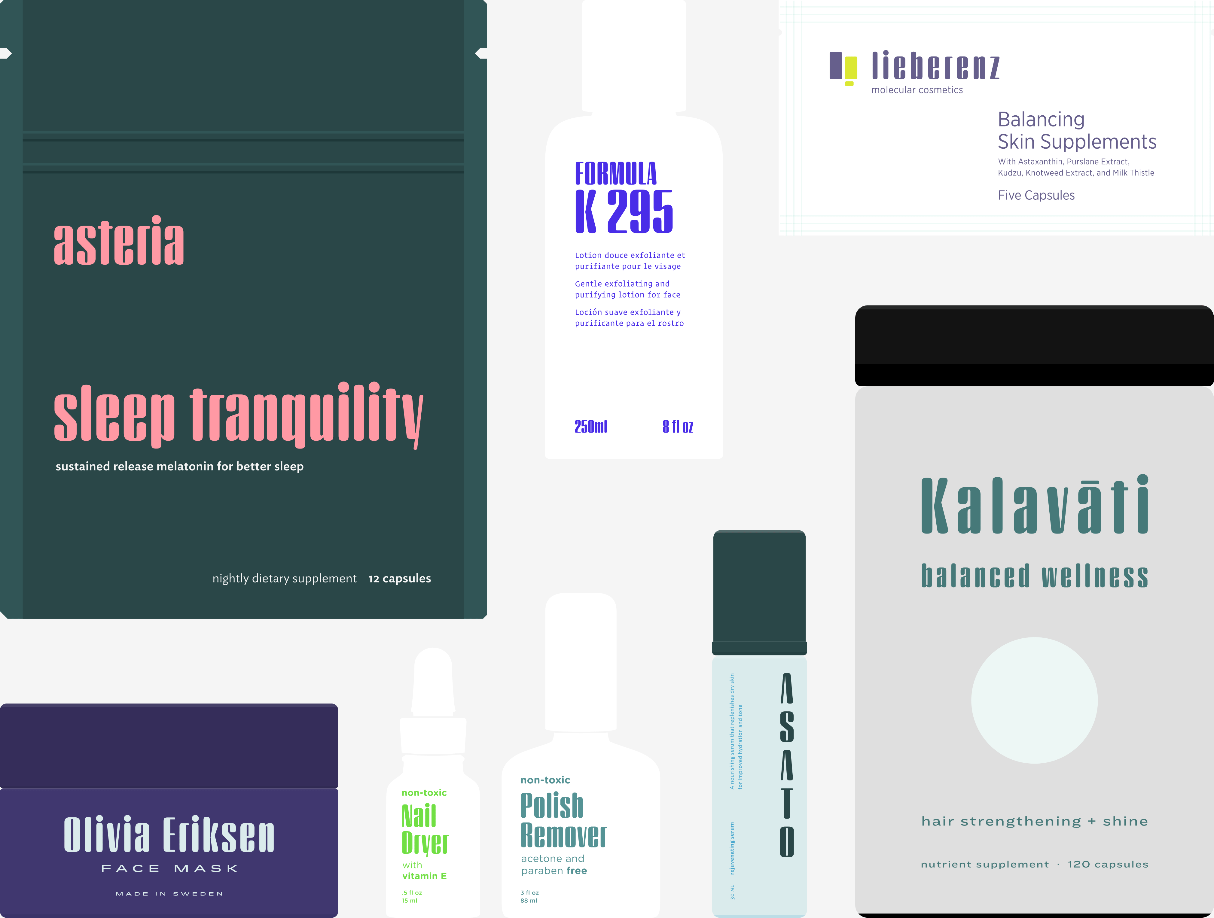
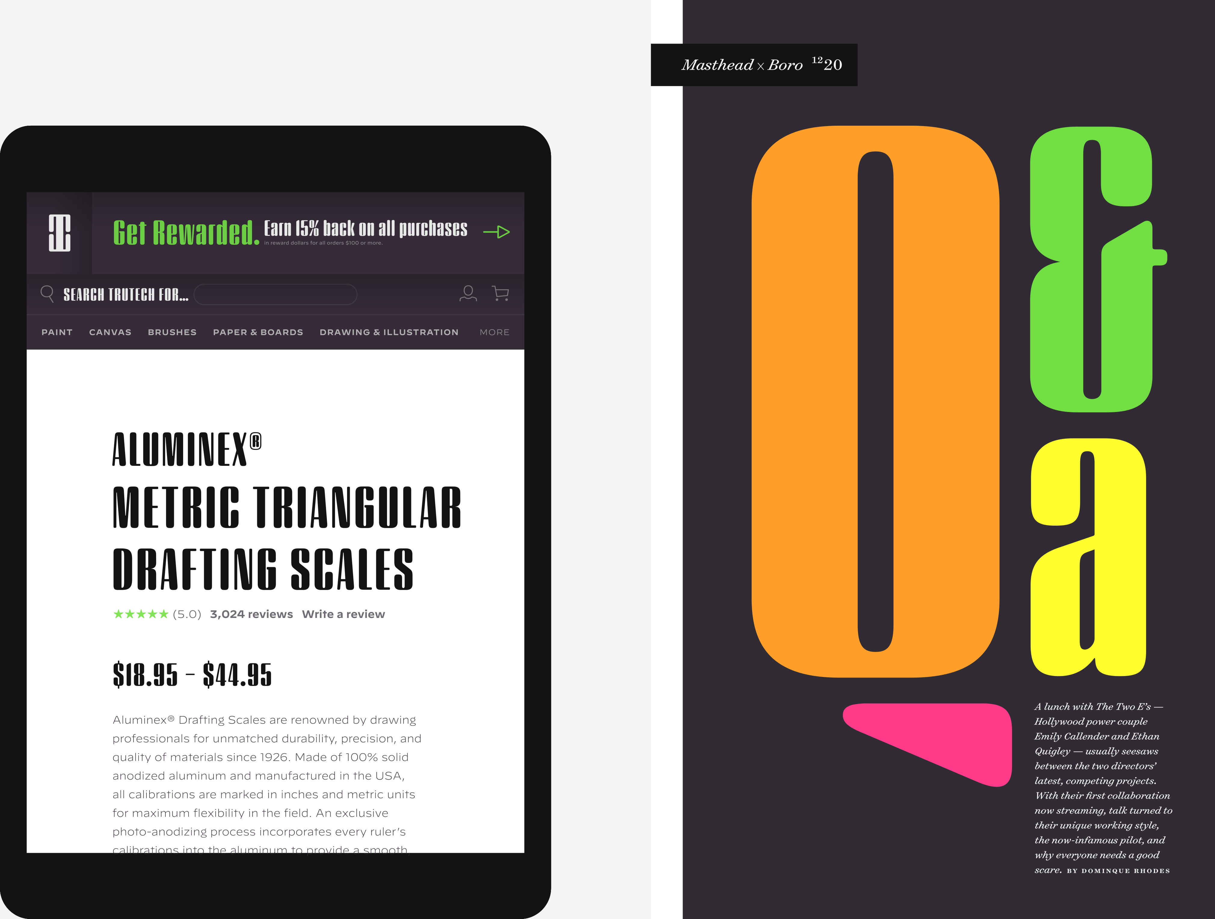
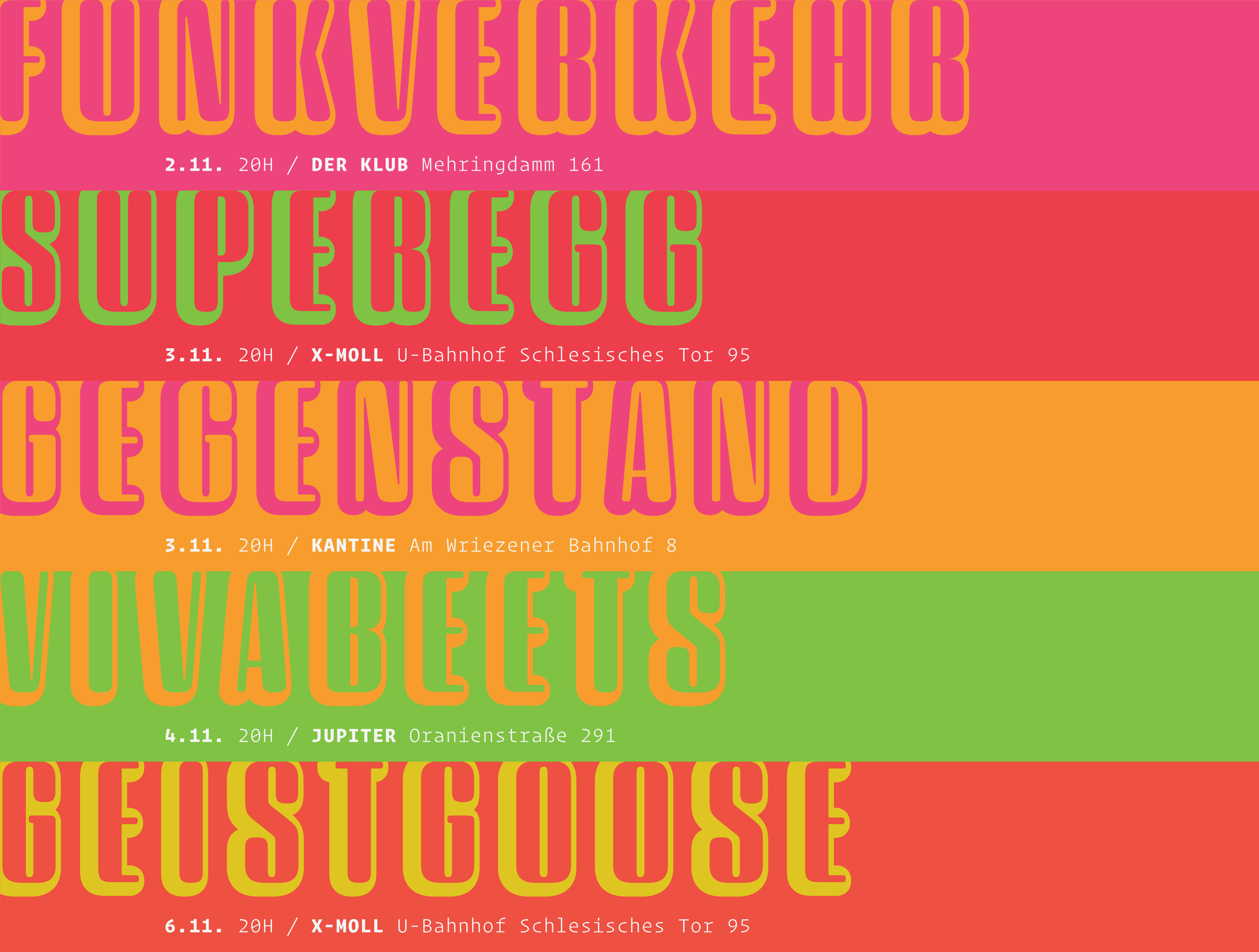
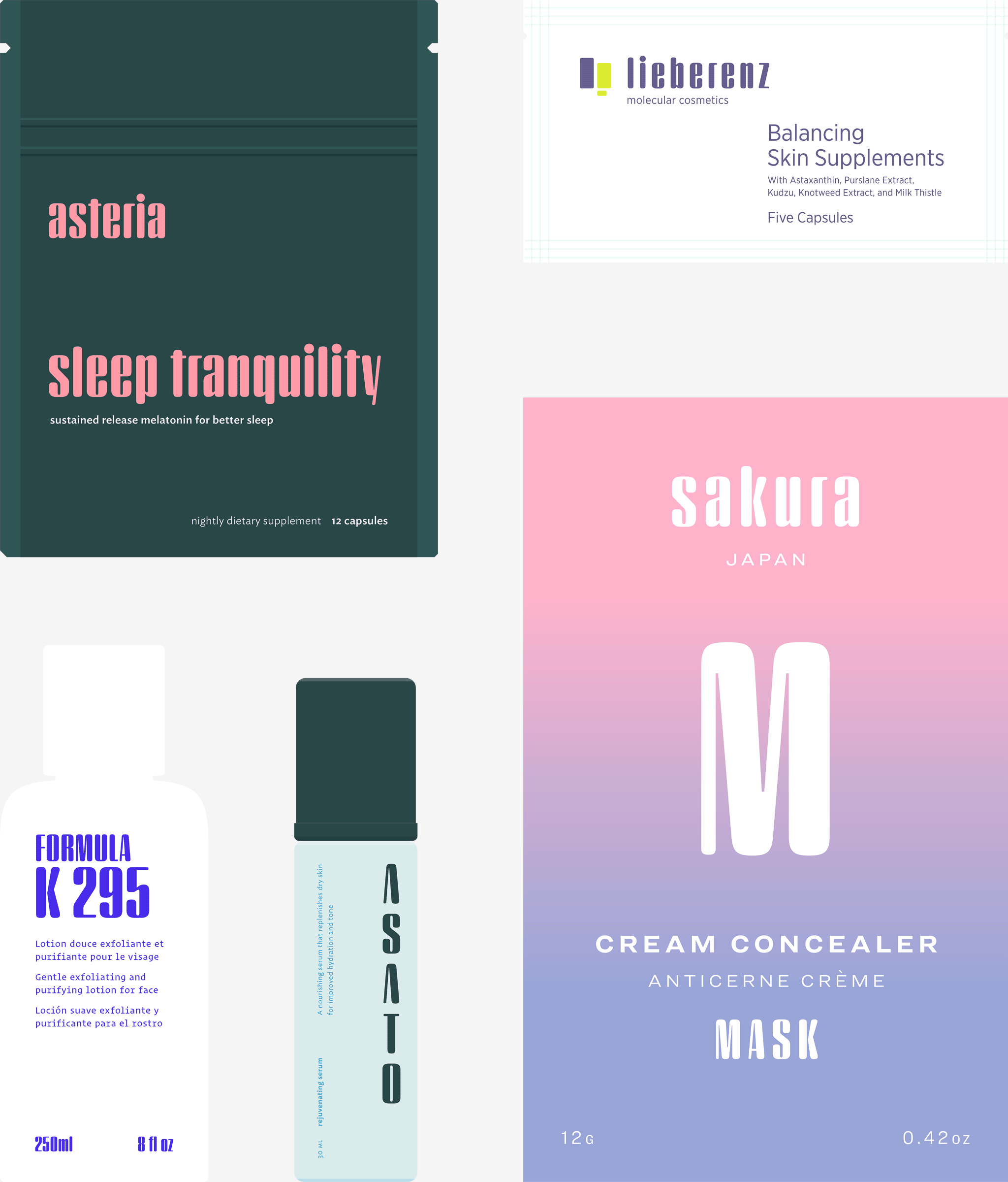
A typeface with lightly-worn futurism, Sagittarius is equally at home among the beauty and wellness aisles, or the coils of the warp core.
Typeface designers spend a lot of time chasing down strange valences. We try to figure out what’s producing that whiff of Art Deco, or that vaguely militaristic air, or what’s making a once solemn typeface suddenly feel tongue-in-cheek. If we can identify the source of these qualities, we can cultivate them, and change the direction of the design; more often, we just extinguish them without mercy. Sometimes, we get the chance to follow a third path, which is how we arrived at our newest typeface, Sagittarius.
During the development of Peristyle, our family of compact, high-contrast sans serifs, I often found myself unwittingly humming space-age pop songs. Nothing about Peristyle’s chic and elegant letterforms suggested the deadpan romp of “The Planet Plan” by United Future Organization, let alone “Music To Watch Space Girls By” from the ill-advised (but delicious) Leonard Nimoy Presents Mr. Spock’s Music from Outer Space, but there they were. Something in the fonts was provoking an afterimage of the otherworldly, as if the typeface was sliding in and out of a parallel universe of high-tech spycraft and low-tech brawls with rubber-masked aliens. It might have had something to do with a new eyeglass prescription. But I liked the effect, and started thinking about creating an alternate, space-age version of the typeface, one with a little more funk, and a lot more fun.
I wondered if softer edges, a measured dose of seventies retrofuturism, and some proper draftsmanship might produce a typeface not only suitable for sci-fi potboilers, but for more serious projects, too: why not a line of skin care products, a fitness system, a high-end digital camera, or a music festival? I put a pin in the idea, wondering if there’d ever be a project that called for equal parts sobriety and fantasy. And almost immediately, exactly such a project appeared.
The Historical Dictionary of Science Fiction
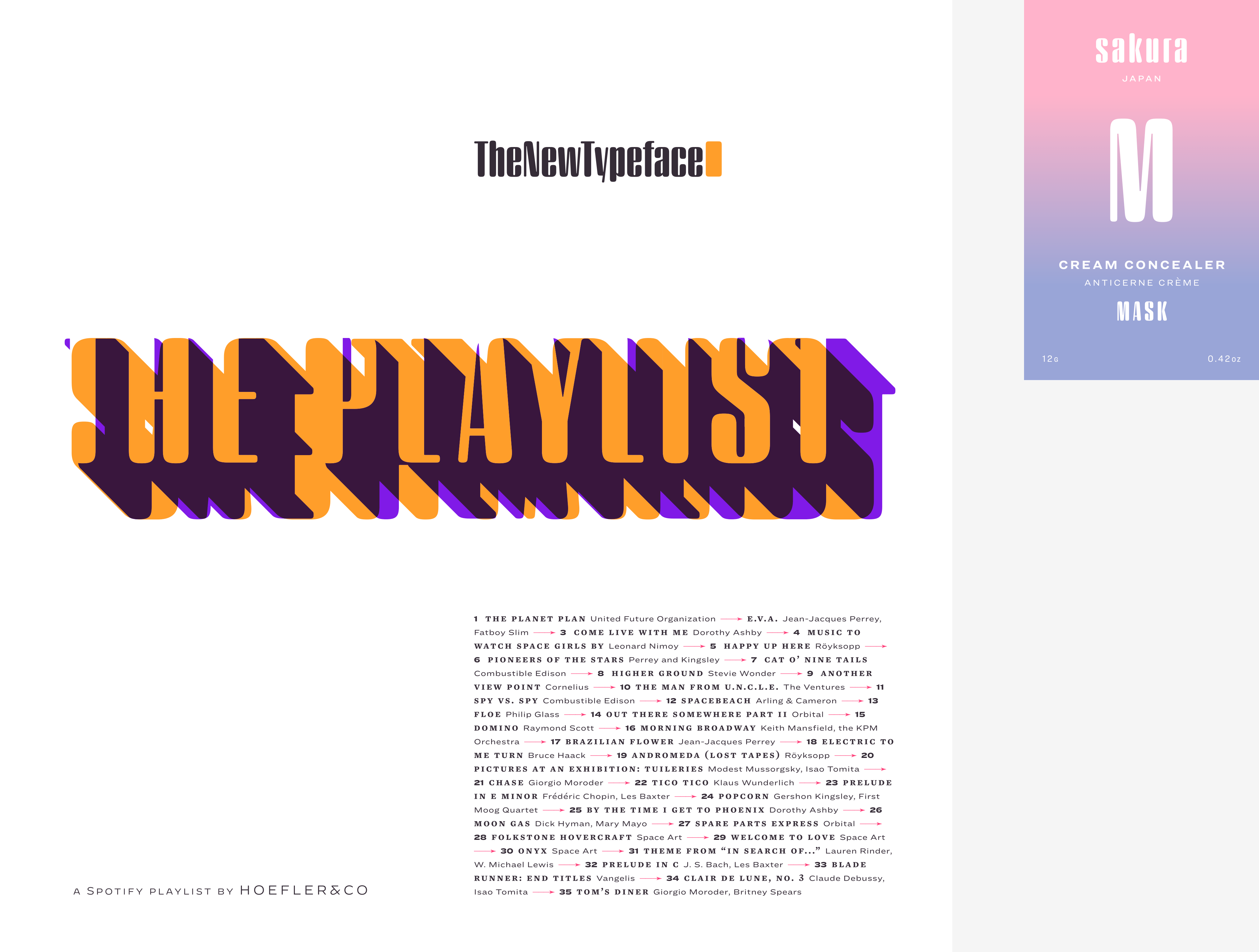
Jesse Sheidlower is a lexicographer, a former Editor at Large for the Oxford English Dictionary, and a longtime friend. He’s someone who takes equal pleasure in the words ‘usufructuary’ and ‘megaboss,’ and therefore a welcome collaborator for the typeface designer whose love of the Flemish baroque is matched by a fondness for alphabets made of logs. Jesse was preparing to launch The Historical Dictionary of Science Fiction, a comprehensive online resource dedicated to the terminology of the genre, whose combination of scholarship and joy was a perfect fit for the typeface I imagined. For linguists, there’d be well-researched citations to explain how the hitherto uninvented ‘force field’ and ‘warp speed’ came to enter the lexicon. For science fiction fans, there’d be definitive (and sometimes surprising) histories of the argot of Stars both Trek and Wars. And for everyone, there’d be the pleasure of discovering science fiction’s less enduring contributions, from ‘saucerman’ to ‘braintape,’ each ripe for a comeback. A moderated, crowdsourced project, the dictionary is now online and growing every day. You’ll find it dressed in three font families from H&Co: Whitney ScreenSmart for its text, Decimal for its navigational icons, and Sagittarius for its headlines — with some of the font’s more fantastical alternate characters turned on.


The New Typeface
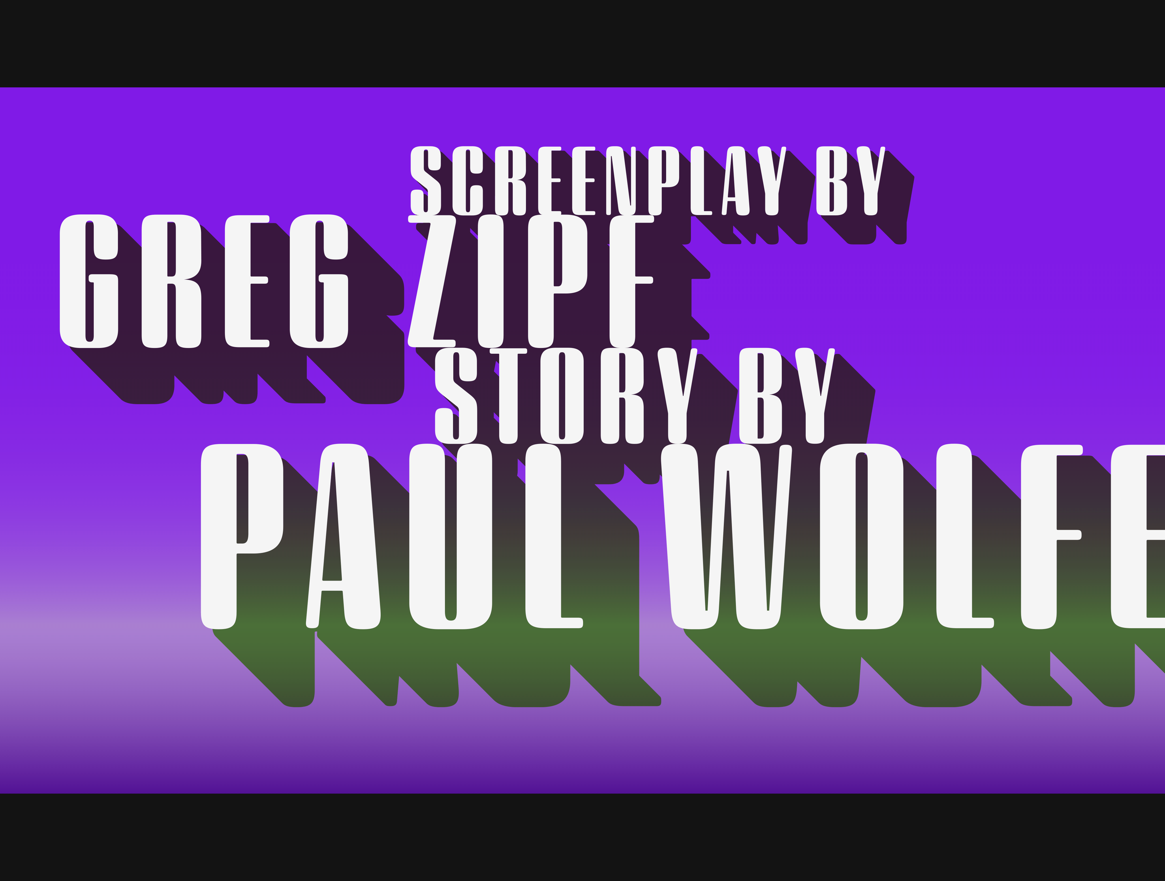
Sagittarius is a typeface whose rounded corners and streamlined forms give it a romantically scientific voice. In the interest of versatility, its letterforms make only oblique references to specific technologies, helping the typeface remain open to interpretation. But for projects that need the full-throated voice of science fiction, a few sets of digital accessories are included, which designers can introduce at their own discretion. There are alternate letters with futuristic pedigrees, from the barless A popularized by Danne & Blackburn’s 1975 ‘worm’ logo for NASA, to a disconnected K recalling the 1968 RCA logo by Lippincott & Margulies. A collection of digitally-inspired symbols are included for decorative use, from the evocative MICR symbols of electronic banking, to the obligatory barcodes that forever haunt human–machine interactions. More widely applicable are the font’s arrows and manicules, and the automatic substitutions that resolve thirty-four awkward combinations of letters with streamlined ligatures.
Sagittarius takes its name from the constellation in the zodiac, and home to some of astronomy’s most inspiring discoveries. In 1977, a powerful radio signal originating in the Sagittarius constellation was considered by many to be the most compelling recorded evidence of extraterrestrial life. Thanks to an astronomer’s enthusiastically penned comment, the 72-second transmission became known as the Wow! signal, and it galvanized support for one of science’s most affecting projects, the Search for Extraterrestrial Intelligence (seti). More recently, Sagittarius has been identified as the location of a staggering celestial discovery: a supermassive black hole, some 44 million kilometers in diameter, in the Galactic Center of the Milky Way. —JH
Sagittarius by H&Co. Exclusively at typography.com.
- 4 Feb 21
And the second best news is getting to see the logo I created for the ticket, a collaboration with Senior Creative Advisor to the campaign Robyn Kanner, which evolves the earlier mark by Aimee Brodbeck at Mekanism. What a wonderful and uplifting announcement this piece of typography gets to accompany: that the formidable Senator Kamala Harris will join the presumptive Democratic presidential nominee in a bid for the White House.
I can’t remember an election in which so much attention (and speculation) has surrounded the choice of a running mate, nor having such a large field of eminently qualified candidates to choose from. A consequential decision at an unpredictable time, conducted under absolute secrecy, poses an interesting dilemma to the typographer: how do you create a logo without knowing for certain what the words will say? Logos, after all, are meaningfully informed by the shapes of their letters, and a logo designed for an eisenhower will hardly work for a taft. The solution, naturally, involves the absurd application of brute force: you just design all the logos you can think of, based on whatever public information you can gather. Every credible suggestion spotted in an op-ed was added to the list that we designers maintained, and not once did the campaign even hint at a preference for one name over another.
While the press debated the merits of the candidates’ backgrounds, my discussions concerned the shapes of their names. Short names versus long ones; names that began with awkwardly-shaped letters; names with ornery kerning pairs. Names whose letters aligned strangely with biden, disqualifying entire categories of visual arrangement; names that run long, thanks to a W or M, or short because of an I, or all three at once. ‘Heterogrammatical’ names, which contain no repeating letters; names that are schnapps-words. One peculiar feature of political design is that each logo is beholden to the others, which allows the campaign to safely prepare an identity that anticipates last-minute developments. Another is how it affects the usual pattern of advocacy and critique: recommending a logo that works for only a specific handful of candidates, there’s no way of truly knowing what calculus will inform the feedback, because you never know if you’re working with placebos. By necessity, good political design is a rigorous, single-blind study.
As both a designer (second) and a citizen (first), I am immensely pleased with the news, and enormously proud to have worked with Robyn and her team to create the typography that befits these two extraordinary public servants. —JH
Joe Biden for President: Official Campaign Website
- 12 Aug 20
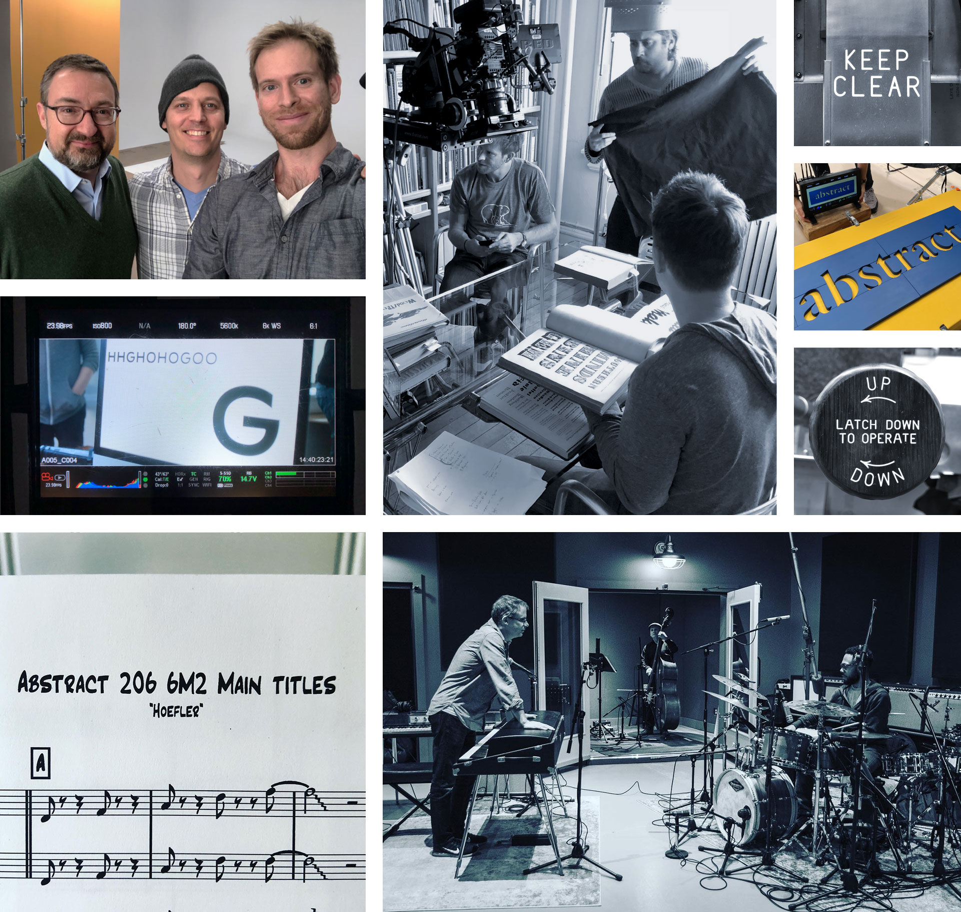
The episode of Abstract about typeface designer Jonathan Hoefler is nominated for a 2020 Primetime Emmy Award
I’m thrilled to discover that my episode of the Netflix original documentary series Abstract: The Art of Design has been nominated for a 2020 Primetime Emmy Award for Outstanding Main Title Design. If ever there was a meaningful category for a typographer, this is it!
Designers know that typography plays a critical role in filmmaking, never more so than in a series like Abstract, and most especially in an episode devoted to typeface design. This is a documentary in which the visible typography of the city is overlaid with typographic annotations, seamlessly segueing into an opening credit sequence that’s used not merely to introduce the story, but to begin telling it. I’m overjoyed that this splendid piece of filmmaking has been singled out for recognition.
While I had the privilege of contributing the most atomic raw materials to the main titles, the nomination honors a sequence that’s the work of the Abstract team, beginning with Executive Producers Scott Dadich, Morgan Neville, and Dave O’Connor, Director Brian Oakes, Motion Graphics Producer Paula Chowles, Creative Director Allie Fisher, Motion Graphics Designer Anthony Zazzi, and Composers Timo Elliston and Brian Jones, to whom I am extraordinarily grateful. I’m equally honored to be in such fine company for the nomination, which this episode of Abstract shares with Carnival Row, Godfather of Harlem, The Morning Show, The Politician, Watchmen, and Westworld.
The 72nd Primetime Emmy Awards will be broadcast on September 20. (In an irresistible coincidence, the visual identity for the event uses our Decimal typeface, whose creation is the subject of this episode of Abstract.) If you haven’t seen it, I hope you’ll spend some time with the series: it’s still streaming on Netflix in 190 countries, and available in thirty languages. —JH
- 3 Aug 20
Typefaces from the Episode:
A designers’ favorite gets a major upgrade, gaining small caps, tabular figures, an easier way to typeset fractions, and a pair of fonts containing 250 ornaments.
I’m delighted to introduce today’s expansion of our Sentinel family. Everything from ‘Fonts by Hoefler&Co’ to the headline above is set in Sentinel, making it one of the typefaces on which I depend the most — a distinction I share with the thousands of designers who’ve made Sentinel a part of their work. Today’s new Sentinel Pro includes a number of new features, including one that’s occasioned by our recent working-from-home, and another that’s been on the drawing board for nearly thirty years, a new personal record for the slow simmer.
What’s New
The new Sentinel Pro adds small caps, tabular figures, fractions, numerics, and more. We’ve updated the fonts with the newest members of the character set — the rupee and ruble symbols, the capital and small cap eszett, the numero — and designed two sets of printers’ fists (or ‘manicules’) that Netflix viewers will know I can’t resist. All of these additions have been created in both the multipurpose Sentinel Pro and the web-optimized Sentinel ScreenSmart Pro, an adaptation of the family that’s specially engineered for text sizes in the browser; you can see Sentinel ScreenSmart at work in the font’s Design Notes section.
Only in 2020…
This season, while everyone at H&Co has been working from home, we’ve all been spending a little extra time with domestic projects. The hours we’ve logged with cookbooks, online recipes, woodworking plans, and patterns for sewing facemasks has reminded us just how many fractions there are in the world — and just how inconvenient they are to typeset. We’ve all seen instructions that backslide into the occasional ‘1/2’ where ‘½’ was intended, as well as countless improvisations for connecting whole numbers to their fractional parts. (The manuscript that reads ‘8-1/2’ often produces ‘8-½’ instead of the desired ‘8½,’ a slippery typo that’s hard to detect, and harder still to fix using a wholesale find-and-change.) In speaking with cookbook designers, we’ve come up with a new approach for typesetting fractions that we think might make them easier to wrangle, and we’ve baked this new mechanism directly into the new Sentinel Pro fonts. You’ll find more about how this works in the ‘Smart Fractions’ section of Sentinel’s How to Use page, along with a few more automated features to help make fine typography that much more attainable in a production workflow.
Sentinel Ornaments
In the early nineties, I fell in love with a set of nineteenth century decorative printers’ dashes that were reproduced in a journal article. I went about faithfully digitizing them, as an exercise in understanding what made them tick, but quickly discovered just how unforgiving digital outlines can be when it comes to capturing the charming idiosyncrasies of metal type. Reducing some shapes to their underlying geometries made them sterile, but recording their every inconsistency made them awkward. Some shapes were so disfigured by the effects of printing that it was difficult to guess what the original typefounder had even intended. These ornaments have been my rainy day project for the better part of thirty years, and their solution only recently came into focus. I took the opportunity to prune the original set, and come up with nearly two hundred additional shapes in a sympathetic style. Their new form shares many of Sentinel’s motifs, so I’ve welcomed them into the family: these new fonts, Sentinel Ornaments Bright and Dark, are available as a package, and also included in Sentinel Pro. They’re exactly what I’d hoped for: not merely a means to reproduce some handsome historical artifact, but a robust and well-appointed toolkit for creating new and more relevant kinds of typographic decoration.
My thanks to the team at H&Co who contributed to this project, especially Colin Ford who took on the challenge of constructing and painstakingly testing Sentinel’s new fraction feature, and Sara Soskolne who joined me on my mad odyssey into ornaments and manicules. Whether you’re a designer who relies on Sentinel already, or are taking an interest in the fonts for the first time, I hope the new Sentinel Pro will find a welcome home in your own font library. —JH
The new Sentinel Pro, exclusively at H&Co.
- 15 Jul 20
Two H&Co typefaces, and a new typographic system designed for the campaign.
On Independence Day, Vice President Joe Biden’s presidential campaign began rolling out a new visual identity built on two typefaces by Hoefler&Co: the sans serif Decimal, and the seriffed Mercury Text. We could not be more proud to see our work support a campaign of nuanced thinking and decisive action, in the critical election before us.
When I was approached by Robyn Kanner, Senior Creative Advisor to Biden For President, she shared with me one of the campaign’s most interesting communications challenges: its reliance on sophisticated and irreducible messages, which would need the clarifying effects of typography. Kanner described this in musical terms, talking about the ways in which rhythms and harmonic resolutions can shape the contours of a long lyric. For me, this resonated with the typography of America’s revolutionary period, and its vogue for capitalizing significant words: “Life, Liberty and the pursuit of Happiness,” as these unalienable rights are famously styled in The Declaration of Independence.
Working together, we came up with some guidelines for the campaign’s typography, which would help articulate thoughtful messages with attentive typography. Words of action would be set in Decimal’s declarative small capitals, while the supporting syntax would rely on Mercury Text Grade Four. Both fonts are considered and unobvious choices for a national campaign: less than a year old, Decimal is a contemporary typeface, but one that’s rooted in the same traditions as our most enduring designs, while the time-tested Mercury is a stalwart but adventurous text face designed to take on any challenge. Both choices feel especially apt.
The words above come from the Vice President Biden’s address on the Fourth of July, a surprisingly candid assessment of the unfinished American project. We at Hoefler&Co are honored that our work is helping give form to these ideas, and serving a campaign of optimism, determination, and ideas. —JH

Type designers love a good pangram. Pangrams, of course, are sentences that contain each letter of the alphabet at least once, of which the quick brown fox jumps over the lazy dog is surely the most famous. Lettering artists of the previous generation bequeathed us jackdaws love my big sphinx of quartz; puzzlers are fond of the impossibly compact Mr Jock, TV quiz PhD, bags few lynx for its 26-letter world record. Sometime in the early nineties, I whiled away an entire afternoon in a San Francisco café coming up with a bunch of my own, honoring typeface designers (mix Zapf with Veljović and get quirky Béziers), and philosophers (you go tell that vapid existentialist quack Freddy Nietzsche that he can just bite me, twice), and the uplifting grace of a cosmos in balance (Wham! Volcano erupts fiery liquid death onto ex-jazzbo Kenny G.) Pangrams are unctuous little brain ticklers, challenging to concoct, droll to read, and immensely popular for presenting fonts.
I find them singularly useless in type design, and I don’t use them in my work.
Attractive Options for Unruly Letters:
An inline adaptation of a distinctive slab serif, Cesium is an unusually responsive display face that maintains its high energy across a range of different moods.
I always felt that our Vitesse typeface, an unusual species of slab serif, would take well to an inline. Vitesse is based not on the circle or the ellipse, but on a less familiar shape that has no common name, a variation on the ‘stadium’ that has two opposing flat edges, and two gently rounded sides. In place of sharp corners, Vitesse uses a continuously flowing stroke to manage the transition between upright and diagonal lines, most apparent on letters like M and N. A year of making this gesture with my wrist, both when drawing letterforms and miming their intentions during design critiques, left me thinking about a reduced version of the typeface, in which letters would be defined not by inside and outside contours, but by a single, fluid raceway. Like most straightforward ideas, this one proved challenging to execute, but its puzzles were immensely satisfying to solve.
Adding an inline to a typeface is the quickest way to reveal its secrets. All the furtive adjustments in weight and size that a type designer makes — relieving congestion by thinning the center arm of a bold E, or lightening the intersecting strokes of a W — are instantly exposed with the addition of a centerline. Adapting an existing alphabet to accommodate this inline called for renovating every single character (down to the capital I, the period, and even the space), in some cases making small adjustments to reallocate weight, at other times redesigning whole parts of the character set. The longer we worked on the typeface, the more we discovered opportunities to turn these constraints into advantages, solving stubbornly complex characters like € and § by redefining how an inline should behave, and using these new patterns to reshape the rest of the alphabet.
The outcome is our new typeface, Cesium®. It shares many of Vitesse’s qualities, its heartbeat an energetic thrum of motorsports and industry, and it will doubtless be welcome in both hardware stores and Hollywood. But we’ve been surprised by Cesium’s more reflective moods, its ability to be alert and softspoken at the same time. Much in the way that vibrant colors can animate a typeface, we’ve found that Cesium’s sensitivity to spacing most effectively changes its voice. Tighter leading and tracking turns up the heat, heightening Cesium’s sporty, high-tech associations, but with the addition of letterspacing it achieves an almost literary repose. This range of voices recommends Cesium not only to logos, book covers, and title sequences, but to projects that regularly must adjust their volume, such as identities, packaging, and editorial design. (Read more about how to use Cesium.)
As for its name: Cesium is a chemical element, one of only five metals that’s liquid at room temperature. Resembling quicksilver, cesium is typically stored in a glass ampule, where the tension between a sturdy outer vessel and its volatile contents is scintillating. The Cesium typeface hopes to capture this quality, its bright and insistent inline restrained by a strong and sinuous container.
Cesium is one of only three H&Co typefaces whose name comes from the periodic table, a distinction it shares with Mercury and Tungsten. At a time when I considered a more sci-fi name for the typeface, I learned that these three elements have an unusual connection: they’re used together in the propulsion system of nasa’s Deep Space 1, the first interplanetary spacecraft powered by an ion drive. I found the association compelling, and adopted the name at once, with the hope that designers might employ the typeface in the same spirit of discovery, optimism, and invention. —JH
Cesium by H&Co. Exclusively at typography.com.
- 29 Apr 20
Five typography-adjacent books for indoor times.
by Jonathan Hoefler
I suspect I’m not alone in my current appetite for reading: right now I’m craving things that are written with clarity, wit, honesty, and heart, and I very much need to hear from good-natured people of extraordinary ability who love what they do. Below are some of the books I’ve most enjoyed reading of late, three connected only tangentially with typography because their subjects are words, and two that are more expressly about design. All five share a sincerity, an attention to detail, and a sense of humor that has kept me smiling for weeks. I hope you’ll enjoy them as much as I have.
Senator Elizabeth Warren withdrew from the presidential race today, having run a campaign of candor and intelligence that strengthened the debate, and having shared a wealth of original ideas that can only strengthen the nation.
We had the pleasure of working with Blue State Digital on the Warren campaign: they selected our Ringside and Verlag typefaces for the identity, and commissioned H&Co’s Jonathan Hoefler and Sara Soskolne to refine the logo that they designed, one created to bridge and serve these two distinct typefaces.
We’re grateful to have again worked with Matt Ipcar and his team at Blue State Digital, with whom we collaborated on the Obama-Biden 2012 logo, and to have been afforded the chance to contribute to a campaign of ideas from an extraordinary thinker and leader. Senator Warren, thank you for raising the level of public discourse, for your continuing public service, and for your unwavering vision of a country that serves all the people. —JH
- 5 Mar 20
Jonathan Hoefler offers suggestions to designers struggling with letterforms, and shares these observations with everyone following @HoeflerCo.
From time to time, I’ve been invited to offer advice to designers wrestling with thorny letterforms, and have shared my observations on Twitter. Sometimes these are conversations with first time type designers, other times they’re with accomplished lettering artists who just need a second set of eyes. I love these exchanges (no surprise, this is my day job at Hoefler&Co), so I thought I’d make this a regular feature, open to anyone who’s interested in type.
NEW — Alex York’s stalwart alphabet uses different techniques to maximize the space. I offer a few more, with some thoughts about when to let character widths take a back seat to spacing.
Above, excerpts of some of the conversations we’ve been having. I’m delighted by the range of projects people have been sending my way, and the opportunities they’ve provided to discuss all the factors that influence a typeface: not only local details (like ‘how to draw an S’), but philosophical topics as well. Swipe through and you’ll find links to each of these critiques.
If you’re a designer who could use a sounding board, send me a direct message and I’ll do my best to get in touch. I’m especially happy to hear from students, from anyone in under-represented communities, and from designers who don’t have anyone to bounce ideas off of — not just people working independently, but anyone who’s the lone type fanatic in their world. We’ve all been there! —JH
- 24 Feb 20
Type Capsules are $99 font collections from H&Co, each including five font styles chosen for both compatibility and versatility. And since each comes with $125 in discounts toward larger font families, they’re a practical way to build your own font library.
Type capsules are a new and simple way to get started with fine typography. For students, they’re an affordable way to start using professional fonts; for practicing designers, they’re a new pathway toward building a library of fonts that will last a lifetime. And for non-designers, they’re an informed place to begin, offering not only suggestions about which fonts to start with, but ideas about how to get the most out of them.
Today we’re introducing three type capsules, each created for a different kind of communications: a Foundation capsule as a basic typographic toolbox, a Digital capsule for designer-developers, and a Literary capsule for publishing. I chose each of these fonts personally, by working in reverse: starting by designing the kinds of things that could most benefit from better typography, and selecting those fonts that best fit the bill — fine-tuning each selection along the way, to ensure that every type capsule stands alone as a complete, effective, and flexible tool for design. —JH

No. 1: Foundation
The Foundation type capsule is a versatile toolbox for communications: a serif and a sans serif, plus an accent face to mark out guideposts that create points of entry.
Two of the families I find myself reaching for the most are the slab-serif Sentinel and the sans serif Ideal Sans. Both are used throughout this website, whose recent redesign was a useful lesson in economy: with an eye toward bandwidth, we wanted to rely on as few fonts as possible, while creating templates that were varied and engaging. I’ve found this same thriftiness useful in other kinds of design work as well, and have discovered just how useful these particular fonts are in projects as wide-ranging as catalogs, product literature, and printed correspondence.
A few carefully chosen fonts can go a long way. All of these examples, which range from marketing materials to correspondence, were designed using nothing more than the five font styles in the $99 Foundation type capsule.
Designer Brian Hennings and I put together examples of nineteen different projects built from the five styles in the Foundation capsule. Some show how the choice between fonts can change the voice in which text is read, others demonstrate ways in which these particular fonts can come together, to create unexpectedly sophisticated and multi-layered formats. As its name suggests, we think the Foundation type capsule is a great place to begin building a typographic library — or a great place to land, if you’re shaping all the communications for a small organization.
The $99 Foundation type capsule includes $125 in credits toward the purchase of its larger families: save $25 off Idlewild, $50 off Sentinel, and $50 off Ideal Sans.
The Foundation Type Capsule, $99 from H&Co.
No. 2: Digital
A collection for designer-developers, the Digital type capsule features not only typefaces for creating finished products, but also the Operator Mono font for use in your favorite IDE.
Developers have been overwhelmingly enthusiastic about the Operator Mono family that we created for programming. But not everyone needs all of the styles in its extended family, so we selected our two favorite fonts for the terminal — the screen-optimized Operator Mono ScreenSmart Book and Book Italic — as the core of our Digital type capsule, the second in the series.
The Digital type capsule includes the ScreenSmart edition of Operator Mono, a typeface designed and engineered for coding.
Working with Operator not only in the terminal, but while designing websites, apps, tutorials, and documentation (not to mention what might be my favorite template for personal correspondence), I felt the need for another sans serif to use in counterpoint. The natural choice was Decimal, our latest release, which itself was shaped by the input of web developers, who’d encouraged me to create the set of UI icons included in the fonts. We’ve paired these with a compact style of Gotham Extra Narrow that I’ve always found useful for headlines in sizes both large and small.
The $99 Digital type capsule includes $125 in credits toward the purchase of its larger families: save $25 off Gotham, $50 off Operator, and $50 off Decimal.
The Digital Type Capsule, $99 from H&Co.
No. 3: Literary
The Literary type capsule is designed with publishing in mind, its hard-working serif and sans serif crowned by a striking and articulate headline face.
Where the Foundation capsule can handily render a catalog or a newsletter, I thought that designers tasked with more traditional publishing projects could benefit from a capsule of their own. For designers of books, magazines, and journals, we’ve created the Literary type capsule, with fonts up to the challenge of even the most complex and demanding editorial formats.
Sophisticated and varied designs created using just the five font styles in the Literary type capsule.
The Literary capsule begins with our Chronicle Text typeface, originally designed for newspapers, and expands to include members of two less frequently seen families: the sans serif Ringside Regular, and the headline face Quarto, both designs of recent vintage. We’ve designed eighteen examples of formats that use these faces together, which range from a conservative opinion page to an energetic technology column, all the while explaining everything we’ve discovered about how to shape a flexible and powerful typographic palette.
The $99 Literary type capsule includes $125 in credits toward the purchase of its larger families: save $25 off Quarto, $50 off Ringside, and $50 off Chronicle Text.
The Literary Type Capsule, $99 from H&Co.
- 5 Feb 20
What’s Inside:
Twenty-five things I learned making the Netflix documentary Abstract, including what to wear to a graveyard, when to bring up your favorite sci-fi podcast, and how to avoid being detained by armed agents of the Treasury Department.
by Jonathan Hoefler
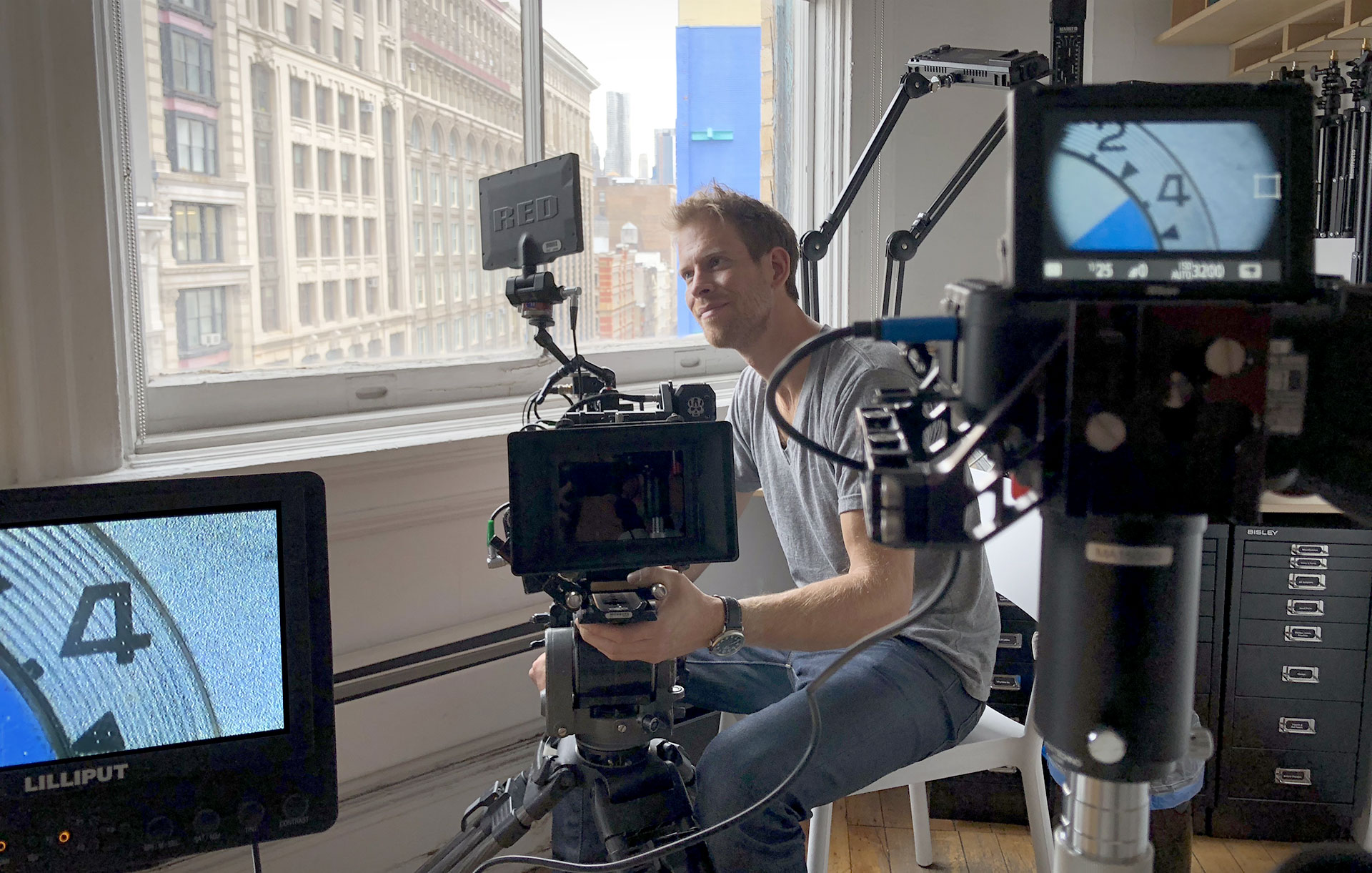
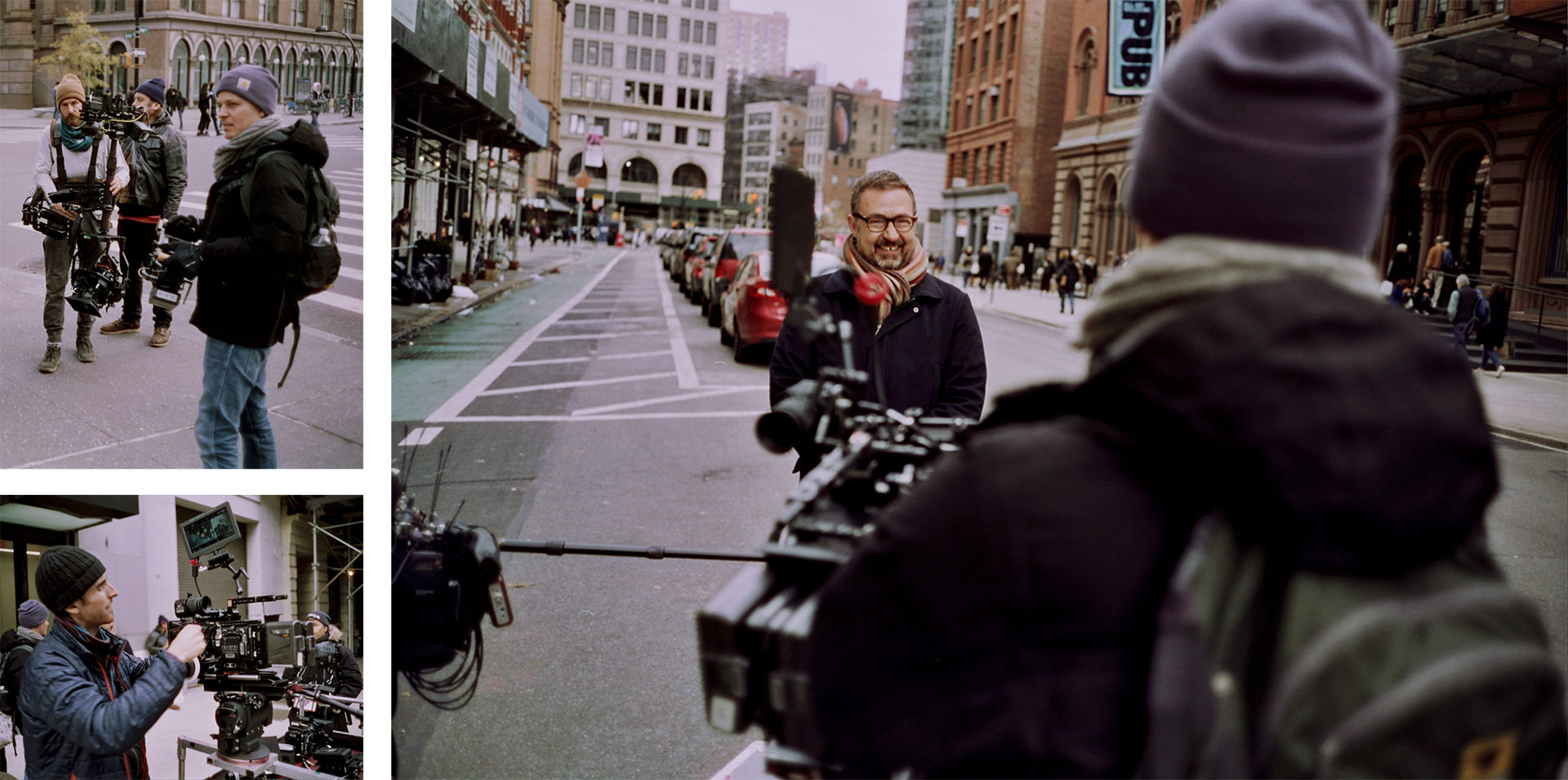
1. The most trivial parts take the most work. One of the most elaborate setups of the entire episode was the eleven second shot of me walking up Astor Place, which appears under narration during the opening credits. It took sixteen takes to get this right. As a typeface designer, I found this reassuringly familiar, thinking about the disproportionate effort that goes into drawing the rare bird §, compared with the everyday E.
2. Producers are skilled diplomats. Security guards don’t like television cameras, and they’re trained to move quickly. Twice, outside of midtown office buildings, I watched producer Sam LaCroix mollify some aggressive and twitchy enforcers in red jackets, who would have none of our nonsense about a font documentary or whatever. Each time, Sam’s calm and unhurried explanation was effective, insofar as it gave the crew enough time to surreptitiously get the shot.
3. Focus engenders respect. Most reporting about typeface design devotes all of its energy to explaining graphic design, leaving little room for typography, and almost none for the actual typeface designer. I’m grateful that director Brian Oakes had the confidence to assume that anyone tuning in would already know what typography was, even if only in broad strokes, so we could use our episode to focus on shading in the details. I find myself yearning for this kind of respect in other kinds of reporting, and grateful whenever I encounter it.
Rather than a profile, I wanted to be part of a documentary about typeface design itself.
4. Even treasured memories are rarely enlightening. An early inquiry about whether I still had my high school yearbook helped clarify something up front: that what I wanted was less a biography, and more a documentary about typeface design that I could help create, and in which my work would be featured. I’m indebted to executive producers Scott Dadich and Dave “Doc” O’Connor for letting me so stubbornly argue this position, and for advocating it to the Netflix brass. As a result, we all got to spend more time on optical illusions and gothic alphabets, and less time on my regrettable senior year haircut. A win for everyone.
5. You don’t get to see the episode until it airs. Netflix takes the position that a biography should not be influenced by the wishes of its subject. I collaborated with the producers, director, and crew to create material for the episode, but had no control over its final outcome. With the episode now behind me, I can wholeheartedly commend their absolute adherence to the standards of journalism over entertainment, but it made for an anxious year: not because I ever doubted the team, but because the material was complex, and the process often opaque. How many of us would trust even our parents or our closest friends to accurately portray the nuances of what we do?
6. Designers regularly take leaps of faith. Taking part in a documentary means submitting yourself to a series of unordered vignettes that can seem disconnected, unpredictable, and rambling. You steel yourself with the hope that these will someday make sense in the hands of an able editor (who, it turns out, you’ll never meet.) Flying blind gave me a renewed appreciation for everyone who’s ever entrusted me to design a new typeface: having approved a handful of test characters, my clients have had to wait patiently while my team and I proceeded to draw the remaining five thousand glyphs, reassured only by my track record, their own optimism, and our mutual rapport.
7. Filmmaking is arduous. The day starts at 5:30 each morning, and wraps up thirteen hours later. It was taxing in every way, and I wasn’t even one of the many people carrying a flight case full of heavy and expensive equipment.
8. Great designers share. Biographies of creative people are notorious for slipping into the shopworn pattern of lionizing The Great Man, a lazy cliché that shouldn’t have survived into even the last century. In talking to Brian about my work at Hoefler&Co, and how it’s always a group effort, I was concerned that recounting an accurate story about teamwork might grate against a biography that was templated for a single subject. But he was confident that we could present things as they truly are, because…
Making a film, like making a typeface, is collaborative work.
9. Great directors are collaborative, not autocratic. Directors go into a project with what they hope is a clear vision, they entrust parts of it to people they respect and admire, they hold their ideas gently (eliciting input at every turn), and when outcomes are uncertain, they take the responsibility for making the call. I was enormously encouraged to see Brian working with his colleagues the way I work with mine. On our first day of shooting, I watched him rethink an entire sequence because sound recordist Brad Bergbom had concerns about how to mic the shot, and the resolution benefitted from the perspectives of director of photography Clair Popkin, and first assistant camera Graham Deneen, and even some suggestions from me, before Brian called the play.
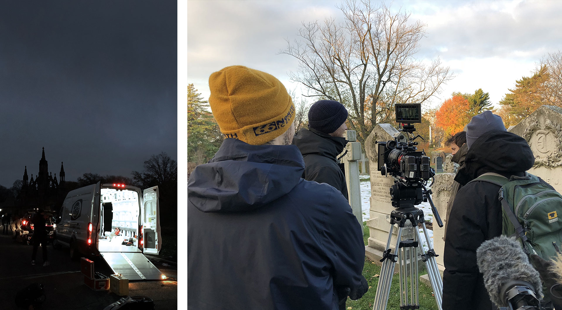
10. Know for next time: study the shot list. The thing you wear to the first shoot on the first day will be the outfit you’re stuck with for the entire project, so that continuity can be maintained should an editor need to splice in footage from a different day. If shooting begins on the slushy hills of Green-Wood Cemetery, you’ll end up presenting yourself to viewers in 190 countries not wearing the English hand-lasted brogues that you bought for the occasion, but rather the muddy Timberlands that you keep in your car.
11. Expect friendly fire. When you’re shooting on city streets, curious onlookers have no compunction about walking right into frame, and asking you, right to your face, while the cameras right behind you are rolling, if you’re making a movie. This is how we lost many of those sixteen takes on Astor Place.
12. Trained actors have skills that civilians don’t. Most of the takes were ruined not by pedestrians, but by me, because I couldn’t process my instructions about how to accommodate the steadicam operator and his fifty pounds of gear. “Walk slowly at first,” I was told, “so he can swing around you. And then speed up. But don’t change your pace, because of the music.” I found myself thinking about my actor friends, who in their college years always seemed to be either coming back from or heading off to a “movement class.” I was never really clear what went on in these classes, but I gather it has something to do with how to get shots like this in one take rather than sixteen.
13. Lighten up. In an early discussion about how we’d demonstrate the way large and small fonts differ, I brought up my favorite sight gag from the movie Top Secret!, and the possibility of using a lens called a ‘split diopter’ which I’d learned about from an equally beloved source, an irreverent but kindhearted Star Trek: TNG podcast called The Greatest Generation. More than just a chance to goof off with the director and dp over YouTube clips, our conversation helped set the tone for the episode, serving as a reminder that thoughtful critique doesn’t need to be deadly earnest, and that respectfulness doesn’t require taking yourself too seriously. I personally find design both meaningful and fun, don’t you?
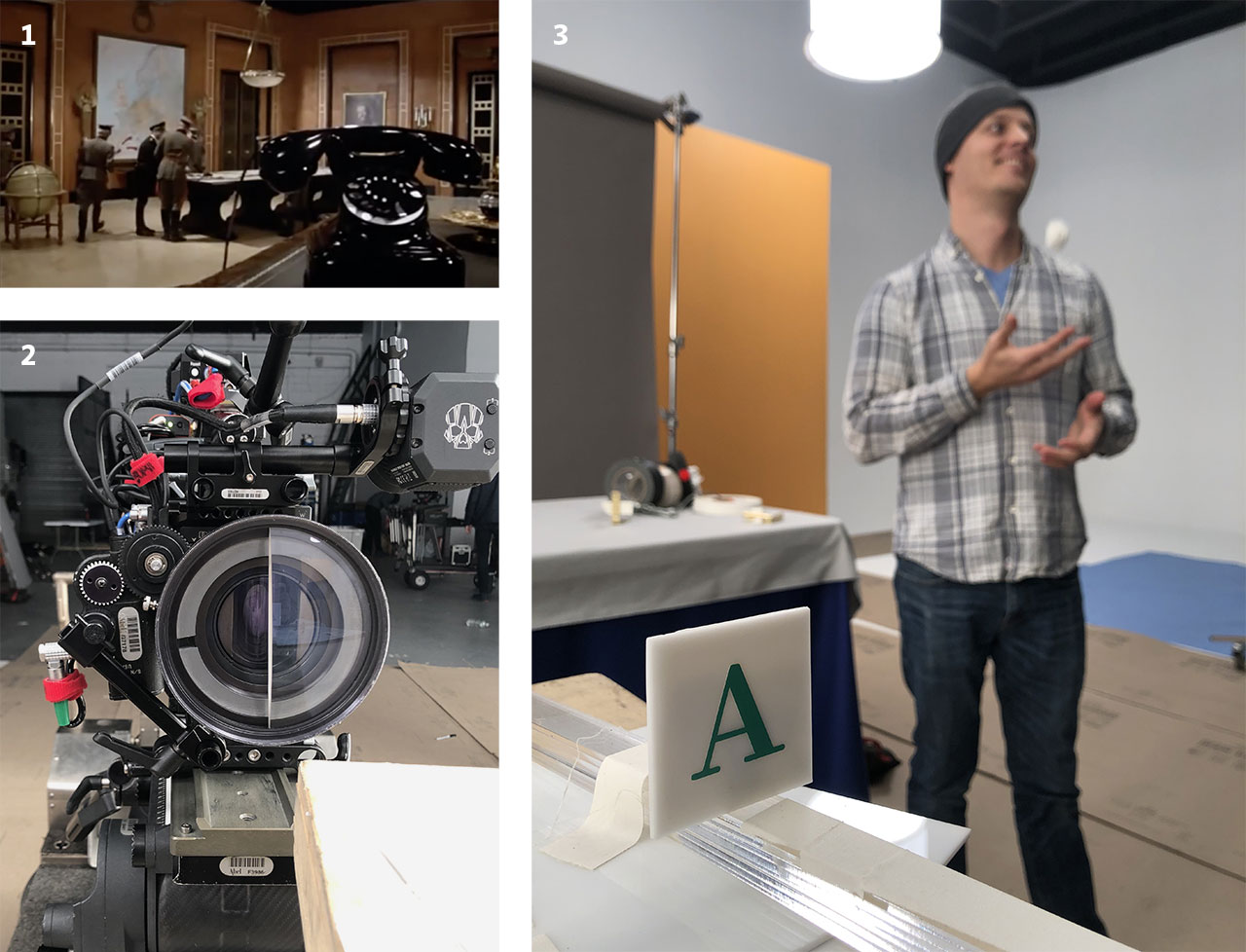
14. Storytelling needs editing, not embellishment. Anyone hoping to document typeface design learns quickly that behind this wonderful visual art are almost no visuals worth capturing. A typeface designer at work looks like a programmer or an accountant: we sit motionless before monitors, we tap at our keyboards, we confer with colleagues about esoteric problems that are invisible at a distance, we make our rounds to the laser printer. Most creative work is like this, which is why I suspect so many depictions of the creative process are so steroidally enhanced with theatrics: actual work is replaced with staged demonstrations, and ordinary challenges are whipped into existential crises. Everyone associated with Abstract was too smart for these kinds of histrionics, but it still left the question of how to turn what’s essentially quiet office work into compelling television. This is where filmmaking comes in.
15. Allow the storytelling to shape the story. Director Brian Oakes wisely kept an eye out for actual challenges — in both the design process and the filmmaking — that might precipitate a welcome change of scene. Our trip to the cemetery was prompted not by the development of the Parliament typeface, but by the need to demonstrate how gothic alphabets respond to shadows — and the obelisk we stumbled upon, quite by accident, really did alter the path I’ve decided to follow with the typeface. Our trip to the library was similarly motivated: after designer Sara Soskolne and I reached a dead end regarding the shape of the capital U in the Decimal typeface, it was Brian who prompted me to stretch my legs and let the camera follow. It’s not unlike the way presenting a typeface in a specimen book, or in documentation, has occasionally revealed the need to send a font back to the drawing board. An idea that can’t be elegantly presented might not be fully resolved, and I found filmmaking a valuable crucible for forging such ideas.
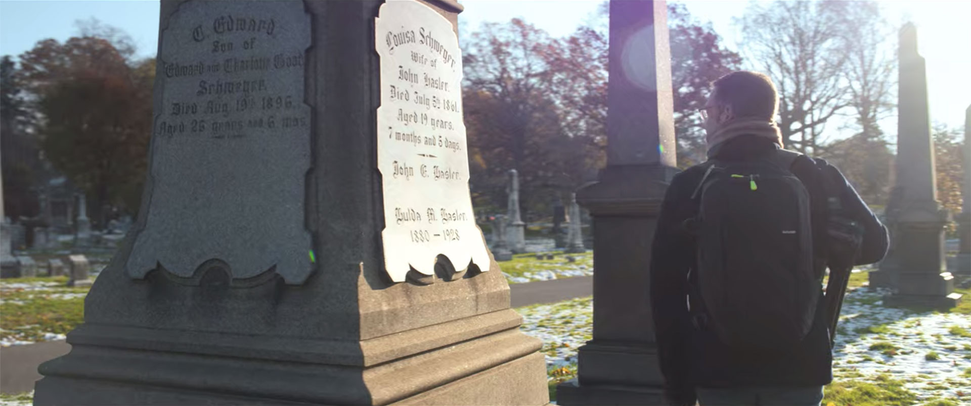
16. Librarians are vital. The map division at the New York Public Library has an extraordinary collection11 Much of it available online, as spectacular high-resolution scans., but it was curator Ian Fowler and his staff who made the visit meaningful. I’ve spent enough time among special collections to know that the storyboard with a stick-figured JH pulling books from open stacks was never going to happen: we were instead going to consult with the library staff, submit a materials list in advance, and review each item individually. Ian’s knowledge of his subject and his collection turned what could have been idle tourism into a constructive and enjoyable morning, provoking some genuine exploration, and yielding some answers that measurably helped resolve the Decimal typeface. Just as I hope this episode of Abstract helps to explain typeface design, I hope it helps dispel the notion that libraries are repositories of books, and librarians their mere custodians. It’s quite the reverse: it is librarians who are the invaluable resource, and books a mere part of their apparatus. Their insights cannot be googled.
17. Type designers lead the least glamorous lives. In the first season of Abstract, Nike’s Tinker Hatfield had delivered Michael Jordan for an appearance, and the episode about costume designer Ruth Carter in season two would feature Spike Lee, and Samuel L. Jackson, and Ryan Coogler. I may have done work for Barack Obama, Elizabeth Warren, Robert Redford, and Madonna, but I’ve never met any of them, so cadging a testimonial seemed unlikely. I am however grateful that Ryan Gosling made an appearance in my episode, even if we didn’t get to hang out on set.
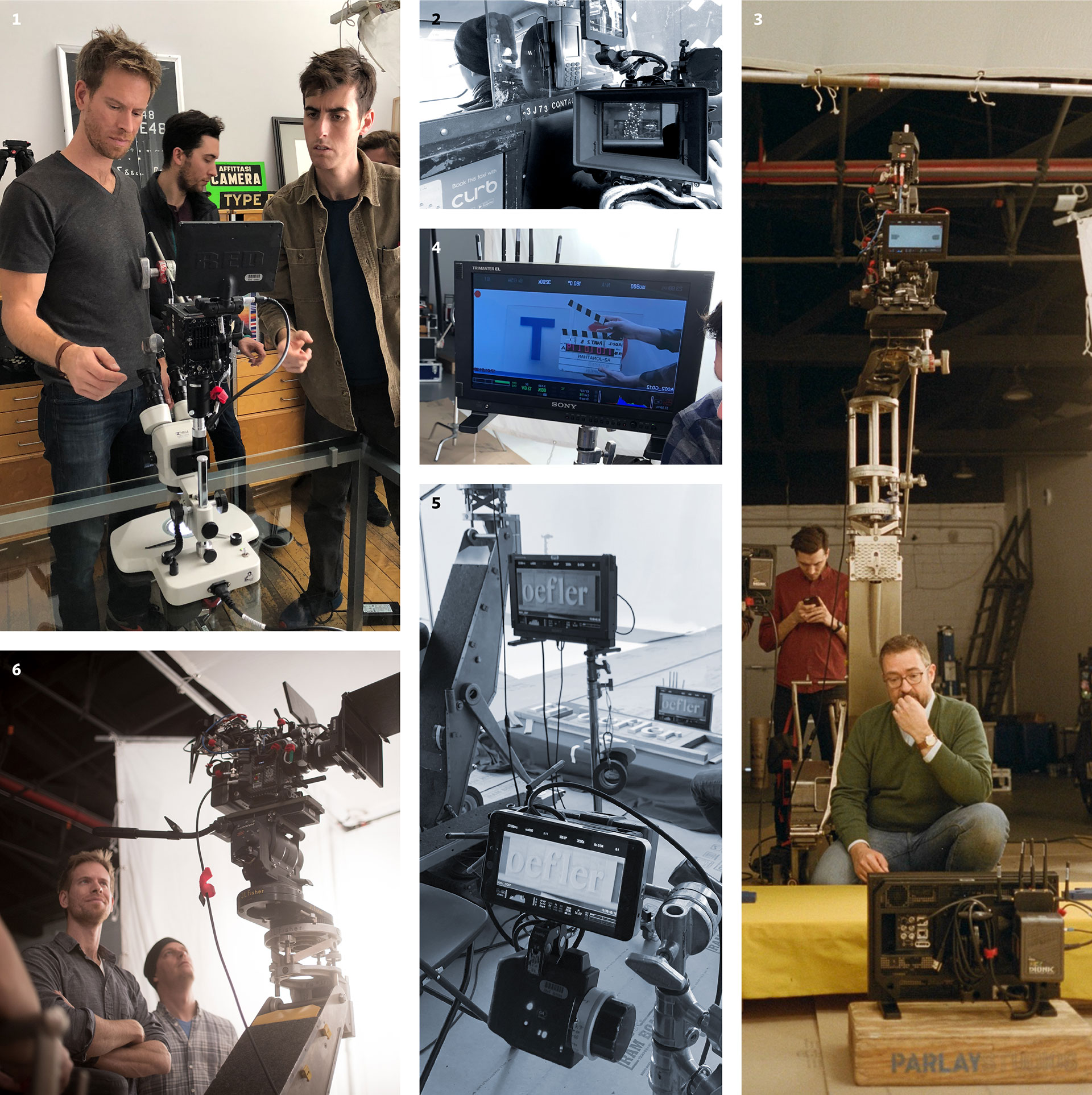
18. Practical effects are compelling. We spent a lot of time thinking about how to best illustrate different typographic illusions, and assumed at first that we’d make quick work of this with animation. But at some point we realized that only physical objects are unimpeachably honest, and manipulating them on camera might be as beguiling and astonishing as close-up magic. The tangible world remains more credible than the digital one.
19. Filmmaking has a lot of D-I-Y. For one of those segments, I designed a set of wooden props that were fabricated by the director himself. In another segment, we needed someone to serve as my hand double, and one of the show’s executive producers stepped up to fill the role. Everyone’s gumption, and everyone’s lack of pretense, really reminded me of home.
20. Documentarians are frugal. We are grateful to the unnamed big box store whose generous return policy made possible a surprising number of this episode’s lightly-used props and costumes.
21. Dress in layers. On that early December morning, I hadn’t expected the soundstage in dumbo to be unheated, especially given the open loading dock that admitted every fierce and freezing wind off the East River. But then I also hadn’t expected that lighting the set would require bridging ten circuit breakers to deliver 38,000 watts of illumination, effectively turning the room into a giant tanning booth.
22. Nobody notices most of it, but everyone feels everything. I’m speaking of filmmaking, but I could just as easily mean typography. Color grading gives raw footage a mood and a point of view; foley work sells the action that cameras and microphones didn’t capture. And then there’s the soundtrack. There was a time when I aspired to write film scores, and I’ve been quoted as saying that “typography is the soundtrack of writing.” But I don’t think I fully appreciated the invisibilty of this art until watching the final edit, being asked what I thought of the soundtrack, and realizing that I hadn’t noticed it at all. It’s been a profound joy to spend time with the score in the past few months, and to get to know composers Timo Elliston and Brian Jones — and to really savor the work of percussionist Jerome Jennings, whose explosive opening fanfare and poignant shuffle during the closing credits capture the mood of the episode with absolute and total perfection. (If you leave feeling energized, and that the creative journey continues, that might be as much Jennings’ doing as mine.) But I just didn’t notice at the time. It simply felt right. Like good type.
23. These aren’t the droids you’re looking for. The most extraordinary thing I saw during the project was producer Sam LaCroix persuading the entire construction crew of a downtown skyscraper to take a twenty minute break so we could record clean audio in my office.
24. Sound recordists carry gear worthy of 007. Speaking purely hypothetically here: If you are a loudmouth out-of-town dad, stepping out of the Public Theatre to call home during intermission, and you learn that your tween daughter has gotten her eyebrow pierced, and right before Thanksgiving no less, and you react colorfully and at great length, you might be interested to know that sound recordists generally carry a highly directional microphone called a ‘shotgun mic’ which is very effective at localizing sound at a distance, even across a busy urban thoroughfare. I’m just saying that you never really know if the tape is rolling, and also that DJs have to get their kooky samples from somewhere.
25. Check yourself before you wreck yourself. During a lunch break in the public atrium of a building on Madison Avenue, I went off in search of a restroom, reflexively turning off the lapel mic that I wore throughout the production. Someone directed me to an escalator, which I noticed was flanked by two nypd officers, uncharacteristically kitted out in body armor and assault rifles. Only as I descended into the basement, with its aggressive onrush of gold and crimson decor, and gold and more gold, and the best gold, believe me, did I realize that we were in the back of Trump Tower. Downstairs, two Treasury agents were checking IDs and xraying bags, and were unfailingly polite in asking me to please open my coat. Weren’t we all surprised to find that underneath, I was wrapped in wires that led down to a blinking radio transmitter in my pocket. Best to avoid doing this, if you can. —JH
Typefaces from the Episode:
Our Catalog No. 11 is now available at the H&Co Design Shop. $15, shipping included, and fully credited toward your next font order.
Even more fun than designing typefaces is getting to design with them, and no project is more gratifying — nor as challenging — as a type specimen. Presenting a typeface in its best light takes some thought about its virtues: choosing the sizes, cases, and measures at which each font looks its best, identifying those characters that exhibit a font’s signature moments, and finding ways to distill dauntingly large families down to clear and economical summaries. (And then, designing attractive pages. And trying not to repeat yourself.) Brian Hennings and I spent the summer on this very project, and are very pleased to present our first catalog in more than a decade: New and Recent Typefaces by Hoefler&Co, Eleventh Edition.
Catalog No. 11 introduces our new Decimal family, and presents the Surveyor, Obsidian, Ringside, Quarto, Inkwell, Operator, Isotope, Peristyle, and Landmark families for the first time in a type specimen. Sent free to some of the people who most recently joined our mailing list (sign up!), the new catalog is $15 from the H&Co Design Shop, and includes both free shipping to most countries and a $15 credit toward your next purchase of fonts from H&Co. I hope you’ll find to be both a practical reference, and a source of inspiration in your work with typography. —JH
Catalog No. 11, from the H&Co Design Shop.
- 16 Dec 19
The Hamilton Wood Type & Printing Museum in Two Rivers, Wisconsin is not only home to the world’s greatest collection of wood type, it’s a destination for anyone who loves typography, letterpress, or Americana. A few years ago, I had the irresistible opportunity to collaborate with the folks at Hamilton to create something for sale in their store, so I designed this set of wood type catchwords. I’m pleased to see that they’re back in production, and available from the Hamilton online shop for ten dollars a pop. One hundred percent of proceeds benefit the museum and support its excellent program of exhibits, workshops, and conferences.
‘Catchwords,’ of course, are decorative logotypes of common words and phrases, a lively typographic gimmick that probably found its way into American wood type via signpainting. I’ve always loved the flourished the, or, and, or for without which no nineteenth century was complete, so I felt that our modern utterances deserved some of this same pizzazz. Charming objets for any designer’s workspace, they’re also bonafide pieces of wood type, cut in end-grain sugar maple and planed type high (.918") — perfect for the letterpress printer eager to exclaim ‘Wood Type Forever!’ or identify Finely-Made Letters, or to remind readers that Studious Typefaces Fortify Us, and that Great Typography Flourishes Online. —JH
- 14 Dec 19

Inspired by a brush with an inscrutable but no doubt revenue-positive New York City Traffic Regulation, I created my own set of ticketable offenses with which designers could return the favor, or at least have a convincing prop to flash around when they detect typographic trouble. By special issue, then, from the 100% totally real Typographic Violations Division, the Uniform Ticket Book is standard equipment for the modern design enforcer, and it’s now available for a mere $15 from the H&Co Design Shop. Lists thirty-two common design infractions, each with an appropriate penalty, with plenty of room for improvisation.
Authoritatively typeset in Helvetica to provoke maximum anxiety, and jarringly printed in retina-scorching orange, each Notice of Violation is sure to startle, striking an uneasy chill in even the most upstanding designer. Contains fifty tickets, each neatly perforated for a satisfyingly loud rrrip prior to presentation. Bound in soul-deadening municipal pressboard, with a heavy-duty 100pt millboard backing, and foil stamped with an official-looking clip art emblem in gold. Police uniform neither included, nor recommended. For novelty use only. —JH
The Typographic Ticket Book. $15, from the H&Co Design Shop.
- 3 Dec 19
A collection of free tools for demonstrating typographic phenomena, for anyone teaching or studying typeface design.
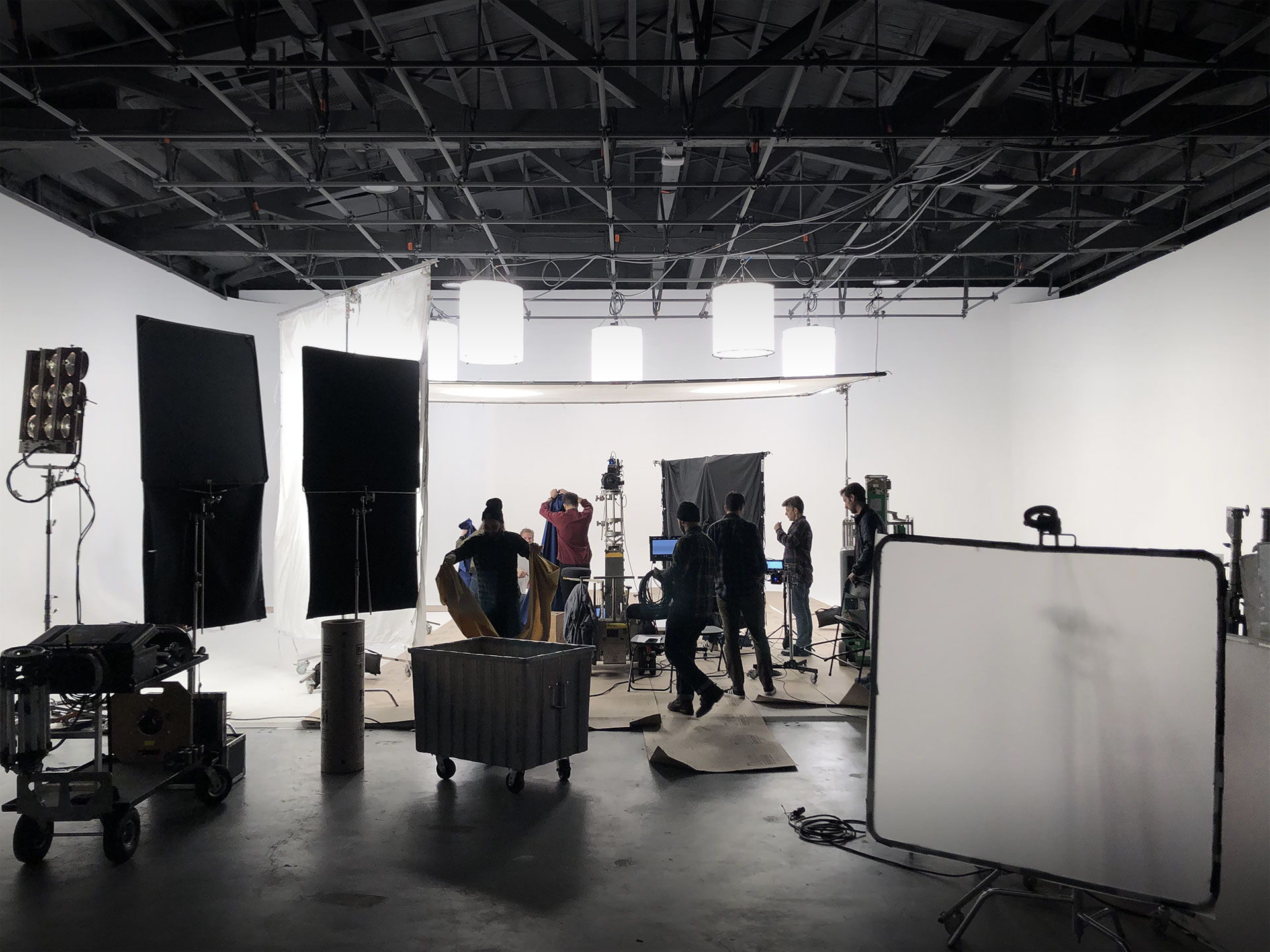
In my very first meeting with director Brian Oakes, we agreed that our episode of the Netflix documentary Abstract: The Art of Design should be more than a profile of a working typeface designer: it should also offer viewers some practical insights into the mechanics of the craft itself. I loved Brian’s idea of periodically cutting away from the narrative to offer little lessons, and we both felt that manipulating physical props on a soundstage, rather than using computer animation, would be the most compelling way of demonstrating typographic principles.
The three resulting segments, titled These Are Letters! and heralded by an impish jingle, are the result. For the chapter about optical illusions, I wrote and storyboarded ten different examples, though in the end we whittled these down to a leaner set of four. Since a number of people who teach design have suggested that we manufacture these for use in the classroom, I thought I’d take the more direct approach, and make them available as a free download, as a PDF that can be printed on transparencies. This also felt like a good moment to publish the six additional lessons that didn’t make the cut, which are illustrated below. Whether you’re teaching typography, studying it, or just giving letters a closer look for the first time, I hope you’ll find these useful. —JH
No. 1. Type design is a battle with optical illusions, which we only win through a complete surrender. We convince the eye to see things clearly not by creating rational drawings, but through irrational ones, by introducing strange distortions that outwit the eye: to shape not what we see, but what we think we see.
Even the alphabet’s simplest goals begin with some unexpected accommodations. Making all the letters appear the same height means drawing round characters to be measurably taller than flat ones, to counter our physiological tendency to see circles as smaller than squares of the same height. In a typeface, letters that are round at the top or bottom (such as this C) will need to project beyond the height of the flat letters (such as T), by an amount that type designers call “overshoot.” Overshoot will apply throughout the character set, to the lowercase, numbers, symbols, and punctuation — and devilishly, it won’t always have the same measurement. It’s not uncommon for the overshoot of an S and an O to differ, dictated only by how things appear to the eye.
No. 2. Our misperception about circles and squares extends to triangles, too: letters whose strokes converge into a point are prone to appear smaller than they actually are. So type designers customarily apply some degree of overshoot to diagonal letters like A, V, and W, and often, if the design calls for especially sharp corners, the acute points of the letters N and M as well.
No. 3. Another thing we consistently misjudge is balance. This may be a vestige of how humans have evolved to process the physical environment, intuitively recognizing that remote objects appear smaller than those nearby. Applied to typography, it means that making a letterform appear equally balanced requires drawing it to be measurably smaller on top. These expectations about “natural balance” are at work in letters like B, E, and S, which are visibly smaller above and larger below — and even in the letter H, which in order to appear symmetrical, needs a crossbar that’s just above center.
No. 4. Curiously, a letterform’s construction can also influence how we perceive its equilibrium. Take the letter A, whose most basic recipe is “a delta with a horizontal bar in the center.” By rotating this letter about the center of the crossbar, we can see just how far below center this waistline really is. This is because perception is subject to context, and for the bar of the A, what we perceive as its relevant context isn’t the entire letter, it’s the much smaller region that’s inside the delta.
No. 5. Both kinds of typographic balance combine unexpectedly in the letters E and F, whose center arms appear identical, but in fact almost never align. Following what we know about natural balance, the arm of the E will be positioned just above center, in order to appear equidistant from the two other strokes. But owing to its relevant context, the arm of the F will be centered not on the height of the character, but in the void between the underside of the top stroke, and the empty bottom of the letter — making it lower than the arm of the E, its fraternal twin. Often, the arrangement of the F is a compromise between what its own construction suggests, and its need for compatibility with the frequently adjacent letter E.
No. 6. The simple letter T conceals one of typography’s great paradoxes: that lines appear thicker when oriented horizontally than vertically. Type designers call this property “contrast,” and because it behaves differently in different directions, it’s said to be “anisotropic.” To create letterforms that appear to have a consistent weight throughout, a type designer will make sure that vertical strokes are measurably thicker than horizontal ones; diagonal strokes, therefore, will fall somewhere in between.
No. 7. Anisotropic contrast affects not only weight, but also dimension: just as we perceive horizontal strokes to be thicker than they really are, we perceive horizontal distances to be longer than they actually are. To create what appears to be a perfect circle or a perfect square, a type designer will create a shape that’s measurably narrower than it is tall. Looking at the letter O, we can see two effects of anisotropic contrast at once: in its normal orientation, the stroke weight becomes steadily thinner as it reaches the top and bottom of the letter, and the letterform itself is taller than it is wide.
No. 8. Complicating the way we perceive weight is the “calligraphic bias” that’s implicit in the Latin alphabet itself. The very shapes of our letters are the product of the broad-edged pen, held at an oblique angle in the right hand, which, as it moves rightward, produces thin upstrokes and thick downstrokes. This pattern of thins and thicks is apparent in many of the typefaces we read every day, but it’s also imperceptibly fossilized in even the most evenly-weighted design. Looking at a mirror image of the letter A reveals that its left leg is subtly lighter than its right, a necessary maneuver to satisfy our subliminal expectations about weight — all the consequence of ancient right-handed scribes.
No. 9. To see all of these phenomena at work, look no further than the letter S: it only takes viewing the letter from a different angle to reveal all the sleight-of-hand that goes into making it appear balanced. Turning the S clockwise reveals the different proportions of its top and bottom halves, a necessity to maintain natural balance. In this orientation, the ends of the strokes appear to flare outward, a consequence of the anisotropic contrast that causes weights to thicken as they approach verticality.
No. 10. Looking at its mirror image reveals an additional illusion: that the S is considerably thicker in the middle than above or below, a consequence of the calligraphic bias that expects downward strokes to be the heaviest. Nowhere is this more dramatic than in its lower left quarter, where the letter’s heavy spine rapidly thins out as it approaches the baseline, the combined effects of anisotropic contrast and calligraphic bias that are both undetectable in its normal orientation. —JH
Download the PDF of these illustrations
- 5 Nov 19
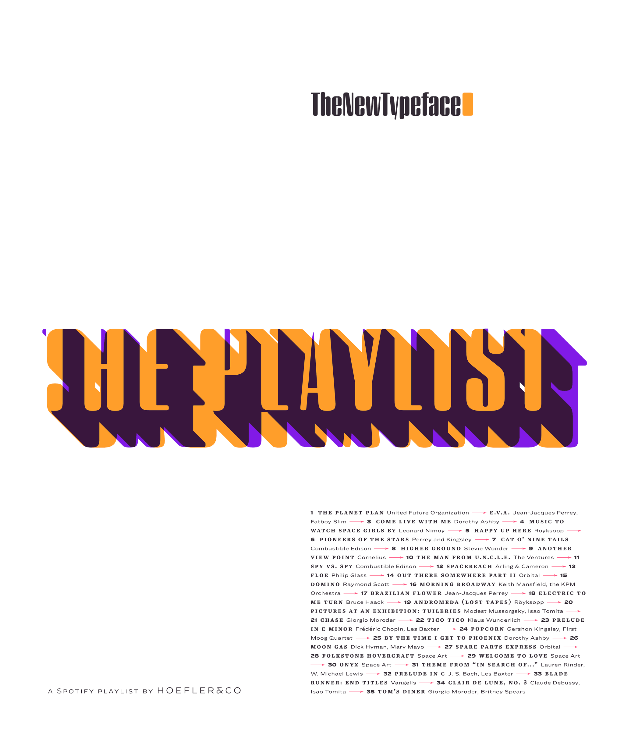
Illusionary Typefaces:
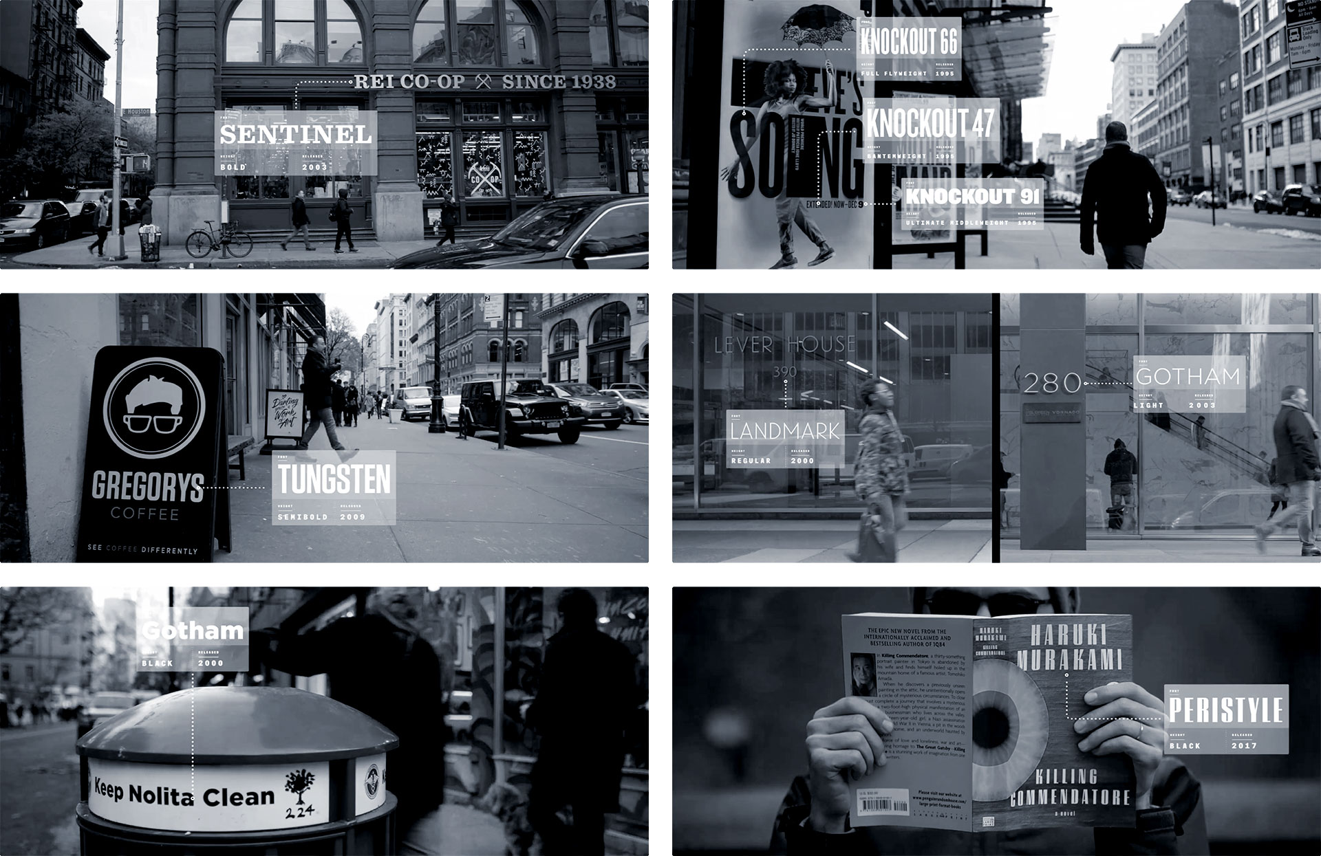
Nearly all wristwatches once shared a distinctive form of lettering. It was confident, and timeless, and it’s almost completely vanished. Decimal examines this style, and explores the things that shaped it, to create a family of original typefaces that transcends its forms to celebrate its ideas.
One of the telltale signs of a vintage watch is its lettering. The unique markings on watch dials, surprisingly consistent from one manufacturer to the next, evolved separately from typography: these are forms unconcerned with the needs of type designed for printing words on paper, and unmoved by the changing fashions of graphic design. Instead, watch lettering has been shaped by the curious technologies of dial manufacturing, the demanding requirements of working in miniature, and the unusual commercial arrangements that first gave rise to these remarkable inventions.
Watch lettering is printed through tampography, a technique in which ink is transferred first from an engraved plate to a spongy, dumpling-shaped silicone pad, and from there onto the convex dial of a watch. To reproduce clearly, a letterform needs to overcome the natural tendencies of liquid ink or enamel held in suspension: tiny serifs at the ends of strokes can create a larger coastline, to help prevent liquid from withdrawing due to surface tension; wide apexes on characters like 4 and A eliminate the acute angles where liquid tends to pool. In the two watches above, an Omega 30T2 (ref. 2186) and a Universal Genève Aero-Compax (ref. 22414), artists have taken different liberties with the figures 3 and 7, using different approaches to maximize the openness of these forms. But the peculiar figure 4 is identical, with a low crossbar and a wide apex designed to dilate the counter, defending clarity while producing a silhouette that balances comfortably the other numbers on the dial. How is it that two unrelated watches have the same figure four? How do nearly all vintage watches have it?
For all the sophistication of a mechanical movement, it’s the dial that may be the most complex part of a watch. Creating a single dial may require more than a hundred different operations, as well as the expertise to work with materials from stainless steel to mother-of-pearl (to gemstones, to feathers, to wood.) A dialmaker must know how to galvanize, electroplate, varnish, lacquer, paint, stamp, engrave, solder, and drill, and all in miniature. Dialmakers routinely maintain and operate multiple generations of the same technology, using a laser cutter in concert with a centuries-old rose engine, to create a particular guilloché pattern specified by a manufacturer. The niche skills and equipment needed by these workshops encouraged dialmakers to specialize long ago, and for most of the last century, the same small handful of prestigious dialmakers supplied watch dials to nearly all of the major manufacturers. Stern Créations, established in 1898, provided dials to Audemars Piguet, Vacheron Constantin, Patek Phillipe, and Cartier; Singer, founded in 1919, created them for Rolex, Omega, Heuer, and Universal Genève. For all the ways in which watch lettering was a natural response to the measurable needs of the medium, it was also the product of a relatively small number of artisans, whose hands shaped the aesthetic of the entire industry. The wide-topped 4, the sharp-centered M, and the bulldog stance of the short-limbed R and K were among their mannerisms, a seamless blend of mechanical problem-solving and artistic intuition.
Some signature gestures of the watchmakers’ alphabet were innovations that evolved to suit new technological features. The broad swing of the letter J, uncharacteristically topped by a serif, helps to make the letter wider, ensuring that narrow-lettered months like jul and wide-lettered ones like mar will occupy the same space on a calendar wheel. Elsewhere on a watch, alphabets are usually smaller, relegated to marking the scale of a tachymeter or telemeter, or identifying a watch as a chronograph or chronometer. The Swiss domination of the industry ensures the letters S and W on most dials (useful bellwethers for the typeface designer) but here the material ends. Few watches ever included lowercase or italics, save the occasional Km on a telemeter dial, or water resistance indicated in ft or m; punctuation beyond periods and ampersands is similarly absent. But even among the realm of garden-variety capitals, every watch reveals inherent contradictions and short-sighted decisions that limit the potential for a truly authentic typographic revival of the style, guaranteeing early that Decimal would be an interpretation and a celebration of the style, but not a replica.
One of the charms of lettering is its inconsistency. Where a typeface is a fixed system designed to deploy in predictable ways, lettering has the flexibility to adapt to its circumstances. At the small scale of the wristwatch, these circumstances can be extreme: in this Brietling Top Time (ref. 810), the G on the top line has a curved construction, but the one below it — just 20% smaller — uses fully horizontal gestures to maintain an open aperture between the two nearby strokes. The dogged type designer may be left to choose between these two models, or to conclude that this beloved aesthetic is the product of these differences, and that no single alphabet could possibly deliver the attractive diversity of the vintage watch. For Decimal, we tried a third approach.
Instead of trying to reproduce the anarchic (and sometimes impractical) letters from actual watches, Decimal dissects the style into discrete themes, reassembling them in a different but more useful order. In the Breitling watch above, each model of letter G has its own merit: one is welcoming in its roundness, the other fierce in its geometry. Decimal applies these ideas in different places, so that they become less discordant, and more widely applicable throughout the typeface. In Decimal, open-armed roundness is evoked by curving the letter’s jaw, intensity by shearing its top stroke at a dramatic angle that ends in a sharp point. These decisions point the way to resolving the letter S (often awkward on watch dials), and the letter Q (generally absent.)
Wherever they could be employed consistently, and harnessed to serve a range of ten weights, idiosyncratic details have been retained, from the J with its unexpected serif, to the wide plateau on the A. The vestigial serifs on watch dials, never appearing with much consistency, are referenced in the angled arms of letters like E, reified into a subtle but perceptible motif that recurs throughout the design.
The word ‘Decimal’ has recurred throughout horological history. Decimal Time refers to an invention of the French Revolution, in which the project of revising the calendar to feature a ten-day week was expanded to include a ten-hour clock, composed of one hundred ‘decimal minutes,’ each with one hundred ‘decimal seconds’ — a well-intentioned but short-lived experiment. Decimal watches are those that feature an additional chapter ring divided into hundredths, making it easier to measure minutes or seconds in more mathematically relevant units: “2.5 minutes” instead of “two minutes and thirty seconds” was a boon to scientists, aviators, and statisticians, if not bakers and athletic coaches as well. The idea of the decimal watch appealed to me as a piece of simple technology, and resonated with the themes of the typeface: here is an additional system, designed not to supplant what’s useful and recognized, but to supplement it with a new and valuable way of looking at the familiar. —JH
Decimal by H&Co. From $149, exclusively at typography.com.
- 24 Sep 19
Abstract: The Art of Design returns for a second season, featuring an episode about Jonathan Hoefler and the typeface designers at H&Co.
I’m delighted to announce that I’m one of the six designers profiled in season two of Abstract: The Art of Design, the Emmy-nominated Netflix original documentary series that returns on September 25. The creation of Scott Dadich, Morgan Neville, and Dave O’Connor, Abstract explores design as a way of thinking, through the work of designers in different disciplines. For design practicioners, learning about different modes provokes new ways of thinking about the work we do; for design enthusiasts, it explains both the practice and the motivation behind our work.
For my episode, I had the extraordinary good fortune of putting myself in the hands of director Brian Oakes, who came up through the ranks of graphic design (and was therefore no stranger to typography), and his creative team that included the award-winning cinematographer Clair Popkin. In the coming weeks, I’ll be sharing a behind-the-scenes look at my work on this once-in-a-lifetime project.
I hope you’ll spend an hour getting to know me and my team at H&Co (and two of our unpublished typefaces) — as well as all of the other remarkable designers representing truly fascinating realms of design.
Typefaces from the Episode:
████ ██ ████ ████ █████ ███ ██████ ██ █████ ███ █████ ██████ ████ █████ ██ antidote ███ ████ ██████ ████ ██████ ████ ██ █████ ███ █████ ████ ██████ █████ █ ███ ██ ████ ██ ██████ █████ ███ ████ ████ ███ ███ ████ ██████ ████ ████ ███ ██ ████ ██ ██ █████ ███ ██████ ██████ ███ ███ ████ ██ ██ ██ █████ █████ █ █████ ██ ███ ██ typography of intrigue, ████ ██ ███ ██████ ██ ██████ ███ ████ ██ ██ ██████ ███ ███ ███ ██████ ██ ██████ █████ ██ ███ ███ ██ ████ ██ █████ ████ ██████ █████ ████ ██ ██████ ██████ █████ ███ ████ ████ ███ ███ ████ ██ █████ █ █████ ██ █ █████ ██ █ ██████.
- 11 Jun 19
Recommend
About Joyk
Aggregate valuable and interesting links.
Joyk means Joy of geeK