

UI Bar in javascript for react native
source link: https://reactnativeexample.com/ui-bar-in-javascript-for-react-native/
Go to the source link to view the article. You can view the picture content, updated content and better typesetting reading experience. If the link is broken, please click the button below to view the snapshot at that time.

react-native-bottom-toolbar
Bottom toolbar styled as in iOS, implemented in JS, typed with Flow. Highly configurable with text or icons (I recommend react-native-vector-icons) and nested actions that display in ActionSheetIOS (iOS only). You can also render your own components as content.
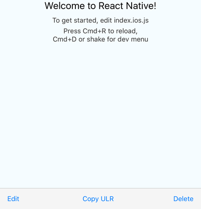
Expo demo
here, code for the demo is in the example folder
Installation & usage
npm i react-native-bottom-toolbar
oryarn add react-native-bottom-toolbar
import BottomToolbar from 'react-native-bottom-toolbar'

<BottomToolbar>
  <BottomToolbar.Action
    title="Edit"
    onPress={(index, propsOfThisAction) =>
      console.warn(index + ' ' + JSON.stringify(propsOfThisAction))}
  />
  <BottomToolbar.Action
    title="Copy ULR"
    onPress={(index, propsOfThisAction) =>
      console.warn(index + ' ' + JSON.stringify(propsOfThisAction))}
  />
  <BottomToolbar.Action
    title="Delete"
    onPress={(index, propsOfThisAction) =>
      console.warn(index + ' ' + JSON.stringify(propsOfThisAction))}
  />
</BottomToolbar>
Configuration
The component accepts these props:
type BottomToolbarProps = {
  IconComponent?: React.ComponentType<*>, // use this together with `color` prop and `iconName` from `BottomToolbar.Action`
  iconSize: number,
  onPress: (number, Object) => any,
  wrapperStyle?: ViewStyleProp,
  textStyle?: ViewStyleProp,
  buttonStyle?: ViewStyleProp,
  color: string,
  disabledColor: string,
  showIf: boolean,
  children: React.Node,
};

type ActionProps = {
  IconElement?: React.Node, // use this to provide your own custom react element (e.g. icon with text)
  IconComponent?: React.ComponentType<*>, // overrides `IconComponent` from `BottomToolbar`
  title: string,
  iconName?: string,
  disabled?: boolean,
  onPress?: (number, Object) => any,
  color?: string,
  testID?: string,
  iconSize?: number,
  actionSheetTitle?: string,
  actionSheetMessage?: string,
};

type NestedActionProps = {
  title: string,
  onPress?: (number, Object) => any,
  style?: 'cancel' | 'destructive',
};
The onPress function can be specified on three different levels: you may pass it as a prop to the component itself (see the first example), you may include it in the BottomToolbar.Action (see the first example), or may include it in the BottomToolbar.NestedAction (see the second example).
The function has to be specified on at least one level. You may combine the levels together - the onPress of a BottomToolbar.NestedAction overrides the onPress of an BottomToolbar.Action, and the onPress of a BottomToolbar.Action overrides the onPress of the component. This gives you a lot of flexibility - you can have one event handler for all actions and nested actions, or you can specify the handlers separately. The onPress function always receives the action / nested action it was triggered from, so you can easily distinguish the event source.
I suggest you pick an approach that works best for a given scenario and stick with it so you keep you code easy to understand.
License
GitHub
Recommend
About Joyk
Aggregate valuable and interesting links.
Joyk means Joy of geeK