

Replicating Good Mood UI in Xamarin Forms
source link: https://askxammy.com/replicating-good-mood-ui-in-xamarin-forms/
Go to the source link to view the article. You can view the picture content, updated content and better typesetting reading experience. If the link is broken, please click the button below to view the snapshot at that time.

Replicating Good Mood UI in Xamarin Forms
 In this case we are going to replicate a Good Mood UI App obtained from Dribble. I hope this is use for you!
 Before starting, to get the best out of the post, I’ll leave you some instructional notes so that you have a better experience reproducing the UI:
 At the beginning, you will see an image with the original UI where you will see divided into blocks as we’ll be working on each part of the design. Each block presents the image with the design explicitly that we’ll be working on that block, they are highlighted in a box. In each of the code blocks, you can see a comment that says: “Here add the code that is being explained in the next block“. To keep you as focused as possible, this part indicates to you that the next block code explanation goes right where the comment line is added. I will not be using styles so that the properties added to the various components can be seen and understood faster in the explanation process.
Let’s start!
Let’s divide the original design into blocks
To better understand, I have divided the original design into blocks, which are listed in the order in which we will be reproducing each one, these are:


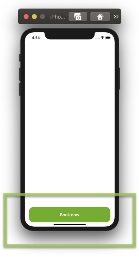 As the first step, I want to build the floating button. To do it, I’ll use a ScrollView inside a Grid layout to get the desired effect. If you want to know more information about how to do it, you can enter here.
<!-- 1. Floating Button--> <Grid RowDefinitions="*"> <ScrollView Grid.Row="0"> <Grid ColumnDefinitions="*,*" RowDefinitions="Auto,Auto,Auto,Auto,Auto,Auto,*" Padding="30,0"> <!-- Here add the code that is being explained in all the blocks, starting by number 1. --> </Grid> </ScrollView>
<!-- Floating Button--> <Button Grid.Row="0" Text="Book now" FontSize="{OnPlatform iOS='20', Android='15'}" FontAttributes="Bold" BackgroundColor="#62b000" BorderRadius="20" TextColor="White" HeightRequest="{OnPlatform iOS='70', Android='50'}" Margin="20" VerticalOptions="End"/> </Grid>
 If you want to add a Shadow, you can use Xamarin Community Toolkit, check it here!

 Let’s break down some important points!
Rounded Image: I used a Frame where the magic property is IsClippedToBounds, which allow us to clip its children to its bound.
Inside this one, I added the Image which must have the same value both in WidthRequest and HeightRequest properties and half of that value in the CornerRadius property, to achieve the exact rounded shape.
You can see more information here.
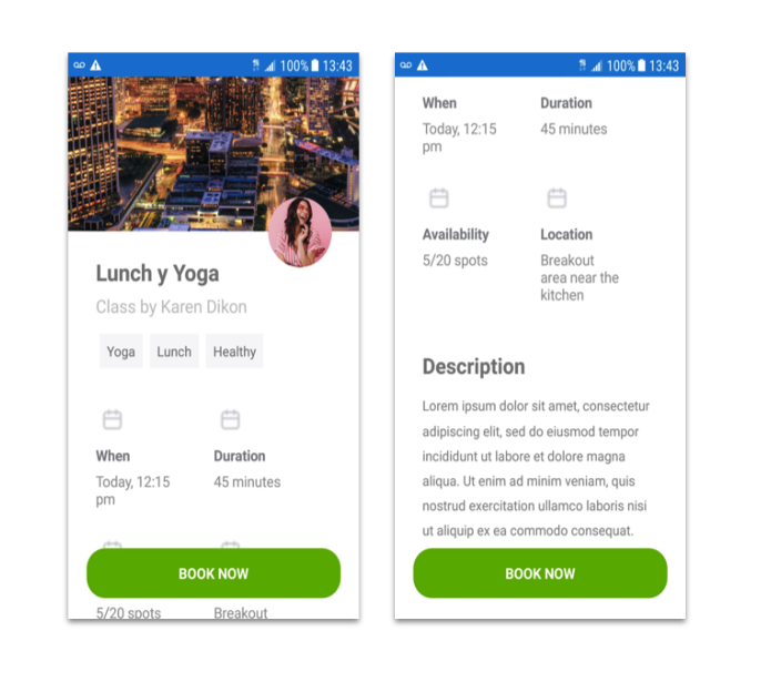
<!-- 2. Header information--> <Image Grid.Row="0" Grid.Column="0" Grid.ColumnSpan="2" Source="Landscape" VerticalOptions="Start" Margin="-35,-45,-35,0" HeightRequest="{OnPlatform iOS='250', Android='200'}" Aspect="AspectFill"/> <Frame Grid.Row="1" Grid.Column="1" Margin="0,-40,0,0" BorderColor="White" VerticalOptions="Start" HorizontalOptions="End" WidthRequest="70" HeightRequest="70" HasShadow="False" CornerRadius="35" Padding="0" IsClippedToBounds="True"> <Image Source="Profile" Aspect="AspectFill"/> </Frame> <Label Grid.Row="1" Grid.Column="0" Grid.ColumnSpan="2" Text="Lunch y Yoga" Margin="0,20,0,0" FontAttributes="Bold" FontSize="{OnPlatform iOS='28', Android='23'}"/> <Label Grid.Row="2" Grid.Column="0" Grid.ColumnSpan="2" Text="Class by Karen Dikon" FontSize="18" TextColor="Silver"/>
<!-- Here add the code that is being explained in this block -->

 Let’s continue with the Topics list, here the objective is to make it as scalable as possible using a CollectionView, in this way you can add as many Topics / tags as you need in your App without having to modify the XAML.
<!-- 3. Topics--> <CollectionView Grid.Row="3" Grid.Column="0" Grid.ColumnSpan="2" HorizontalScrollBarVisibility="Never" ItemsSource="{Binding topics}" ItemsLayout="HorizontalList" HeightRequest="50"> <CollectionView.ItemTemplate> <DataTemplate> <StackLayout Padding="4,10" Margin="0,20"> <Label Text="{Binding Description}" BackgroundColor="#f6f5f7" Padding="8"/> </StackLayout> </DataTemplate> </CollectionView.ItemTemplate> </CollectionView>
<!-- Here add the code that is being explained in this block -->

This block requires that the information is presented with a repetitive pattern which must be divided into two columns, for this, let’s also use the CollectionView.
<!-- 4. Details--> <CollectionView Grid.Row="4" Grid.Column="0" Grid.ColumnSpan="2" HorizontalScrollBarVisibility="Never" ItemsSource="{Binding information}" Margin="0,20" HeightRequest="280"> <CollectionView.ItemsLayout> <GridItemsLayout Orientation="Vertical" Span="2" /> </CollectionView.ItemsLayout> <CollectionView.ItemTemplate> <DataTemplate> <Grid Padding="0,0,30,0" RowDefinitions="40,*,60"> <Image Grid.Row="0" Source="{Binding Icon}" Aspect="AspectFit" HorizontalOptions="Start" HeightRequest="38" WidthRequest="38"/> <Label Grid.Row="1" Text="{Binding Title}" TextColor="#7d7e83" VerticalOptions="Start" FontSize="{OnPlatform iOS='20', Android='15'}" FontAttributes="Bold"/> <Label Grid.Row="2" Text="{Binding Description}" TextColor="#909093" FontSize="{OnPlatform iOS='20', Android='15'}"/> </Grid> </DataTemplate> </CollectionView.ItemTemplate> </CollectionView>
<!-- Here add the code that is being explained in this block -->

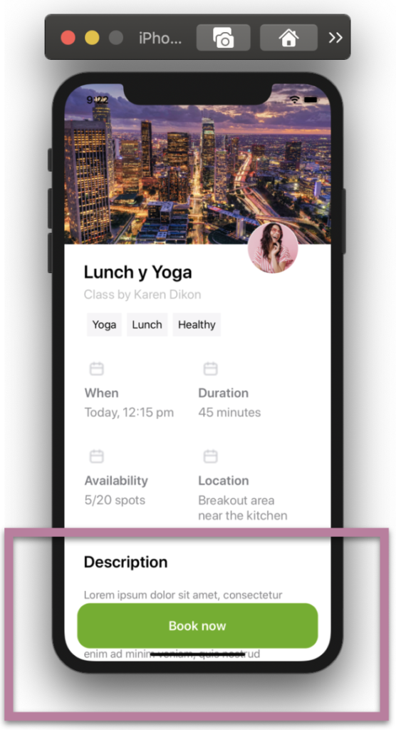
Do you remember the first step where we made the floating button? Yep! Well, in this step we are going to work on the description block and this is where we are going to see the “float” effect reflected!
<!-- 5. Description--> <Label Grid.Row="5" Grid.Column="0" Text="Description" FontAttributes="Bold" FontSize="22" Margin="0,0,0,10"/>
<Label Grid.Row="6" Grid.ColumnSpan="2" TextColor="#828184" LineHeight="1.5" Padding="0,0,0,80" Text="Lorem ipsum dolor sit amet, consectetur adipiscing elit, sed do eiusmod tempor incididunt ut labore et dolore magna aliqua. Ut enim ad minim veniam, quis nostrud exercitation ullamco laboris nisi ut aliquip ex ea commodo consequat."/>
 .
.

Recommend
About Joyk
Aggregate valuable and interesting links.
Joyk means Joy of geeK