

Matplot pyplot绘制单图,多子图不同样式详解,这一篇就够了
source link: https://blog.csdn.net/qq_40985985/article/details/119643704
Go to the source link to view the article. You can view the picture content, updated content and better typesetting reading experience. If the link is broken, please click the button below to view the snapshot at that time.

matplotlib.pyplot 是使 matplotlib 像 MATLAB 一样工作的函数集合。这篇博客将介绍
- 单图多线不同样式(红色圆圈、蓝色实线、绿色三角等)
- 使用关键字字符串绘图(data 可指定依赖值为:numpy.recarray 或 pandas.DataFrame)
- 使用分类变量绘图(绘制条形图、散点图、折线图)
- 多子表多轴及共享轴
- 多子表(水平堆叠、垂直堆叠、水平垂直堆叠、水平垂直堆叠共享轴、水平垂直堆叠去掉子图中间的冗余xy标签及间隙、极坐标风格轴示例);
-
plt.set_title(‘simple plot’, loc = ‘left’)
设置表示标题,默认位于中间,也可位于left靠左,right靠右 -
t = plt.xlabel(‘Smarts’, fontsize=14, color=‘red’)
表示设置x标签的文本,字体大小,颜色 -
plt.plot([1, 2, 3, 4])
如果提供的单个列表或数组,matplot假定提供的是y的值;x默认跟y个数一致,但从0开始,表示x:[0,1,2,3] -
plt.plot([1, 2, 3, 4], [1, 4, 9, 16])
表示x:[1,2,3,4],y:[1,4,9,16] -
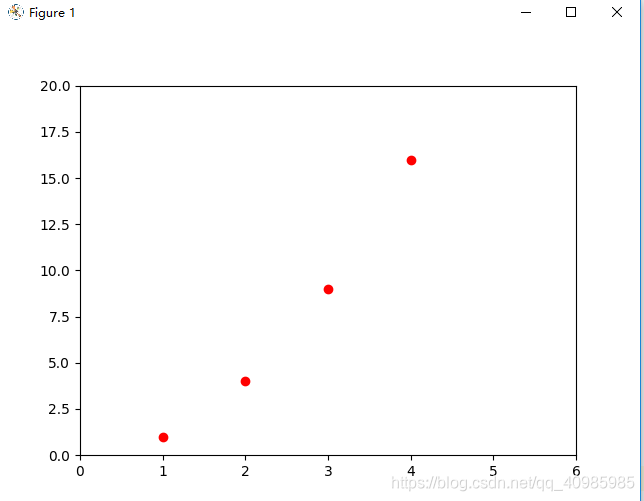
plt.plot([1, 2, 3, 4], [1, 4, 9, 16], ‘ro’)
表示x:[1,2,3,4],y:[1,4,9,16],然后指定线的颜色和样式(ro:红色圆圈,b-:蓝色实线等) -
plt.axis([0, 6, 0, 20])
plt.axix[xmin, xmax, ymin, ymax] 表示x轴的刻度范围[0,6], y轴的刻度范围[0,20] -
plt.bar(names, values) # 条形图
-
plt.scatter(names, values) # 散点图
-
plt.plot(names, values) # 折线图
-
fig, ax = plt.subplots(2, sharex=True, sharey=True) 可创建多表,并指定共享x,y轴,然后ax[0],ax[1]绘制data
-
fig, (ax1, ax2) = plt.subplots(2, sharex=True, sharey=True) 可创建多表,并指定共享x,y轴
-
fig, (ax1, ax2) = plt.subplots(2, sharex=True, sharey=True) 可创建多表,垂直堆叠表 2行1列
-
fig, (ax1, ax2) = plt.subplots(1, 2, sharex=True, sharey=True) 可创建多表,水平堆叠表 1行2列
-
fig, (ax1, ax2) = plt.subplots(2, 2, sharex=True, sharey=True,hspace=0,wspace=0) 可创建多表,水平垂直堆叠表 2行2列,共享x,y轴,并去除子图宽度和高度之间的缝隙
共享x,y轴表示共享x,y轴的刻度及值域;
- plt.text(60, .025, r’
μ
=
100
,
σ
=
15
\mu=100,\ \sigma=15
μ=100, σ=15’)
表示在60,0.025处进行文本( μ = 100 , σ = 15 \mu=100,\ \sigma=15 μ=100, σ=15)的标注
1. 单图单线
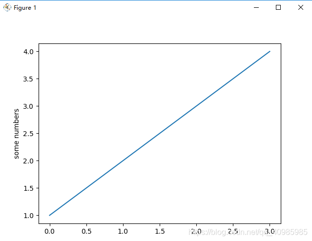
# 单图单线
import matplotlib.pyplot as plt

# 如果提供单个列表或数组,matplotlib 会假定它是一个 y 值序列,并自动为您生成 x 值。
# 由于 python 范围从 0 开始,默认的 x 向量与 y 具有相同的长度,但从 0 开始。因此 x 数据是 [0, 1, 2, 3]
plt.plot([1, 2, 3, 4])
plt.ylabel('some numbers')
plt.show()

plt.plot([1, 2, 3, 4], [1, 4, 9, 16])
plt.show()

# 对于每对 x, y 参数,都有一个可选的第三个参数,它是指示绘图颜色和线型的格式字符串。
# 格式字符串的字母和符号来自 MATLAB,将颜色字符串与线型字符串连接起来。默认格式字符串是“b-”,这是一条蓝色实线。'ro'红色圆圈
plt.plot([1, 2, 3, 4], [1, 4, 9, 16], 'ro')
plt.axis([0, 6, 0, 20])  # 刻度轴的范围,x:0~6,y:0~20
plt.show()
2. 单图多线不同样式(红色圆圈、蓝色实线、绿色三角等)
- ’b-‘:蓝色实线
- ‘ro’:红色圆圈
- ‘r–’:红色破折号
- ‘bs’:蓝色方形
- ‘g^’:绿色三角
mark标记:
‘.’ point marker
‘,’ pixel marker
‘o’ circle marker
‘v’ triangle_down marker
‘^’ triangle_up marker
‘<’ triangle_left marker
‘>’ triangle_right marker
‘1’ tri_down marker
‘2’ tri_up marker
‘3’ tri_left marker
‘4’ tri_right marker
‘8’ octagon marker
‘s’ square marker
‘p’ pentagon marker
‘P’ plus (filled) marker
‘*’ star marker
‘h’ hexagon1 marker
‘H’ hexagon2 marker
‘+’ plus marker
‘x’ x marker
‘X’ x (filled) marker
‘D’ diamond marker
‘d’ thin_diamond marker
‘|’ vline marker
‘_’ hline marker
- 支持的颜色:
‘b’ blue 蓝色
‘g’ green 绿色
‘r’ red 红色
‘c’ cyan 兰青色
‘m’ magenta 紫色
‘y’ yellow 黄色
‘k’ black 黑色
‘w’ white 白色
- 支持的点的样式:
‘-’ solid line style 实线
‘–’ dashed line style 虚线
‘-.’ dash-dot line style 点划线
‘:’ dotted line style 虚线
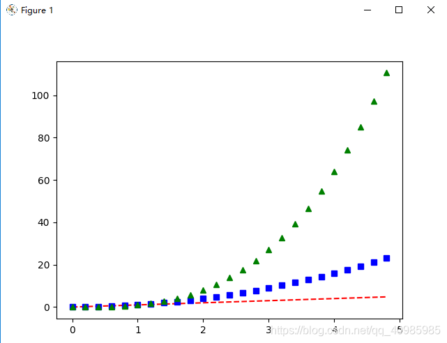
import matplotlib.pyplot as plt

import numpy as np

# 以 200 毫秒的间隔均匀采样时间
t = np.arange(0., 5., 0.2)

# 'r--':红色破折号,  'bs':蓝色方形 ,'g^':绿色三角
plt.plot(t, t, 'r--', t, t ** 2, 'bs', t, t ** 3, 'g^')
plt.show()
3. 使用关键字字符串绘图(data 可指定依赖值为:numpy.recarray 或 pandas.DataFrame)
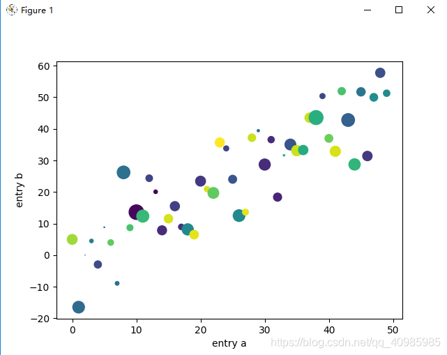
import matplotlib.pyplot as plt

import numpy as np

# 使用关键字字符串绘图(data 可指定依赖值为:numpy.recarray 或 pandas.DataFrame)
data = {'a': np.arange(50),  # 1个参数,表示[0,1,2...,50]
        'c': np.random.randint(0, 50, 50),  # 表示产生50个随机数[0,50)
        'd': np.random.randn(50)}  # 返回呈标准正态分布的值(可能正,可能负)
data['b'] = data['a'] + 10 * np.random.randn(50)
data['d'] = np.abs(data['d']) * 100

print(np.arange(50))
print(np.random.randint(0, 50, 50))
print(np.random.randn(50))
print(data['b'])
print(data['d'])

plt.scatter('a', 'b', c='c', s='d', data=data)
plt.xlabel('entry a')
plt.ylabel('entry b')
plt.show()
4. 使用分类变量绘图(绘制条形图、散点图、折线图)
- plt.bar(names, values) # 条形图
- plt.scatter(names, values) # 散点图
- plt.plot(names, values) # 折线图
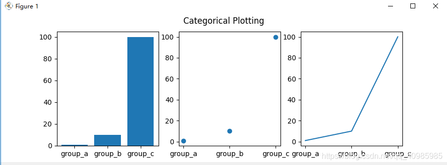
import matplotlib.pyplot as plt

import numpy as np

# 用分类变量绘图
names = ['group_a', 'group_b', 'group_c']
values = [1, 10, 100]

plt.figure(figsize=(9, 3))

plt.subplot(131)
plt.bar(names, values)  # 条形图
plt.subplot(132)
plt.scatter(names, values)  # 散点图
plt.subplot(133)
plt.plot(names, values)  # 折线图
plt.suptitle('Categorical Plotting')
plt.show()

# 控制线条属性:线条有许多可以设置的属性:线宽、虚线样式、抗锯齿等;
lines = plt.plot(10, 20, 30, 100)
# use keyword args
plt.setp(lines, color='r', linewidth=2.0)
# or MATLAB style string value pairs
plt.setp(lines, 'color', 'r', 'linewidth', 2.0)
line, = plt.plot(np.arange(50), np.arange(50) + 10, '-')
plt.show()
5. 多子表多轴及共享轴
多子表多轴,先用点再用线连接,效果图如下: 多子表多轴,绘制点效果图如下:
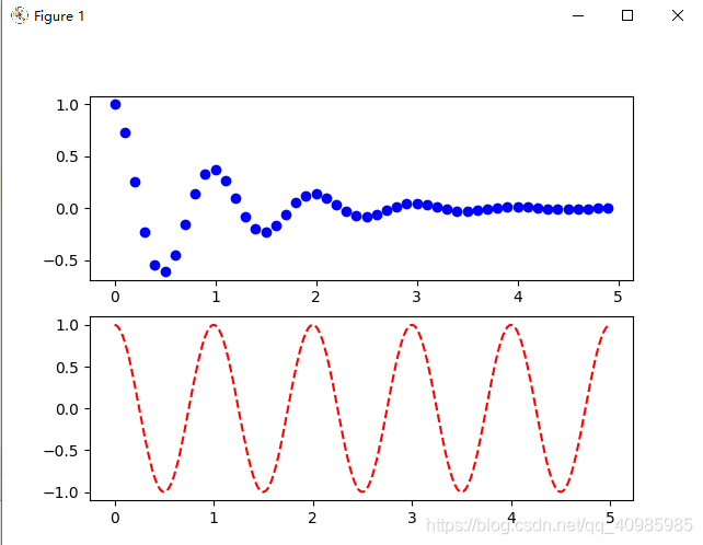
import matplotlib.pyplot as plt
import numpy as np


# 多表和多轴
def f(t):
    return np.exp(-t) * np.cos(2 * np.pi * t)


t1 = np.arange(0.0, 5.0, 0.1)
t2 = np.arange(0.0, 5.0, 0.02)

plt.figure()
plt.subplot(211)  # 2行1列共俩个子表,中间的2,1,1同211
plt.plot(t1, f(t1), 'bo', t2, f(t2), 'k')  # 绘制蓝色圆圈(t1,f(t1)),然后用黑色线连接值

plt.subplot(212)
plt.plot(t2, np.cos(2 * np.pi * t2), 'r--')
plt.show()

# 图1去掉t2,f(t2)并没有把结果进行连线
plt.figure()
plt.subplot(211)  # 2行1列共俩个子表,中间的2,1,1同211
plt.plot(t1, f(t1), 'bo')

plt.subplot(212)
plt.plot(t2, np.cos(2 * np.pi * t2), 'r--')
plt.show()
多子表共享y轴,效果图如下:
fig, (ax1, ax2) = plt.subplots(2, sharey=True) 共享y轴
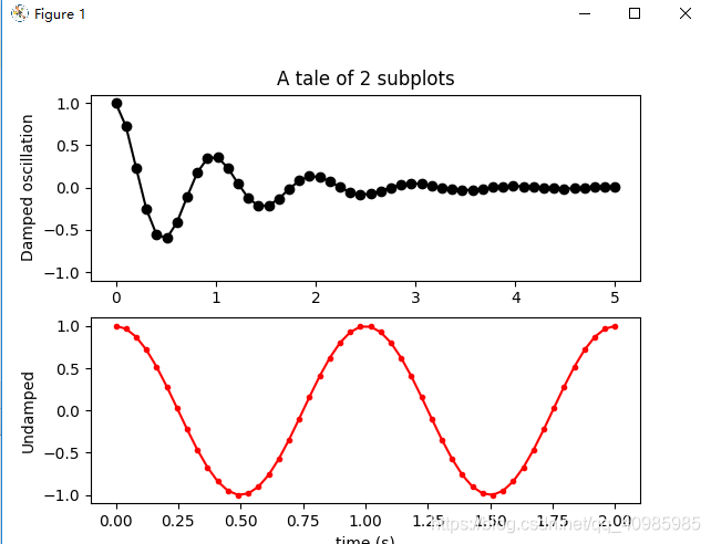
# 多子表共享轴
import numpy as np
import matplotlib.pyplot as plt

# 构建绘图数据
x1 = np.linspace(0.0, 5.0)
x2 = np.linspace(0.0, 2.0)
y1 = np.cos(2 * np.pi * x1) * np.exp(-x1)
y2 = np.cos(2 * np.pi * x2)

# 绘制俩个子图,共享y轴
fig, (ax1, ax2) = plt.subplots(2, sharey=True)

ax1.plot(x1, y1, 'ko-')
ax1.set(title='A tale of 2 subplots', ylabel='Damped oscillation')

ax2.plot(x2, y2, 'r.-')
ax2.set(xlabel='time (s)', ylabel='Undamped')

plt.show()
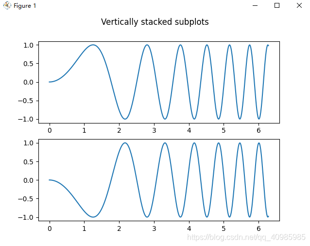
6. 多子表
6.1 多子表垂直堆叠
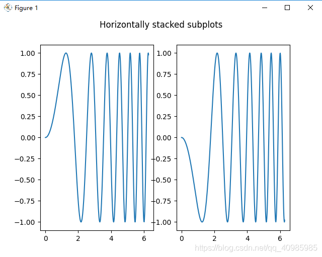
6.2 多子表水平堆叠
6.3 多子表垂直水平堆叠
隐藏顶部2子图的x标签,和右侧2子图的y标签,效果图如下: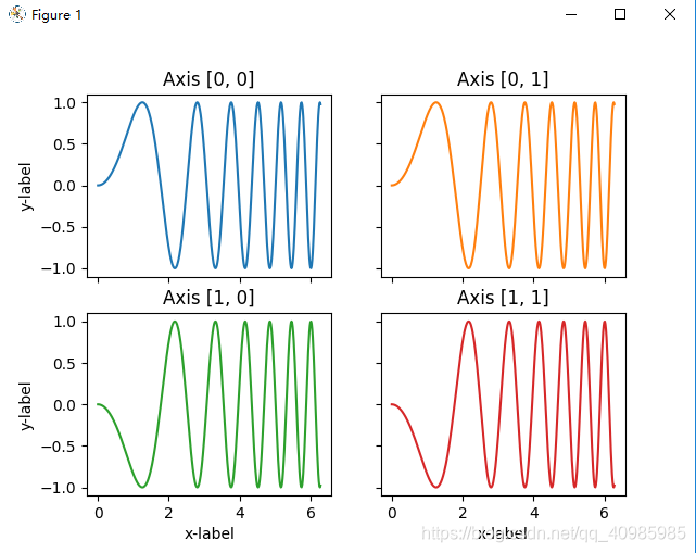
同上图,共享x列,y行的坐标轴~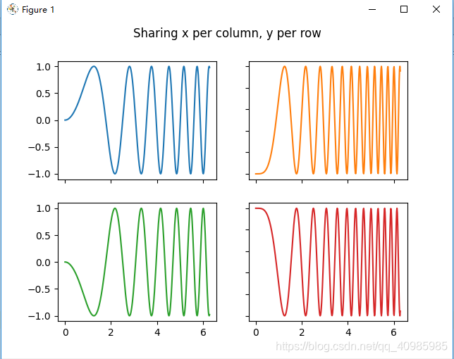
6.4 多子表共享轴(去除垂直、水平堆叠子表之间宽度和高度之间的缝隙)
共享x轴并对齐,效果图如下: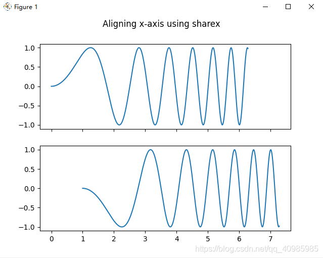
共享x,y轴效果如下图:
共享x,y轴表示共享其值域及刻度;
对于共享轴的子图,一组刻度标签就足够了。内部轴的刻度标签由 sharex 和 sharey 自动删除。子图之间仍然有一个未使用的空白空间;
要精确控制子图的定位,可以使用fig.add_gridspec(hspace=0) 减少垂直子图之间的高度。fig.add_gridspec(wspace=0) 减少水平子图之间的高度。
共享x,y轴,并删除多个子表之间高度的缝隙,效果如下图: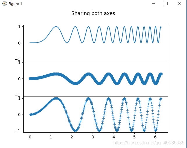
共享x,y轴,并删除多个子表冗余xy标签,及子图之间宽度、高度的缝隙,效果如下图: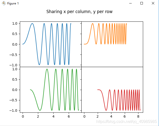
6.5 多子表极坐标风格轴
6.6 多子表源码
# 多子表示例:水平堆叠、垂直堆叠、水平垂直堆叠、水平垂直堆叠共享轴、水平垂直堆叠去掉子图中间的冗余xy标签及间隙;
import matplotlib.pyplot as plt
import numpy as np
# 样例数据
x = np.linspace(0, 2 * np.pi, 400)
y = np.sin(x ** 2)
def single_plot():
fig, ax = plt.subplots()
ax.plot(x, y)
ax.set_title('A single plot')
plt.show()
def stacking_plots_one_direction():
# pyplot.subplots 的前两个可选参数定义子图网格的行数和列数。
# 当仅在一个方向上堆叠时,返回的轴是一个一维 numpy 数组,其中包含创建的轴列表。
fig, axs = plt.subplots(2)
fig.suptitle('Vertically stacked subplots')
axs[0].plot(x, y)
axs[1].plot(x, -y)
plt.show()
# 当只创建几个 Axes,可将它们立即解压缩到每个 Axes 的专用变量会很方便
fig, (ax1, ax2) = plt.subplots(2)
fig.suptitle('Vertically stacked subplots')
ax1.plot(x, y)
ax2.plot(x, -y)
plt.show()
# 水平方向堆叠子图
fig, (ax1, ax2) = plt.subplots(1, 2)
fig.suptitle('Horizontally stacked subplots')
ax1.plot(x, y)
ax2.plot(x, -y)
plt.show()
def stacking_plots_two_directions():
# 在两个方向上堆叠子图时,返回的 axs 是一个 2D NumPy 数组。表示俩行俩列的表
fig, axs = plt.subplots(2, 2)
axs[0, 0].plot(x, y)
axs[0, 0].set_title('Axis [0, 0]')
axs[0, 1].plot(x, y, 'tab:orange')
axs[0, 1].set_title('Axis [0, 1]')
axs[1, 0].plot(x, -y, 'tab:green')
axs[1, 0].set_title('Axis [1, 0]')
axs[1, 1].plot(x, -y, 'tab:red')
axs[1, 1].set_title('Axis [1, 1]')
for ax in axs.flat:
ax.set(xlabel='x-label', ylabel='y-label')
# 隐藏顶部2子图的x标签,和右侧2子图的y标签
for ax in axs.flat:
ax.label_outer()
plt.show()
# 也可以在 2D 中使用元组解包将所有子图分配给专用变量
fig, ((ax1, ax2), (ax3, ax4)) = plt.subplots(2, 2)
fig.suptitle('Sharing x per column, y per row')
ax1.plot(x, y)
ax2.plot(x, y ** 2, 'tab:orange')
ax3.plot(x, -y, 'tab:green')
ax4.plot(x, -y ** 2, 'tab:red')
for ax in fig.get_axes():
ax.label_outer()
plt.show()
def sharing_axs():
fig, (ax1, ax2) = plt.subplots(2)
fig.suptitle('Axes values are scaled individually by default')
ax1.plot(x, y)
ax2.plot(x + 1, -y)
plt.show()
# 共享x轴,对齐x轴
fig, (ax1, ax2) = plt.subplots(2, sharex=True)
fig.suptitle('Aligning x-axis using sharex')
ax1.plot(x, y)
ax2.plot(x + 1, -y)
plt.show()
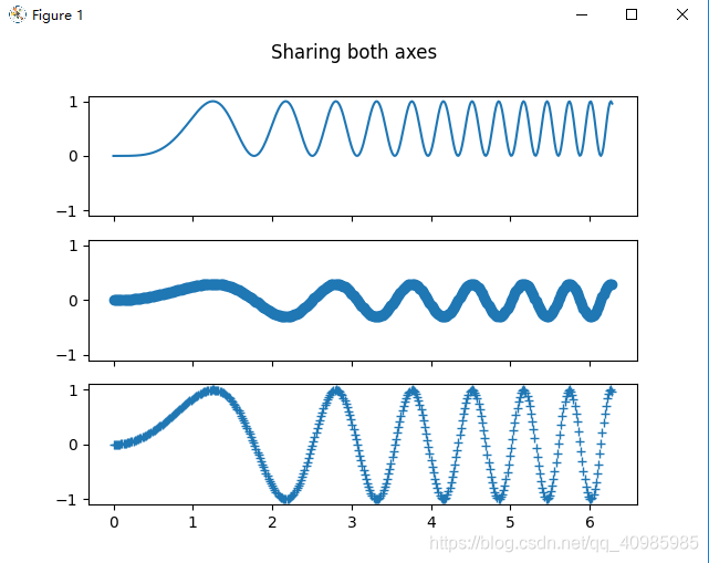
# 共享x,y轴
fig, axs = plt.subplots(3, sharex=True, sharey=True)
fig.suptitle('Sharing both axes')
axs[0].plot(x, y ** 2)
axs[1].plot(x, 0.3 * y, 'o')
axs[2].plot(x, y, '+')
plt.show()
# 对于共享轴的子图,一组刻度标签就足够了。内部轴的刻度标签由 sharex 和 sharey 自动删除。子图之间仍然有一个未使用的空白空间;
# 要精确控制子图的定位,可以使用 Figure.add_gridspec 显式创建一个 GridSpec,然后调用其子图方法。例如可以使用 add_gridspec(hspace=0) 减少垂直子图之间的高度。
fig = plt.figure()
gs = fig.add_gridspec(3, hspace=0)
axs = gs.subplots(sharex=True, sharey=True)
fig.suptitle('Sharing both axes')
axs[0].plot(x, y ** 2)
axs[1].plot(x, 0.3 * y, 'o')
axs[2].plot(x, y, '+')
# 隐藏除了底部x标签及刻度外,其他子图的x标签及刻度
# label_outer 是一种从不在网格边缘的子图中删除标签和刻度的方便方法。
for ax in axs:
ax.label_outer()
plt.show()
# 2*2多图堆叠,共享x,y轴,并去除子图之间宽度和高度之间的缝隙
fig = plt.figure()
gs = fig.add_gridspec(2, 2, hspace=0, wspace=0)
(ax1, ax2), (ax3, ax4) = gs.subplots(sharex='col', sharey='row')
fig.suptitle('Sharing x per column, y per row')
ax1.plot(x, y)
ax2.plot(x, y ** 2, 'tab:orange')
ax3.plot(x + 1, -y, 'tab:green')
ax4.plot(x + 2, -y ** 2, 'tab:red')
for ax in axs.flat:
ax.label_outer()
plt.show()
# 复杂结构的共享轴代码
fig, axs = plt.subplots(2, 2)
axs[0, 0].plot(x, y)
axs[0, 0].set_title("main")
axs[1, 0].plot(x, y ** 2)
axs[1, 0].set_title("shares x with main")
axs[1, 0].sharex(axs[0, 0])
axs[0, 1].plot(x + 1, y + 1)
axs[0, 1].set_title("unrelated")
axs[1, 1].plot(x + 2, y + 2)
axs[1, 1].set_title("also unrelated")
fig.tight_layout()
plt.show()
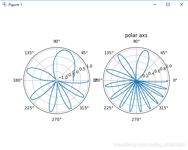
def polar_axs():
fig, (ax1, ax2) = plt.subplots(1, 2, subplot_kw=dict(projection='polar'))
ax1.plot(x, y)
ax2.plot(x, y ** 2)
plt.title('polar axs')
plt.show()
# 仅单表
single_plot()
# 仅单方向堆叠子表(垂直方向堆叠,水平方向堆叠)
stacking_plots_one_direction()
# 水平垂直堆叠子图
stacking_plots_two_directions()
# 共享轴
sharing_axs()
# 极坐标风格轴
polar_axs()
7. 图表中文本标注(箭头注释)
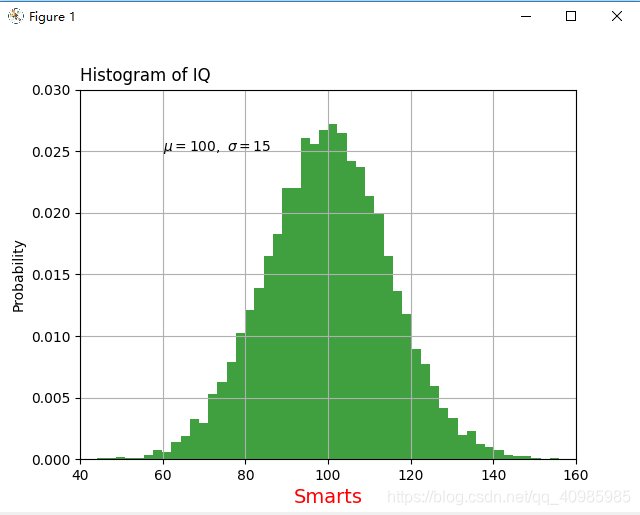
简单文本标注(只设置要标注的文本内容,起始位置),效果图如下:
# 表示在60,0.025处进行文本('$\mu=100,\ \sigma=15$')的标注,
# 字符串前面的 r 很重要——它表示字符串是一个原始字符串,而不是将反斜杠视为 python 转义
plt.text(60, .025, r'$\mu=100,\ \sigma=15$')
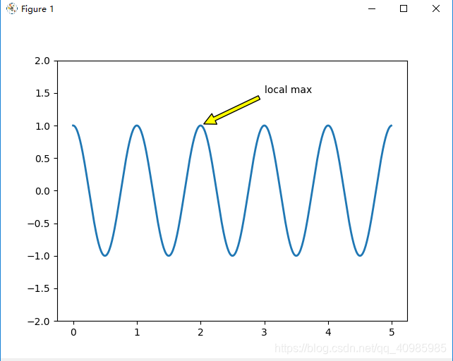
文本标注箭头效果图如下:(需设置箭头起始位置,文本起始位置,文本值)
# 文本的一个常见用途是对绘图的某些特征进行注释,而 annotate 方法提供了辅助功能来简化注释。
# 在注释中,有两点需要考虑:由参数 xy 表示的被注释的位置和文本 xytext 的位置。这两个参数都是 (x, y) 元组。
plt.annotate('local max', xy=(2, 1), xytext=(3, 1.5),
                 arrowprops=dict(facecolor='yellow', shrink=0.05),
                 )
# 文本标注
import matplotlib.pyplot as plt
import numpy as np


# 简单文本注释
def simplt_text():
    mu, sigma = 100, 15
    x = mu + sigma * np.random.randn(10000)

    # 直方图数据
    n, bins, patches = plt.hist(x, 50, density=1, facecolor='g', alpha=0.75)

    # 设置x标签的文本,字体大小,颜色
    t = plt.xlabel('Smarts', fontsize=14, color='red')
    plt.ylabel('Probability')
    plt.title('Histogram of IQ', loc='left')

    # 表示在60,0.025处进行文本('$\mu=100,\ \sigma=15$')的标注, 字符串前面的 r 很重要——它表示字符串是一个原始字符串,而不是将反斜杠视为 python 转义
    plt.text(60, .025, r'$\mu=100,\ \sigma=15$')
    plt.axis([40, 160, 0, 0.03])
    plt.grid(True)
    plt.show()


# 箭头文本标注
def annotation_text():
    ax = plt.subplot()

    t = np.arange(0.0, 5.0, 0.01)
    s = np.cos(2 * np.pi * t)
    line, = plt.plot(t, s, lw=2)

    # 文本的一个常见用途是对绘图的某些特征进行注释,而 annotate 方法提供了辅助功能来简化注释。
    # 在注释中,有两点需要考虑:由xy: 箭头位置,xytext:文本位置。这两个参数都是 (x, y) 元组。
    plt.annotate('local max', xy=(2, 1), xytext=(3, 1.5),
                 arrowprops=dict(facecolor='yellow', shrink=0.05),
                 )

    plt.ylim(-2, 2)
    plt.show()


# 简单文本注释
simplt_text()

# 箭头文本标注
annotation_text()
8. 对数轴和其他非线性轴
线性轴 VS 对数轴 VS 线性对称轴 VS logit轴:
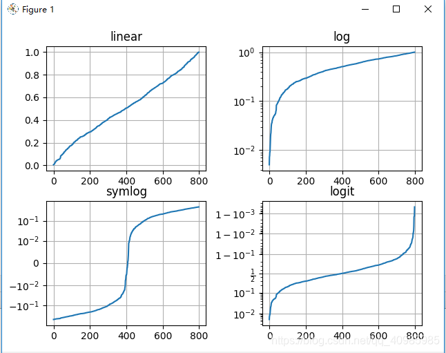
# matplotlib.pyplot 不仅支持线性轴刻度,还支持对数和 logit 刻度

import matplotlib.pyplot as plt
import numpy as np

# 线性轴 对数轴 对称对数轴 logit轴
def logit_plot():
    # 设置种子,以保证随机可重复性显现
    np.random.seed(19680801)

    # 在开区间(0,1)补充一些数据
    # 从正态(高斯)分布中抽取随机样本
    y = np.random.normal(loc=0.5, scale=0.4, size=1000)
    y = y[(y > 0) & (y < 1)]
    y.sort()
    x = np.arange(len(y))

    # 绘制不同坐标轴维度的数据
    plt.figure()

    # 线性
    plt.subplot(221)
    plt.plot(x, y)
    plt.yscale('linear')
    plt.title('linear')
    plt.grid(True)

    # 对数
    plt.subplot(222)
    plt.plot(x, y)
    plt.yscale('log')
    plt.title('log')
    plt.grid(True)

    # symmetric log对称对象轴
    plt.subplot(223)
    plt.plot(x, y - y.mean())
    plt.yscale('symlog', linthresh=0.01)
    plt.title('symlog')
    plt.grid(True)

    # logit
    plt.subplot(224)
    plt.plot(x, y)
    plt.yscale('logit')
    plt.title('logit')
    plt.grid(True)

    # 调整子图的布局,因为logit会占用比其他更多的空间,y在"1 - 10^{-3}"
    plt.subplots_adjust(top=0.92, bottom=0.08, left=0.10, right=0.95, hspace=0.25,
                        wspace=0.35)

    plt.show()

# matplotlib.pyplot 不仅支持线性轴刻度,还支持对数和 logit 刻度
# 线性轴 对数轴 对称对数轴 logit轴
logit_plot()
Recommend
About Joyk
Aggregate valuable and interesting links.
Joyk means Joy of geeK