

Storybook-UXPin: Review of the New Merge Integration
source link: https://www.uxpin.com/studio/blog/review-uxpin-storybook-integration/
Go to the source link to view the article. You can view the picture content, updated content and better typesetting reading experience. If the link is broken, please click the button below to view the snapshot at that time.

Storybook-UXPin: Review of the New Merge Integration
Before releasing the Storybook integration (which is now available fully on paid plan and with public library access on trial), UXPin gave me a chance to try this Merge’s new feature. I decided to share my impressions on how it influenced the designer-developer collaboration in our team.
For reference, UXPin is already a widely used design tool that allows you to design and create prototypes. What sets it apart from other design tools is that it’s code-based, so more flexible, providing a lot of advanced interactions for prototyping. It brings the UI closer to development.
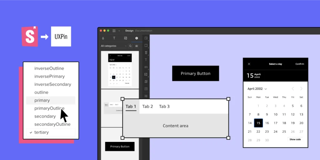
Merge is a part of UXPin – that’s technology providing two main integrations with developers’ tools (Git and Storybook). It allows you to quickly prototype using ready UI code components that are React-based for Git integration, or any framework-based for Storybook integration. We tested the newest Merge integration, with Storybook.
The review was written by Roy S. Kim, the CEO, and Jacobo Moreno Quiroga – Front end engineer & Digital Content Designer from Fixel Inc., the Japanese UX/UI design consulting company specializing in Design Systems.
Trying out UXPin’s Merge and its Storybook integration
I have both an engineering and design background, and I work on a daily basis on finding solutions to processes inside an application and then writing them in code. The designer part comes in handy when I need to consider and improve the user’s perspective. This involves more than defining visual aesthetics, it requires considering how the application interface can be subtle enough for someone to not notice it so that they can focus on what they are trying to achieve in the app.
I usually struggle with the back and forths between iterations of coding that aim to improve user experience.
Those kinds of improvements are not the same as fixing the product because something doesn’t work. It’s more of intuitive work when a user reports that something feels off. Even if you apply all the design and UX good practices, the user could still complain, and they would be 100% right. This is where a coded Design System or an organized UI component library can help. If you have tested and polished the components approved for your Design System, then you can treat them as ready building blocks for new applications without spending too much time thinking or adjusting them.
UXPin with Merge technology allows you to import all your Design System components stored in Git or Storybook to the design editor so that you can prototype with them right away. Thanks to this designers can use actual coded elements to speed up the prototyping. UXPin Merge’s motto is “The single source of truth” because what you see in the prototype is combining design with actual working code that developers use as well.
UXPin – designing to coding
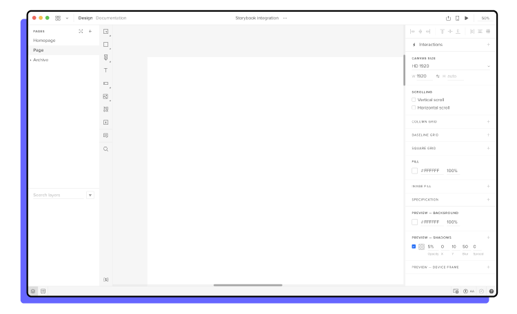
Let’s start with just UXPin. Essentially, UXPin is a UI/UX design tool similar to Sketch, AdobeXD, or Figma. It’s similar to other competitors so you can get used to it very quickly. You can start with wireframing and end with advanced prototyping in this single tool.
In most of the similar tools, there is a big difference between what the designer creates in the design tool and what happens in the dev environment, where the real working product is coded. Features like the inspect tab in Figma enable you to see roughly what the CSS behind a certain object would look like. However, this is not always an accurate depiction between what is designed and what is coded.
Designers and developers essentially come from two different worlds when it comes to the tools used in their daily work. Trying to find a common language between them can lead to way too many meetings and back-and-forths. This might be the very issue that UXPin Merge aims to solve, by having “The single source of truth” which the whole team can treat as the ultimate place of the right components and documentation.
The UXPin Merge approach
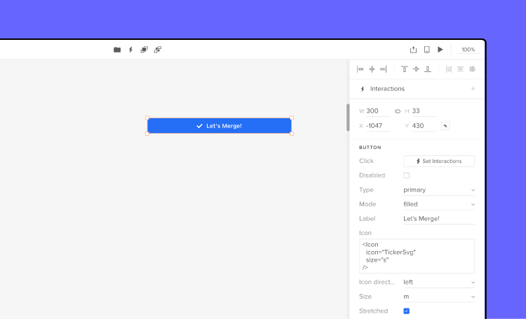
Merge is UXPin’s technology. Essentially, what Merge does is that it brings coded Design Systems stored in Git repositories or Storybooks to UXPin. Hence, a designer can use real components in their mock-ups and prototypes. These components are already coded in the repository, and the designer can access its different versions inside UXPin as needed. This way, the integrity of each component is never compromised. It minimizes possibilities for a designer to make mistakes and use elements that aren’t in line with the company’s standards.
Once you have a Design System and repositories ready to go, you won’t be really modifying them often as their purpose is to store and unify all the versions of the possible elements to speed up the product development process and create governance. So, using UXPin Merge and the imported components, controls the design process as elements are predefined. The changes can be made without a problem but it must be done by developers, so that the chances for casual mistakes are pretty low.
These limitations actually simplify the work of a designer. They can use fully interactive and prepared elements to focus on the most crucial part – user experience. Sure; color, padding, fonts, and other visual elements are important parts of the experience, but choosing every single little detail can slow down the process. If all of that is already sorted out in the Design System and repositories, building prototypes with real code components gets easier and faster. Also, it helps keep the consistency even if the components get updated in code as the imported UI is in sync with the components stored in devs’ libraries. No need to worry that elements will be outdated and designers will have to redesign the projects.
Connecting Storybook
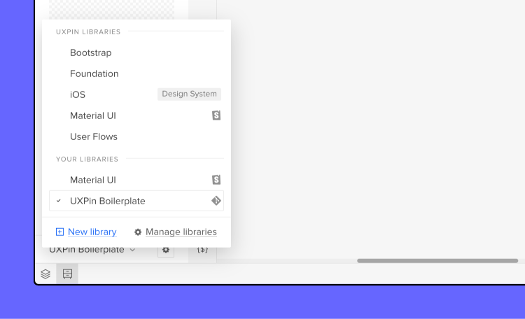
One of the UXPin Merge integrations I got to see was Storybook. Storybook serves as a sort of developers’ Design Systems to store all the coded UI. It is used by many companies, and it’s very flexible framework-wise as it provides support for around 15 of them. Now, for teams that are not supported by developers, setting up a Storybook project and placing all the components there may be a struggle. However, once it’s ready, it neatly holds and displays all the components that are in the Design System.
UXPin Merge aims to bring what is stored and defined in Storybook to UXPin so that components made in whichever framework can be used for prototyping. The integration part is very simple; grab the URL of a published Storybook project to import the components to the UXPin library for designing. I tested it and it seemed to work perfectly with React components – all the elements behaved in the design editor just as they should.
Thoughts for the future
The design process including UXPin Merge in it can be visualized like this:
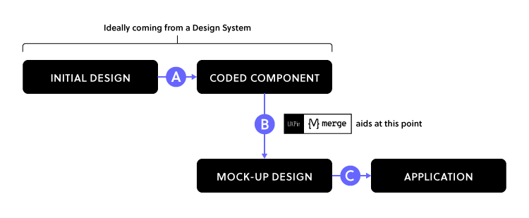
UXPin Merge plays a big part in Step B since it provides production-ready UI-coded components that you can use to iterate faster when creating prototypes. With a defined Design System or a component repository, you really shouldn’t worry about Step A because you most probably already have the organized components. Still, there is a possibility that you need to adjust something within the coded components, especially if you are in the middle of creating your own Design System.
With Step C, which is the build-up step of the application, the developers look at the Merge prototype to see how code components are put together, as well as what code corresponds to which part of the design. However, they won’t just copy and paste the whole code to build the product instantly – they will still need to adjust it so that the prototype becomes a product.
UXPin Merge seems to be a great solution for rapid prototyping and keeping the consistency thanks to making the most of Design Systems. However, it appears that certain steps are still to be covered.
To some extent, the work of designers is limited as they mostly can use pre-prepared components, however, it saves time and prototyping with code components brings the world of design and development together.
Want to try out the integration? Sign up for a 14-day trial!
Found this useful? Share with
by Roy S. Kim and Jacobo Moreno Quiroga on 13th August, 2021
Roy S. Kim is the CEO and Jacobo Moreno Quiroga,- the Front end engineer/Digital content designer of Fixel Inc., A Japanese UX/UI design consulting company specializing in Design Systems.
Recommend
About Joyk
Aggregate valuable and interesting links.
Joyk means Joy of geeK