

Celebrating the legacy of Kamekura Yusaku’s iconic Tokyo 1964 Olympics identity
source link: https://www.itsnicethat.com/features/kamekura-yusaku-tokyo-1964-olympics-identity-graphic-design-040821?ref=sidebar
Go to the source link to view the article. You can view the picture content, updated content and better typesetting reading experience. If the link is broken, please click the button below to view the snapshot at that time.

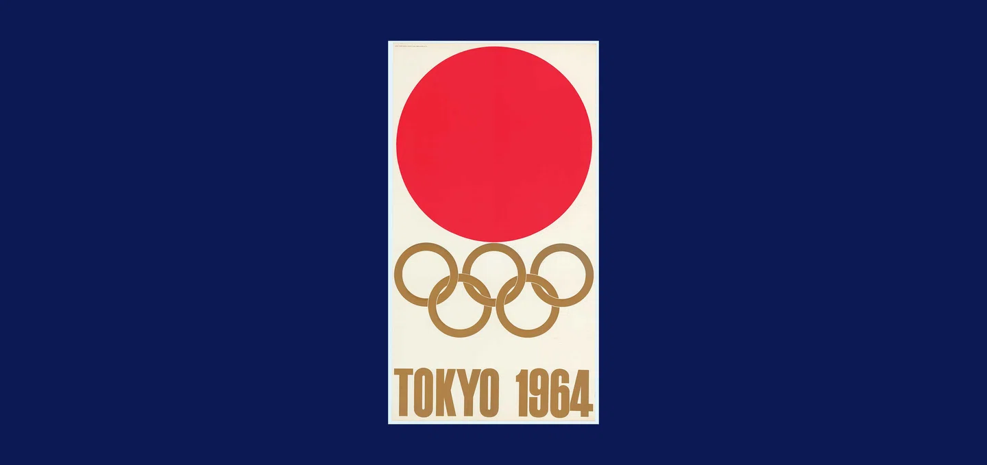
A large red circle on a white background hovers above five golden interlinked rings and a bold, gold sans serif typeface that reads “Tokyo 1964”. It couldn’t be simpler. Or more powerful. It is, of course, Kamekura Yusaku’s iconic logo for the Tokyo 1964 Summer Olympics – a starkly modernist emblem heralded as a beacon of innovative graphic design since it was first presented to the world in 1961.
Kamekura’s symbol, along with an array of ground-breaking designs, feature in Tokyo 1964: Designing Tomorrow, an exhibition at Japan House London exploring the pioneering design strategy of these historic Games and its lasting legacy. As the 2020 Olympics are underway in Tokyo, the show looks back on the visual identity created in the first Tokyo Games, which have reverberated through the design world. For Simon Wright, curator and programme director at Japan House, it “seemed obvious to go back to that revolutionary time,” to reflect on the importance of design on Japanese society and on the branding of the Olympics. “The design of these Games influenced every international sporting tournament since, from the pictograms to the idea of a brand,” he says.

Tokyo Olympic Games Art Exhibition Poster – National Folk Art Festival, 17-18 October. Tokyo Bunka Kaikan

The 1964 Summer Games marked many graphic design firsts: a set of sports and informational pictograms; a cohesive identity scheme through a design guide; and a modernist vision championed by Kamekura. Regarded as the father of Japanese graphic design, Kamekura was a torchbearer for modernism, his work having a lasting cultural impact on design both in and beyond Japan. He was pivotal in establishing the Japan Advertising Arts Club (1951), the Japan Graphic Designers Association (1978) and the Nippon Design Centre in 1959. He set a new standard for the design of the Olympic Games, earning him and his colleagues international recognition. Where other designers had only peeked through the doors of modernism in their work, Kamekura yanked them wide open with the world-renowned visual identity he created for the Games.

The first of four posters he created, it effortlessly combined Japanese iconography with modernist aesthetics. In graphic design terms, it’s a gold medal – a masterpiece of modernism that remains fresh to this day for clearly communicating Japan and the Olympics. Kamekura was among six graphic designers, including Tanaka Ikko and Nagai Kazumasa, invited to submit proposals for the logo. According to Nagai, Kamekura forgot about the competition deadline and dashed out his design in a couple of hours. It was chosen unanimously, instantly catching the eye of his colleagues and, later, the design world. The red circle’s resemblance to the Hinomaru on the Japanese flag was seen as helping to galvanise a spirit of nationalism in post-war Japan, but for Kamekura the red sun signified the passion and excitement of the Games.
Kamekura’s creative upbringing was influenced by the Bauhaus, reflected in his three subsequent posters, which were the first Olympic posters to use photography. Revered as one of the most seminal achievements in post-war Japanese design, they eschewed traditional illustrations for modernist compositions that combined typography and imagery to compelling effect.

“They were quite cutting-edge and challenged the process of photography in order to create the right look,” says Simon. The second poster, released in May 1962, was a full-bleed photograph depicting a line of athletes shooting off from the starting block against a sharp black background and that striking gold typeface emblazoned below. The photo used American servicemen who were stationed at the Tachikawa airbase as models, alongside amateur Japanese athletes. Its technical mastery is in the painstaking process it took to get the final dynamic image – at the time, blacking out the background digitally wasn’t an option (Photoshop had yet to be born). The shoot took place in the National Stadium on a cold February evening over three hours, with the six runners making around 80 staggered false starts before photographer Hayasaki Osamu captured the perfect shot.
The final two posters, Butterfly Swimmer and Torch Bearer were equally technically complex and celebrated as totems of progressive design. The posters were in multi-colour photogravure, showcasing the technical advancement of Japan’s printing industry, and received numerous awards.
Tokyo 1964’s design committee also hurdled over the language barrier that the Games presented with the introduction of pictograms. These Olympics were seen as a turning point for Japan, not only as the first Games to be held in Asia but as Japan’s re-emergence onto the world stage after the Second World War. The organisers recognised that design could play a crucial role in building the country’s economy and reshaping its image as a trailblazer in technology and visual communication.
Enter pictograms. Tokyo 1964 was the first international sporting event to use a coordinated set of pictograms devised to communicate with international visitors who couldn’t speak Japanese. A team of designers created 39 facilities pictograms, inspired by Austrian graphic designers Otto Neurath and Gerd Arntz’s isotypes, while Yoshiro Yamashita’s 20 sports symbols helped visitors seek out specific events.
They created a new universal language and forged a path for others to evolve the same concept. Otl Aicher’s iconic symbols for the Munich 1972 Games are perhaps the most globally recognised and used (such as the signs for men and women on public toilets), owing their streamlined aesthetic to their Japanese predecessors. Later iterations incorporated aspects of the host city’s heritage, such as the Lillehammer 1994 Olympics. These told a cultural story, their design based on 4,000-year-old Norwegian rock paintings found in a cave representing a skier. Athens took the baton a decade later, drawing on Cycladic and Ancient Greek figures for their icons, followed by Beijing in 2008 with pictograms that also referenced ancient carvings and cleverly resembled Chinese writing.
Fast forward to today’s events where Tokyo 2020 has revolutionised the use of pictograms once again, introducing the first-ever animated versions in the Olympics’ history. The opening ceremony even paid tribute to the 1964 pictograms with a dance sequence acting out each of the sports.


The design principles of the Tokyo Games “spread across the whole palette of the Olympics,” says Simon, and feature in various ways in the exhibition. Take the pioneering architecture of the Yoyogi National Gymnasium by Kenzo Tange, a model of which is on display in Japan House alongside the chic staff uniforms, each one with a block colour and minimalist aesthetic that would fit perfectly in a hipster shop today (“you could easily sell them in Shoreditch,” agrees Simon). Other design highlights, from the commemorative medals to the craftsmanship of the tickets, are also documented.
These pieces of pioneering design coalesced to create a unique visual personality for the Tokyo 1964 Games as the first modernist Olympiad. They demonstrated what design could be, owing much of this to Kamekura’s forward-thinking visual philosophy, in which he set about – as the exhibition name highlights – to design tomorrow. To Simon, the brilliance of Kamekura’s designs paired with the universality of the pictograms have “kept the 1964 Games enduring in the hearts of designers and all of us around the world ever since.”

Recommend
-
84
Samsung has produced more than 4,000 special edition Galaxy Note 8s to hand out to Olympics participants at the upcoming event.
-
7
Preamble¶ :dep darn = {version = "0.3.0"} :dep nda...
-
3
Business TransformationIn the face of COVID-19, the Tokyo Olympics make a bold choiceWith the much-anticipated 2020 Olympics now on the horizon, T...
-
8
Home Chevron iconIt indicates an expandable section or menu, or sometimes previous / next navigation options.
-
8
Nike brings hands-free entry shoes to the Olympics with the Glide FlyEase As part of the Medal Stand outfit, they’re putting a spotlight on accessibility. ...
-
2
Video game music Japan’s most iconic games opens the Tokyo OlympicsBy Gene ParkReporter July 23...
-
1
Apr 25, 2022 eBay for Charity Celebrating a Legacy of Commitment Press Release GLIDE...
-
4
-
3
Iconic icons: Celebrating design’s nifty little helpersThe power of iconography in our everyday livesPublished in
-
5
The Family Business: Celebrating America’s LegacyThe invention is as old as humanity. It’s older than religion, older than the pyramids, the Great Wall of China, older than the first written word. When exactly? Nobody knows. In fact...
About Joyk
Aggregate valuable and interesting links.
Joyk means Joy of geeK