

Replicating Fashion UI in Xamarin Forms
source link: https://askxammy.com/replicating-fashion-ui-in-xamarin-forms/
Go to the source link to view the article. You can view the picture content, updated content and better typesetting reading experience. If the link is broken, please click the button below to view the snapshot at that time.

Replicating Fashion UI in Xamarin Forms
 In this case we are going to replicate a Fashion UI App obtained from Dribble. You can check the design here! Previously I created an article on how to start creating this UI, thinking about how to divide the rows and columns, I recommend you take a look, the name is “Getting started with a UI and not die trying in Xamarin Forms”.
 Before starting, to get the best out of the post, I’ll leave you some instructional notes so that you have a better experience reproducing the UI:
 At the beginning, you will see an image with the original UI where you will see divided into blocks as we’ll be working on each part of the design. Each block presents the image with the design explicitly that we’ll be working on that block, they are highlighted in a box. In each of the code blocks, you can see a comment that says: “Here add the code that is being explained in the next block“. To keep you as focused as possible, this part indicates to you that the next block code explanation goes right where the comment line is added. I will not be using styles so that the properties added to the various components can be seen and understood faster in the explanation process.
Let’s start!
Let’s divide the original design into blocks
To better understand, I have divided the original design into blocks, which are listed in the order in which we will be reproducing each one, these are:

First of all…
We will be using Xamarin Community Toolkit  . So, be sure to include the following steps in the screen developed below:
 Add from NuGet Package the plugin: Xamarin.CommunityToolkit

Then, add the following namespace:
xmlns:xct="http://xamarin.com/schemas/2020/toolkit"

 .
.
Let’s start with the first screen, to do it we need to define the main structure, we will be based on our previous article named Getting started with a UI and not die trying in Xamarin Forms.
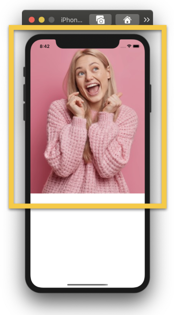
Additionally, we need to add the main image in our screen.
<Grid RowDefinitions="*,Auto"> <!-- 1. Main image --> <Image Grid.Row="0" Source="Model3" Aspect="AspectFill" /> <!-- Here add the code that is being explained in the next block -->
</Grid>

 Now, let’s create the Description block which is composed by the following components:
Title & Box mark
Description
Rounded Button
Title & Box mark: I like this little effect! In this case, we are going to achieve a title with two different styles which have a decoration behind a pink Box!
For the title, we will use a single label with the FormattedText and for the mark behind we will use a BoxView.
<!-- 2. Description--> <Frame Grid.Row="1" Margin="0,-35,0,25" CornerRadius="30" HasShadow="False"> <Grid RowDefinitions="Auto,Auto,*"> <!-- Box mark--> <BoxView Grid.Row="0" WidthRequest="{OnPlatform iOS='100', Android='80'}" BackgroundColor="{StaticResource MainColor}" HorizontalOptions="End" Rotation="-3" Margin="{OnPlatform iOS='0,8,55,0', Android='0,0,55,0'}" VerticalOptions="Start"/> <!-- Title--> <Label Grid.Row="0" LineHeight="1.5" FontAttributes="Bold" VerticalOptions="Start" HorizontalTextAlignment="Center" FontSize="{OnPlatform iOS='25', Android='20'}"> <Label.FormattedText> <FormattedString> <Span Text="Find The Best "/> <Span Text=" Fashion " TextColor="White"/> <Span Text=" Style For You"/> </FormattedString> </Label.FormattedText> </Label> <!-- Here add the code that is being explained in the next step -->
</Grid> </Frame>
The next step contains Description & Rounded Button! Note that we have a shadow for the Button, to edit we will be using Xamarin Community Toolkit!
<!-- Description--> <Label Grid.Row="1" Text="Platform that provides many kinds of the best and most trusted fashion styles. " FontAttributes="Bold" TextColor="#9fa2a8" FontSize="{OnPlatform iOS='18', Android='15'}" LineHeight="1.4" Margin="30,0" HorizontalTextAlignment="Center"/>
<!-- Rounded Button--> <Button Grid.Row="2" BackgroundColor="{StaticResource MainColor}" CornerRadius="33" HeightRequest="66" WidthRequest="66" ImageSource="Arrow" xct:ShadowEffect.Color="{StaticResource MainColor}" HorizontalOptions="Center" VerticalOptions="Center" Margin="0,0,0,15"/>


Let’s continue with the second screen, working with the Header Block.
First, let’s start with the main layout structure that we will be using!
<ScrollView> <!-- Main layout--> <Grid RowDefinitions="Auto,Auto,Auto,*,Auto,Auto" ColumnDefinitions="*,Auto" VerticalOptions="StartAndExpand" Padding="30,60,30,15"> <!-- Here add the code that is being explained in this block -->
</Grid> </ScrollView>
The block is composed by the following components:
Profile picture
Welcome & Name
Bell
Search & Action Button
<!-- 3. Header--> <Grid Grid.Row="0" Grid.ColumnSpan="2" RowDefinitions="Auto,Auto" ColumnDefinitions="Auto,*"> <!--Profile picture--> <ImageButton Grid.Column="0" Grid.RowSpan="2" Source="Women" HeightRequest="50" WidthRequest="50" HorizontalOptions="Start" BackgroundColor="#f1f0f4" CornerRadius="10"/> <!--Welcome & Name--> <Label Grid.Column="1" Grid.Row="0" Text="Welcome" TextColor="Silver" FontAttributes="Bold" Margin="20,0,0,0"/> <Label Grid.Column="1" Grid.Row="1" Text="Mariona Putri" FontAttributes="Bold" Margin="20,0,0,0"/> <!--Bell--> <Image Grid.Column="2" Grid.RowSpan="2" VerticalOptions="Center" HorizontalOptions="End" Source="Bell" TranslationX="-10"/> </Grid>
<!--Search & Action Button--> <SearchBar Grid.Column="0" Grid.Row="1" Margin="-5,10,0,10" BackgroundColor="Transparent"/> <Button Grid.Column="1" Grid.Row="1" BackgroundColor="{StaticResource MainColor}" CornerRadius="9" VerticalOptions="Center" HorizontalOptions="End" WidthRequest="50" ImageSource="List"/>
<!-- Here add the code that is being explained in the next block-->

 .
.
Finally, we are going to create a horizontal list with the Popular Fashion information. To achieve this, we will use a CollectionView.
This list of details will be broken down into the following data:
Profile picture
Description
Price
Like button
If you want to know more information about CollectionView, you can enter here.
<!-- 4. Popular--> <Label Grid.Column="0" Grid.Row="2" Text="Popular Fashion" TextColor="#858788" FontSize="20" FontAttributes="Bold" /> <Label Grid.Column="1" Grid.Row="2" Text="View All" HorizontalTextAlignment="End" FontAttributes="Bold" TextColor="Silver" VerticalTextAlignment="Center"/> <CollectionView Grid.ColumnSpan="2" Grid.Row="3" HorizontalScrollBarVisibility="Never" ItemsSource="{Binding popularFashion}" Margin="-20,0,-25,0" ItemsLayout="HorizontalList" HeightRequest="380"> <CollectionView.ItemTemplate> <DataTemplate> <StackLayout Padding="2,10,20,30"> <Frame Padding="20,10,20,30" WidthRequest="220" HeightRequest="320" VerticalOptions="FillAndExpand" CornerRadius="20" HorizontalOptions="Start" HasShadow="False" xct:ShadowEffect.Color="Silver" xct:ShadowEffect.OffsetY="10"> <Grid RowDefinitions="*,Auto,Auto" ColumnDefinitions="*,Auto"> <Frame Grid.ColumnSpan="2" Grid.Row="0" IsClippedToBounds="True" CornerRadius="25" HasShadow="False" Padding="0" xct:ShadowEffect.Color="Silver" xct:ShadowEffect.OffsetY="12"> <Image Source="{Binding Picture}" Aspect="AspectFill" /> </Frame> <Label Grid.Column="0" Grid.Row="1" Text="{Binding Name}" FontAttributes="Bold" Padding="0,10,0,0"/> <Label Grid.Column="0" Grid.Row="2" Text="{Binding Price}" TextColor="{StaticResource MainColor}" FontAttributes="Bold"/> <Button Grid.Column="1" Grid.Row="1" Grid.RowSpan="2" ImageSource="Heart" HorizontalOptions="End" WidthRequest="35" HeightRequest="35" CornerRadius="8" VerticalOptions="Center" BackgroundColor="{StaticResource MainColor}"/> </Grid> </Frame> </StackLayout> </DataTemplate> </CollectionView.ItemTemplate> </CollectionView>
<!-- Here add the code that is being explained in the next block-->


Finally, let’s create the recommended list, also using a CollectionView!
<!--5. Recommended-->
<Label Grid.Column="0" Grid.Row="4" Text="Recommended" TextColor="#858788" FontSize="20" FontAttributes="Bold" />
<Label Grid.Column="1" Grid.Row="4" Text="View All" HorizontalTextAlignment="End" FontAttributes="Bold" TextColor="Silver" VerticalTextAlignment="Center"/>
<CollectionView Grid.ColumnSpan="2" Grid.Row="5" Margin="-20,20,-25,0" HorizontalScrollBarVisibility="Never"
ItemsSource="{Binding recommended}"
ItemsLayout="HorizontalList"
HeightRequest="150">
<CollectionView.ItemTemplate>
<DataTemplate>
<StackLayout>
<Frame Margin="0,0,10,0" HasShadow="False" CornerRadius="20" xct:ShadowEffect.Color="Silver" xct:ShadowEffect.OffsetX="10">
<Grid RowDefinitions="Auto,Auto,Auto" ColumnDefinitions="Auto,*,Auto">
<Frame Grid.Column="0" Grid.RowSpan="3" Margin="0,0,20,0" VerticalOptions="CenterAndExpand" WidthRequest="75" HeightRequest="85" HasShadow="False" CornerRadius="10" Padding="0" IsClippedToBounds="True">
<Image Source="{Binding Picture}" Aspect="AspectFill"/>
</Frame>
<Label Grid.Column="1" Grid.Row="0" Text="{Binding Name}" FontAttributes="Bold"/>
<Label Grid.Column="1" Grid.Row="1" Text="{Binding Description}" TextColor="Silver" FontAttributes="Bold"/>
<Label Grid.Column="1" Grid.Row="2" Text="" FontSize="13" />
<Image Grid.Column="2" Grid.RowSpan="3" Source="DetailsArrow"/>
</Grid>
</Frame>
</StackLayout>
</DataTemplate>
</CollectionView.ItemTemplate>
</CollectionView>

 .
.

Tagged AskXammy, Replicating UI, UI, Xamarin, Xamarin Forms
Recommend
About Joyk
Aggregate valuable and interesting links.
Joyk means Joy of geeK