

Aligning a Button Label Vertically
source link: https://ishadeed.com/article/button-label-alignment/
Go to the source link to view the article. You can view the picture content, updated content and better typesetting reading experience. If the link is broken, please click the button below to view the snapshot at that time.

Aligning a Button Label Vertically
At some time in the past, you were given a design mockup to implement. The designer used a new cool font, and it looks perfect in the design. Once you import it and use it in CSS, you will notice additional spacing around the font. What is that? And why the designer did pick such a font in the first place?
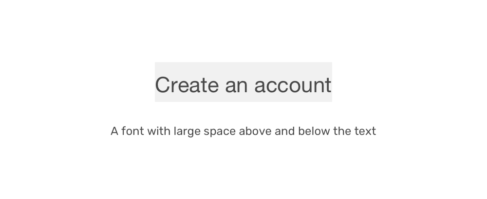
Well, this issue is related to the font itself. Each font has a different line-height and that comes with a different spacing above and below the text.
Introduction
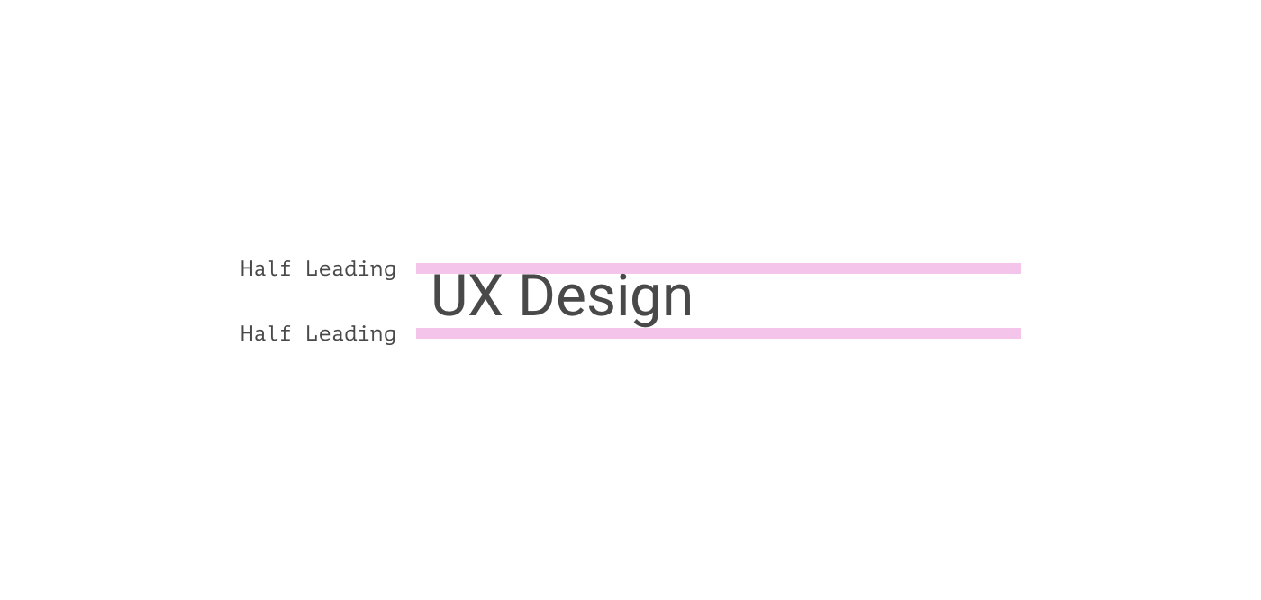
Each font has something called leading which means the space between lines of text. In CSS, it’s line-height.
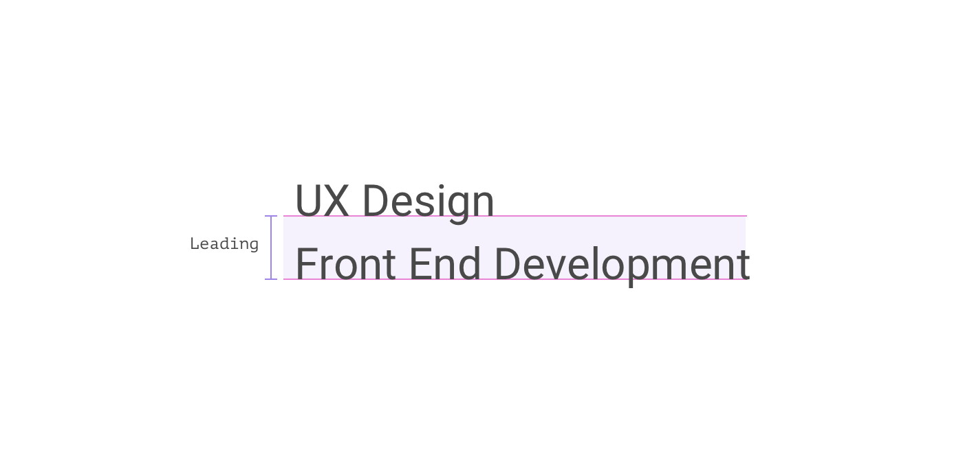
In the figure above, the spacing between the baseline of the second line and the first line is the leading. In CSS, this is done by adding space above and below each line, and it’s called Half Leading.
Each font has a default line-height, and then the author can also add a larger line-height in CSS if needed. This can cause spacing problems in some fonts.
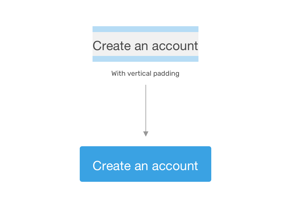
Consider the following figure.
The spaces are perfect and well-measured in the design tool. When the developer implements this in CSS, things will start to look inconsistent.
Currently, there is no fix for this unless you want to use different top and bottom spacing values (e.g: padding or margin), but that won’t work for all fonts and it’s a process that will take too much time.
There is a hope that a new property called leading-trim will fix that, but it’s not supported in any browser at the time of writing this article. You can read more about it here.
The Magic Fix
As a part of my daily curiosity, I was inspecting Facebook’s messenger page and noticed an interesting bit. The primary button has a pseudo-element with zero width and a height of 20px.
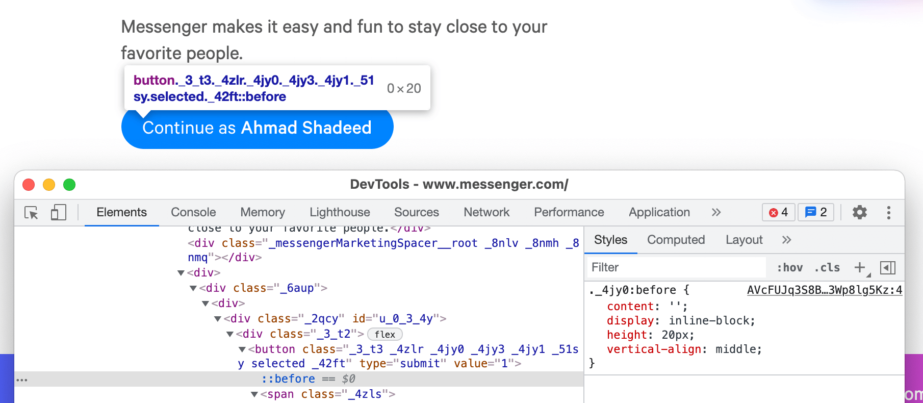
Let me show the issue first.
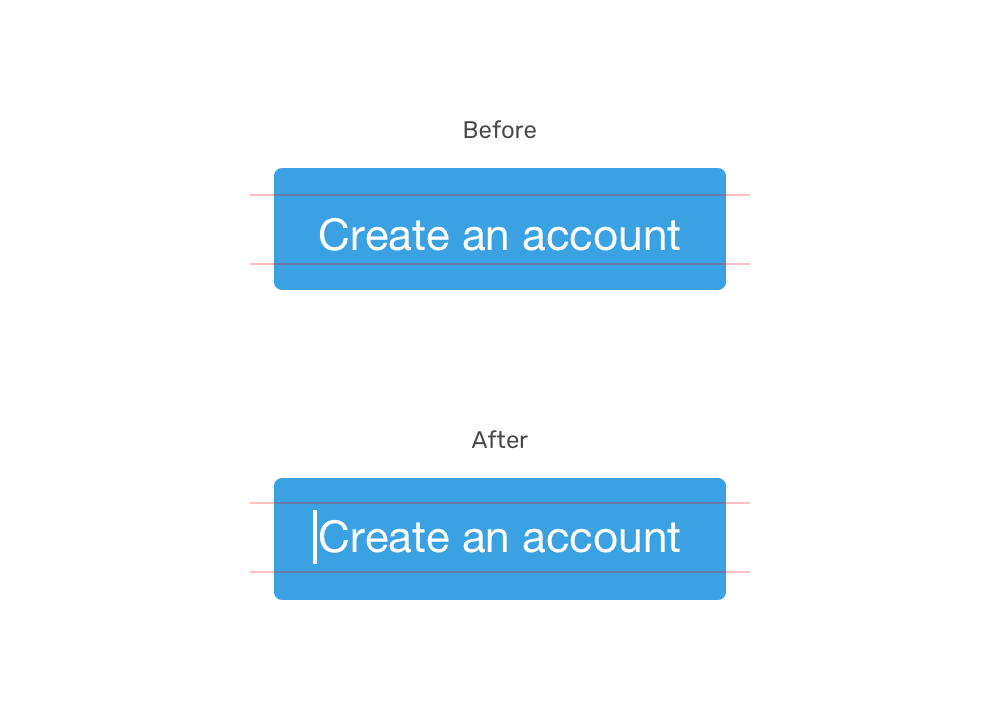
A font with consistent spacing is used. In the following figure, the grey area represents the font height itself without any padding.
When we add padding, it will look even worse. See the following figure:
To fix that, we need to add a fake element next to the button’s TextNode. Here is the HTML:
<a href="/sign-in" class="button">Sign in</a>
The text “Sign in” is considered a text node, and when a pseudo-element is placed next to it, we can use vertical-align: middle to center both.
.button:before {
	content: "";
	display: inline-block;
	height: 16px;
	vertical-align: middle;
}
It works! The only downside is that we need to set the height carefully to get a good result. With all that, it’s a much better solution than setting the padding manually like the following:
.button {
	padding: 11px 8px 18px 8px;
}
Have you run across a similar issue? If so, what did you use to fix it? Share your thoughts via Twitter @shadeed9.
More articles
Previous Article
Thinking About The Cut-Out Effect: CSS or SVG?Subscribe to my RSS feed
Subscribe to the newsletter
Get the latest CSS articles published by Ahmad Shadeed, a UX Designer and Front End Developer.

Ahmad Shadeed
UI, UX Designer & Front-End Developer. You can hire me. I Write about web accessibility on @weba11ymatters and share articles on my blog.
Recommend
About Joyk
Aggregate valuable and interesting links.
Joyk means Joy of geeK