

Thinking About The Cut-Out Effect: CSS or SVG?
source link: https://ishadeed.com/article/thinking-about-the-cut-out-effect/
Go to the source link to view the article. You can view the picture content, updated content and better typesetting reading experience. If the link is broken, please click the button below to view the snapshot at that time.

Thinking About The Cut-Out Effect: CSS or SVG?
In a recent front-end project, one of the components included an interesting cut-out effect. There are multiple ways to do such an effect in CSS or SVG, but each way has its pros and cons. I thought about exploring the solutions for this challenge and share them with you.
To follow along with the article, you need to have basic CSS and SVG knowledge. If not, it’s totally fine as I will try to explain everything in detail.
Let’s dive in!
Introduction
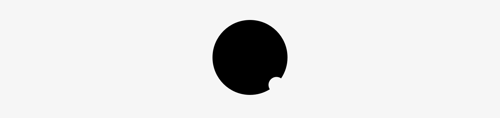
First, let me show you what I mean by the cut-out effect. It’s about cutting an area of a shape. Here is an example:
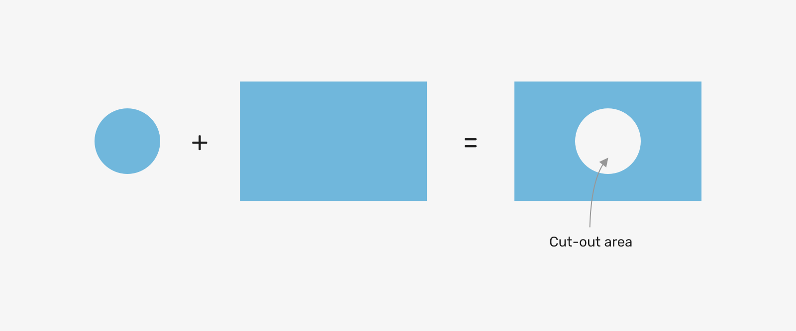
Notice that we cut a hole by subtracting the circle from the rectangle. In design apps, this is simple to do. However, when it comes to implementing similar effects on the web it can get a bit challenging for different reasons:
- We might need to toggle the cut out via JavaScript
- It might contain an image or text
- Adding borders or shadows can be challenging
In the next few sections, I will explore different examples and how we can implement the cut-out effect in them using CSS or SVG.
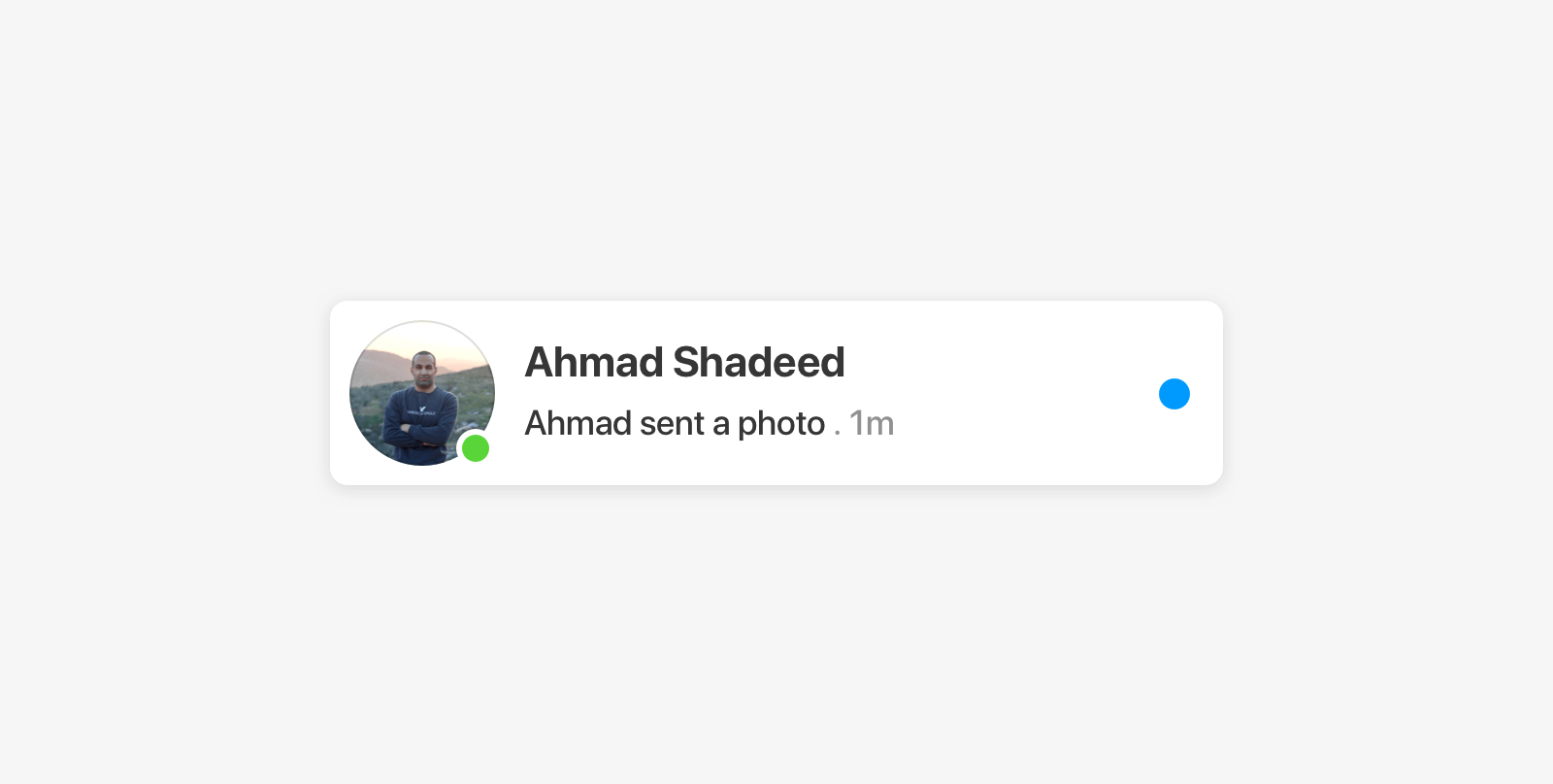
User Avatar
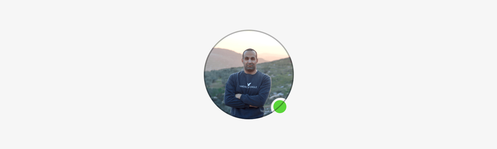
This is a real example taken from Facebook messenger. The user avatar can have a green badge indicating that a user is currently online. Let’s take a look at it:
I know what you’re thinking. We can add a white border to the green badge and call it a day, right? Hmm, that’s not the case here. In dark mode, it will look like this.
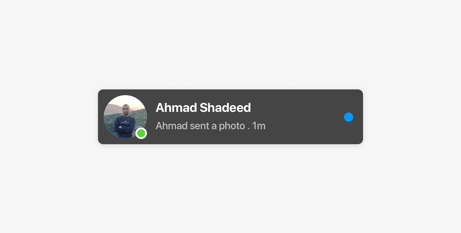
Also, it can fail for background color changes (e.g: hover effects.
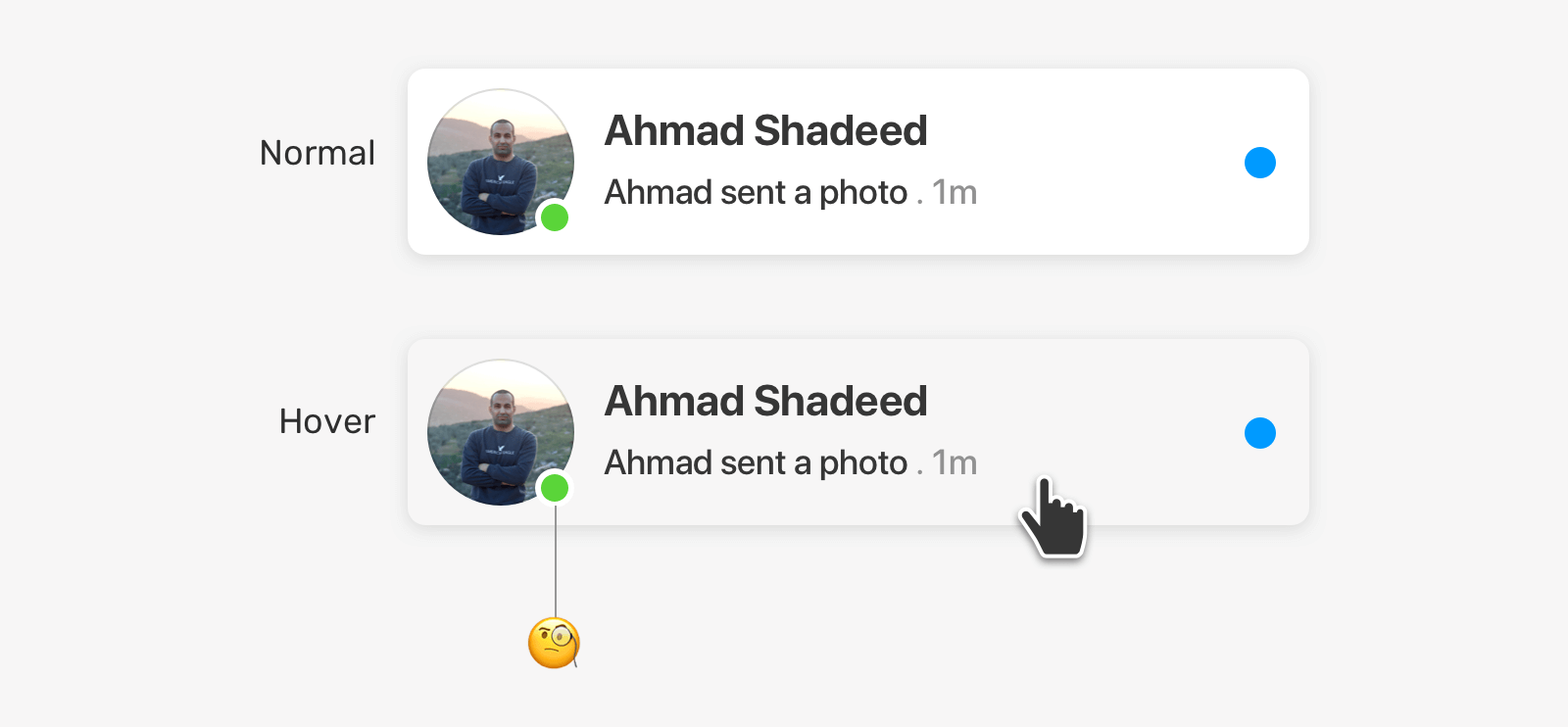
Again, it’s possible to change the badge’s border to match the background, but that’s not the best solution. Let’s explore what we have.
Solution 1 - Clip Path
This solution uses a mix of SVG and CSS. First, we need to make a path and export it as SVG. You can do this in the design app that you use and export it as SVG. For me, I used Figma.
After that, we need to copy the path values and convert them to relative units. By default, SVG path points are absolute. That means, they can stretch if the width and height change. To fix that early on, we can use this great tool.
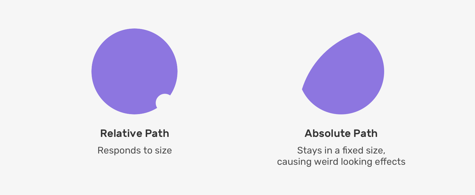
Then, the path should be added to an inline SVG in the page as a <clipPath>.
<svg class="svg">
    <clipPath id="circle" clipPathUnits="objectBoundingBox"><path d="M0.5,0 C0.776,0,1,0.224,1,0.5 C1,0.603,0.969,0.7,0.915,0.779 C0.897,0.767,0.876,0.76,0.853,0.76 C0.794,0.76,0.747,0.808,0.747,0.867 C0.747,0.888,0.753,0.908,0.764,0.925 C0.687,0.972,0.597,1,0.5,1 C0.224,1,0,0.776,0,0.5 C0,0.224,0.224,0,0.5,0"></path></clipPath>
</svg>
The value objectBoundingBox for the clipPathUnits attribute means that the values inside the path are relative to the bounding box of the element that the clip-path is being applied to.
.item {
    clip-path:url("#circle");
}

That’s great. How this will work in case we want to include an inner border for the image? This will serve as a fallback in case the user uploads a bright image.
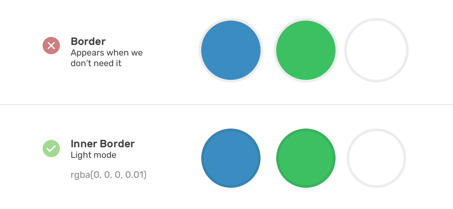
Unfortunately, it’s not possible to add an inner shadow for an <img>. To work around that, we can either use an additional HTML element (e.g: span) or a pseudo-element.
I will go with the pseudo-element.
.item:after {
    content: "";
    position: absolute;
    left: 0;
    top: 0;
    width: 100%;
    height: 100%;
    border-radius: 50%;
    border: 1px solid;
    opacity: 0.2;
}
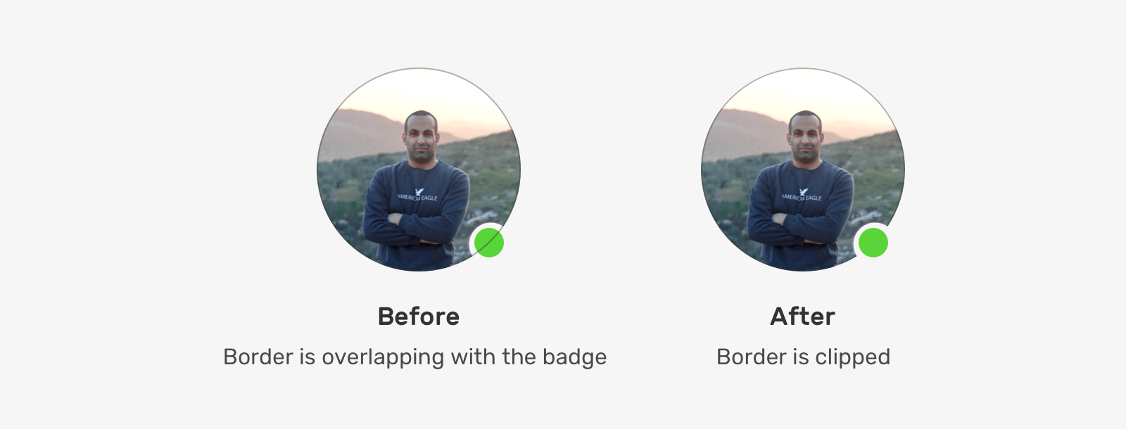
Oops, what’s happening? The border is appearing where it shouldn’t be. We can apply clip-path again and it should work as expected.
.item:after {
    /* other styles */
    clip-path:url("#my-clip-path");
}
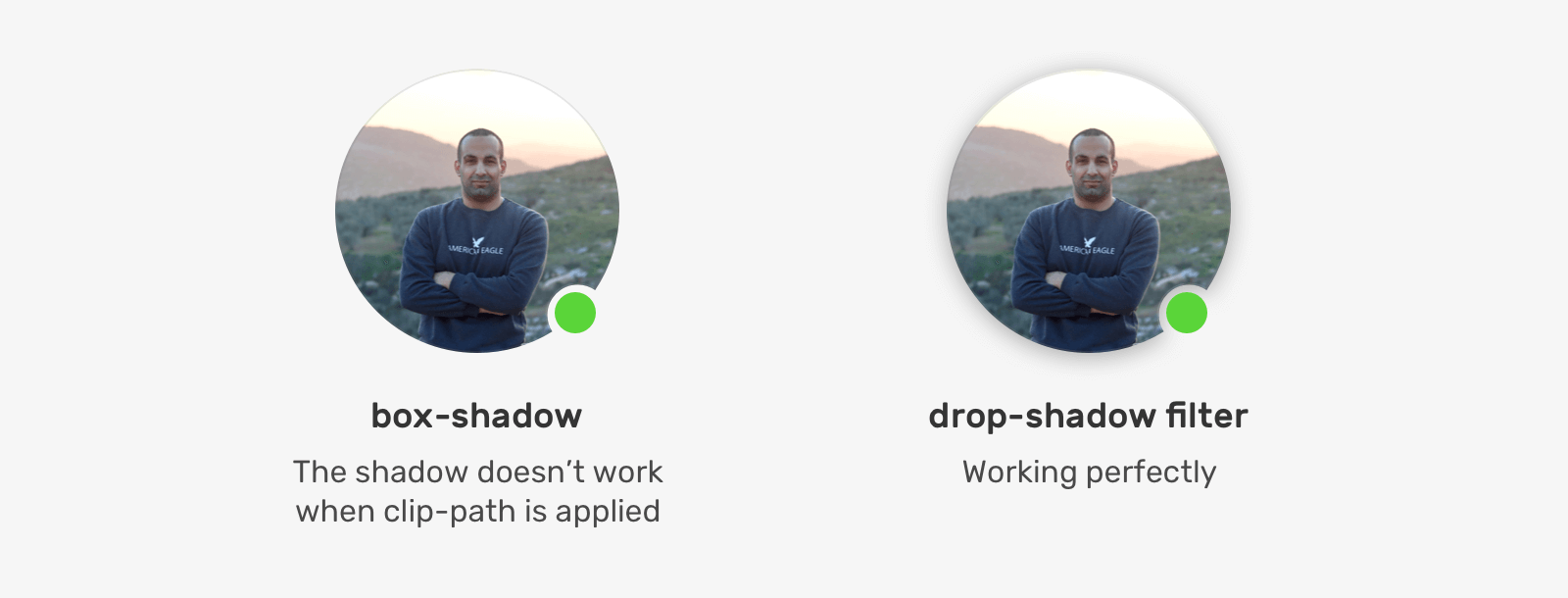
The final thing that I want to explore is the ability to add a shadow. It’s possible by using CSS drop-shadow filter and the great thing is that it will follow the cut-out shape of the avatar.
- Cross-browser, works on all major versions of Chrome, Edge, Firefox, and Safari.
- Good for very basic examples. It can get complex with borders or shadows.
- To remove the cut-out effect, we need to change the path. This can be hard to do in a component with different states.
- It needs some experience in dealing with merging shapes in a design app.
Solution 2 - CSS Mask
It’s possible to make the cut-out effect using a combination of CSS masks and gradients. Let’s explore how.
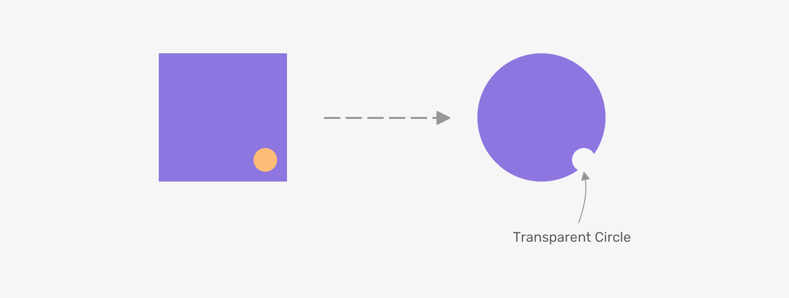
By using a radial-gradient, we can draw a circle and then fill the rest of the space with another color. Consider the following figure:
.item {
    background-image: radial-gradient(circle 20px at calc(100% - 30px) calc(100% - 30px), yellow 30px, purple 0);
}
Next, we need to change the circle color to transparent and add border-radius to the element.
.item {
    background-image: radial-gradient(circle 20px at calc(100% - 30px) calc(100% - 30px), transparent 30px, purple 0);
    border-radius: 50%;
}
Based on that, we can use it as a CSS mask as below.
.item {
    -webkit-mask-image: radial-gradient(circle 20px at calc(100% - 30px) calc(100% - 30px), transparent 30px, purple 0);
    border-radius: 50%;
}
With this solution, it’s possible to add an outer border as it will be masked within the shape. However, for an inner border (AKA: inset shadow), it’s not possible until we use another element for that, just like the previous solution.
- Cross-browser, but needs the vendor prefix all browsers except Firefox.
- Can be limited or complex in other examples
Solution 3 - SVG Mask
First, let me explain how the SVG mask works. We need to create the mask, and then apply it somewhere within the SVG itself. Consider the following example.
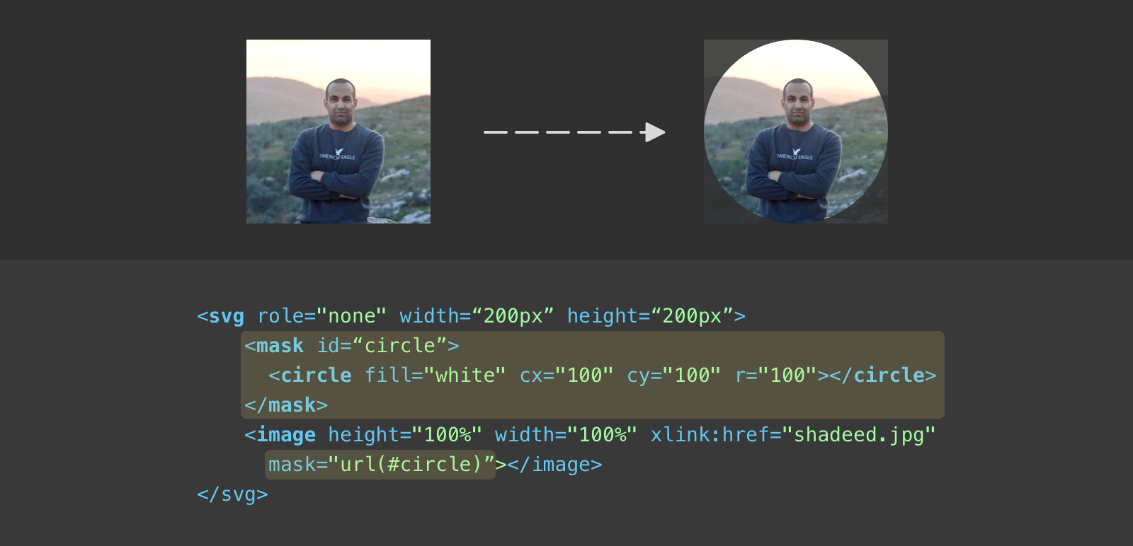
It’s simply an image that is being masked in a circle. In SVG, it’s different (syntax-wise) than CSS masks. Let’s analyze the above code:
- First, we have a
<mask>element that contains a circle. - The mask is being applied to the
<image>element. In SVG, it can be anything like a group<g>, for example.
Let’s try to add another little circle to the mask.
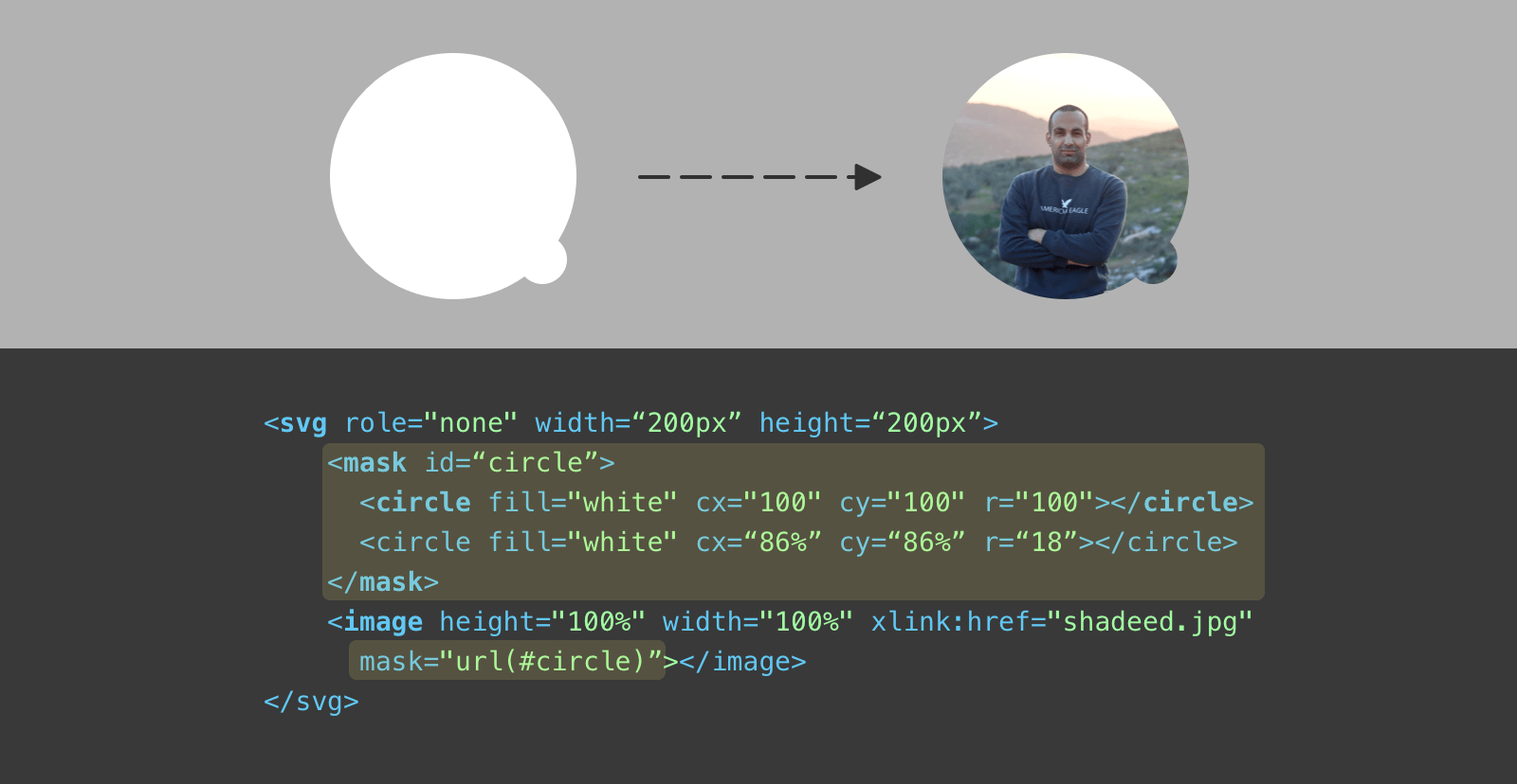
That’s great. The question is, how we can make the cut-out effect? Well, I learned about a very interesting thing while researching this, here it is.
In masks, an object with a white fill represents the area we want to show. While an object filled with black represents an area we want to hide. Interesting, right?
Let’s change the little circle fill to black instead.
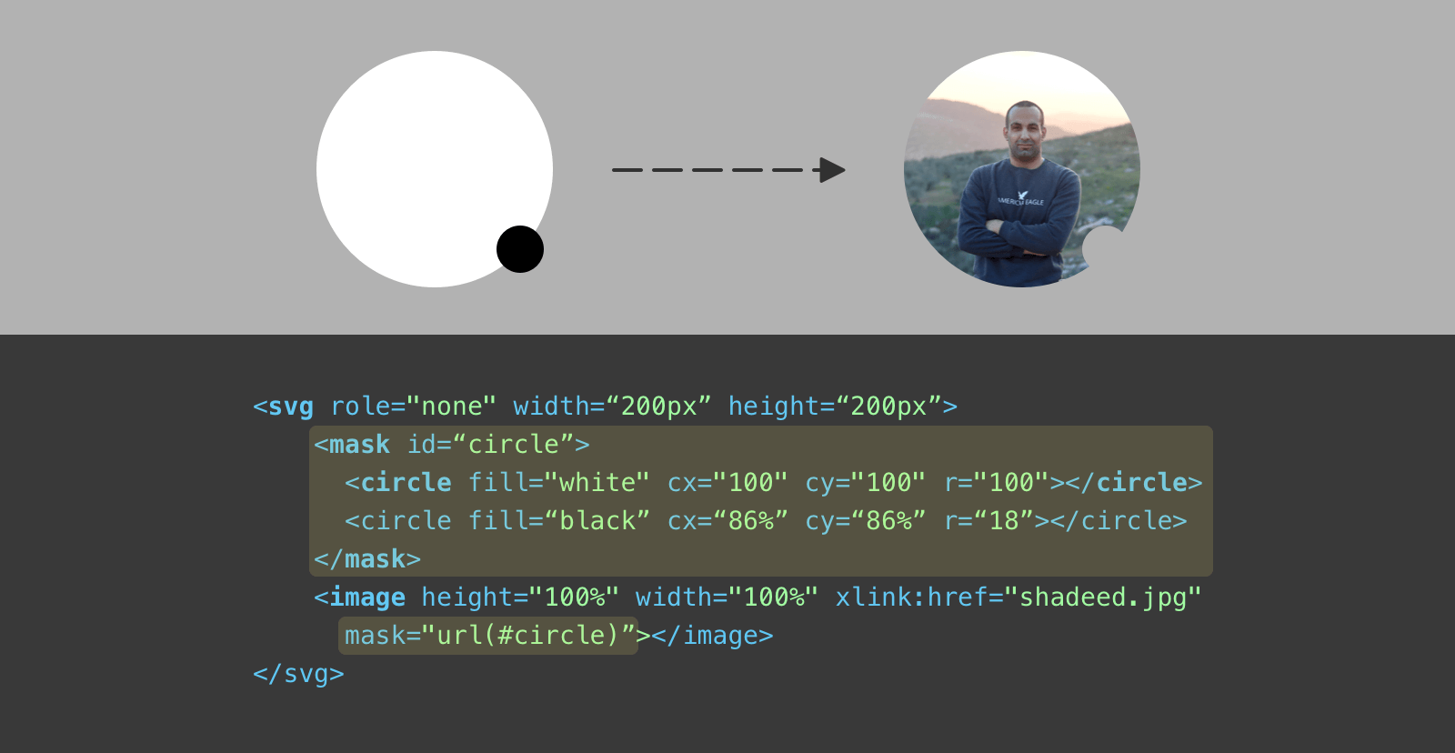
That’s the trick. It’s very useful and can open a lot of opportunities for us developers. If you’re a designer, here is a visual explanation for you.
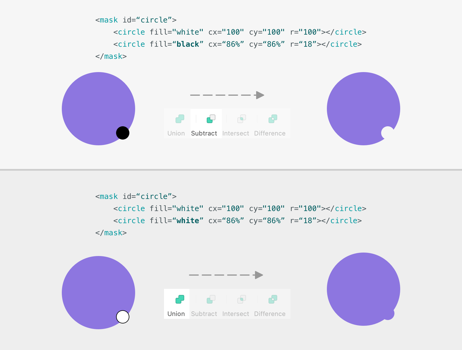
When the mask items are both white, it will lead to a result similar to merging two shapes (AKA union). If one of white and the other is black, one shape will be subtracting from the other.
The next step is to add the inner border to the avatar. With SVG, this is much easier. We need to use a <circle> with an empty fill and a semi-transparent border with rgba().
<svg role="none">
	<mask id="circle">
		<circle fill="white" cx="100" cy="100" r="100"></circle>
		<circle fill="black" cx="86%" cy="86%" r="18"></circle>
	</mask>
	<g mask="url(#circle)">
		<image x="0" y="0" height="100%" width="100%" xlink:href="shadeed.jpg"
		></image>
		<circle fill="none" cx="100" cy="100" r="100" stroke="rgba(0,0,0,0.1)" stroke-width="2"></circle>
	</g>
</svg>
Notice that the image and the border are within a group, and that group has a mask attribute.
- A simple solution.
- Great cross-browser support.
- Can be maintained.
I can’t think of any cons for this solution except that it can be a bit hard for a person who doesn’t know SVG.
For me, this is the winner solution. Do you know that this is being used by Facebook? If this tells us anything, it’s that this solution works on all browsers without issues and offers ways to disable the mask when not needed.
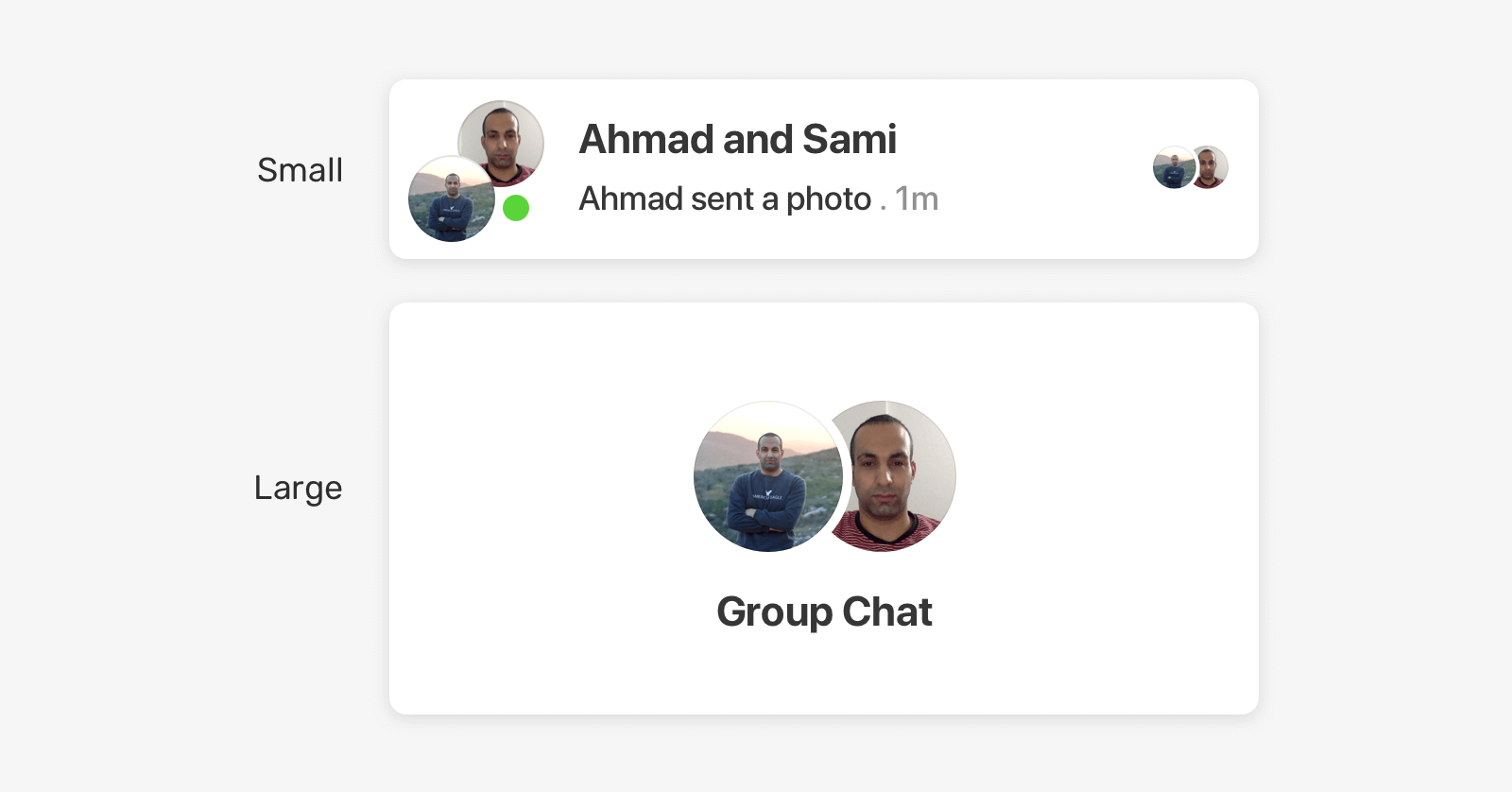
Seen Avatars
We have a cut-out effect that is different from the previous example. The avatars you see are indicators that a message has been seen in Facebook Messenger in a group chat.
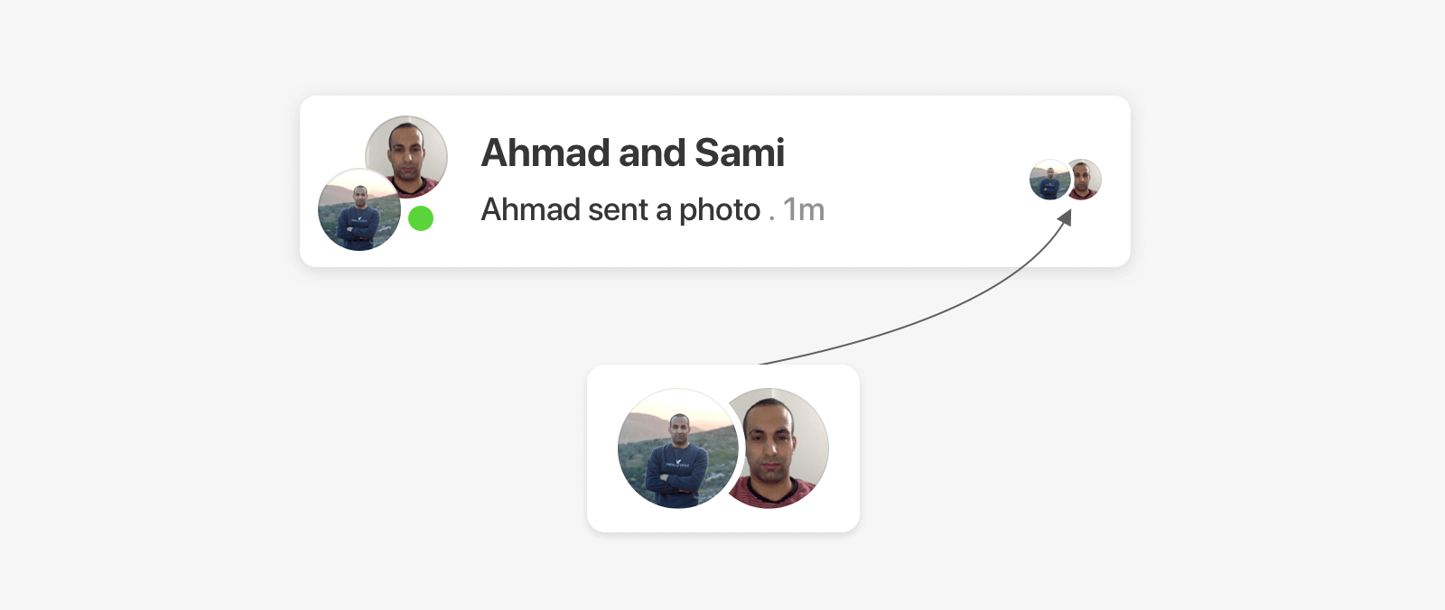
To solve the problem, we need to have two overlapping circles and then subtract one from another.
It’s time to explore the solutions.
Solution 1 - Seen Avatars
Trying this with a clip-path was a fun experience. I exported the path as SVG and converted its values to relative values (Similar to what I did for the first example), and here is what happened.
The exported path will look odd when the image has border-radius: 50%. Unfortunately, the clip-path won’t work for this example.
Solution 2 - Seen Avatars
Okay, let’s try the mix of CSS gradients and masks. Similar to the previous example, we need to draw an ellipse to represent the cut-out effect.
.item {
    -webkit-mask-image: radial-gradient(ellipse 54px 135px at 11px center, #0000 30px, #000 0);
}
And it’s done! Though, there is one little issue with the above. If you pay close attention, you will notice that the edges of the ellipse are jagged.
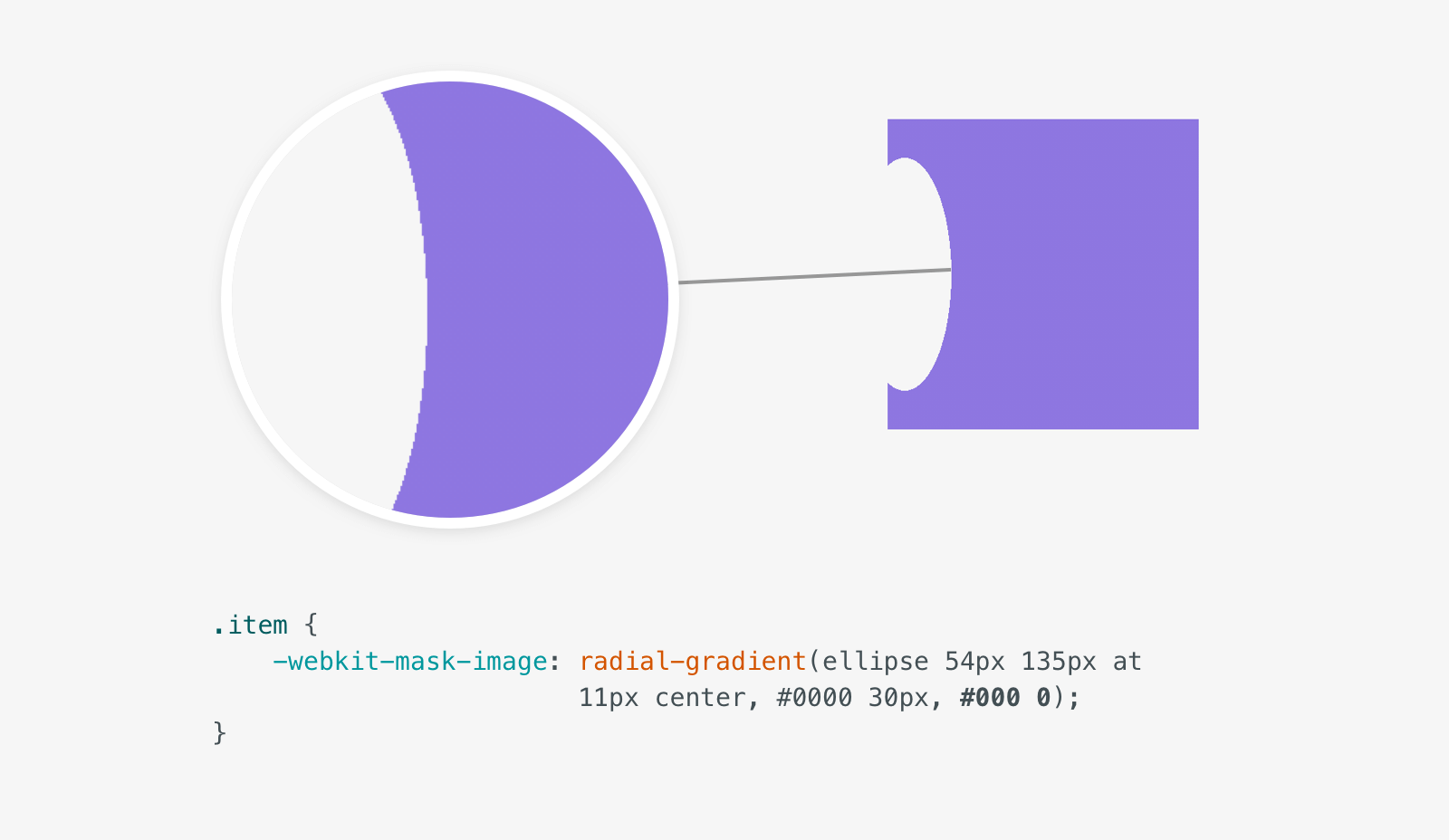
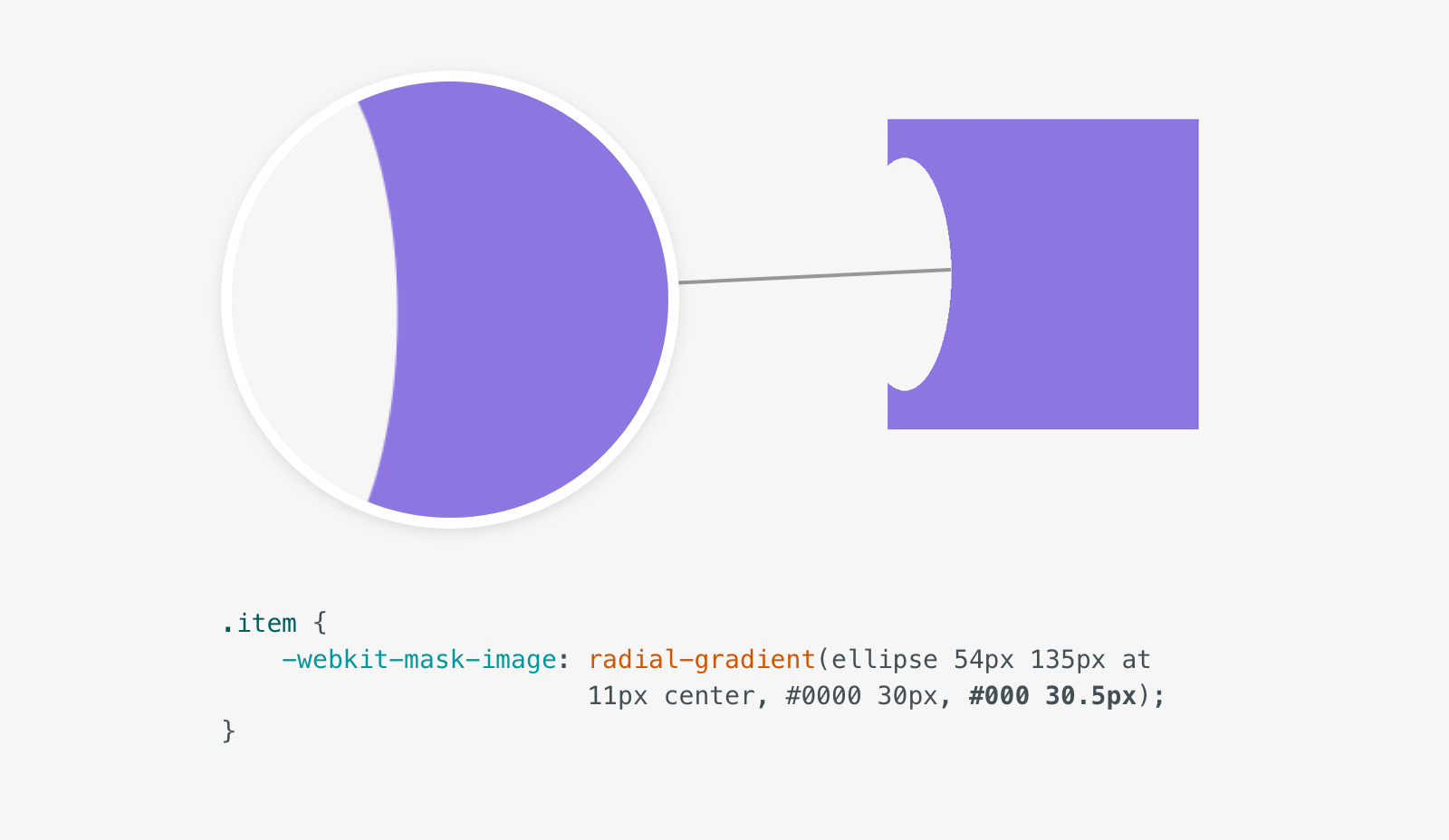
This is happening because the stop value of the first color is the start one of the next. In other words, the first color ends at 30px and the second one starts from 30px to 100%. To work around that, we can change the second color value to 30.5px.
.item {
    -webkit-mask-image: radial-gradient(ellipse 54px 135px at 11px center, #0000 30px, #000 30.5px);
}
There is another way we can implement the solution via CSS masks, which is to use an ellipse image.
.item {
    -webkit-mask-image: url(oval.svg);
    -webkit-mask-repeat: no-repeat;
    -webkit-mask-position: -26px 54%;
    -webkit-mask-size: 80px 140px;
}
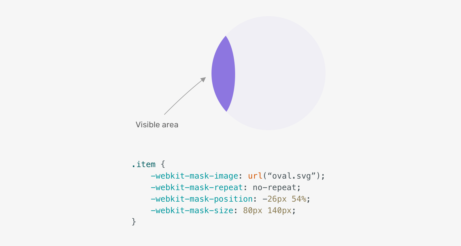
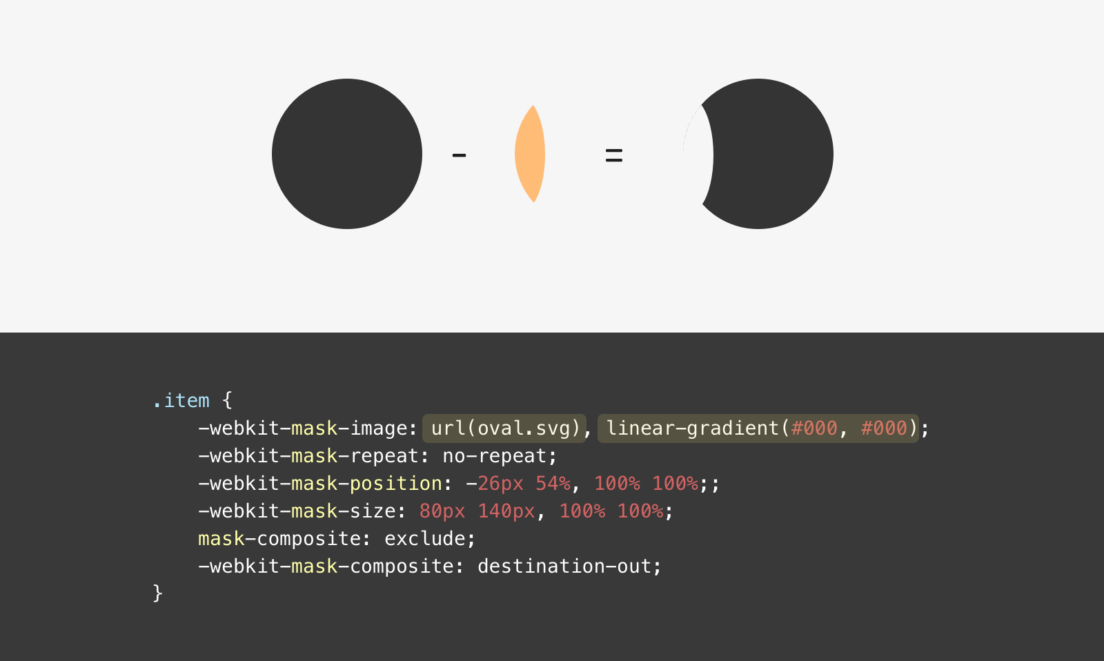
As you see, this is not the desired result. We want the opposite which is to exclude the ellipse and show the rest. How we can do that? While researching, I learned about mask-composite allows us to add multiple masks and composite them as we want.
I added another mask which is a solid fill using the same color stops for a linear-gradient. Then, with mask-composite, all we need is to use exclude.
.item {
    -webkit-mask-image: url(oval.svg), linear-gradient(#000, #000);
    -webkit-mask-repeat: no-repeat;
    -webkit-mask-position: -26px 54%, 100% 100%;;
    -webkit-mask-size: 80px 140px, 100% 100%;
    mask-composite: exclude;
    -webkit-mask-composite: destination-out;
}
Note: mask-composite works for Firefox, and -webkit-mask-composite for Chrome and Safari. The value exclude is the equivalent to destination-out.
- Cross-browser, but needs the vendor prefix all browsers except Firefox.
- Can be limited or complex in other examples
Solution 3 - Seen Avatars
Do you remember when we used two <circle> elements for the mask, one is white and the other is black? We will do the same for this solution.
<svg role="none" class="avatar-wrapper">
    <mask id="cut">
        <circle cx="50" cy="50" r="50" fill="white"></circle>
        <circle fill="black" cx="-30" cy="50" r="50"></circle>
    </mask>
    <g mask="url(#cut)">
        <image x="0" y="0" height="100%" width="100%" xlink:href="shadeed.jpg"></image>
        <circle fill="none" stroke="rgba(0,0,0,0.1)" stroke-width="2"></circle>
    </g>
</svg>
What I did is that I used a negative value for the cx attribute of the black <circle>.
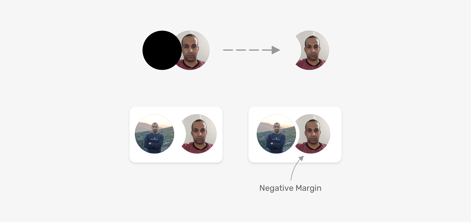
In a real-life project, we might need multiple variations of this component. Most of the time, it will be in terms of size.
To account for that, it’s better to use CSS variables to handle the values for cx, cy and r of the <circle>. Here is the CSS for handling the size of the avatars and the mask:
.avatar {
    --size: 100px; /* [1] */
    width: var(--size);
    height: var(--size);
}

/* [2] */
.avatar-circle {
    cx: calc(var(--size) / 4 * -1);
    cy: calc(var(--size) / 2);
    r: calc(var(--size) / 2);
}

/* [3] */
.avatar-item {
    margin-left: calc(var(--size) / 5.5 * -1);
}
Let me go through the CSS.
- Defining the size of the avatar. This will be used for the width and height properties.
- Using the size to define the
cxandcypositions. - To define the negative margin value between the two avatars, we need to divide the size by
5.5and multiply by-1.
Let’s look at how the cx value is calculated.
cx: calc(var(--size) / 4 * -1);
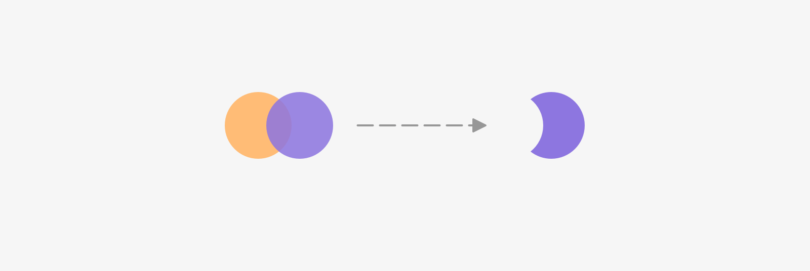
If you don’t already know (like me), the cx and cy values start from the center of the circle. That means, using half of the value will completely hide the image. Consider the following figure:
For visualization purposes, the purple represents the white circle (the area we want to show), and the outlined one represents the black circle (the area we want to hide).
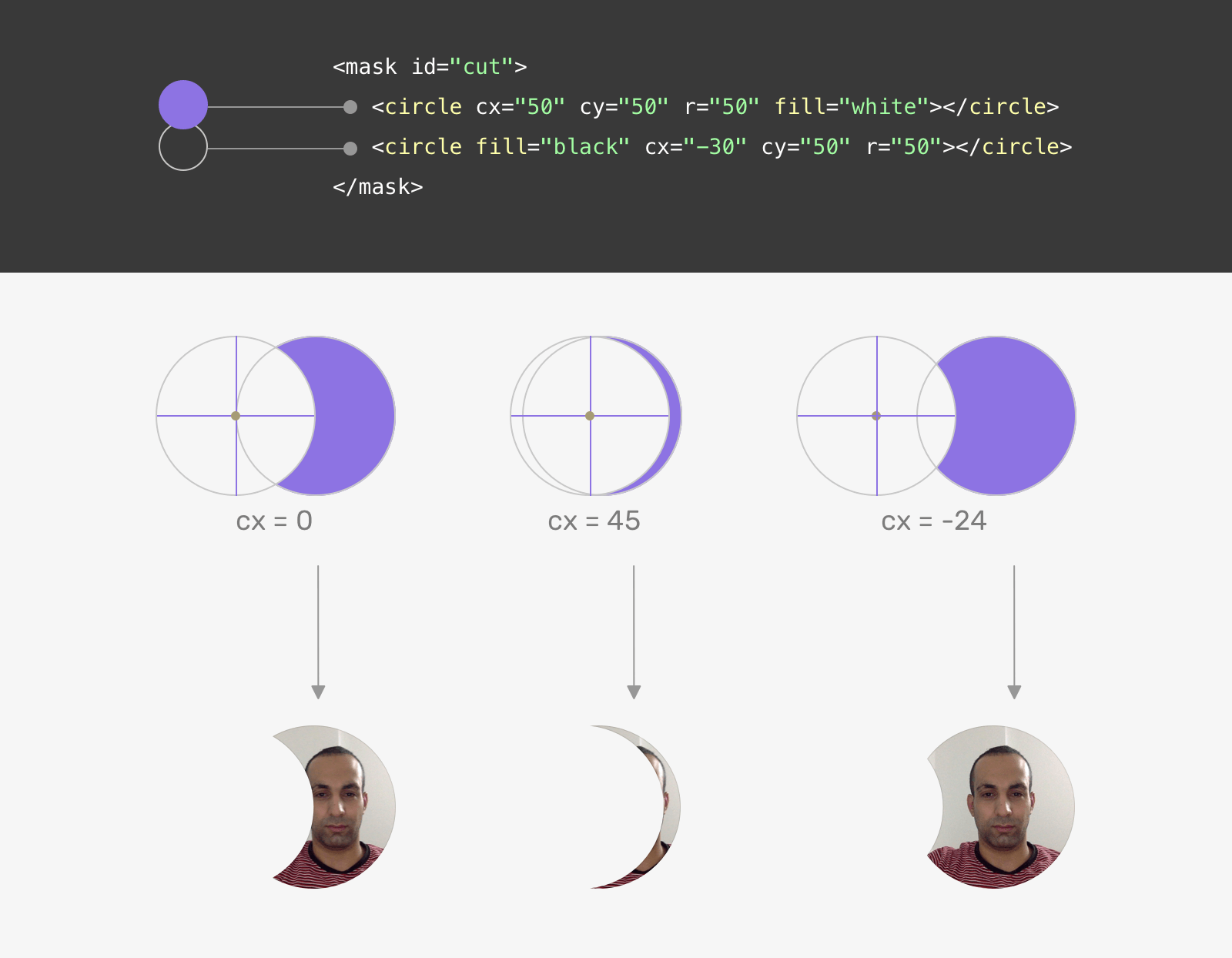
When the cx value of the black circle is 0, it will already be hiding half of the image. We can tweak this and use a negative value instead. The value can be determined based on the size of the cut-out area.
For the negative margin between the avatars, it can be the same as how the value of cx is calculated, but a bit larger. This needs some experimentation to get it right.
- An excellent browser support. It works consistently across all major browsers.
- By using CSS variables, the whole thing can be controlled by only one variable.
- Needs some SVG experience.
Website Header
We have a header with a centered logo. What we want to achieve here is to cut-out the area behind the circular logo.
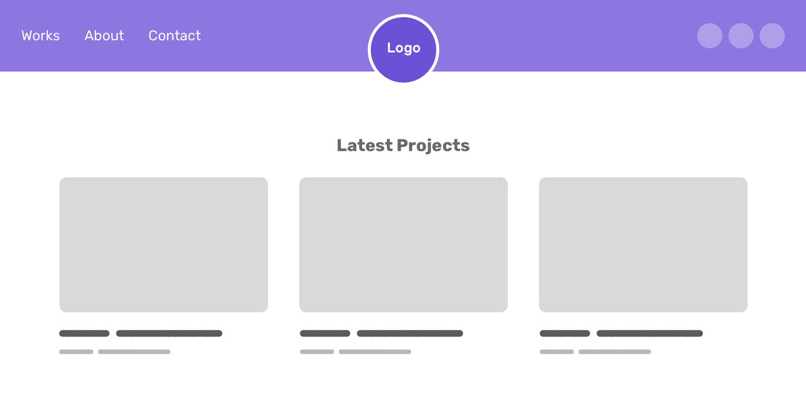
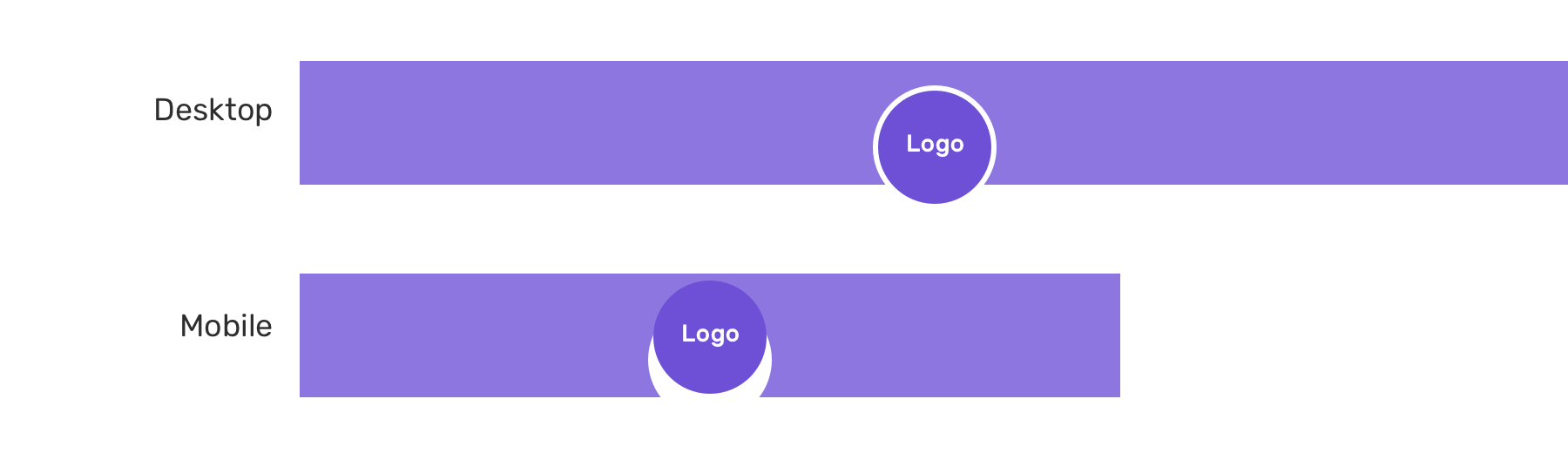
The first thing you might think about is adding a white border, right? It can partially solve the problem. When scrolled, the white border on the logo will look a bit odd.
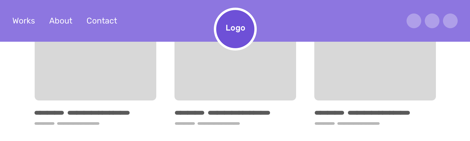
So, how we can solve that?
Solution 1 - CSS Radial Gradient
Similar to the previous example, we can use a radial gradient to make a cut-out area at the center of the header.
.site-header {
    background: radial-gradient(circle at 50% 70%, rgba(0, 0, 0, 0) 58px, #95a57f 58px, #95a57f 100%);
}
And the logo needs to be positioned the same as the cut-out area. I used position: relative with top for that purpose.
.logo {
    position: relative;
    top: 10px;
}
That works, but it’s not perfect. I needed to make the logo and cut-out area size dynamic. That means, their size should shrink or expand based on the viewport size. The first thing I thought about is using CSS clamp() function. I wrote about it here if you want to know more.
:root {
    --radius: clamp(48px, 4vw, 60px);
    --logo-size: calc(calc(var(--radius) * 2) - 8px);
}
The --radius, you guessed it, represents the radius of the circle. Then, the logo size should be double the radius with a little offset for the transparent area.
Everything is okay until I noticed that the top: 10px doesn’t work as it needs to be proportional to the size of the mask and logo.
I started thinking about how can I use a dynamic value for the top property of the logo. First, I listed everything I know:
- Header height is
100px - The center of cut-out area is positioned at 70% of the y-axis
- Circle radius that I can get from the
--radiusvariable
Consider the following explanation.
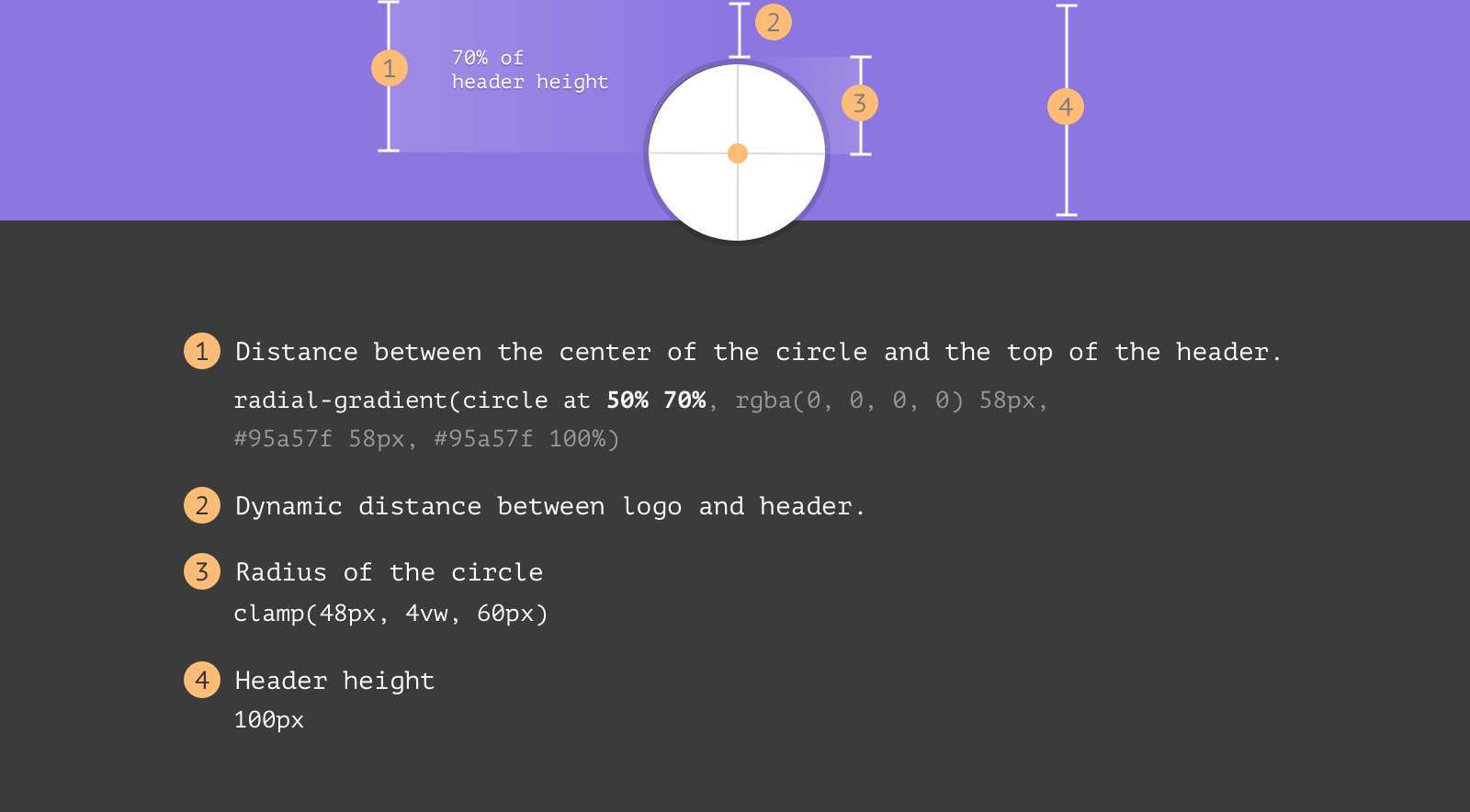
To calculate the dynamic spacing, I came up with the following formula.
Distance = (Header Height * 70%) - Radius
Here is how the formula can be translated to CSS. Thanks to the calc() function.
:root {
    --header-height: 100px;
    --radius: clamp(48px, 4vw, 60px);
    --logo-size: calc(calc(var(--radius) * 2) - 8px);
}

.logo {
    display: block;
    position: relative;
    top: calc(var(--header-height) * 0.7 - var(--radius) + 2px);
    width: var(--logo-size);
    margin-left: auto;
    margin-right: auto;
}

.site-header {
  background: radial-gradient(
    circle at 50% 70%,
    rgba(0, 0, 0, 0) var(--radius),
    #95a57f var(--radius),
    #95a57f 100%
  );
}
- Great browser support
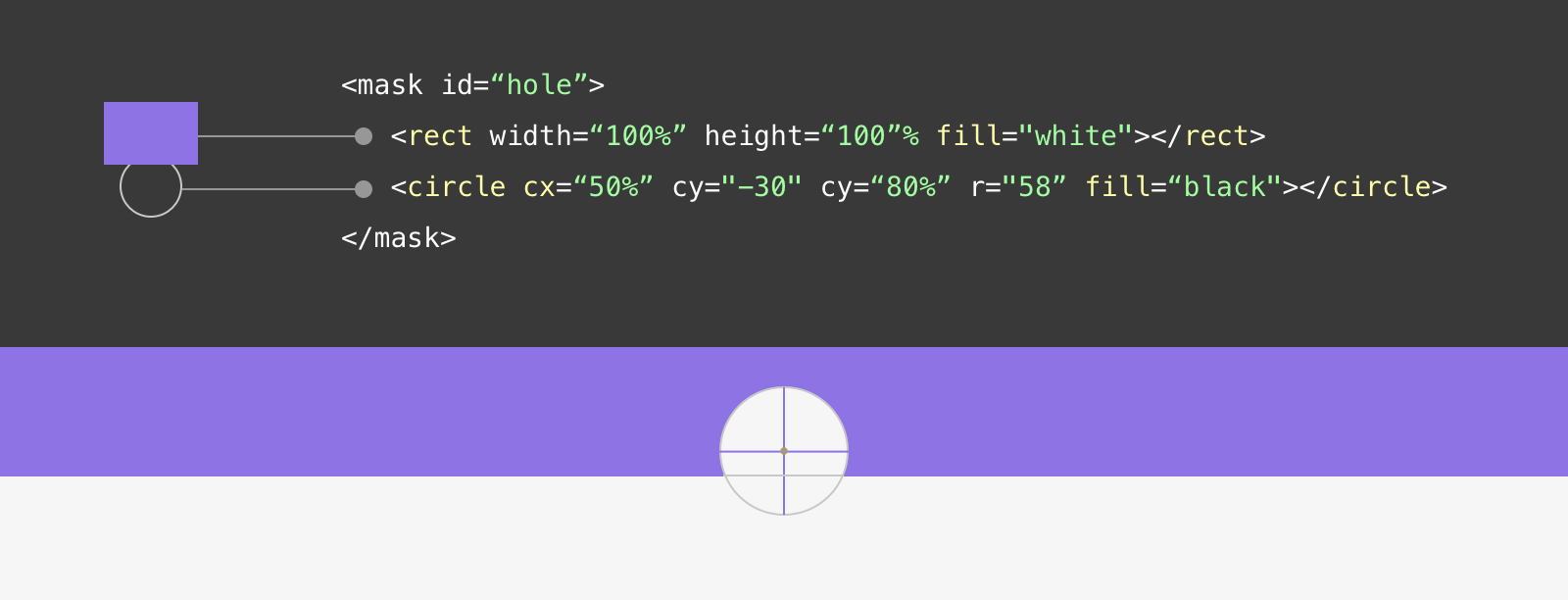
Solution 2 - SVG Mask
For this solution, I used the same technique used previously. There is a rectangle with a white fill and a circle with a black fill. This will create a cut-out effect.
<header class="site-header">
    <img src="assets/logo.svg" alt="" />
    <svg role="none" height="80">
        <defs>
            <mask id="hole">
                <rect width="100%" height="100%" fill="white" />
                <circle cx="50%" cy="80%" r="58" fill="black"></circle>
            </mask>
        </defs>

        <rect width="100%" height="100%" mask="url(#hole)" />
    </svg>
</header>
Keep in mind that the SVG needs to be positioned absolutely to cover the whole header area.
.site-header {
    position: relative;
}

.site-header svg {
    position: absolute;
    left: 0;
    top: 0;
    width: 100%;
    height: 100%;
}
Conclusion
I enjoyed writing and documenting this journey very much. I like that web developers have many methods for achieving a particular result. This can be tricky at times, but it is okay.
I hope you find it useful and enjoy it. If so, please spread the word to your friends and colleges. Tweet or message me on Twitter if you have any feedback!
Thank you for reading.
Resources
- Mask Composite on MDN.
Recommend
About Joyk
Aggregate valuable and interesting links.
Joyk means Joy of geeK