

Best Design System Examples That Will Inspire You
source link: https://www.uxpin.com/studio/blog/best-design-system-examples/
Go to the source link to view the article. You can view the picture content, updated content and better typesetting reading experience. If the link is broken, please click the button below to view the snapshot at that time.

Top 8 Design System Examples
Many companies, such as Airbnb and Uber, have already switched to using a unique design system of their own.
Constant innovation within the industry is an essential aspect of setting a brand apart from the competition and improving the user experience, especially for brands that operate on a global scale.
Thanks to making the most out of repeatable and reusable components, brands who have created a design system in their workflow can increase speed, inspiration and efficacy among teams.
It’s important to note that having a pattern library or a collection of codes and UI elements only shouldn’t be treated as a finished design system. There’s a lot more to a comprehensive design system in terms of design fundamentals, building your own design system as well as overall implementation.
That said, let’s learn more about design systems in general and check out some great examples of other companies who are already using this technology to drive success and value for added inspiration.
What exactly is a design system?
A design system presents a collection of all UI resources that a design company may have. These include all code snippets and development resources with necessary code, documentation, page screenshots and image examples, design guidelines, relevant tools, documents and articles, style guides, reusable components and philosophies, and all other digital assets useful for the overall web design workflow.

These design systems are then hosted as websites online and can be public and internal, whatever the brand decides.
We can think of a design system as a vast data library that acts as a valuable document with applicable instructions and examples, style guides and coding guidelines, and a part of the UI kit all at the same time.
Why do companies create design systems?
Everyone who’s part of the company product team, such as developers, designers, engineers, product managers, etc., gets together to discuss and map out everything that’s currently an existing part of their digital product assets, from logos and colors to language and codes. Then they collaborate on creating this ultimate master plan that explains how exactly things should be presented (designed and coded).
That way, all teams have one full-proof source (there’s a reason why a design system is referred to as a single source of truth in the industry) of visual references, tools, articles, patterns and data libraries. It allows them to keep their work consistent and uniform, and have every single member on the same page – the ultimate goal of design systems.
The use and implementation of design systems
When it comes to implementing and developing design systems, developers don’t have to waste time on repeated code snippets when everything they need is right there to copy from reusable components and/or libraries.

Similarly, designers don’t have to create a new landing page from scratch when they have a library of standard design and UI elements such as colors, logos, headers, footers and other essential symbols to speed up the design process.
Also, web marketers don’t have to work out the tone and template of the newsletters repeatedly when they have everything they need within the system.
What is there to learn from design systems?
The majority of design systems follow rather general setup patterns.
The system often features its top navigation with the main categories: Design, Code, Language, Components, etc.
Each of these main categories has its subcategories that discuss things in more detail, making the most out of the atomic design structure. For instance, these subcategories could be something like Typography, Color, Forms, Banners, etc.
Following this intuitive navigation can get you valuable information about best practices in terms of design.
What’s in it for other people and brands?
A great thing about design systems that many companies host online publicly is that other people can also learn from them and even use them as examples for their own atomic design.
Let’s refer to Shopify for a moment; their shopping design system is publicly displayed on the Web. It means anyone trying to design an eCommerce website can use their set of standards, design components and design language and pattern library for every single design element and be 100% sure that they’re doing a great job.
That said, let’s take a look at some of the best design system examples that you can learn a lot from (and steal from if you want to).
Design system examples
Besides design systems mentioned below, we have a repository of design systems called Adele – get inspired!
1. Google Material Design System
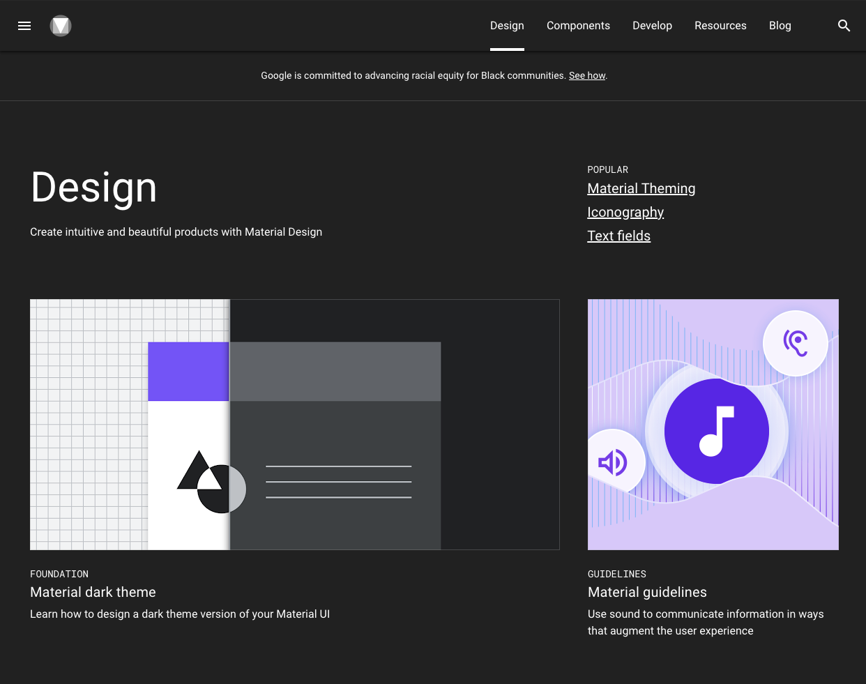
One of the Big Four technology companies, together with Microsoft, Apple and Amazon, Google is a well-known tech giant that focuses on Web services and products, from online advertising and search engine to cloud computing and software.
Google created and publicly shared their Material Design System that goes into the tiniest details regarding everything there is to know about the design and design principles. Every UXPin user can easily use the Material Design components as they are one of the UXPin libraries.
Thanks to this system, users can get valuable information that perfectly unifies UI UX across different devices, platforms and input methods.
Furthermore, Material Design allows other brands and individuals to have a strong foundation for building upon when it comes to their own approach to atomic design, industry innovation and unique brand expression.
The main features of the Google Material Design System include:
- Starter Kits
- Design Source Files
- Material Theming
- Layout
- Typography
- Color
- Components
- Mobile Guidelines
2. Apple Human Interface Guidelines
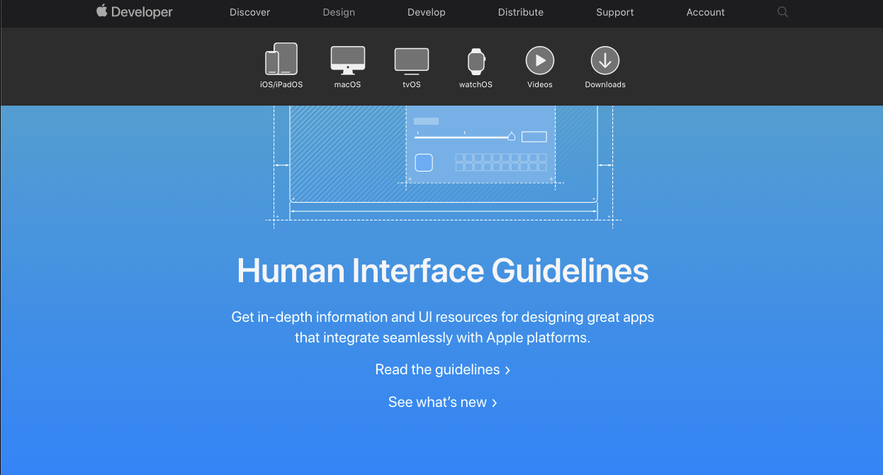
Apple Human Interface Guidelines present a vast and rather valuable design system resource for the web design essentials and pattern libraries but downloadable templates. The iOS UI kit library is also available with a UXPin account.
The system follows Steve Job’s design principles:
- Craft with great precision and attention to detail
- Emphasize user experience and connection with the users
- Focus on what’s truly important on a larger scale
- Generate wanted user reactions thanks to the specific design language and practices
- Utilize the friendly aspect of high tech for both novice and advanced users
- Simplify everything
Apple Human Interface Guidelines consist of practical resources, visual guidelines and style guides for both designers and developers for iOS, macOS, vOS and watchOS.
Its main features include:
- Visual Design
- Visual Index
- App Architecture
- System Capabilities
- User Interaction
- Themes
- Menus
- Buttons
- Icons and Images
- Fields and Labels
- Window and View
- Touch Bar
- Indicators
- Selectors
- Extensions
3. Atlassian Design System
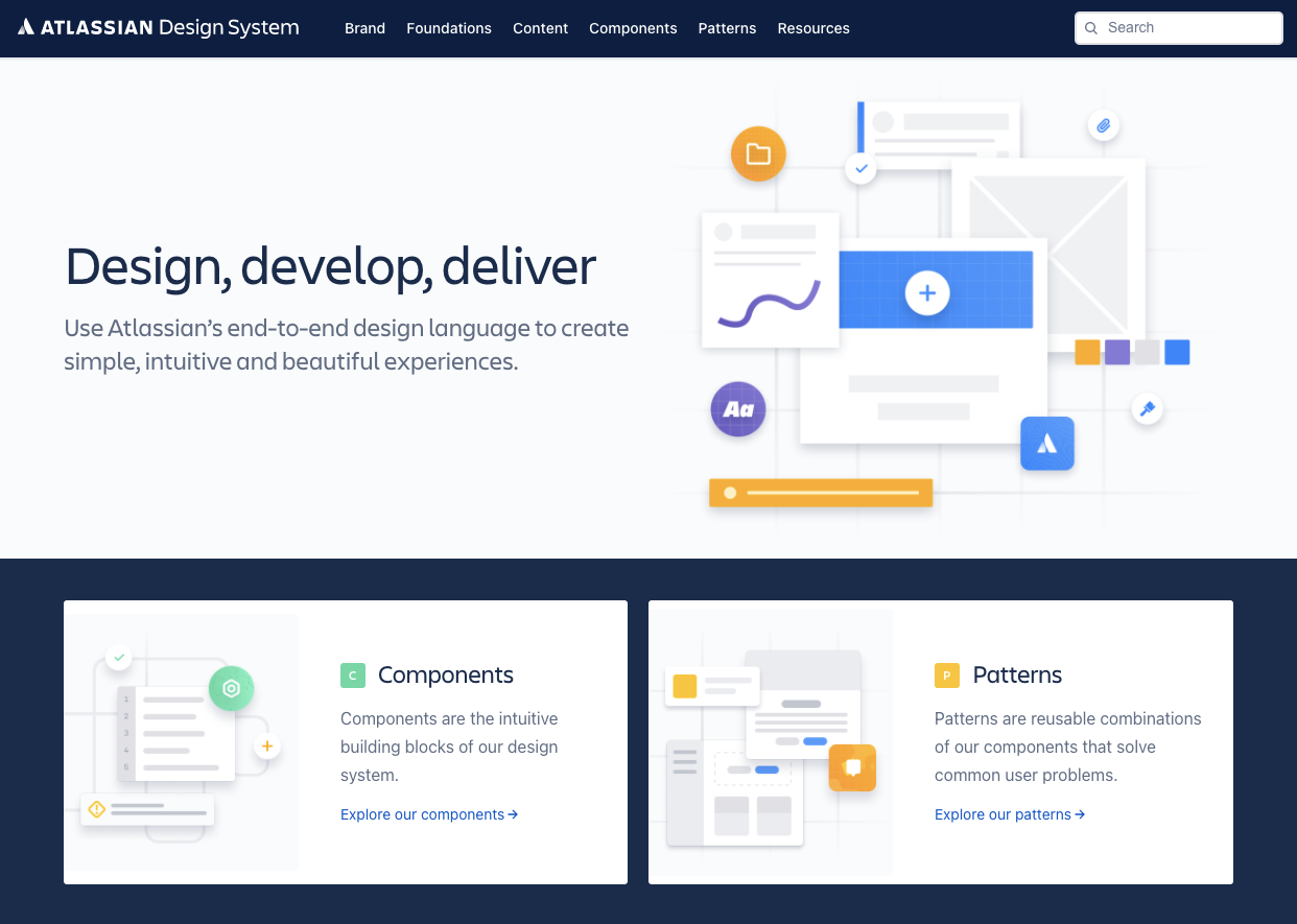
Atlassian Design System focuses on providing valuable assistance to teams from all over the world by making their collaboration seamless and easy. Atlassian Design Guidelines are also a part of UXPin’s library collection.
Atlassian design philosophy is all about utilizing the digital experience to improve the productivity and overall potential of teams and individual team members, perfectly reflected in their globally used collaboration tools Trello and Jira.
That said, Atlassian Design System features agile practices and efficient tracking of every single step within a project that ultimately yields valuable results in terms of product delivery and development:
- Design Principles
- Brand Guidelines
- Product
- Illustration
- Prototyping
- Marketing
- Personality
4. Uber Design System
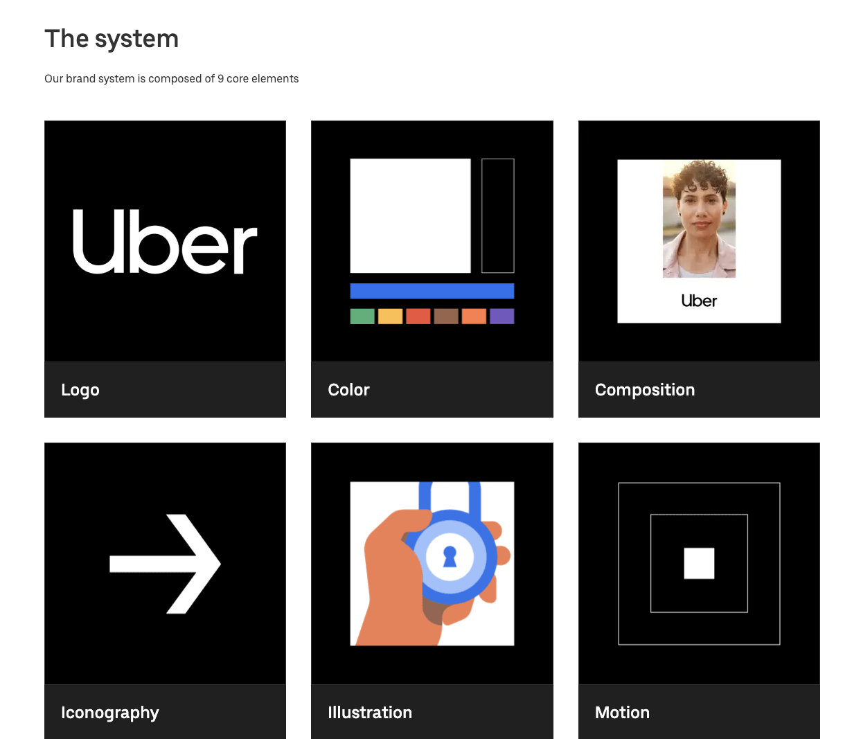
According to Uber, movement ignites opportunity.
After all, Uber service bases on movement with ride-hailing, peer-to-peer ridesharing, food delivery and micro-mobility involving scooters and electric bikes.
For this type of service to work impeccably, from sub-brands to internal ones and products to programs, Uber requires an effective design system that the company shares with the rest of the world.
Main features of Uber Design System:
- Brand Architecture
- Composition
- Tone of Voice
- Motion
- Illustration
- Photography
- Iconography
- Color
- Typography
5. Shopify Design System Polaris
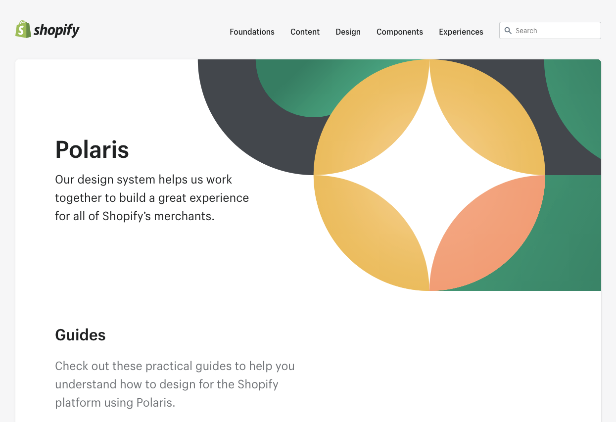
Shopify is a global eCommerce platform that provides everything a brand may need to run and grow its business in one place.
It’s no wonder that their design principles focus on creating a better and more accessible commerce experience.
Shopify’s public design system called Polaris encompasses the company’s core values:
- Be caring and considerate to the users
- Provide people with the right tools to accomplish whatever they set out to do
- Enjoy the top level of craftsmanship that matches the brand image
- Minimize the hustle by providing accurate and quick solutions
- Always build upon users’ trust
- Make the users feel comfortable with using the products
Polaris Design System provides an easy-to-follow and practical style guide for designing for the Shopify platform. It offers a vast knowledge base on utilizing UI components, visual elements, content, and design language for creating a better user experience and product in general. Polaris components are also a part of UXPin management.
Shopify Design System Polaris includes main features that follow the practices mentioned above to a tee:
- Data Visualization
- Accessibility
- Interaction States
- Colors
- Typography
- Icons
- Illustrations
- Spacing
- Sounds
- Resources
6. IBM Carbon Design System
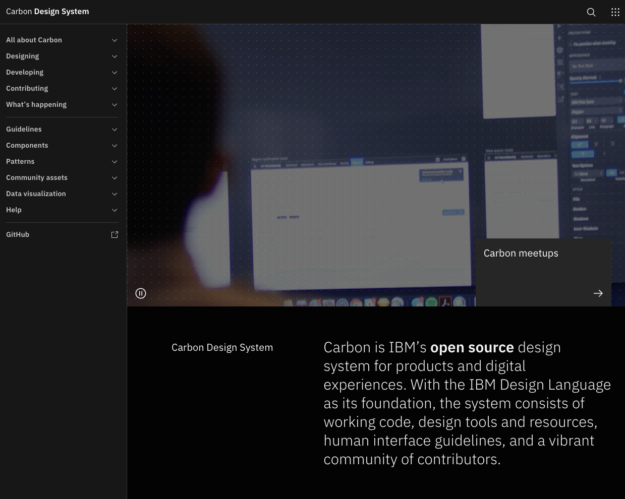
IBM operates on a global scale by meeting large enterprise IT needs.
Their services range from business consulting and financing, software development and IT hosting/management to software-to-hardware products.
IBM’s core belief revolves around making constant progress, be that human condition, society or a brand, by utilizing science, reason and intelligence.
According to IBM, a good design is not only a mere requirement but an actual responsibility to the users.
This is where their Carbon Design System shines with its main features, offering plenty of tools and visual resources for Adobe, Axure and Sketch designers as well as developers:
- Data Visualization
- Patterns
- Components
- Guidelines
- Tutorials
UXPin users can conveniently find everything they need from Carbon in their account as well.
7. Mailchimp Design System
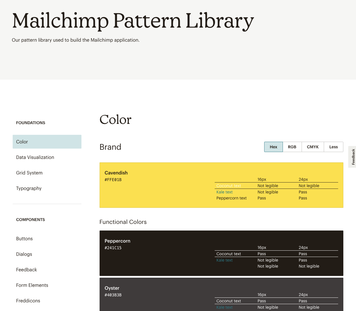
Mailchimp has come a long way from being a renowned email marketing leader to providing an all-in-one marketing platform that goes beyond email only.
Mailchimp has one clear goal: to help small businesses grow while remaining true to their brand identity and image.
That is also one of the many reasons behind creating the Mailchimp Design System and its main features that focus on creative expression, better user experience and top quality:
- Data Visualization
- Grid System
- Color
- Typography
- Components
8. Salesforce Lightning Design System
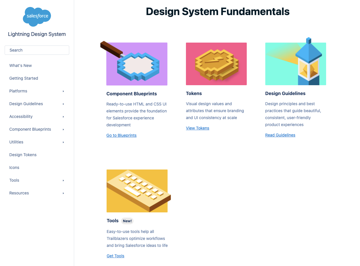
Salesforce goes above and beyond to deliver a personalized experience to its users through the integrated cloud-based CRM software.
The purpose of the Salesforce CRM is to improve marketing, commerce, IT, service and sales efforts – and allows their users to do the same with their users.
Their design philosophy is reflected in the Hawaiian word for intentional family, Ohana, with four core values that drive their company actions and overall culture:
- Innovation
- Equality
- Trust
- Customer Success
That said, Salesforce has put out their own Lightning Design System that allows everyone working with content management systems to learn and benefit from its main features:
- Design Guidelines
- Platforms
- Accessibility
- Components (and a lot of them)
Lightning components are a part of the UXPin account libraries as well.
The benefits of creating a design system for your company
Thanks to a comprehensive design system in place, businesses can considerably improve their teamwork and discipline.
One of the most significant benefits of design systems is that such collection of resources, elements, and data minimizes communication issues between designers and developers and minimizes the room for potential UX design bugs.
What’s more, having such a reference-rich library significantly reduces the necessary time to go from a prototype to an actual product.
For example, PayPal uses Fluent UI together with Merge technology. This allows them to incorporate the code components from Fluent to the UXPin library. That way, both designers and product team members alike can easily access these components and design with them over and over again.
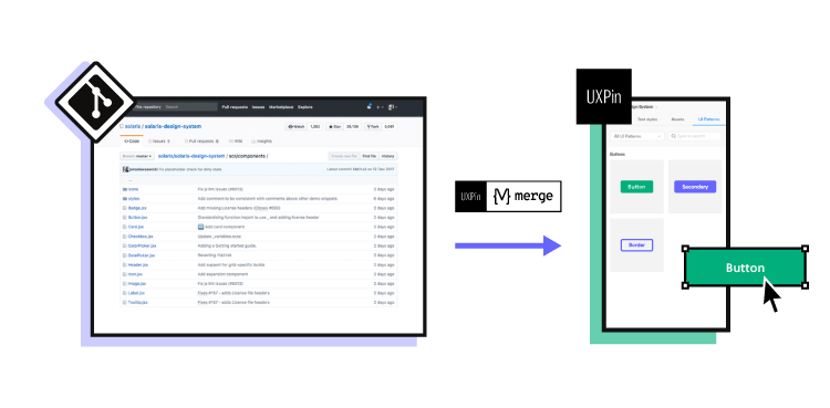
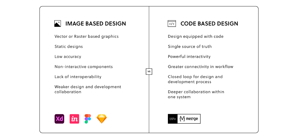
Design systems are a great way to minimize the disconnect between designers and developers but are still not the ideal solution on their own. Thanks to the Merge technology revolution, product team members can easily utilize dev tools and improve their DesignOps workflow processes, with a set design-code parity. This means that both developers and designers can access and use the same codes, documentation and UI elements from one single source.
Make the most of design system: the UXPin Merge way
The UXPin’s Merge is a technology that makes it possible and easy for designers to design with code components.
There are two available solutions on the matter:
- Component synct withdevs’ Git repository such as GitHub, GitLab, BitBucket or others.
- Sync of components from Storybook.
All those components are brought to the UXPin library.
Merge tech is created as an adequate solution to common challenges that often happen when there’s a communication gap between design and development teams. So, various UI components, coding and documentation inconsistencies can arise, affecting the product’s efficiency and maintenance.
With the design system that organizes all of the necessary components as a first step in the right direction, Merge will then take all those coded components right to the design editor.
You’ll save time and money by avoiding inconsistencies, not to mention the joy of seeing an end product that’s exactly the same as what you originally envisioned!
Design system challenges & solution
Even when companies try to create their design system, specific issues and consistency disconnects can still happen, especially when maintaining all the elements, documentation and code.
Learn more about design system challenges and solutions from one of the top design leaders – Johnson & Johnson. During our webinar, the J&J team shared all their best practices.
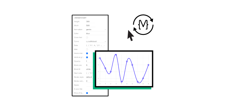
Merge tech focuses on design with code components, i.e., converting a code component into the design. In that respect, designers don’t simply create prototypes based solely on the visual aspect of the final product (while only faking the necessary interactions); instead, designers use already coded components to design the prototype image.
There’s no need to go back and forth between the design and dev team since the design team can take the already existing coded components, synchronize them with UXPin’s editor, and drag and drop the components they need to create new designs.
Essentially, designers don’t have to create fake interactions, add them or search for the right colors.
On the other end, developers get the prototype preview and continue to work with the available production-ready elements.
Summary
Design systems consist of tons of UI components and guidelines that are meant to optimize and improve the design efforts and promote consistency among the teams.
However, if the design system is poorly maintained and implemented, the said system can turn into nothing more than many clunky and confusing code snippets, libraries and components. A design system can quickly educate team members and promote consistency while also allowing designers to deal with more complex UX issues. And when you add revolutionary Merge tech to the mix, you can truly take your design system organization to the next level.
Recommend
About Joyk
Aggregate valuable and interesting links.
Joyk means Joy of geeK