

The Large, Small, and Dynamic Viewports
source link: https://www.bram.us/2021/07/08/the-large-small-and-dynamic-viewports/?ref=sidebar
Go to the source link to view the article. You can view the picture content, updated content and better typesetting reading experience. If the link is broken, please click the button below to view the snapshot at that time.

The Large, Small, and Dynamic Viewports – Bram.usSkip to content
There are some changes being proposed regarding viewport units. The additions — which have already landed in the editor’s draft — define several viewport sizes: the Large, Small, and Dynamic Viewport.
Thanks to these additions we will finally be able to solve that “100vh in Safari on iOS” issue.
Table of Contents
# The Large, Small, and Dynamic Viewports
# The Large Viewport
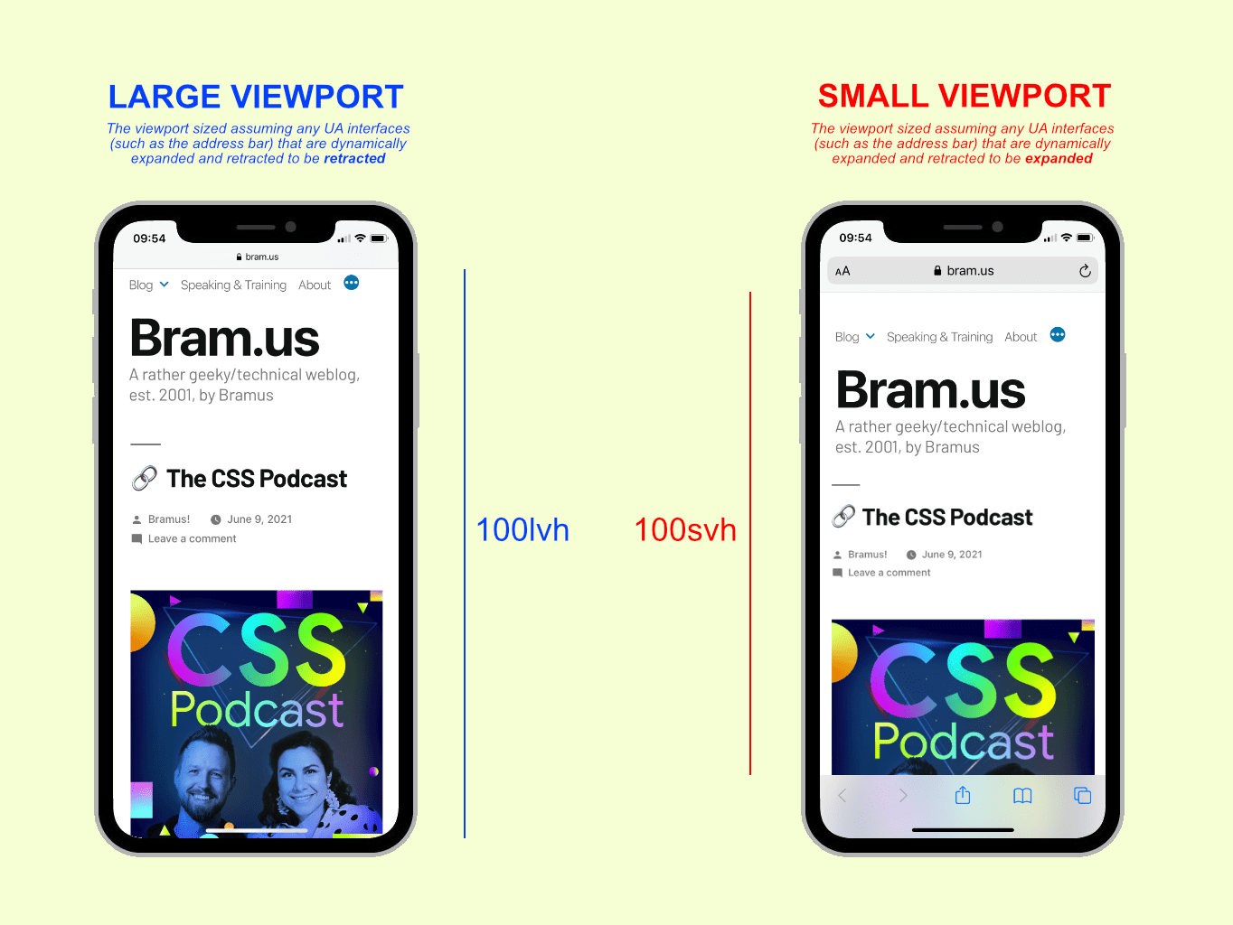
The Large Viewport is the viewport sized assuming any UA interfaces (such as the address bar) that are dynamically expanded and retracted to be *retracted*. It has no prefix, so you use vh / vw / vmin / vmax like before.
# The Small Viewport
The Small Viewport is the viewport sized assuming any UA interfaces that are dynamically expanded and retracted to be *expanded*. It has the s-prefix, so units are svh / svw / svmin / svmax.
# The Dynamic Viewport
The Dynamic Viewport is the viewport sized with *dynamic consideration of any UA interfaces*. It will automatically adjust itself in response to UA interface elements being shown or not: the value will be anything within the limits of 100vh (maximum) and 100svh (minimum).
Its prefix is d, so the units are dvh / dvw / dvmin / dvmax.
👉 You’ll want these Dynamic Viewport Units to have a UI that auto-stretches as the UA interface changes.
# The catch
Note that it’s totally up to the UA (browser) to implement a behavior for the Dynamic Viewport. Some browsers may update directly the interface changes, or only after a while … the spec is fine with that.
The UA is not required to animate the dynamic viewport-percentage units while expanding and retracting any relevant interfaces, and may instead calculate the units as if the relevant interface was fully expanded or retracted during the UI animation.
Above that things like on-screen keyboards are not taken into account. For that we have the upcoming Virtual Keyboard API.
# Going Logical
Additionally the spec now also defines logical units, and thus talks about vi/dvi/svi and vb/dvb/svb which are the inline and block size respectively of the large/dynamic/small viewport. A small but very welcome addition.
# In Closing
It feels great to see things move in this area I must say, as the reported WebKit bug dates back from 2015, and the relevant CSSWG Issue from 2019.
I hope that a final consensus on these viewport additions can be reached soon, and that the upcoming Safari 15 — which alters the viewport extensively as you scroll up/down — will make work to include these additions on top of their already supported env(safe-area-inset-*) values.
To help spread the contents of this post, feel free to retweet the announcement tweet:
The Large, Small, and Dynamic Viewports
🏷 #css #viewport pic.twitter.com/z42BuuqvcE
— Bram.us (@bramusblog) July 7, 2021
🗣 This post originally was a set of tweets.
Posted byBramus!July 8, 2021July 8, 2021Posted inOriginal ContentTags: css, viewport
Published by Bramus!
Bramus is a Freelance Web Developer from Belgium. From the moment he discovered view-source at the age of 14 (way back in 1997), he fell in love with the web and has been tinkering with it ever since (more …) View more posts
Recommend
About Joyk
Aggregate valuable and interesting links.
Joyk means Joy of geeK