

Flutter: Building Beautiful Windows apps — Fluent Design Buttons, Toggle Switche...
source link: https://itnext.io/flutter-building-beautiful-windows-apps-fluent-design-buttons-toggle-switches-checkboxes-and-821b71a29b45
Go to the source link to view the article. You can view the picture content, updated content and better typesetting reading experience. If the link is broken, please click the button below to view the snapshot at that time.

Flutter: Building Beautiful Windows apps — Fluent Design Buttons, Toggle Switches, Checkboxes and Sliders
The Fluent Design is Microsoft’s solution for designing beautiful Windows programs. Flutter has finally expanded support to Windows UWP in Google I/O 2021, which calls for well-designed Windows apps. In this article, I will show you how to create buttons, checkboxes, and sliders with Flutter.
This guide will work best for Win32 and UWP Flutter apps. If you have not set up your UWP Flutter app yet, follow my other guide to do so.
We will be using the fluent_ui package by bdlukaa, available on pub.dev. If you would like to know how to create a basic Fluent Design app using the fluent_ui package, you may refer to this guide.
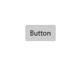
Types of buttons
There are four types of buttons available in Fluent Design — the regular Button we have all come to know, the Split Button, the Toggle Button and the Radio Button.
Button
Let’s see how we can make a regular Button.

To start, we can create a new Button() widget, then specify the title to be shown in a Text() widget in the button using the child property. Do also remember to initialise the onPressed parameter with a blank function or the function of your choice.
Button(
   child: Text("Click Me!"),
   onPressed: () {},
)
The style parameter of the button allows us to customise the appearance. By setting the style parameter to a ButtonStyle(), we can modify the text style, background colour, foreground colour and more!
However, there will be an error if, for example, you set a Color() as the backgroundColor property. This is because the ButtonStyle requires a ButtonState<Color>, and not just a Color. To fix that, we can wrap our Color() in ButtonState.all().
Here is my full example of a button:
Button(
    child: Text(
      "Click Me!",
      style: TextStyle(color: Colors.white),
    ),
    onPressed: () {},
style: ButtonStyle(backgroundColor: ButtonState.all(Colors.blue))
)

There are also some alternative buttons, such as the IconButton(), which is a clickable Icon, OutlinedButton(), which is a button with no fill and an outline, and TextButton(), which is a clickable Text. These buttons’ style property work similarly to that of the regular Button.
Here are some examples of these buttons:
- IconButton
IconButton(
  icon: Icon(Icons.favorite_border),
  onPressed: () {}
),

2. OutlinedButton
OutlinedButton(
  child: Text("Click me!"),
  onPressed: () {}
),

3. TextButton
TextButton(
  child: Text("Click me!"),
  onPressed: () {}
),

Split Button
A Split Button has two parts that can be clicked separately.

Usually, the part on the left behaves like a standard button and invokes an immediate action. The part on the right usually is a down-arrow button that invokes a flyout that contains additional options that the user can choose from. In RTL layouts, the arrangement will be reversed.
To create a Split Button, we can use the SplitButtonBar() widget. We will have to specify the buttons parameter as a list of (usually two) Button() widgets.
SplitButtonBar(
  buttons: [
    Button(
      child: Container(
          height: 24, width: 24, color: Colors.green),
      onPressed: () {
        //modify colour
      },
    ),
    Button(
      child: Container(
          height: 24,
          width: 24,
          child: Icon(Icons.keyboard_arrow_down)),
      onPressed: () {
        //open dropdown list to select colour
      },
    )
  ],
)
Similar to the regular button, the style parameter of the SplitButtonBar allows us to customise the appearance, but we will use a SplitButtonThemeData() to specify the style properties instead. We are able to customise things like the corner radius using the borderRadius property and the space (in logical pixels) between the two buttons using the interval property.
However, properties such as the borderRadius property are affected by the properties of the buttons (i.e. the corner radius property of the SplitButtonThemeData can be overriden by the corner radius property of the ButtonStyle).
Here is my full example of a SplitButton:
SplitButtonBar(
style: SplitButtonThemeData(
    interval: 1
  ),
  buttons: [
    Button(
      child: Container(
          height: 24, width: 24, color: Colors.green),
      onPressed: () {
        //modify colour
      },
    ),
    Button(
      child: Container(
          height: 24,
          width: 24,
          child: Icon(Icons.keyboard_arrow_down)),
      onPressed: () {
        //open dropdown list to select colour
      },
    )
  ],
)

Toggle Button
A Toggle Button is a type of button which can be enabled or disabled when clicked.
When enabled, its background color is blue and when disabled, its background color is grey.
To create a Toggle Button, we can use the ToggleButton() widget. There are three required parameters — child, checked, and onChanged. The checked parameter is a boolean which indicates whether a button is enabled or disabled. The onChanged parameter is a function which is called every time the button is pressed, where we should update the value of checked.
In my example, I have created a variable called checked to store a boolean on whether the button is enabled.
ToggleButton(
  child: Text("Toggle me!"),
  checked: checked,
  onChanged: (newSelection) {
    setState(() {
      checked = newSelection;
    });
  }
),
The style parameter allows us to specify a ToggleButtonThemeData(), which has two properties — checkedButtonStyle and uncheckedButtonStyle. The names of these buttons are self-explanatory, and they both accept a ButtonStyle().
Here is my full example of a ToggleButton:
ToggleButton(
style: ToggleButtonThemeData(
      checkedButtonStyle: ButtonStyle(
          backgroundColor:
              ButtonState.all(Colors.green))),
  child: Text("Toggle me!",
      style: TextStyle(
          color:
              checked ? Colors.white : Colors.black)),
  checked: checked,
  onChanged: (newSelection) {
    setState(() {
      checked = newSelection;
    });
  }
),


Radio Button
Radio Buttons let users select one option from a group of two or more options.

Radio Buttons are always used in groups, and each option is represented by one radio button in the group. Only one radio button in a group can be selected at a time.
To create Radio Buttons, we need the RadioButton() widget. There are two required parameters — checked and onChanged (see the ToggleButton section for more information on this). In my example, I created three variables — checked1, checked2 and checked3 to be assigned to the checked parameter for the respective radio buttons. When onChanged is called on the first Radio Button and the state of the Radio Button is true, or selected, I set the checked parameter for that Radio Button to true and the rest to false.
RadioButton(
  checked: checked3,
  onChanged: (newSelection) {
    if (newSelection) {
      setState(() {
        checked1 = false;
        checked2 = false;
        checked3 = true;
      });
    }
  }
),
Styling the Radio Buttons is similar to the rest of the buttons. The style parameter allows us to specify a RadioButtonThemeData(), which allows us to set the checkedDecoration and the uncheckedDecoration property, customising the appearance of the RadioButton when it is checked and unchecked.
Do note that these two properties accepts a type of ButtonState<BoxDecoration> and not a BoxDecoration, so remember to wrap your BoxDecoration() in ButtonState.all().
Here is my full example of a RadioButton:
RadioButton(
style: RadioButtonThemeData(
      checkedDecoration: ButtonState.all(
    BoxDecoration(
      border: Border.all(
        color: Colors.blue,
        width: 4.5,
      ),
      shape: BoxShape.circle,
      color: Colors.white,
    ),
  )),
  checked: checked3,
  onChanged: (newSelection) {
    if (newSelection) {
      setState(() {
        checked1 = false;
        checked2 = false;
        checked3 = true;
      });
    }
  }
),

Toggle Switch
The toggle switch represents a physical switch that allows users to turn things on or off.

To create a Toggle Switch, we can use the ToggleSwitch() widget. The ToggleSwitch widget has two required parameters — checked and onChanged. The checked parameter is a boolean which indicates whether the switch is on or off.
The onChanged parameter is a function which is called every time the button is pressed, where we should update the value of checked. In my example, I have created a variable called checked to store a boolean which indicates whether the button is enabled.
ToggleSwitch(
  checked: checked,
  onChanged: (newSelection) {
    setState(() {
      checked = newSelection;
    });
  }
),
We can style the ToggleSwitch with the style parameter. Setting the style parameter to a ToggleSwitchThemeData(), we can now set parameters such as animationDuration, uncheckedThumbDecoration and checkedThumbDecoration. The animationDuration property accepts a Duration() type, while the decoration-related properties accepts a ButtonState<BoxDecoration> type. Remember to use ButtonState.all(BoxDecoration()) instead of just BoxDecoration() for these properties.
Here is my full example of a ToggleSwitch:
ToggleSwitch(
style: ToggleSwitchThemeData(
      animationDuration: Duration(milliseconds: 300)),
  checked: checked,
  onChanged: (newSelection) {
    setState(() {
      checked = newSelection;
    });
  }
),


Checkbox
A Checkbox is used to select or deselect items. It can be used for a single item or for a list of multiple items that a user can choose from.

To create a Checkbox, we can use the Checkbox() widget. The CheckBox widget is very similar to the ToggleSwitch, except that it does not accept a child. There are two required parameters — checked and onChanged. The checked parameter is a boolean which indicates whether the checkbox is enabled or disabled. However, in a Checkbox, the checked parameter can be null. This is because in some cases, the Checkbox can be in an “indeterminate” state.

The onChanged parameter is a function which is called every time the button is pressed, where we should update the value of checked. In my example, I have created a variable called checked to store a boolean which indicates whether the button is enabled.
Checkbox(
  checked: checked,
  onChanged: (newSelection) {
    setState(() {
      checked = newSelection!;
    });
  },
),
Styling the Checkbox can be done using the style parameter. The style parameter allows us to specify a CheckboxThemeData(), which accepts many parameters, such as checkedIconColor, uncheckedIconColor and thirdstateIconColor. Again, these properties accepts a type of ButtonState<T>, so remember to wrap your Colors and BoxDecorations in ButtonState.all().
Here is my full example of a Checkbox:
Checkbox(
style: CheckboxThemeData(
      checkedIconColor: ButtonState.all(Colors.white)),
  checked: checked,
  onChanged: (newSelection) {
    setState(() {
      checked = newSelection!;
    });
  },
),


Slider
A Slider is a control that lets the user select from a range of values by moving a thumb control along a track.

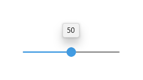
To create a Slider, we can use the Slider() widget. A Slider widget has no fixed width, hence we need to constrain its width using a Container or an Expanded widget. There are four required parameters for a Slider — min, max, value and onChanged. The min parameter specifies the minimum value of the slider, while the max parameter specifies the maximum value of the slider. The value parameter specifies the current value of the slider, and the onChanged parameter is a function which is called every time the slider value is changed, which is then used to update the current value of the slider.
In my example, I have created a variable called currentValue to store a double with the current value of the slider.
Container(
  width: 200,
  child: Slider(
    min: 0,
    max: 100,
    value: currentValue,
    onChanged: (newValue) {
      setState(() {
        currentValue = newValue;
      });
    },
  ),
),
To customise the Slider more, we can use additional parameters such as divisions, which creates “snapping points” to values in the Slider. Also, the style parameter can be used to theme the Slider even more. Passing a SliderThemeData into the style parameter, we can customise the thumb colour, track colour and more with properties such as thumbColor, which specifies the colour of the thumb, and properties such as activeColor, which specifies the colour of the track and the thumb.
Here is my full example of a Slider:
Container(
  width: 200,
  child: Slider(
style: SliderThemeData(
      activeColor: Colors.green,
    ),
    divisions: 5,
    min: 0,
    max: 100,
    value: currentValue,
    onChanged: (newValue) {
      setState(() {
        currentValue = newValue;
      });
    },
  ),
),

Conclusion
That’s all for this article and I hope you are now able to create these Fluent Design input widgets with Flutter. As always, there are many more properties that I have not covered for the widgets mentioned in this article for you to explore. Do give some claps if you found this article useful!
In the next article, I will show you how we can make Fluent Design Content dialogs, Date pickers and Time pickers. See you then!
Recommend
About Joyk
Aggregate valuable and interesting links.
Joyk means Joy of geeK