

We gave up Sketch and rebuilt our design system in Figma
source link: https://uxdesign.cc/we-gave-up-sketch-and-rebuilt-our-design-system-in-figma-a1dfc64948e5
Go to the source link to view the article. You can view the picture content, updated content and better typesetting reading experience. If the link is broken, please click the button below to view the snapshot at that time.

We gave up Sketch and rebuilt our design system in Figma
The tooling limitations made us switch.

Stop holding on and embrace the new
It’s 2021 and you might be tired of hearing about Figma. This article isn’t intended as yet another pitch for Figma, but rather a rhapsody on all the pain points that lead our design team at Brave to replace our tooling with Figma.
And yes, we had to build our entire component library twice. It was painful, but inevitable to achieve a functioning design system at a resource-constrained startup.
Unbearable pain points using Sketch+Abstract
Let me be blunt: everyone still using Sketch+Abstract to manage a design system will experience headaches at every step of sharing the basic building blocks of a design system. It’s simply not a tool made to support design systems. Coupled with other efficiency and collaboration issues, it became apparent to, well, the creators of Figma, that the entire design workflow was rife for disruption.
Color palette
The foundation of a design system rests on brand and interaction colors. Unfortunately, sharing colors is not supported in Sketch+Abstract. There is a color picker that comes with a “global” set of swatches in every Sketch file, but the only way to bring your design system’s color palette into every newly created Sketch file is to individually drag swatches into that global picker. If you have more than 100 different colors in your color palette, that means dragging individual colors into Sketch 100+ times.

Also, Abstract lets you link color palettes, but this does not magically populate everyone’s Sketch file with the design system’s color palette. Each designer has to individually perform the same inane task of dragging swatches into their global picker, one color at a time. If a color is updated, this would not be reflected in everyone’s global color palette; each designer would have to manually update it in their own instance of Sketch. Occasionally overriding a color was an acrobatic exercise in using masks so as to not break from the official color.
Fonts
This is another foundational element to a design system lacking sharing and management capabilities in Sketch+Abstract. The onus to use fonts from an official set is 100% foisted upon the designer. And similar to the color management issue, there’s no way to update everyone’s fonts at the same time if leading, sizing, or an entire font is tweaked. When you’re busy designing experiences, will you go back to every single string of text in your designs to update the font, just so you’re consistent with the design system? The idea is laughably unreasonable.
Sketch symbols, aka shared components
Finally, one of the shining features of Abstract that got everyone on board with it in the first place — components can be shared with other designers by linking libraries to each Abstract project. All the Sketch files created in that project will thereby be blessed with shared Sketch symbols that can be dropped into designs.

The best part of this feature is that any updates made to the Sketch symbols in the linked library also carry over to all the Sketch files that reference it!
…That’s about where the good times end. Accessing a shared Sketch symbol while designing yields an interminable traverse of nested menus. Each interaction state or variation of a component has to be created as a separate Sketch symbol, increasing the bulk of submenus. In practice, it’s unusable without a plugin.

By the way, you can address the previously mentioned font-sharing issue by turning a string of text into a shared Sketch symbol, which includes its font style. That way all the designers can always use the official font! However, one look at this nightmare of menus is enough to deter even the most zealous design system consumer.
Lastly, the friction in creating and testing shared Sketch symbols included not just the menu traverse, but also Abstract’s entire process of versioning files.

If you test a shared component and want to tweak it — no matter how minor of a change — you have to go through all the steps listed above to carry over that change to everyone referencing a linked library of shared components.
Plugins
Sketch’s shortcomings are filled by plugins. These add-ons extend Sketch’s capabilities and for the most part, serve as a rebuttal for any kind of criticism that comes in the way of Sketch. We all thought Sketch was the bomb because it was so customizable, while failing to question the fatal product decision not to include certain highly demanded capabilities in the base product.
By the end of my time with Sketch, I had collected quite a few plugins to make the Sketch+Abstract setup more efficient and support a modern product design and development lifecycle. The presence of each speaks volumes about how dysfunctional Sketch is on its own.

User needs filled by each plugin, in the order shown above:
- Runner Pro to address the shared Sketch symbol menu traverse nightmare

- Anima Toolkit for auto-layout and pinning to create responsive designs

- Abstract to commit changes to Abstract, use its design versioning, and access shared components
- Batch Create Symbols to turn multiple Sketch components into shared symbols
- Design System Manager to help manage the foundational elements of a design system in Sketch. At a previous company, we used the brand.ai plugin to fill a similar a role.

- Rename It to batch name layers and objects to keep them organized
- Sketch Measure to redline designs for developer hand-off
- Symbol Swapper to replace a Sketch symbol with another from the shared library
- Toggle Craft to sync your design files to Invision, a separate cloud collaboration tool
- Unsplash to insert stock content such as avatar pictures and photography
- Magic Mirror 3 to create user flow maps. Sketch has no way to nest artboards, so in order to export a user flow for development, we would use Magic Mirror to create thumbnails of an artboard and put them all together into a user flow artboard. Magic Mirror would ensure the thumbnail stayed up to date with the original.

Collaboration
The other big pain point in our design team’s Sketch+Abstract workflow was the lack of support for collaboration. Technically, commenting was possible in Abstract — but only if the designer first created a “Collection” and manually selected which artboards from the Sketch file to include in the Collection. Typically these artboards would be out of order if the designer didn’t make sure to meticulously rename them from Sketch’s default (instead of artboard 1, artboard 2, artboard 3… Sketch would name copies as artboard, artboard copy, artboard copy copy… 🤦♀️). The Collection would also need to be constantly and manually updated as the designer added, edited, or removed screens from their Sketch file. It was a ton of work to do Collections.

Furthermore, there was a lack of adoption from stakeholders and collaborators because the Abstract interface was too complex to navigate easily. Even if a designer did everything to create a perfect Collection, there was no guarantee that the stakeholder would invest any time in navigating to their designs in Abstract and even go the extra mile to comment on them.
The solution was, more often than not, to upload designs to Invision for stakeholders to comment on because the browser-based collaboration tool was easier to use than the Sketch+Abstract setup.
Lastly, Abstract introduced another kind of busywork to the designer’s collaboration workflow. The Github-inspired design versioning in Abstract allowed multiple designers to work on a file simultaneously by creating a local copy, making changes there, and uploaded it back to Abstract’s cloud. If Abstract found that there was conflicting changes (e.g. one designer deleted an artboard while the other designer added to it) when changes were merged concurrently, it would ask the designer to resolve the conflicts by selecting which change to keep and which to discard. This all sounded like a reasonable way to collaborate on design files until someone smart at Figma asked if there was a way to avoid conflicts in the first place via real-time collaboration.
It short, it was too cumbersome for designers to collaborate with one another in the Sketch+Abstract setup, let alone for developers, product managers, or anyone else outside of the design team to collaborate with us.
Other efficiency issues
Finally, here’s a few choice examples of inefficiencies in the Sketch+Abstract setup to round out the laundry list of workflow and product complaints.
- Slices
If designer chose not to use the Magic Mirror plugin and instead export user flows with Sketch “slices”, it was a herculean effort not to lose track of the Slice within a large design file containing several layers. This was a problem because Slices are not visible nor selectable in the main work area of Sketch, hence, the only way to select it was via the layer list. If it happened to be buried in a design file with 1000+ items expanded in the layer list, the path of least resistance was to create another Slice, leading to file bloat.

- Abstract ghost branches
Over time the design team noticed “ghost” branches in Abstract — branches that we all thought were long ago merged yet showed up again months later. This did not affect any of our design files, but caused confusion on who was working on what. (Due to the previously mentioned situation of occasionally needing to resolve conflicts, designers would try not to create a branch of a design file if they saw other designers already working on it.)

- Opening Sketch files
To avoid the time-consuming experience of branching and merging files in Abstract, designers tended to keep working on a single Sketch file, making the file larger and larger. The aforementioned problem of Slices also contributed to increasing file sizes. Unfortunately, over time this resulted in Abstract being incredibly slow to open big Sketch files. - Saving work manually
Abstract was simply a design versioning tool overlaid on the previous Sketch workflow. When designers worked in Sketch, it was still a local file which required manually saves to ensure work wasn’t lost in the event of a computer crash or power outage. It was a simple problem that contributed to needless background anxiety while designing.
Figma to the rescue
In light of the problems we encountered in setting up a design system using Sketch+Abstract, a lack of support for collaboration, and other workflow inefficiencies, the design team was primed to start looking for design tooling alternatives. Figma had been around for a couple years but I was wary of being too early of an adopter before the tool was proven. What finally persuaded me to seriously evaluate Figma against our Sketch+Abstract setup was a friend’s succinct assessment about Figma: “It’s the future.”
What I found was that nearly every pain point the design team suffered from under the Sketch+Abstract setup was addressed by Figma.
Design system management
Colors, fonts, and UI components are seamlessly shared in Figma. Simply search for a shared component in the Assets panel, and the visual representation along with its name is there, ready for designers to drag and drop into designs.

Interaction states and theming for a single component can all be housed together under component “Variants,” reducing the number of components designers have to search through in the Assets panel to find the one they’re looking for.

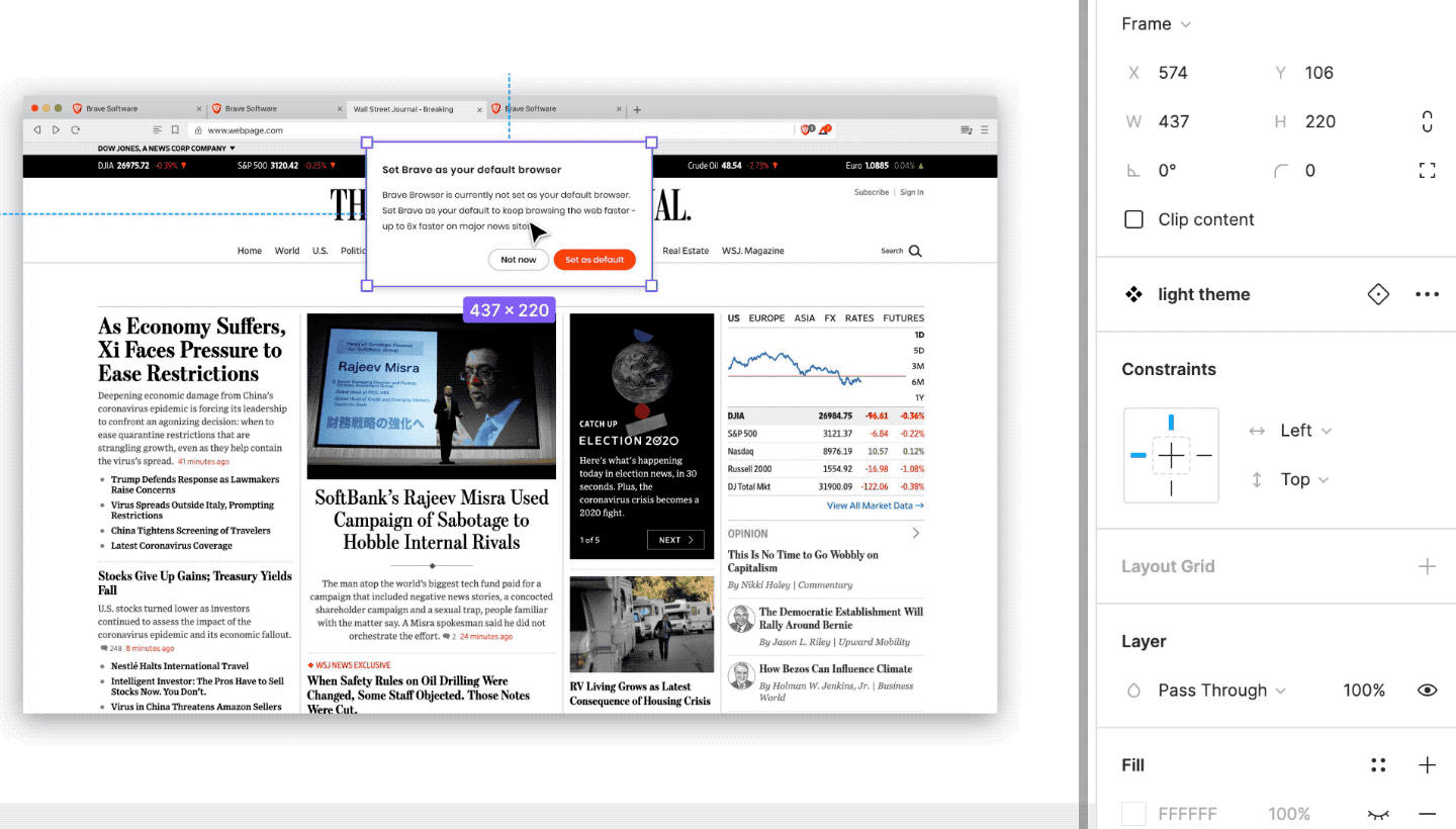
Colors, fonts, and UI components can easily be swapped out for others via searchable menus in the righthand panel containing both thumbnail images and text. Even UI effects such as shadows and background blurs can be managed in this manner.
Figma has features for design system management at the macro level too; updates to the design system can be rolled out to everyone at once, and admins can ensure design files created in specific teams come automatically with specific sets of shared component libraries. Admins also have the ability to see the level of design system adoption across the board to get insights on how to encourage more adoption.
Collaboration
Figma is like Google Docs, but for design. Expect real time collaboration and sharing where designers can design together in a single screen. Stakeholders can be assured they are always looking at the most recent designs and versioning happens automatically, with the ability to bring past versions back if necessary. Figma is fully functional in a browser, so stakeholders don’t have to install any additional software to collaborate with designers.
Developers have an easier time collaborating with designers too. You can ditch Zeplin or Sketch plugins to redline designs; the developer is empowered to go into each design — without installing extra software — and look at CSS properties, spacing, comments, token names, and more.
User permissions in Figma were made with collaboration in mind. At the enterprise level, admins can approve and install plugins for everyone, ensuring individuals who find useful plugins are also benefitting everyone else on the team. Teams can have projects with specific editing and viewing permissions. External guests can be added to specific files or projects. SSO is supported so that new employees can automatically get appropriate permissions with the rest of their software.
Pricing
If your company isn’t on Figma yet, this is probably the most persuasive case you have when convincing whoever is in charge of your design tooling.
Figma is cheaper than the Sketch+Abstract setup simply because fundamentally necessary design capabilities are built into the product without having to purchase additional software, and disparate roles in the design workflow have been priced appropriately.
While the collection of Sketch plugins varied across design teams, a few were ubiquitously used and billed separately from Sketch given that the developers were not from Sketch. In Figma, plugins we found were necessary while on Sketch+Abstract came with the product natively, and therefore reduced our costs. Collaboration tools such as Invision for commenting, and Zeplin for developer handoff are all handled within Figma. Before, we had to pay for separate Sketch licenses so that developers and collaborators could open design files in Sketch. Now, any collaborator can get viewing and commenting privileges for free. Only designers who need to edit designs need to pay.
The other cost-cutting area is prototyping. Previously we had to pay separate licenses for basic prototyping software. Now, prototyping capabilities are supported natively in Figma, cutting down costs further. GIFs work natively, making pages or sections of pages scroll is easily done, and it has a Smart Animate feature which automatically animates layers between artboards based on matching layer names, just like what Principle for Mac used to do. Although Figma is still not as powerful as Framer (design software made specifically for prototyping), Figma is sufficient for generic and quick prototyping.
Unexpected efficiency gains
Figma also comes with unexpected features to help improve designers’ efficiency. For example, duplicated layers are automatically named in ascending order.
![Duplicated layers are automatically named [layer name][n+1]](https://miro.medium.com/max/992/1*c0Gk1415yoE_5bTu4DLjWQ.gif)
When editing text, Figma automatically selects the text layer on the next mouse click, even if the text layer is nested several times under other layers. In Sketch, the text object would have to be manually selected each time the designers moved to edit a different text object.

Of course, responsive elements and layouts are also supported natively in Figma. Tasks such as specifying automatic padding and positioning relative to a parent when resizing are available right in the tool.

The verdict
Despite having to recreate our Sketch symbols in Figma, it seemed worth the effort to rebuild our components library. We decided to move away from a tool that had us bending over backwards to retrofit a design system into our workflow to a tool that supported it by design.
Figma natively supports the sharing and maintenance of the basic building blocks of a company’s brand and design system. Coupled with missing features, other efficiency issues, and the pricing — the only sensible choice was to migrate our entire design tooling over to Figma and get rid of Sketch and Abstract.
That said, Figma still presents challenges for the design team to overcome. While basic logistical issues were solved by the migration, we still have to figure out the best way to organize components, the best way to indicate to others what stage a design is in, the best way to communicate updates to design libraries, and more unknowns. The tool is also still far from perfect — a major trade-off in migrating to a cloud-connected tool like Figma is that it will vie for the same resources as your browser. Furthermore, it still doesn’t solve the pain point of not having all your designs, product specification, decision-making, design approvals, and prototyping in one place.
However, it’s clear that the status quo has been changed by Figma. Huge improvements have been made to the design process and design system support. The previous paradigm of minimal solidarity with other Sketch users has been replaced by a new one: designers on a team can now use Figma and collaborate, together.
Recommend
About Joyk
Aggregate valuable and interesting links.
Joyk means Joy of geeK