

UX Critique: The Outer Wilds [ 2/2]
source link: https://uxplanet.org/ux-critique-the-outer-wilds-2-2-faab5e37232a
Go to the source link to view the article. You can view the picture content, updated content and better typesetting reading experience. If the link is broken, please click the button below to view the snapshot at that time.

UX Critique: The Outer Wilds [ 2/2]
Continuing from where we left off….
This is the second part of the UX critique of The Outer Wilds. Before starting with this one, I urge you to read the first part and share your thought on it.
Before starting with anything, I highly recommend playing The Outer Wilds; not only it’s a beautiful game, it’s very atmospheric and pushes you to explore everything around you through its mysteries, rumors and gameplay mechanics. The addition of a mind-blowing, slowly unraveling story makes it one of the best games I’ve played.
Purchase Outer Wilds, which is now available on PC through Steam and Epic Games.
The Focus
In the last part, I explored and shared my thoughts on the initial screens of The Outer Wilds — Splash Screen, Main Menu, and the options presented to us.
In this second part, I will dig a little deep into the actual Interfaces that I saw during my gameplay and share my thoughts on them.
Like the first part of this critique, I will be going sequentially through the interfaces in the order I’ve encountered during gameplay, describing each aspect of the interface, and then adding my personal thoughts and opinions.
Also, I will try my best not to include or spoil anything related to the story in this article, but even if I do, I’ll mark a Spoiler Alert before it.
Full Disclaimer:
I am trying to understand the UX of Video Games and how UI is constructed to provide specific nuances to make up the entire game experience.
All of these will be my personal experience and opinions.Played on PC using XBOX Controller
Player — Main HUD
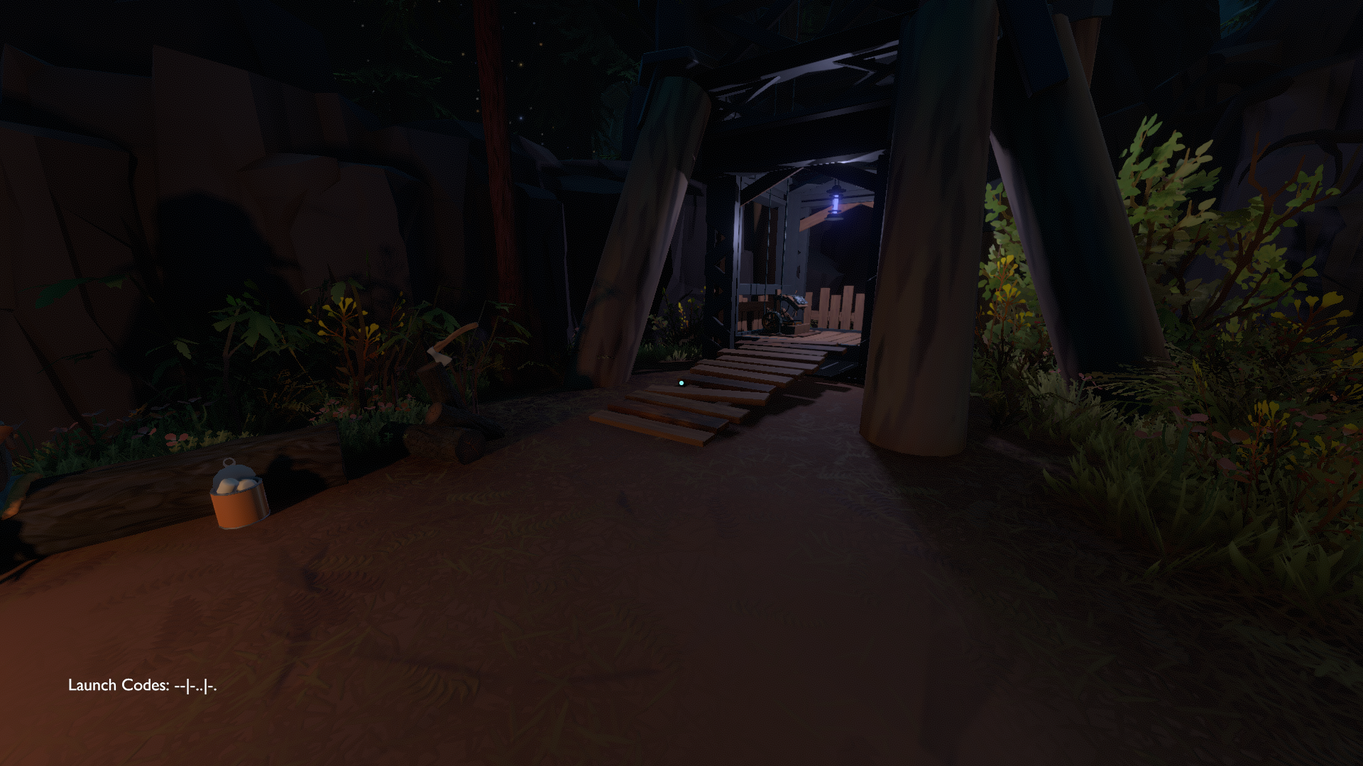
Outer Worlds is a first-person explorative game, so the main HUD creates a non-diegetic UI with 2 components to display at all times.
- Launch Codes — Bottom Left
This becomes the first task of your adventure; after that, codes just stay with you.
So this becomes part of your natural interface. - Gaze-focused reticle dot — Center
Almost all the players are familiar with reticle dots and what purpose it serves.
It brings the gaze focus on where players want to look, but instead of shooting anything or anyone, this helps players complete some of the interactions and puzzles we encounter further in the game. - Tagged Elements
If the player tags a planet from their map or ship’s log, It will be shown as a tagged element on this UI and Space-shuttle’s UI, with a small indicator of where the element is currently and its name and distance.
A small UI component, but with the scale of this game’s world, it’s a beneficial one.
Apart from that, there is no clutter on the screen, no big health meters, powerups, XP level, list of objectives, and even a minimap….for now.
This is actually by choice because of the type of game Outer Wilds really is, which emphasis the player to explore and unravel many mysteries of the Outer Wilds’s world and see how it goes.
It solely relies on the player’s curiosity and will to learn and solve mysteries — exactly like the character we play.
But actually, the player will spend a very brief time in this HUD and devote the entirety of the game to viewing a totally different HUD — which I’ll talk about in detail in a little while.
Interaction Interface
Broadly, the Interactions, which are fuelled by the player’s gaze, are divided into two sections, And the reticle dot actually is a centerpiece in performing these actions.
Gaze — Prompt Interaction
Basically, any interaction with NPC, or reading letters spread around the solar system, takes place in two steps.
- Enter NPC’s radial vicinity
A player cannot invoke any NPC interaction from any distance; it needs to enter a certain fixed radius to hook the interaction, which leads to the second part. - Gaze and Prompt
When the player gazes directly onto NPC, the reticle converts into a prompt — which signifies what action is needed to perform interaction and animation.
As players perform the action — conversation sequence triggers.
I found out some UX issues that I will highlight when we reach the Conversation section.
But apart from that, the interaction itself is pretty easy to follow and doesn’t required a learning curve itself — which is true for most of the components available in the game UI.

Gaze-Only Interaction
As you can see in the image itself, Outer Wilds UI gets pretty busy, pretty fast, with multiple gauges, buttons to take care of.
And, there are numerous puzzles and locks to be invoked in Outer Wilds — and sometimes in an absolute hurry because player’s oxygen/time is running out.
But instead of complicating or adding another layer of interaction, Devs kept a pretty straightforward approach to already defined interaction with a click or prompt.
It works this way:
- Player needs to enter a pretty relaxed radial vicinity of interactable component and,
- Keep the element in line with the reticle, the element gets activated — which is indicated as glowy blue-ball, and
- Then player can move it by moving its reticle — that means by the gaze.
It eliminated the layer of waiting for a prompt to appear and then checking what button to click — which might waste some precious seconds, and as a player gets familiar with Outer Wilds, they know time is of the essence here.
What can be Improved
Even though I love the simplicity of the interaction — I soon realized that this form of prompt-less interaction actually works better either with a controller or when we play any VR game, as we have finite control over the sensitivity of the gaze itself.
But the issue happens when we play this on PC — the sensitivity of the gaze depends on the mouse sensitivity, and players will struggle to get it working correctly — especially when you are running out of time and floating in gravity.
Of course, a player can just head to settings and alter settings, but I believe a better implementation can help players greatly.
A layer of trigger lock-on by button can be added — specifically on PC — which helps players.
A similar focus on these interactions better implement this trigger lock-on is seen in Rockstar’s Red Dead Redemption 2 — where you need to hold the “Right Mouse Button” to focus your attention and gaze on specific person/interaction.
This will help the target audience and players with special needs as now they don’t have to rely on their mouse sensitivity to perform the interaction.
Conversation System
Outer Wilds — NPC ConversationThe conversation system works in the same 2-step way that we saw in Interaction systems — Player gets prompted when they enter a defined radius and they click the prompt button, and the Conversation animation begins.
An initial conversation text comes up from the NPC itself.
Below the dividing line, we see the conversation prompts available for that particular NPC, with the first one selected by default.
Each click-on conversation prompt triggers the next set of conversations, and it continues like that; it is pretty straightforward to understand.
Since the game relies heavily on the player to read the text, it can be a bit of a heavy read, and the player has to concentrate as this will help the player unravel the mystery behind everything — connecting rumors and clearing doubts.
What can be Improved
The conversation system is self-explanatory, and it’s doing its task efficiently. What I felt that can be improved is the dialogue interface itself.
Mark the Exit
A visual indication of the exit needs to be marked to highlight the prompt that can exit the conversation. It helps to separate out the exit path from the rest of it.
In the standard UX implementation in software, we provide an explicit exit path button via icon and color, which separates it from the traditional buttons so that users don’t have to rack their brains to understand the exit.

Witcher 3 was a reading-heavy game as well(those who really wanted to understand lore), and during the conversation, exit paths were marked clearly with an exit indicator.
So that is a pretty good way to show the exit. A similar implementation should be followed here as well.
Player — Main HUD (with Suit)
This is the main view that the player will be spending almost the entirety of the game.
Compared to the default view discussed in the first section, this HUD tells a similiar but different story; it augments the original Player UI with many elements. Each element serves another but essential purpose.
As you can see in the images above, the player has access to (going from Top-left to Bottom-right):
- Player Main Stats
These stats contain an Oxygen indicator, Fuel indicator, Jet-boost indicator, and surprisingly — Health Bar in a person’s silhouette. - Minimap
A small map in a shape of a sphere is only visible when player enters the atmosphere of any planet.
It is also where player can see a trail of dots that leads to its ship’s location. - Gravity Indicator
This small meter displays the gravity of the planet or the environment player is in. - Axis Indicator? and Propulsion Meter
This indicator showcases the rotational and the vertical axis of the player with respect to the horizon.
Apart from visual indication of axis, this also has a 6-axis propulsion meter, which helps identify how much propulsion is being used, which ties in directly with Oxygen and Fuel meters. - Shortcut Keys
On the Top-right, We see the keys showcases the additional functionalities added in the suit and keys to activate them. - Bottom-Right Empty Part
This space was left intentionally blank to accommodate the interface that the player can invoke using the Shortcut.
This diegetic interface itself was well designed, and it serves its purpose without blocking the view itself.
Any error messages or timer information or any other information, like, when player is low on fuel or oxygen is displayed in the same manner in the top center of the HUD.
The visual design of the elements is showcased like the projection-type visuals that are overlaid on the suit’s helmet, which is broken from the sides. The visual intensity of the elements is uneven, which gives a realism of the interface.
Similiar effects are used in the Battlefield 3 — Jet HUD as well.

What can be Improved
UI design and the visual elements used blend nicely with the universe it is taking place, and the experience provided through it was satisfactory.
Still, few enhancements could provide a better experience.
Health Bar Visuals
Unlike Firewatch — where developers can skip the health bar entirely because a player can’t die in the game, The visuals of the health bar are of utmost importance, which I felt lacking in this game.
Because there was no color indication of health in the silhouette, I took a while to discover my health bar.
My expectations for this game to be exactly like Firewatch, because it is an explorative game, there will be no guns, combat, fight, or health consequences whatsoever, there is no danger to health — so, no health bar.

A similar interface is used in the Max Payne series, where a player’s silhouette for health starts empty. But it works flawlessly with a game because of the genre game was in — unlike Outer Wilds.
Green or similar health color fill is recommended to give a more robust implementation and enhance access to an accessible component.
Pole Indicator
There should be a naming indicator for marking the poles in the Minimap Globe to clearly signify which one is — It took me an actual while to discover this. It searched on steam to understand which one is the true North Pole (Redone), an easily solvable problem if there’s a little N indicator or an arrow point on the North pole.
I also discovered only another way to see North and South’s use of Space-shuttle’s landing camera.
In addition to mentioned issues, Red is really an absurd choice for marking the North Pole.
Primary blue should be the default color for marking North instead of South.
Signifying anything with only colors is a big accessibility no-no and provides a severe problem for people with colorblind issues.
Space-Shuttle HUD
Player’s Space-shuttle is another significant aspect where they will spend a lot of time exploring the universe.
Visually, it simulated what an actual Space shuttle dashboard looks like, and cleverly, It replaces the UI elements available when a player is in a spacesuit with more physical diegetic shuttle components.
For example:
1. It removed the Oxygen/Fuel Indicators — Shuttle is player’s safe place with Unlimited? Oxygen and fuel, when they are wandering around the solar system.
2. Axis controller and Propulsion meter are added as a physical entity inbuilt into the shuttle to make it more robust and non-intrusive with the UI.
This is a fantastic way to incorporate HUD elements into a physical space while keeping the same function.

3. Damage Monitor — If the player flies recklessly and bumps into rocks, there’s a Damage Monitor on the bottom left, which shows different parts of the ship that are being impacted.
When there’s severe damage to any specific part of the ship, it just stops working, and a player needs to go out and repair it to make it work again.
I have no issues about its UI, as it was pretty neatly designed, with each component, both in physical and HUD space, fulfilling its purpose.
Ship Log Interface

Apart from the Space-shuttle main Interface, there is another physical UI component is arguably the third most important component after Suit and Space-shuttle UI — The Ship Log.
This is where players’ progress is stored, everything they’ve explored, and everything needed to choose the next destination.
Outer Wilds unfolds in a rumor manner, as it solely depends on the player’s ability to connect the dots between each rumor, understand each aspect, and decide where to go.
Since the game works itself in a tight loop, everything the player explored or encountered is recorded.
Interface-wise it is straightforward, nodes are classifying what they mean, and a player can click on it, and it shows information associated with each node.
It doesn’t tell the player where it will connect, but that’s for the best as it maintained a high mystery of where it will lead.
A player can also jump into Map mode, where it showcases the rumor based on each planet, so that player can choose their next destination or if they want to explore the same world in search of more rumors.
It gels with the Rumor mode cohesively with no learning curve.
Understanding and Using this interface is a core part of Outer Wilds gameplay. This interface’s UX effectively makes this part a natural part of Outer Wilds interface, which is very well designed with a minimal learning curve.
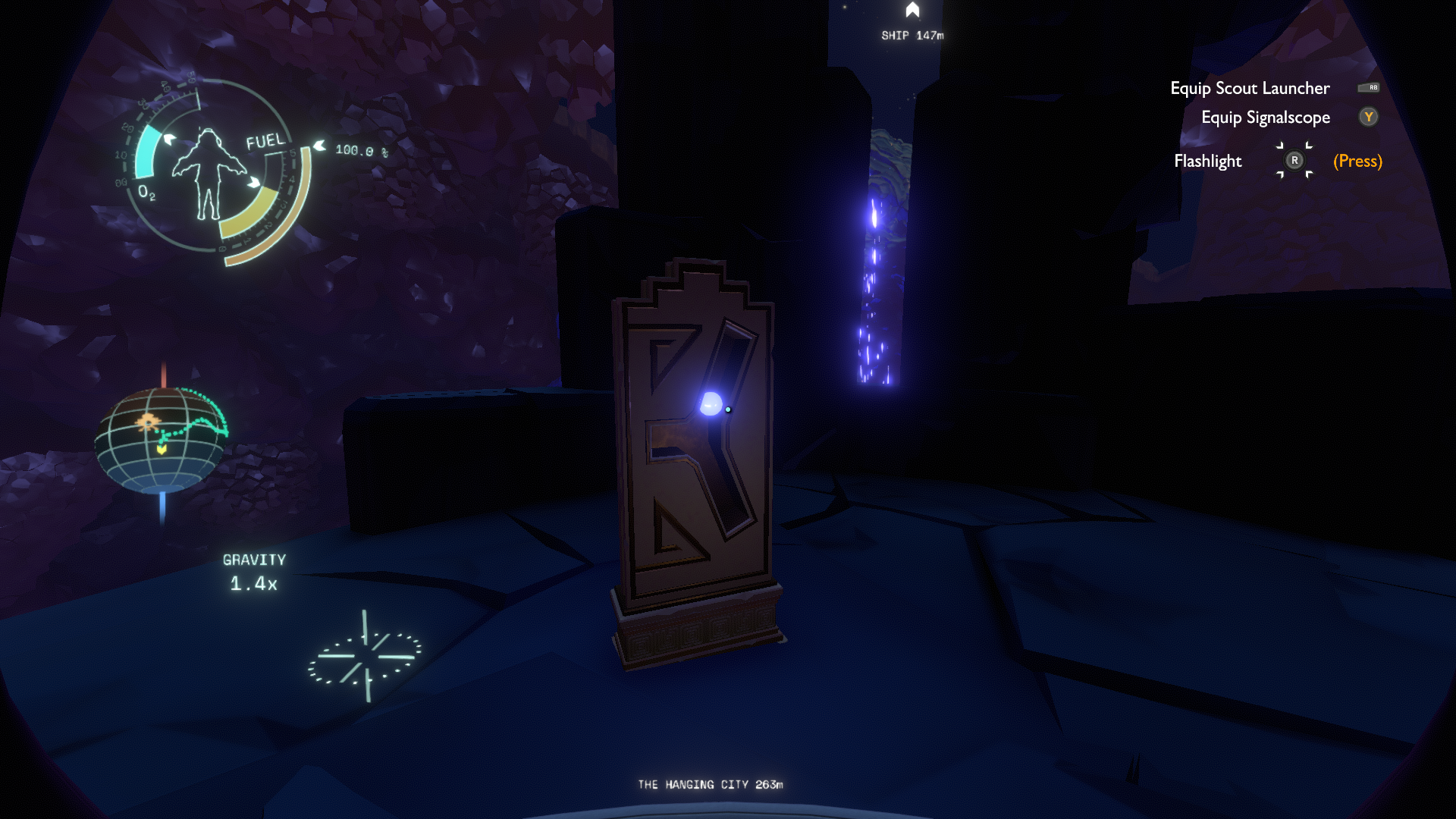
Other UI Elements
There are more UI components available in the game than I’ve discussed in these 2 parts of the article.
For example:
- Scout Launcher
- Landing Camera
- Translator Device
- Actual Map of System — Planet Classification
- Signalscope
These elements are designed cohesively, and I don’t have any design thoughts related to this, so I chose to omit these.
But I’d love to hear from you people, what do you think can be improved in these components or the ones I’ve discussed.
Parting Thoughts
This concludes what I wanted to cover here.
In this second part, We continued from the first part and tried to dig deep into the UI of the Outer Wilds and understand what they are and what else can be done to make it even better.
If you haven’t read the first part, please do, and share your thoughts.
Creating an engaging and meaningful experience is the only way to make a product stand out from competitors — be it game or software products.
Outer Wilds achieved just that; it really is a game to remember; there are infrequent instances when the game submerges players in such fun, full of mystery, and engaging experiences and story.
If you haven’t played this game, I urge you to try it once — If you are into Story-heavy, Mystery-heavy, Explorative, Combat-less games.
Even if you are not, give it a shot, nonetheless. Steam sale is around the corner as well, so why not.
I thank Mobius Digital for creating this experience and hoping to see more awesome adventures from their talented team.
If you have any thoughts or feedback on:
How can I improve my writing? What else can I cover or any other feedback? That’ll be really great.
You can explore my other work here and connect with me on my LinkedIn to share your thoughts or just talk in general.
Here are some interesting reads that helped me get started on understanding UX of games:
Cheers!
Recommend
About Joyk
Aggregate valuable and interesting links.
Joyk means Joy of geeK