

An Introduction to Drawing Charts with Chart.js
source link: https://www.codedrome.com/chartjs-intro/
Go to the source link to view the article. You can view the picture content, updated content and better typesetting reading experience. If the link is broken, please click the button below to view the snapshot at that time.

This is the first of a series of articles on the Chart.js JavaScript library which provides us with quick and easy but powerful ways to draw a variety of data-driven charts in a web page.
In this article I will introduce the library and provide some sample code which will get you up and running quickly but also build a firm foundation for expansion and enhancement.
The Chart.js Library
Chart.js is free and open-source under the MIT licence and "lives" on GitHub and is also on NPM. It was first introduced in 2013 and so is mature and stable.
The library is well documented on its own site chartjs.org but in this series I will go into greater depth, discussing when and why you might choose a particular type of chart, as well as a few "hacks" for more complex or specialist situations.
First though we need to get started with the basics so in this introductory article I will create a simple HTML page to display charts, along with some JavaScript to do the work.
The Source Code
I will be adding all the source code for this series of articles to a single ZIP file and GitHub repository, the links to which are below.
Source Code Links
The HTML Page
The page used to display charts is very simple, and just contains a canvas element and the necessary JavaScript files.
chartjs.html
<!DOCTYPE html>
<html lang="en">
<head>
<meta charset="utf-8"/>
<title>Chart.js Introduction</title>
<head>
<body>
<div style="width: 800px; height: 400px;">
<canvas id="chart" width="800px" height="400px">
<p>No canvas :(</p>
</canvas>
</div>
<script src="https://cdnjs.cloudflare.com/ajax/libs/Chart.js/3.3.2/chart.min.js"></script>
<script src="chartdefaults.js" type="text/javascript"></script>
<script src="chartjscolors.js" type="text/javascript"></script>
<script src="chartdata.js" type="text/javascript"></script>
<script src="chartjsintro.js" type="text/javascript"></script>
<body>
</html>
Note that I am using a CDN (content delivery network) for chart.min.js but you can download and use your own copy if you prefer.
Data Sources
The official documentation includes numerous examples but these are mostly self-contained, with all data, colours etc. hard coded into a single block of code. To make my Chart.js demonstration environment more flexible and extensible I will move as much as possible out to separate objects in separate JavaScript files.
The first of these separate files is chartdata.js which contains objects the properties of which are arrays containing the names and values of individual data points.
In the scary place that they call The Real World you are most likely to get your chart data in a format similar to these objects, for example parsed from JSON obtained via a REST service. The sample code which actually creates charts can therefore easily be edited to adapt to your requirements, for example calling a function which grabs JSON from a rest service and returns it in a parsed form.
This is the current contents of chartdata.js. It should be self-explanatory from the names and I will add to it as this series of articles progresses.
chartdata.js
const chartData = {};
chartData.countryPopulations = {
countries: ['France', 'Germany', 'Italy', 'Spain', 'United Kingdom'],
populations: [65, 84, 60, 47, 68],
};
chartData.countryAreas = {
countries: ['France', 'Germany', 'Italy', 'Spain', 'United Kingdom'],
areas: [551695, 357386, 301338, 498511, 242495],
};
chartData.LondonMonthlyTemperatures = {
months: ['January',
'February',
'March',
'April',
'May',
'June',
'July',
'August',
'September',
'October',
'November',
'December'],
min: [2, 2, 3, 5, 8, 11, 13, 13, 11, 8, 4, 2],
max: [7, 8, 10, 13, 17, 20, 22, 22, 19, 15, 10, 8],
};
Colors
The samples on chartjs.org also have arrays of colours hard-coded into them. As with the data this is fine for self-contained examples but as your projects expand it becomes unsustainable if you need to reuse colour schemes or provide colour scheme options.
Yes, you guessed it: I have created a file with an object containing several arrays of colours for repeated use and easy editing. You can think of this as conceptually similar to a CSS file. Here it is:
chartjscolors.js
chartjsColors = {}
chartjsColors.backgroundColors =
[
'rgba(255, 0, 0, 0.4)',
'rgba(0, 255, 0, 0.4)',
'rgba(0, 0, 255, 0.4)',
'rgba(255, 255, 0, 0.4)',
'rgba(0, 255, 255, 0.4)',
]
chartjsColors.borderColors =
[
'rgba(255, 0, 0, 1)',
'rgba(0, 255, 0, 1)',
'rgba(0, 0, 255, 1)',
'rgba(255, 255, 0, 1)',
'rgba(0, 255, 255, 1)',
]
chartjsColors.minTempLine = 'rgba(0, 0, 255, 1)'
chartjsColors.maxTempLine = 'rgba(255, 0, 0, 1)'
Changing Option Defaults
When creating a chart we can specify a large number of options which affect the appearance and behaviour of the chart. Many if not most can be left at their default values so we will typically only need to set a handful.
The defaults are defined in Chart.defaults, the properties of which can be overwritten if you find yourself using the same options repeatedly.
Carrying on with the theme of streamlining as much as possible I have added another JavaScript file into this project called chartdefaults.js. Just to give a flavour of how it works I have changed a few of the title properties but there are many more, documented on the Chart.js site. Remember these are only defaults and even if they are changed can easily be overridden.
chartdefaults.js
Chart.defaults.plugins.title.color = 'rgba(0, 0, 192, 1)';
Chart.defaults.plugins.title.font.size = 20;
Chart.defaults.plugins.title.display = true;
Chart.defaults.plugins.title.font.family = "'Times New Roman', 'serif'";
Let's Actually Draw Some Charts...
We have some data and colour schemes, and know how to change default options to save a bit of time. Now for the easy bit: drawing a few charts.
Chart.js provides 8 different types of chart, some of them specialised to the point of being esoteric, but for this introductory article I'll draw just three which are probably the best known and most useful:
- Bar chart showing country population data
- Line chart showing average monthly temperatures in London
- Pie chart showing country area data
The First Bits of JavaScript
The code actually drawing charts is in chartjsintro.js which starts out like this.
chartjsintro.js - part 1 of 4
"use strict"
const app = {
canvasContext: document.getElementById('chart').getContext('2d')
};
window.onload = () =>
{
bar();
// line();
// pie();
}
Firstly I have created an object called app which here has just one property, the 2d context of our canvas. In a more complex solution it would have more properties.
The window.onload handler simply calls the three chart-drawing functions which we can comment/uncomment as we go along.
Bar Chart Showing Country Population Data
At last we get to actually draw a chart. This is the function to draw a bar chart.
chartjsintro.js - part 2 of 4
function bar()
{
const myChart = new Chart(app.canvasContext,
{
type: 'bar',
data:
{
labels: chartData.countryPopulations.countries,
datasets:
[{
data: chartData.countryPopulations.populations,
backgroundColor: chartjsColors.backgroundColors,
borderColor: chartjsColors.borderColors,
borderWidth: 1
}]
},
options:
{
plugins:
{
legend: { display: false, },
title: { display: true, text: 'Population (millions)' }
},
// indexAxis: 'y',
scales: { y: { beginAtZero: true } }
}
});
}
All we need do to draw a chart is create a new Chart object with a 2d canvas context and an object containing the necessary information.
Firstly we need to specify the type of chart, in this case bar, and then data. This should be self-explanatory and the labels, data and colours all come from the objects in other JavaScript files which I discussed above. Finally we have a few options. The legend shows blocks of colour and their corresponding label but here it is suppressed because the labels are shown on the x-axis. We also set the title, and finally force the chart to start the y-axis scale at 0. If we don't do this it might choose another starting point which can be misleading and in my opinion should only be used when values are very close and otherwise hard to distinguish.
Now open chartjs.html in any browser you might have lying around and you should see this.

The heading is formatted in accordance with the overwritten defaults, and if you mouseover one of the bars the corresponding label and value are shown.
You might have noticed the commented out line of code setting indexAxis to 'y'. If you uncomment this you'll get a horizontal bar chart like this.

Line Chart Showing Average Monthly Temperatures in London
A bar chart is ideally suited to discrete individual values, but if you have time series data consisting of one or more variables measured at various points over time then a line chart is more suitable. To demonstrate this I'll use a line chart to display the average monthly temperatures in London, the data for which you saw earlier.
This is the source code.
chartjsintro.js - part 3 of 4
function line()
{
const data =
{
labels: chartData.LondonMonthlyTemperatures.months,
datasets: [{
label: 'Max',
backgroundColor: chartjsColors.maxTempLine,
borderColor: chartjsColors.maxTempLine,
data: chartData.LondonMonthlyTemperatures.max,
borderWidth: 1,
tension: 0.4,
},
{
label: 'Min',
backgroundColor: chartjsColors.minTempLine,
borderColor: chartjsColors.minTempLine,
data: chartData.LondonMonthlyTemperatures.min,
borderWidth: 1,
tension: 0.4,
},]
};
const config =
{
type: 'line',
data: data,
options:
{
scales: { y: { beginAtZero: true } },
plugins:
{
legend: { position: 'right', },
title:
{
display: true,
text: 'London Monthly Temperatures (\u00B0C)'
}
}
}
};
var myChart = new Chart(app.canvasContext, config);
}
I have used a slightly different approach here in that both the data and config objects are created outside of the creation of the Chart object, and passed as arguments. This makes the code tidier and easier to maintain, especially as we have more going on and therefore more lines of code.
Firstly note that we have two datasets, each with their own labels and colours. (I'll explain tension: 0.4 in a moment.)
Most of config is familiar from the bar chart but this time we want to show the legend. The defaults is 'top' so I have changed it to 'right'. Finally we just create a new Chart with the relevant arguments.
At the top of the file in the onload event handler comment out bar();, uncomment line(); and refresh the page in your browser. This is the new chart.
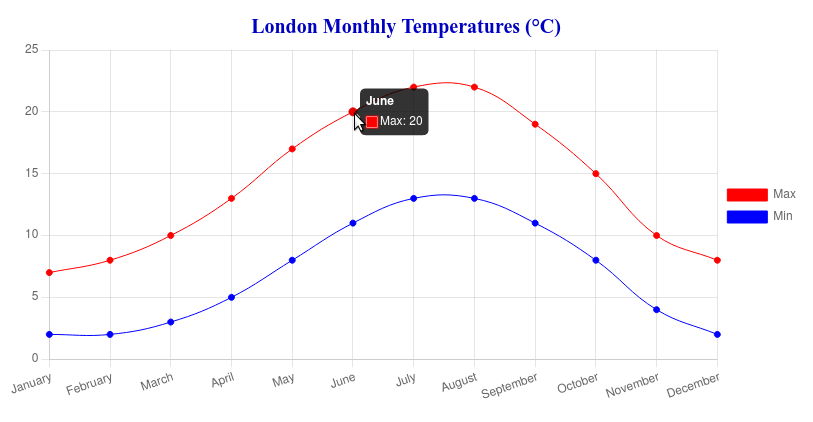
As with the bar chart you can mouseover the data points to see the label and value. I'm writing this in London in June and it's a lot hotter than 20°C!
The tension: 0.4 I promised to explain causes the lines to use cubic interpolation. Maybe one day I'll work out the mathematics behind it and write an article on the topic, but from the name it is clear that an equation containing x3 is used. It's more for aesthetic purposes than a serious attempt at interpolation and it certainly looks better than a series of straight lines.
You might want to try experimenting with different values for the tension. This uses 4.0 which is entertaining but perhaps not a good representation of reality...

Pie Chart Showing Country Area Data
Now let's look at the code to draw a pie chart, this time using the country area data.
chartjsintro.js - part 4 of 4
function pie()
{
const data =
{
labels: chartData.countryAreas.countries,
datasets: [{
data: chartData.countryAreas.areas,
backgroundColor: chartjsColors.backgroundColors,
borderColor: chartjsColors.borderColors,
borderWidth: 1
}]
};
const config =
{
type: 'pie',
// type: 'doughnut',
data: data,
options:
{
plugins:
{
legend: { position: 'right', },
title:
{
display: true,
text: 'Country Areas (km\u00B2)'
}
}
}
};
var myChart = new Chart(app.canvasContext, config);
}
This should all be familiar by now, so comment/uncomment the function calls at the top of the file and refresh the page.

If you change the type from 'pie' to 'doughnut' you'll get something slightly different.

This is conceptually the same as a pie chart, but I feel it could imply non-existent adjacancies (or lack of) caused by no more than the way the data happens to be ordered. Also, the ring might imply some sort of circular "flow", again spurious. Just my opinion, and in the end the decision to use a pie or a doughnut is just a matter of personal preference.
What's Next
That's the end of my introduction to Chart.js and I hope you have enough information to get something useful up 'n' running.
We now have a firm foundation for exploring Chart.js further and indeed stretching it to its limits. It is straightforward to add more data and chart-drawing functions to the existing code which is what I will do in future articles.
Firstly I'll look into the other types such as radar and bubble charts, and then I'll move on to using/abusing Chart.js in ways it probably wasn't built for...
Recommend
-
50
Subscribe On YouTube Demo
-
52
Creating Quality Control Charts using qcc package Roberto...
-
14
Ruby, ChartKick and chart.js versus Google Charts and the Y Axis Auto Sizing Dec 13, 2019 Like a lot of people in th...
-
5
Introduction As I’ve been learning about developing websites using Python and Flask, I’ve had to learn a decent amount of HTML and CSS in order to make the web pages look decent. Bootstrap has...
-
7
By Ruben Geert van den Berg under Charts SPSS chart templates are tiny text files that contain styling for charts. Practice Data File This tutorial walks you...
-
4
The previous tutorial of this series focused on creating line and bar charts using Chart.js. Both these charts have their own uses a...
-
5
Laravel 5 Chart example using Charts Package 393228 views 4 years ago Laravel
-
6
Bar Chart Example With Angular 13 Using ng2-chartsThis tutorial help to implement chart.js into angular 13 application. The Chart is a graphical representation of data, in which “the data is represented b...
-
10
Angular 12 Line Chart using ng2-charts Example 4189 views 9 months ago Angular This example is fixated on the angul...
-
1
October 25, 2022 Real-time Charts with ASP.NET Core, SignalR, and Chart.js
About Joyk
Aggregate valuable and interesting links.
Joyk means Joy of geeK