

五种Pandas图表美化样式汇总
source link: https://zhuanlan.zhihu.com/p/380612027
Go to the source link to view the article. You can view the picture content, updated content and better typesetting reading experience. If the link is broken, please click the button below to view the snapshot at that time.

五种Pandas图表美化样式汇总
Pandas是一种高效的数据处理库,它以dataframe和series为基本数据类型,呈现出类似excel的二维数据。
在Jupyter中,会美化Pandas的输出。不同于IDE展示的文本形式,Jupyter可以通过CSS修改表格的样式。
我们在做excel表格的时候,常常会对重要数据进行highlight,或者用不同颜色表示数据的大小。这在Pandas中也是可以实现的,而且非常简洁。

Pandas提供了DataFrame.style属性,它会返回Styler对象,用以数据样式的美化。
一般的,我们需要将样式函数作为参数传递到下面方法中,就可以实现图表美化。
- Styler.applymap: 作用于元素
- Styler.apply:作用于行、列或整个表
下面通过一些例子,具体展示常用的美化形式。
一、高亮显示
为便于展示,数据示例是用的2021世界人口数量前十国家数据。
import pandas as pd
data = pd.read_excel(r"E:\\jupyter_notebook\\2021世界人口数据.xlsx")
data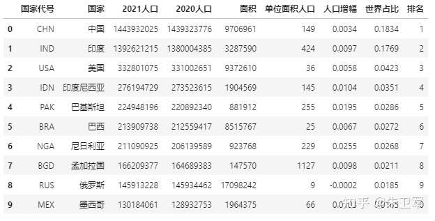
我们先看下该表的信息:
data.info()
除了前两列,其他列都为数字类型。
现在对指定列的最大值进行高亮处理:
def highlight_max(s):
    '''
    对列最大值高亮(黄色)处理
    '''
    is_max = s == s.max()
    return ['background-color: yellow' if v else '' for v in is_max]

data.style.apply(highlight_max,subset=['2021人口', '2020人口', '面积','单位面积人口','人口增幅','世界占比'])
如果不想对元素背景高亮处理,也可以直接更改指定元素颜色,从而达到突出重点的目的。
标记单位面积人口列大于200的元素:
def color_red(s):
    is_max = s > 200
    return ['color : red' if v else '' for v in is_max]

data.style.apply(color_red,subset=['单位面积人口'])
二、数据条显示
Excel条件格式里,有一个数据条显示方式,用以可视化表达数据大小。
Pandas Style方法中也有数据条的表达形式,用df.style.bar来实现。
还是用前面人口数据的例子,我们来看下如何操作数据条。
import pandas as pd
data = pd.read_excel(r"E:\\jupyter_notebook\\2021世界人口数据.xlsx")
# 数据条显示指定列数据大小
data.style.bar(subset=['2021人口', '2020人口'], color='#FFA500')
三、色阶显示
色阶也就是热力图,它和数据条一样,都用来表达数据大小。
Pandas Style中色阶的使用也很简单,用df.style.background_gradient实现。
import seaborn as sns

# 使用seaborn获取颜色
cm = sns.light_palette("green", as_cmap=True)
# 色阶实现
data.style.background_gradient(cmap=cm,subset=['2021人口', '2020人口', '面积','单位面积人口','人口增幅','世界占比'])
可以通过选择最大最小颜色比例,调节色阶范围。
import seaborn as sns

# 色阶实现,这里使用内置色阶类型,不调节颜色范围
data.style.background_gradient(cmap='viridis',high=0.2,low=0.1,subset=['2021人口', '2020人口', '面积','单位面积人口','人口增幅','世界占比'])
import seaborn as sns

# 色阶实现,这里使用内置色阶类型,调节颜色范围
data.style.background_gradient(cmap='viridis',high=0.5,low=0.3,subset=['2021人口', '2020人口', '面积','单位面积人口','人口增幅','世界占比'])
四、百分比显示
有些数字需要百分比显示才能准确表达,比如说人口数据里的人口增幅、世界占比。
Pandas可以数据框中显示百分比,通过Styler.format来实现。
data.style.format("{:.2%}",subset=['人口增幅','世界占比'])
五、标记缺失值
数据集中可能会存在缺失值,如果想突出显示缺失值,该怎么操作?
这里有好几种常用的方法,一是用-符号替代,二是高亮显示
先创建一个带缺失值的表,还是用人口数据。
import pandas as pd
import numpy as np
data = pd.read_excel(r"E:\\jupyter_notebook\\2021世界人口数据.xlsx")
data.iloc[1, 4] = np.nan
data.iloc[3, 1] = np.nan
data.iloc[6, 6] = np.nan
data
上面数据中有三个缺失值,我们用-符号替代缺失值:
data.style.format(None, na_rep="-")
再试试对缺失值高亮显示:
data.style.highlight_null(null_color='red')
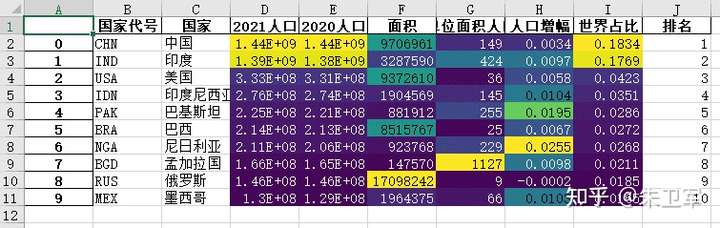
附:将样式输出到excel
Pandas中的数据美化样式不仅可以展示在notebook中,还可以输出到excel。
这里使用to_excel方法,并用openpyxl作为内核
import pandas as pd
import numpy as np
data = pd.read_excel(r"E:\\jupyter_notebook\\2021世界人口数据.xlsx")
data.style.background_gradient(cmap='viridis',subset=['2021人口', '2020人口', '面积','单位面积人口','人口增幅','世界占比']).\
                              to_excel('style.xlsx', engine='openpyxl')
❝本文参考Pandas官方文档Styling章节
Recommend
About Joyk
Aggregate valuable and interesting links.
Joyk means Joy of geeK