

【Python】绘图方法汇总2
source link: https://www.guofei.site/2017/11/01/datavisualization.html
Go to the source link to view the article. You can view the picture content, updated content and better typesetting reading experience. If the link is broken, please click the button below to view the snapshot at that time.

【Python】绘图方法汇总2
2017年11月01日Author: Guofei
文章归类: 7-可视化 ,文章编号: 722
版权声明:本文作者是郭飞。转载随意,但需要标明原文链接,并通知本人
原文链接:https://www.guofei.site/2017/11/01/datavisualization.html
单变量
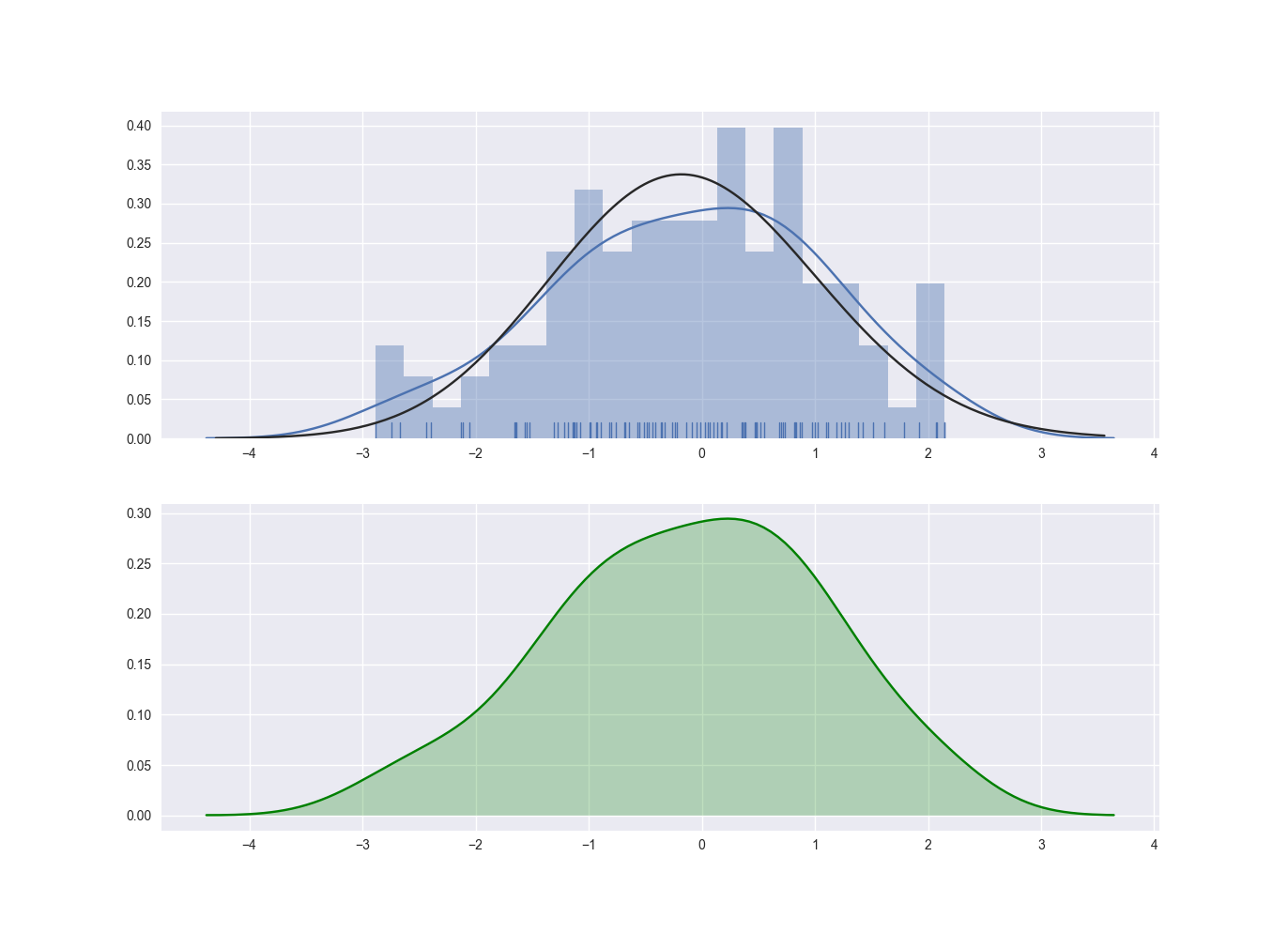
分布图 sns.distplot()
from scipy import stats
import matplotlib.pyplot as plt  # 导入
import seaborn as sns

fig,ax=plt.subplots(2,1)
x = stats.norm.rvs(loc=0, scale=1, size=100)
sns.distplot(x, bins=20, kde=True, hist=True, rug=True, fit=stats.gamma,ax=ax[0]);
# bins直方图多少个矩阵条
# hist=True显示直方图
# kde=True 显示核密度分布图
# fit=stats.gamma 拟合
# rug=True 在x轴上显示每个观测上生成的小细条(边际毛毯)

sns.distplot(x, hist=False, color="g", kde_kws={"shade": True}, ax=ax[1])
# kde图上阴影
plt.show()
displot的输入参数 解释 bins 直方图多少个矩阵条 hist 是否显示直方图 kde 是否显示核密度估计图 fit 是否显示拟合图 rug 是否显示边际毛毯
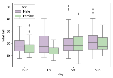
box图
sns.boxplot
官方示例
matplotlib版本示例
import seaborn as sns
df = sns.load_dataset("tips")

sns.boxplot(data=df, x="day", y="total_bill", hue="sex", palette="PRGn")
palette=’Set1’,’Set2’,’Set3’,’PRGn’…
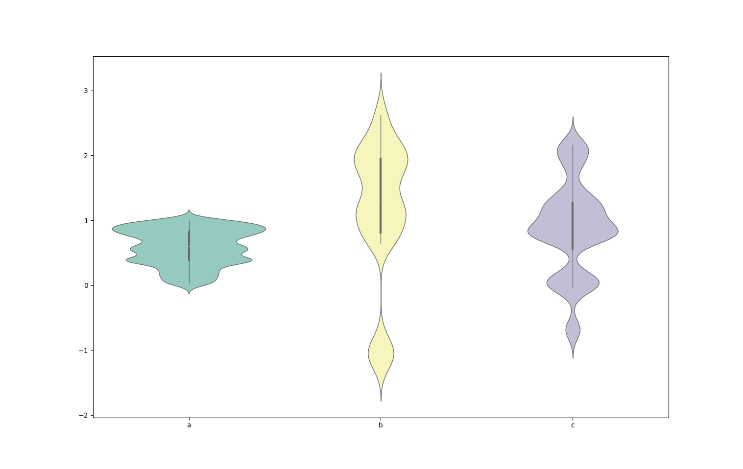
小提琴图
小提琴图1
每一列数据作为一个小提琴
import seaborn as sns
df = sns.load_dataset("tips")

sns.violinplot(data=df, palette="Set3", bw=.2, cut=3, linewidth=1)
小提琴图2
定义x列和y列,定义分类hue(可选)
import seaborn as sns
df = sns.load_dataset("tips")

sns.violinplot(data=df, x="day", y="total_bill", hue="sex", bw=.2, cut=3, linewidth=1, palette="PRGn")
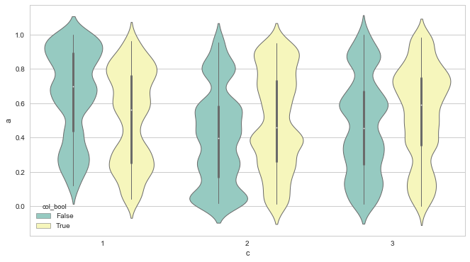
小提琴图3
import seaborn as sns
df = sns.load_dataset("tips")

sns.violinplot(data=df, x="day", y="total_bill", hue="sex",split=True, bw=.2, cut=3, linewidth=1, palette="PRGn")
#split=True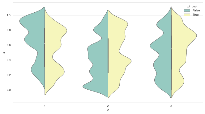
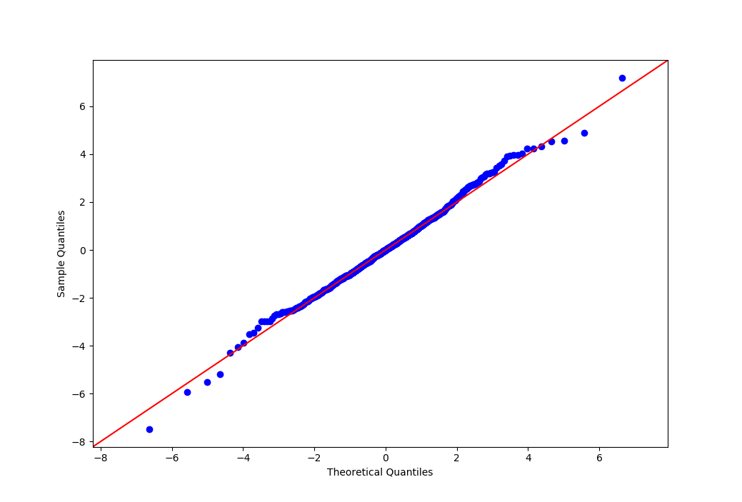
qq图
用来看看是否服从特定分布2
(所用库:statsmodels)
from scipy.stats import t
data = t(df=5).rvs(size=1000)

import statsmodels.api as sm
from matplotlib import pyplot as plt
fig = sm.qqplot(data=data, dist=t, distargs=(3,), fit=True, line='45')
plt.show()
多变量
regplot
df = pd.DataFrame(np.random.rand(200).reshape(-1, 2), columns=['x', 'resid'])
df.loc[:, 'y'] = df.loc[:, 'x'] + df.loc[:, 'resid'] + 1

sns.regplot(x=df.x, y=df.y,
            scatter=True,  # 画散点图
            fit_reg=True,  # 回归并画回归线
            ci=95,  # 置信区间 [0,100]
            color='r',  # 颜色
            marker='^',  # 点的形状
            ax=None  # 使用哪个 axes
            )

# 另一种用法
# sns.regplot(x='x', y='y', data=df)
还有些其它用法:
- order=2, 多项式回归
- sns.lmplot 可以分组把多个图画下来
- jointplot, pairplot 这两个画图方法可以设定
kind="reg",从而调用 regplot
jointplot
df = pd.DataFrame(np.random.rand(200).reshape(-1, 2), columns=['x', 'resid'])
df.loc[:, 'y'] = df.loc[:, 'x'] + df.loc[:, 'resid'] + 1

sns.jointplot(x=df.x, y=df.y, kind='kde', space=0)
# sns.jointplot(x='x', y='y', data=df, kind='hex', space=0)

# space 是三个子图之间的空隙
# kind='kde', 'hex', 'scatter', 'reg'
kind=’kde’: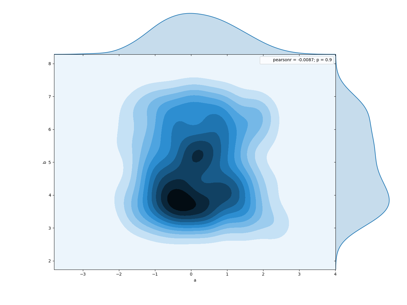
kind=’hex’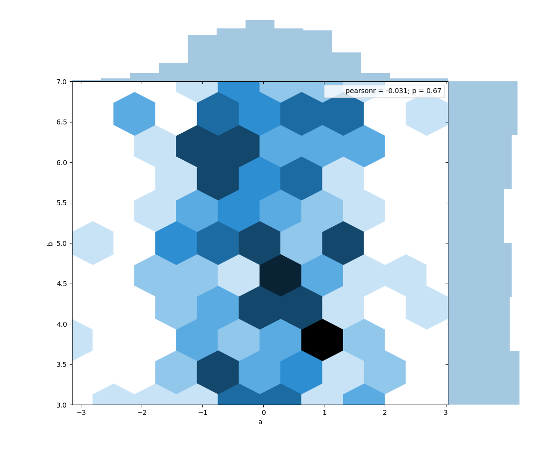
kind=’scatter’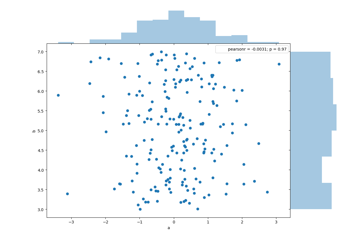
kind=’reg’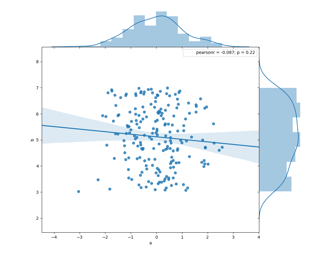
PairGrid
import matplotlib.pyplot as plt
import seaborn as sns

iris = sns.load_dataset("iris")

# 1. 用什么数据
g = sns.PairGrid(iris, vars=["sepal_length", "sepal_width"], hue="species")
# vars:指定画哪几个变量。默认全画
# hue:按照这一列分组


# 2. 在哪画图
# g.map = g.map_diag(对角线) + g.map_offdiag(非对角线)
# g.map_offdiag = g.map_upper + g.map_lower

# 3. 画什么图
# g.map_diag(plt.hist)
g.map_diag(sns.kdeplot, lw=3, legend=False)
# 主对角线,可以画的图有:
# a) plt.scatter(默认)
# b) plt.hist
# c) g.map_diag(sns.kdeplot, lw=3, legend=False)

g.map_upper(plt.scatter)
g.map_lower(sns.kdeplot)
# 可以画的图有:
# plt.scatter(默认)
# sns.kdeplot:对角线上就是kde,其它地方是二维kde,所以画成等高线图
# sns.regplot:带回归线和预测范围的 scatter


# 4. 美化:针对有分类 hue 的情况,会在右边显示 label
g.add_legend()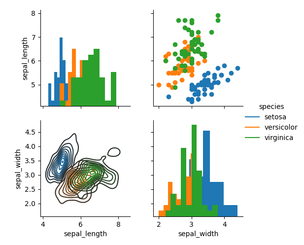
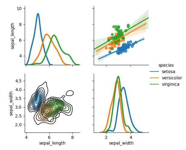
另外,还可以更精细地指定画哪些图
g = sns.PairGrid(iris, x_vars=['petal_length','sepal_width'], y_vars=['petal_length'], hue="species")
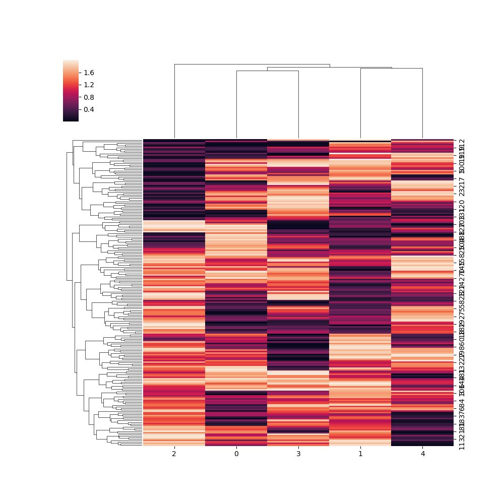
clustermap
import pandas as pd
import scipy.stats as stats
df = pd.DataFrame(stats.uniform(loc=0, scale=2).rvs(size=1000).reshape(-1, 5))


import matplotlib.pyplot as plt
import seaborn as sns
sns.clustermap(df)
plt.show()
对应的参数:
col_cluster=False
row_cluster=False
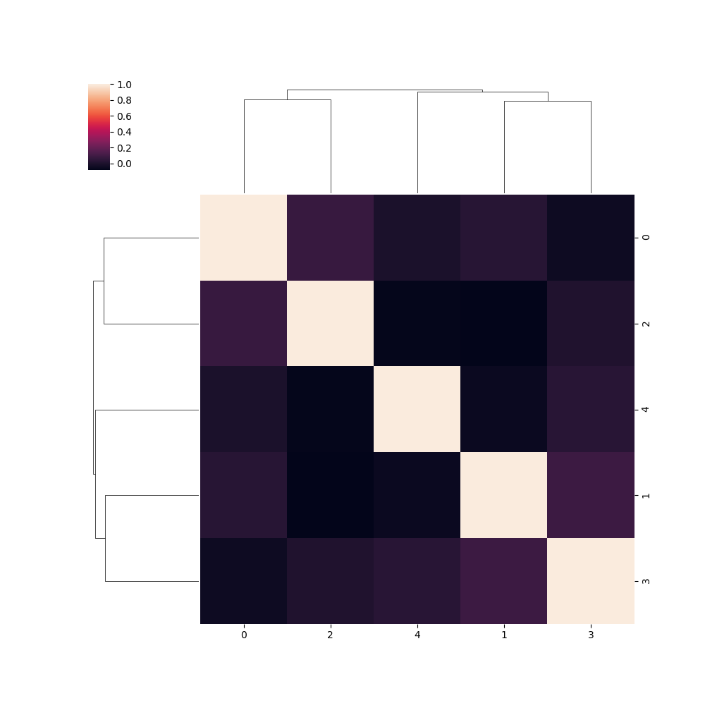
还有第二种图:
sns.clustermap(df.corr())
plt.show()
常用自定义画图
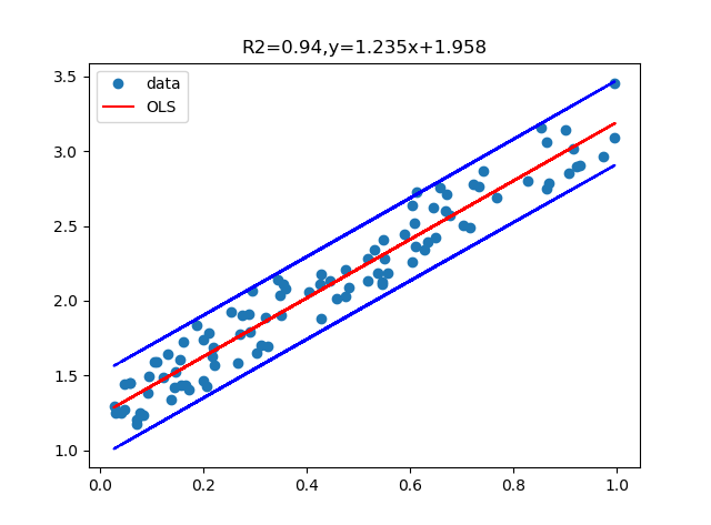
一种回归并画图的例子
# 导入包与数据
import pandas as pd
from statsmodels.sandbox.regression.predstd import wls_prediction_std
import matplotlib.pyplot as plt
import numpy as np
df=pd.DataFrame(np.random.rand(200).reshape(-1,2),columns=['x','resid'])
df.loc[:,'y']=2*df.loc[:,'x']+0.5*df.loc[:,'resid']+1

# 建模
import statsmodels.formula.api as smf
lm_s = smf.ols(formula='y ~ x', data=df).fit()

# 画图
prstd, iv_l, iv_u = wls_prediction_std(lm_s)
fig, ax = plt.subplots()
ax.plot(df.x, df.y, 'o', label="data")
ax.plot(df.x, lm_s.fittedvalues, 'r-', label="OLS")
ax.plot(df.x, iv_u, 'b--')
ax.plot(df.x, iv_l, 'b--')
ax.legend(loc='best')
plt.title('R2={a:.2f},y={b:.3f}x+{c:.3f}'.format(a=lm_s.rsquared,b=lm_s.params[0],c=lm_s.params[1]))
plt.show()
参考文献
您的支持将鼓励我继续创作!
Recommend
-
67
Python Matplotlib 绘图使用指南 (附代码)
-
7
【丢弃】【Python】【seaborn】绘图示例 2017年10月01日 Author: Guofei 文章归类: ,文章编号: 751 版权声明:本文作者是郭飞。转载随意,但需...
-
6
【matplotlib】绘图方法汇总1 2017年09月25日 Author: Guofei 文章归类: 7-可视化 ,文章编号: 721 版权声明:本文作者是郭飞。转载随意,但需要...
-
7
Pandas必会的方法汇总,用Python做数据分析更加如鱼得水! ...
-
6
在可视化数据时,通常需要在单个图形中绘制多个图形。 例如,如果您想从不同的角度可视化相同的变量(例如,数字变量的并排直方图和箱线图),则多个图形很有用。 在这篇文章中,我分享了绘制多个图形的 4 个简单但实用的技巧。
-
4
很多情况下,为了能够观察到数据之间的内部的关系,可以使用绘图来更好的显示规律。 比如在下面的几张动图中,使用
-
3
诈尸人口回归。这一年忙着灌水忙到头都掉了,最近在女朋友的提醒下终于想起来博客的账号密码,正好今天灌水的时候需要画一个双X轴双Y轴的图,研究了两小时终于用Py实现了。找资料的过程中没有发现有系统的...
-
3
使用 drawInRect 绘图时丢失清晰度解决方法 2013/07/24 18:40 | Co...
-
3
opencv 绘图及交互(python) 原创 暴风雨中的白杨 2022-06-08 00:07:58
-
6
V2EX › 问与答 请教一个关于 Python 绘图的问题,我写了一段代码,随机挑选一张图片给图片中间加上一个半透明的黑色正方形,但是最后生...
About Joyk
Aggregate valuable and interesting links.
Joyk means Joy of geeK