

Case study: A platform to get you started with Cloud Kitchen
source link: https://bootcamp.uxdesign.cc/case-study-a-platform-to-get-you-started-with-cloud-kitchen-a36fa4ef557d
Go to the source link to view the article. You can view the picture content, updated content and better typesetting reading experience. If the link is broken, please click the button below to view the snapshot at that time.

Case study: A platform to get you started with Cloud Kitchen
This case study was an assignment project I did as a part of the 10kdesigners masterclass with a duration of 16 days.
👋I’m Papori, a Product Designer trying to solve problems in the Food & restaurant industry space with this case study.
Let me tell you a story because of which I decide to write this case study.
I use Instagram a lot on a daily basis. One day I saw an ad on Cloud Kitchen MasterClass. I heard of the term Cloud Kitchen for the very first time. I was curious on knowing more about it.
It was a video ad & it was quite interesting to watch that ad, it fully justified why people should know about Cloud Kitchen & earn money through it.
The video ad was by this guy.
I got interested & started googling about it more. I went through some articles, videos & even online Reddit groups.
Here’s what I got first from the internet resources:
- A cloud kitchen — also referred to as a “ghost kitchen” or “virtual kitchen” — is a commercial kitchen space that provides food businesses the facilities and services needed to prepare menu items for delivery and takeout.
- Unlike traditional brick-and-mortar locations, cloud kitchens allow food businesses to create and deliver food products with minimal overhead.

👀 Also, I had a look at its Market Demand
- The food industry is changing. High startup costs, burdensome regulations, and now COVID-19 has all threatened the restaurant industry and traditional food business models.
- Recent data indicates that meal delivery orders increased by more than 150% from 2019 to 2020 — and it is anticipated the food delivery market to increase more than 10x over a ten-year period from $35 billion per year to $365 billion. More and more restaurant owners and food entrepreneurs are turning to cloud kitchens as an ideal business solution to capture this increase in food delivery demand.

🧐Now let’s look at the problem statement & the possible solution
So far we know cloud kitchens are doing great in pandemic times but most people don’t know how to get started. There’s a gap that requires a lot of effort to start your own cloud kitchen. Most of them get stuck in things like getting a license, marketing their cloud kitchens, Point of Sales Integration, etc.

Solution: So I thought about an ed-tech platform that would make their journey smoother by giving them exact tips about how to get started from people who have already done it before. Its something like Cloud Kitchen Masterclass app,i.e an EdTech product that only focuses on Cloud Kitchen.
I looked into some competitors who are already doing an awesome job at it but there are some USPs(Unique Selling Point) that they’re leaving out, which I decided to include in my platform.

So the key USPs of my platform would be:
- The above platforms either provide just a 1-day live class or pre-recorded courses. People have different preferences, most of the working professionals can’t attend live classes as it might fall in between their working hours whereas some people prefer live classes as it's more interactive. This platform will have live classes as well as pre-recorded.
- Even after the learner takes a few courses & understands the concept, there might be some doubts. Having a 1 on 1 mentoring call will help to solve this problem.
👨👨👦Who could be the primary audience for the Cloud Kitchen Masterclass?
This Masterclass is for Entrepreneurs, Chefs, homemakers & Food Industry People. For anyone interested in cloud kitchens, this serves as your rock-solid foundation & easy-to-follow roadmap.
🌐Exploring Cloud Kitchen Masterclass platforms
I explored Cloud Kitchen Masterclasses to look for similar patterns in terms of information, value proposition & their business model. Also, I tried to look for gaps & scope of improvements in their Masterclasses.
Some common Information patterns among the competitor platforms
- Course overview or Event overview/ Event agenda
- What you will learn out of it?
- Who should enroll for this course or event? i.e detail on the target audience.
- Content Details for a course or the event
- Instructor details
- Testimonials & Reviews, because social proof is important.
Now I got the information inspiration that I need from the competitor platforms. But I need some design inspiration too. This is a cloud kitchen mastering platform, an EdTech product focused on Cloud Kitchen. Here, learning will be the main task of the users on my platform.
So in order to make their learning experience great, I need to check how EdTech apps in general do that? What are “the good-to-have features” that their users are looking for?
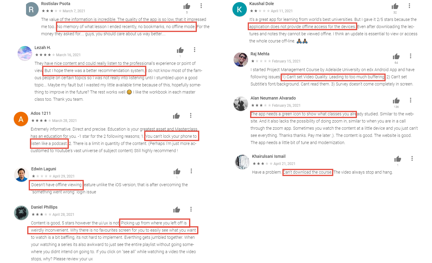
I went through the play store reviews & observed the gaps in these platforms.
- No Bookmarks & offline mode of the learning experience
- Users can’t keep track of their learning progress from where they left.
- Users can’t set the video quality if in case their internet connection is slow sometimes.
- Lack of personalized learning experience & course recommendations.
Then, I gathered screenshots of several EdTech apps to observe the common patterns for inspiration.
Common patterns I observed were on:
- Onboarding
- Home Pages
- Course content
- Search & filter
- Bookmark & Download
- Premium Pricing
- Gamification
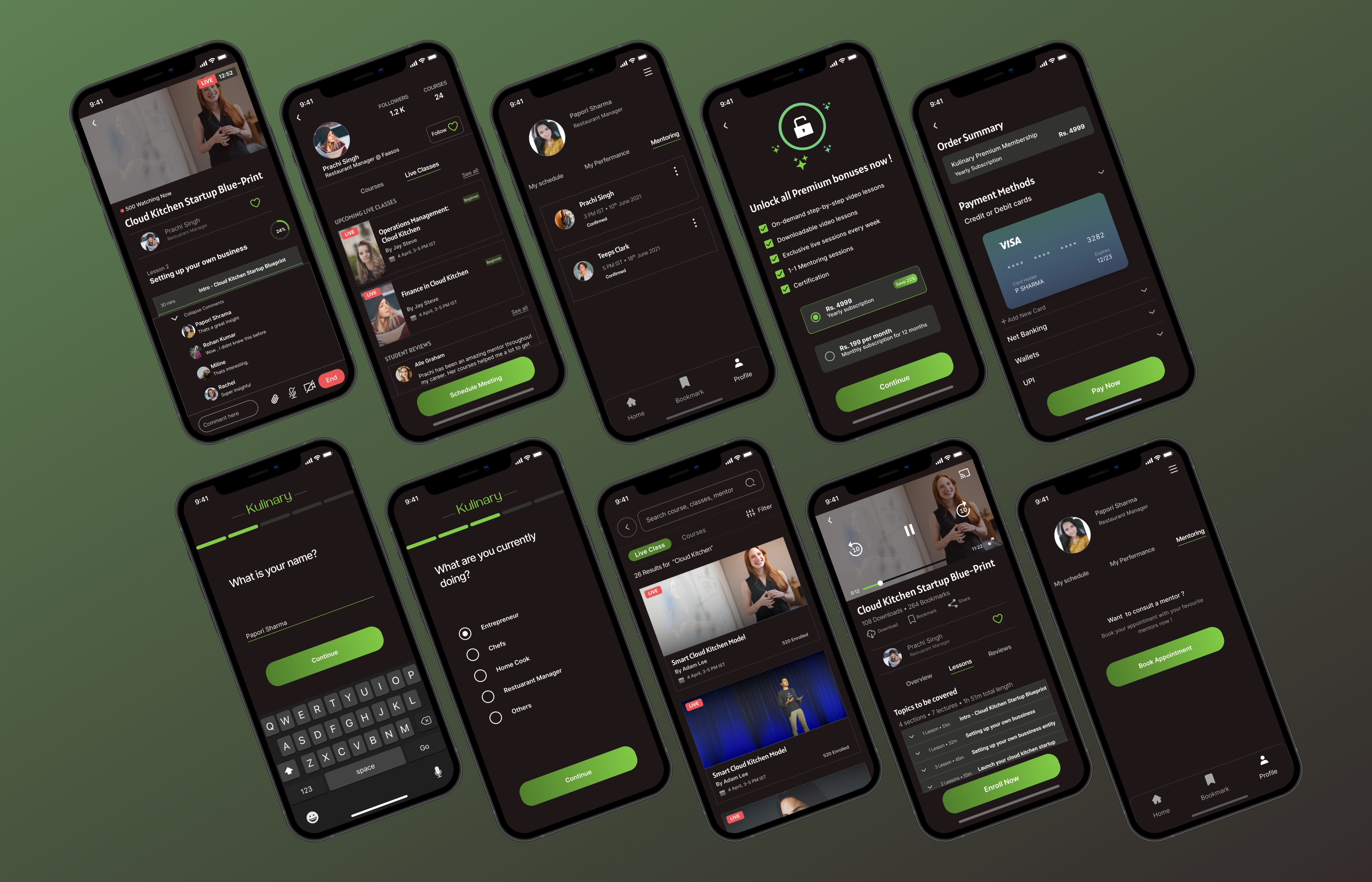
 A sneak pic for my explorations
🗒️Information Architecture
The key idea of this step is to focus on the ease of navigation & give the users the most important information that they want to look at first.


😅Behind the Scenes: Trying out different ideas at Low-Fidelity Level
I experimented with different layouts & content grouping at an early stage & narrowed it down to a few ones that I felt would convey more value to the user.

And here comes “Visual Design”!
📱 Onboarding screens
- Communicate the value of the app upfront through the onboarding screens.
📸 Picture Superiority Effect — People remember pictures better than words
- Use clear copy & concise, don't use technical jargon.
- Keep the number of steps for onboarding as minimum as possible, to minimize the drop-offs & increase the number of signups. Also giving a progress bar for onboarding helps to keep a track of the no. of steps.

🏠Home Screens
- There is a slight change in the home screen for Premium & Non-Premium members. The course content for non-premium members isn’t accessible (apart from the first preview video of the courses), which is shown with a lock icon.
- There is a chatbot experience at the bottom of the page to help out users with their queries as customer support.

- Tracking the learning progress has been a big drawback across most of the EdTech apps. As the user keeps bookmarking their courses, they might lose track of their learning progress. So I have added a progress bar along with a CTA that will redirect to complete all the bookmarked courses.

🧭Content Browse
- Now the focus is on the searchability of the content, since this platform has 2 types of content (Pre-recorded & Live), these should show up separately on the search results.
- By default on searching anything both live classes & courses will show up. I took this decision because if I search some term & it shows nothing on the live class tab at first (taking it as an example) but there were pre-recorded courses, this kind of scenario won’t be a good experience. Hence I should try to show the user that there is enough content on my product for them.

🔖Pre-Recorded Courses
- In Pre-Recorded Content Page, the key information like no. of downloads, no. of bookmarks, course reviews help the users to decide if the course is worth enrolling in.
- But before enrolling, the user can’t download & apart from the course preview video every video is locked. The user has to enroll in the course to get the course access.

👨💻Live Classes
- During the Live class, it's important that both mentor & student has a track of how many portions of the course are being finished by the time, & for that, a chart with % completed along with the ongoing lessons is highlighted on the screen are displayed.
- Giving a status update of how many lessons are completed throughout the live class helps mentors & students to maintain a proper learning pace with is convenient for both.
- Options like comment & attach are added here to boost up the class interaction level, for sharing useful study materials & for Q/A sessions in between.
- I have also tried to show a glimpse of class participant faces too because it will have a great impact of the class participation level. Eg: At sometimes the mentor might ask any student to unmute themselves & ask questions. This kind of peer participation will help to break the mentor monologue mode in the class.

👨🏫1–1 Mentoring
When comes 1–1 mentoring sessions, its starting point is from the mentor’s profile. After the meeting is scheduled it is saved on the Profile tab. The meeting time is by default 30 mins. If the user selects the start time, the end time will automatically get updated 30 mins later.

💸Payment Flow
- Here I have highlighted things like the premium benefits, & the value in selecting the yearly subscription.
- From a business perspective, I would want the user to go for the yearly subscription so I kept it as the first option.
This follows ⚓ Anchoring Bias -Users rely heavily on the first piece of information they see

🧐Retrospective
Since this is the first app I designed, there are a few things I would do differently or rather add to the existing app to improve the experience.
- I feel the community-based learning feature would be really helpful, as it will bring more engagement in the peer-to-peer learning process & learners can look up to each other's work to get inspired.
- Point Of Sale(POS) integration has been seen as a super important topic of discussion in the online restaurant owners' community. A recommendation feature for purchasing Cloud Kitchen POS software might be helpful for the learners.
✍️ My Learnings
- More & more experimentation is super helpful at an early designing stage so that we can select the best one out of them all. I had to shift from my first color palette after I designed a few UI screens because it wasn’t giving a vibe of the food business.
- Feedbacks & iterations are very important. As I have written this case study I know everything about it but I have written it for the readers. Testing the articles with readers is really helpful to polish the case study.
Thank you for reading my Case Study! 🤝

Thank you for taking out time and reading this case study. I would love to hear any feedback or suggestions, it would be highly valuable for me. Feel free to reach out to me on — LinkedIn or Twitter.
Recommend
About Joyk
Aggregate valuable and interesting links.
Joyk means Joy of geeK