

How to Leverage Browsers’ DevTools as a UI/UX Designer
source link: https://uxplanet.org/how-to-leverage-browsers-devtools-as-a-ui-ux-designer-ee34857e3e36
Go to the source link to view the article. You can view the picture content, updated content and better typesetting reading experience. If the link is broken, please click the button below to view the snapshot at that time.

How to Leverage Browsers’ DevTools as a UI/UX Designer
Nowadays every modern browser comes with its powerful suite of developer tools, which are known by many names such as DevTools, Web Inspector, Web Debugger, etc depending upon what use case they are being used for. I am quite sure, as a designer, irrespective of any browser choice, you might have come across this window.

Now the point is, despite people call it ‘Developer’ Tools, it has a lot of features to offer to our designers’ fraternity as well, features like making live visual changes on the website, running an accessibility audit for a webpage, etc. Let’s discuss numerous ways you can use DevTools that can help you in your day-to-day job.
Here is the list of features which are covered as dedicated sections below:
- Fidgeting with HTML & CSS of any Webpage on the internet
- Checking Responsive views of your Website or Web App
- Running the UX Audit on a Webpage or Web App
- Taking a Full Length or Section Specific Screenshot of a Webpage
- Downloading all the Media Assets and other Resources of a Webpage at a single place in the original form.
Fidgeting with HTML & CSS of any webpage on the Internet
You might be aware of the ‘Inspect’ feature if you have already seen web inspector before (which is seen if you right-click anywhere on the webpage inside a browser) This is where you can check out HTML structures and CSS classes applied to any element.

Here are a few quick tips and tricks to try out next time you inspect any element:
- Click on the ‘Inspect’ button and hovering on any area of a webpage would highlight its bounds on webpage and clicking on it would jump to its HTML tag in the DOM editor and show the applied CSS styles in the Style section.


2. Inside DOM Editor and CSS Editor, you can perform various operations on the selected HTML Tag and observe the live changes on the webpage. Here are some most handy features:
- Double click on any part of the syntax to edit its attributes or node type. For example, changing HTML tag type, adding child tags to it, editing URL path or rich text, etc.
- Change the order of any HTML tag by Dragging and Dropping the selected HTML tag anywhere in the editor.
- Hide the HTML tag altogether by pressing ‘H’ on your keyboard or selecting the ‘Toggle Visibility’ option by right-clicking on the active tag.
- Add or overwrite your own set of CSS classes inside the CSS Editor; Furthermore, you can add, update, remove any property or their values to the existing applied classes.
- Check all the properties applied on a particular element, both applied and inherited from parents inside the Computed tab, right next to the style tab. The beauty of the Computed Tab is, Not only you can check all the applied CSS properties applied to the element in a single glance, but you can also check specifications like position, borders, paddings, length, and width on the box model and change its value right there itself by double-clicking on any the numbers.
It might sound intimidating if you are not comfortable with HTML and CSS, but Trust me, this ability to make live changes by fidgeting with values of existing properties, allows you to express your ideas and get quick feedback from your stakeholders instantaneously on the already deployed version.
So next time, When your stakeholder asks you to make that logo a little bigger, you know what to do
Checking Responsive views of your Website or Web application
From the above section, you got the chance to fidget and test with the website, Now what about the same website being viewed on some different device like mobile phone, tablet, or some monitor with different screen size or resolution? Also, Mobile devices have unique touch interactions like swiping gestures, pinch to zoom interaction, as likewise, desktops have interactions like hovering and right-clicking, for which responsive testing has to be done separately.
Obviously, having a device with every possible variation in screen size to test a webpage isn’t a feasible or time-efficient idea, right?
Inside web inspector, you can simulate and check how an existing page might look or respond in different devices with specific screen sizes, look for all the media queries applied on the particular responsive scenario, and can perform the same HTML & CSS operations that we discussed in the above section.
The reason why I have mentioned this as a separate section because Responsive screen viewer offers various options & features within itself which are not known or common to many people.
Now, To begin, you can click on Toggle Device Toolbar, which resides just next to the ‘inspect’ element inside chrome or brave browser. In safari, You’ll now see Develop in the top Safari menu bar. Select Develop > Enter Responsive Design Mode in the Safari toolbar.

Below are the following options that you can apply changes to, as per your use case:

- Device List : You can select a device from the dropdown list. By Default, the ‘Responsive’ option is selected which allows you to change the width and height of the content window with the cursor. Click on the ‘Edit’ option to get more device lists or to add your custom one.

2. Width & Height : you can input manual entry in pixels for width and height respectively.
3. Device Pixel Ratio (DPR) : It is the ratio between the physical pixels on the hardware screen and the logical pixels (related to the physical size of the screen, also known as CSS resolution). One can set its value from the dropdown list as per the device specifications.
4. Device Type : You can change device types ranging between mobile and desktop, Touch and non-touch type. Selecting between touch and non-touch value results in Tap pointer and mouse pointer respectively.
5. Orientation : Toggle device orientation between landscape and portrait of a device directly from here.
6. More Options : Clicking you give access to more options like:
Show/Hide Device Frame : When activated, it adds a device frame around the content window to display, which provided a more real-life feel to the content (PS Device frame might not be available for all the device types.)
Show/Hide Media Queries : Refer Next point to know more about it.
Show/Hide Rulers : Activate this option to display rulers to get the real idea of the physical bounds of your content window and elements.
Capture Screenshot & Capture full size Screenshot : As the name suggests, use this option to get the screenshot of your content window (PS taking single view screenshot also covers the device frame with it)
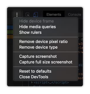
7. Show/Hide Media Queries : When activated, it shows timelines in different colors representing the range and extent of screen width to which a particular media query is applicable.
Running the UX Audit on a Webpage
I have started leveraging this tool lately, especially found on browsers like Chrome & Brave, and it has turned out to be a very useful feature in the UX research phase. Next time, whenever you go for UX analysis for any of your targeted webpage/web app, or run a competitive analysis for a similar website like yours, try out generating the Lighthouse report which is available as a dedicated tab inside Chrome DevTools or Brave DevTools.
To give more info, Lighthouse is an open-source speed tool from Google which helps in improving the quality of web pages. It audits your webpage or web app and provides reports on Performance, Accessibility, SEO, and other best practices. Though it is more of a Developer friendly tool, but getting insights on indicators like Performance and Accessibility of your webpage helps you understand the possible flaws and scope of enhancement, overall contributing to the user experience of the page.

Here are the quick steps to generate a Lighthouse report inside Chrome browser:
- In Google Chrome, go to the URL you want to audit.
- Open Web Inspector, and go to Lighthouse tab
- Select all the Categories and Device type for which you want to generate the report.
- Select Generate report.
- After 30 to 60 seconds, Lighthouse gives you a report on the page.

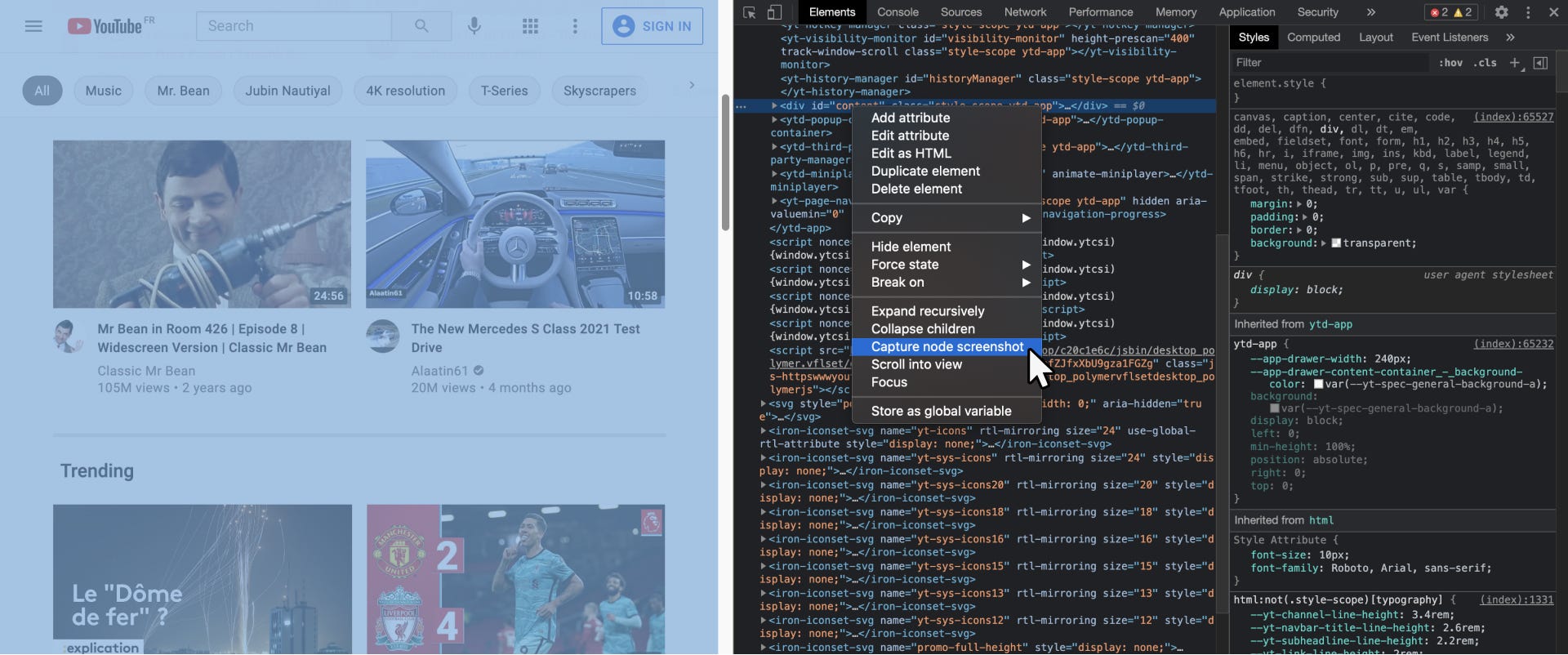
Taking a Full Length Screenshot of a Complete UI of a Webpage
Ever wondered how can you take a screenshot of a complete UI of a webpage that has multiple scroll worth of height, that too without any additional plugin or software in a single go?, or taking a crisp screenshot of a section of a webpage with perfect corners and edges without additional cropping?
Well, you can do it right from your DOM Editor in Web Inspector.
Just right click on the opening of the containing tag or section of the desired div (you can cross-validate by which section gets highlighted in Blue color when your pointer hovers on the tag in the editor) and select ‘Capture node screenshot’.
Downloading all the Media Assets and other Resources of a Webpage at a single place in the original form
Even struggled to get the Transparent logo or Background video which is not directly available for download, and then you had to manage by using the petty tricks like taking the bland screenshot and cropping it for your use?
One way to find the assets directly is, You can find all the original static assets (images, videos, SVGs, Font families) uploaded by the website in the Sources section of the Web Inspector.
Just visit the Sources tab (third tab to the Elements tab) and find the Static folder in the directory. Mostly all the media files like Images, Videos, Fonts being used on the webpage can be found there. Navigate through the list one by one and view and download them in their original form.

Thanks for Reading!
With this, I end this article and hope that you find it interesting and insightful. Let me know which point did you find most helpful. Also, I’d love to know if you are already aware of, or using any other feature from the DevTools which is not mentioned here, in your UI/UX workflow.
I write and share my learnings and experience on User Experience Design here on Medium. Follow me to stay updated on more such articles.
Connect with me on LinkedIn Here.
Recommend
About Joyk
Aggregate valuable and interesting links.
Joyk means Joy of geeK