
9

A Fully customizable checkbox with flexible component for React Native
source link: https://reactnativeexample.com/a-fully-customizable-checkbox-with-flexible-component-for-react-native/
Go to the source link to view the article. You can view the picture content, updated content and better typesetting reading experience. If the link is broken, please click the button below to view the snapshot at that time.

react-native-checkbox-flex
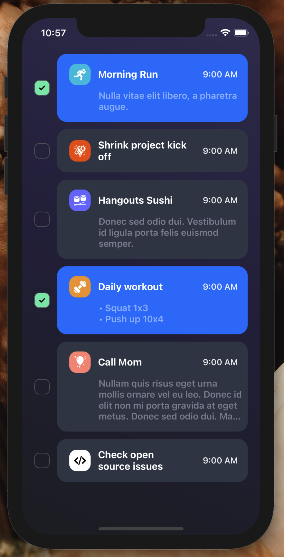
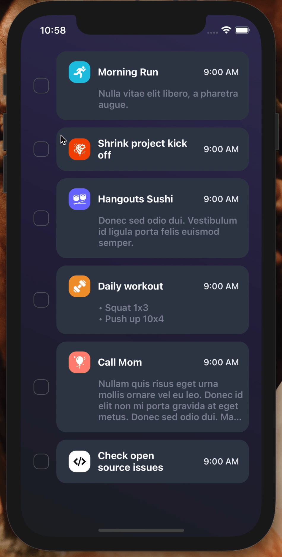
Fully customizable, easy to use checkbox with flexible component by React Native on Android and iOS
Installation
Add the dependency:
npm i react-native-checkbox-flex
Peer Dependencies
IMPORTANT! You need install them
"@freakycoder/react-native-bounceable": "^0.2.4",
Usage
Import
import CheckboxFlex from "react-native-checkbox-flex";
React JSX
Fundamental Usage
<CheckboxFlex
  title="Morning Run"
  date="9:00 AM"
  description="Nulla vitae elit libero, a pharetra augue."
  imageSource={require("./assets/running.png")}
/>
React JSX
Example Project 😍
You can checkout the example project 🥰
Simply run
npm ireact-native run-ios/android
should work of the example project.
Configuration - Props
activeCardBackgroundColor?: string;
inactiveCardBackgroundColor?: string;
Fundamentals
Property Type Default Description title string undefined set the checkbox title date string undefined set the checkbox date description string undefined set the checkbox description imageSource image undefined set the checkbox icon image sourceCustomization (Optionals)
Property Type Default Description onPress function undefined set your own logic for the button functionality when it is pressed isActive boolean false set the initial isActive state style ViewStyle default set or override the style object for the main container checkboxContainerStyle ViewStyle default set or override the style object for the checkbox container iconContainerStyle ViewStyle default set or override the style object for the icon container iconImageStyle ImageStyle default set or override the style object for the icon image titleTextStyle TextStyle default set or override the style object for the title text dateTextStyle TextStyle default set or override the style object for the date text descriptionTextStyle TextStyle default set or override the style object for the description text titleNumberOfLines number 2 change the title number of lines checkboxBorderColor color "rgba(100,100,100,0.9)" change the checkbox border color activeCheckboxBackgroundColor color "#63eead" change the active checkbox container background color inactiveCheckboxBackgroundColor color "transparent" change the inactive checkbox container background color activeCardBackgroundColor color "#2173FF" change the active card container background color activeCheckboxBackgroundColor color "#343c4d" change the inactive card container background color disableBuiltInActiveSystem boolean false disable the built in active control system disableDate boolean false disable date component dateContainerStyle ViewStyle default set or override the style object for the checkbox date container titleContainerStyle ViewStyle default set or override the style object for the checkbox title container descriptionContainerStyle ViewStyle default set or override the style object for the checkbox description containerAuthor
FreakyCoder, [email protected]
GitHub
Recommend
About Joyk
Aggregate valuable and interesting links.
Joyk means Joy of geeK