

HarmonyOS三方件开发指南(17)-BottomNavigationBar
source link: https://my.oschina.net/u/4857646/blog/5018589
Go to the source link to view the article. You can view the picture content, updated content and better typesetting reading experience. If the link is broken, please click the button below to view the snapshot at that time.

目录:
引言
BottomNavigationBar底部导航栏,可以说所有的app是这样的页面架构,原因很简单,操作简单,模块化清晰,页面切换流畅,而且每页都可以展示不同的风格。相信开发者已经很熟悉Android的底部导航栏的开发以及开发流程,那么接下来将对比Android来讲解鸿蒙的底部导航栏的实现步骤。
功能介绍
鸿蒙BottomNavigationBar底部导航栏,根据所需要底部button的数量,动态生成对应的底部button,并且可以设置默认字体颜色,选中字体颜色,默认icon,选中icon属性。模拟器效果图如下:
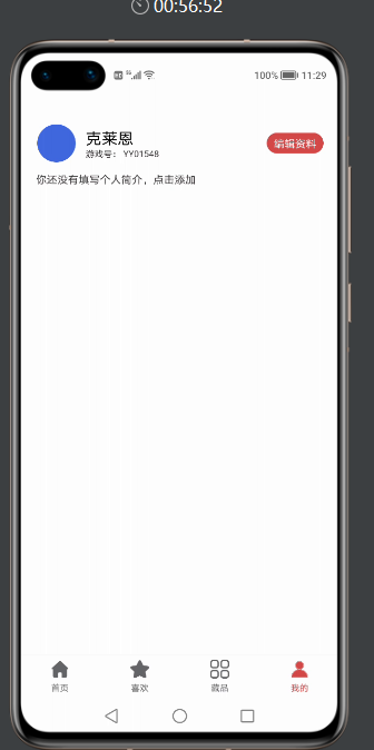
看了效果图,是不是都想知道在实际工作中,是如何使用的呢?接下来给大家详细介绍下BottomNavigationBar如何使用。
BottomNavigationBar使用指南
Ø 新建工程, 添加组件Har包依赖
在应用模块中添加HAR,只需要将mylibrarybottom-debug.har复制到entry\libs目录下即可。
Ø 修改相关文件
1. 修改主页面的布局文件ability_main.xml:

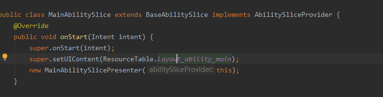
2. 修改MainAbilitySlice代码:
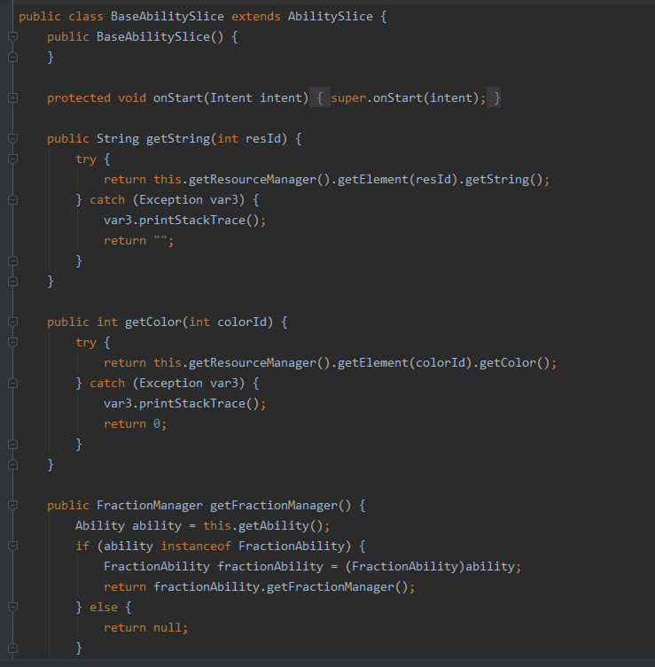
3. 修改BaseAbilitySlinct代码:
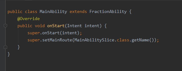
4. MainAbility的代码:
配置好1-4步,接下来就看如何给对应的底部导航栏添加Fraction
1. initBottom 方法如下:
private void initBottom() {
    tabBottomLayout = (BottomNavigationBar)  mAbilitySliceProvider.findComponentById(ResourceTable.Id_bottom_navigation_bar);
    bottomInfoList = new ArrayList<>();
    // 获取string.json文件中定义的字符串
    String home = mAbilitySliceProvider.getString(ResourceTable.String_home);
    String favorite = mAbilitySliceProvider.getString(ResourceTable.String_favorite);
    String category = mAbilitySliceProvider.getString(ResourceTable.String_category);
    String profile = mAbilitySliceProvider.getString(ResourceTable.String_mine);
    // 首页
    BottomBarInfo<Integer> homeInfo = new BottomBarInfo<>(home,
            ResourceTable.Media_category_norma1,
            ResourceTable.Media_category_norma2,
            defaultColor, tintColor);
    homeInfo.fraction = HomeFraction.class;
    // 收藏
    BottomBarInfo<Integer> favoriteInfo = new BottomBarInfo<>(favorite,
            ResourceTable.Media_category_norma1,
            ResourceTable.Media_category_norma2,
            defaultColor, tintColor);
    favoriteInfo.fraction = SecondFraction.class;
    // 分类
    BottomBarInfo<Integer> categoryInfo = new BottomBarInfo<>(category,
            ResourceTable.Media_category_norma1,
            ResourceTable.Media_category_norma2,
            defaultColor, tintColor);
    categoryInfo.fraction = ThirdFraction.class;
    // 我的
    BottomBarInfo<Integer> profileInfo = new BottomBarInfo<>(profile,
            ResourceTable.Media_category_norma1,
            ResourceTable.Media_category_norma2,
            defaultColor, tintColor);
    profileInfo.fraction = MineFraction.class;

    // 将每个条目的数据放入到集合
    bottomInfoList.add(homeInfo);
    bottomInfoList.add(favoriteInfo);
    bottomInfoList.add(categoryInfo);
    bottomInfoList.add(profileInfo);
    // 设置底部导航栏的透明度
    tabBottomLayout.setBarBottomAlpha(0.85f);
    // 初始化所有的条目
    tabBottomLayout.initInfo(bottomInfoList);
    initFractionBarComponent();
    tabBottomLayout.addBarSelectedChangeListener((index, prevInfo, nextInfo) ->
            // 显示fraction
            mFractionBarComponent.setCurrentItem(index));
    // 设置默认选中的条目,该方法一定要在最后调用
    tabBottomLayout.defaultSelected(homeInfo);
2. 创建fraction类,继承BaseFraction
1. 引入需要展示页面的布局文件
  @Override
public int getUIComponent() {
    return ResourceTable.Layout_layout_fraction_home;
}
2. 操作布局文件中的控件
@Override
public void initComponent(Component component) {
    text = (Text) component.findComponentById(ResourceTable.Id_text);
}
BottomNavigationBar开发指南
底部导航栏,在应用中真的非常常见,核心思想就是底部有几个选项,然后点击其中任意一个,切换至对应的页面。接下来主要介绍下核心实现步骤。
主要封装的原则是,动态的,通过外界传递,固定过的则封装起来。其中底部导航栏的图片、文字、文字的颜色是变的,其它的可以封装起来,外界只需要把每个条目的图片、文字以及文字的颜色传入进来即可,内部来实现底部导航栏。在封装的时候,需要面向接口编程,同时使用泛型。
定义接口IBarLayout
1、定义一个IBarLayout接口,第一个泛型就是底部导航栏中的每个条目,第二个泛型是每个条目的数据。在接口里面提供一些方法,可以根据数据查找条目,可以添加监听,可以设置默认选中的条目,可以初始化所有的条目,当某个条目被选中后需要通过回调方法。
代码如下:
public interface IBarLayout<Bar extends ComponentContainer, D> {

    /**
     * 根据数据查找条目
     *
     * @param info 数据
     * @return 条目
     */
    Bar findBar(D info);

    /**
     * 添加监听
     *
     * @param listener
     */
    void addBarSelectedChangeListener(OnBarSelectedListener<D> listener);

    /**
     * 默认选中的条目
     *
     * @param defaultInfo
     */
    void defaultSelected(D defaultInfo);

    /**
     * 初始化所有的条目
     *
     * @param infoList
     */
    void initInfo(List<D> infoList);

    interface OnBarSelectedListener<D> {

        /**
         * 当某个条目被选中后的回调,该方法会被调用多次
         *
         * @param index 点击后选中条目的下标
         * @param preInfo 点击前选中的条目
         * @param nextInfo 点击后选中的条目
         */
        void onBarSelectedChange(int index, D preInfo, D nextInfo);
    }
}
2、再定义一个单个条目的接口IBar,泛型就是每个条目的数据,接口里面定义方法,可以设置条目的数据,可以动态修改某个条目的大小
代码如下:
/**
 * 单个条目的接口
 */
public interface IBar<D> extends IBarLayout.OnBarSelectedListener<D> {

    /**
     * 设置条目的数据
     *
     * @param data
     */
    void setBarInfo(D data);

    /**
     * 动态修改某个条目的大小
     *
     * @param height
     */
    void resetHeight(int height);
}
每个条目所对应的实体类BottomBarInfo
每个条目都有自己的图片、文字、文字的颜色,我们把这些属性定义在一个实体类中。由于颜色可以是整型,也可以是字符串,这里定义泛型,泛型就是文字的颜色。具体是哪种类型的颜色,由调用者来决定。
注意下BarType这个枚举,我们的底部导航栏支持两种类型,IMAGE代表下图,某个条目只显示图片,也可以让某个条目凸出来,只需要将条目的高度变高即可。
public class BottomBarInfo<Color> extends TopBottomBarInfo {

    public enum BarType {
        /**
         * 显示图片和文案
         */
        IMAGE_TEXT,
        /**
         * 只显示图片
         */
        IMAGE
    }

    /**
     * 条目的名称
     */
    public String name;
    public BarType tabType;
    public Class<? extends Fraction> fraction;

    public BottomBarInfo(String name, int defaultImage, int selectedImage) {
        this.name = name;
        this.defaultImage = defaultImage;
        this.selectedImage = selectedImage;
        this.tabType = BarType.IMAGE;
    }

    public BottomBarInfo(String name, int defaultImage, int selectedImage, Color defaultColor, Color tintColor) {
        this.name = name;
        this.defaultImage = defaultImage;
        this.selectedImage = selectedImage;
        this.defaultColor = defaultColor;
        this.tintColor = tintColor;
        this.tabType = BarType.IMAGE_TEXT;
    }
}
单个条目的封装
定义BottomBar,继承相对布局,实现之前定义的IBar接口,泛型就是每个条目所对应的实体类,由于目前并不知道泛型的具体类型,所以泛型直接使用问号来代替。BottomBar就是单个条目。
我们需要将component对象放入到BottomBar中,所以第二个参数传this,第三个参数为true。
public class BottomBar extends DependentLayout implements IBar<BottomBarInfo<?>> {

    /**
     * 当前条目所对应的数据
     */
    private BottomBarInfo<Color> tabInfo;
    private Text mTabName;
    private Image mTabImage;

    public BottomBar(Context context) {
        this(context, null);
    }

    public BottomBar(Context context, AttrSet attrSet) {
        this(context, attrSet, "");
    }

    public BottomBar(Context context, AttrSet attrSet, String styleName) {
        super(context, attrSet, styleName);
        Component component = LayoutScatter.getInstance(context).parse(ResourceTable.Layout_layout_bar_bottom, this, true);
        mTabImage = (Image) component.findComponentById(ResourceTable.Id_image);
        mTabName = (Text) component.findComponentById(ResourceTable.Id_name);
        mTabImage.setScaleMode(Image.ScaleMode.INSIDE);
    }

    /**
     * 设置条目的数据
     *
     * @param data
     */
    @Override
    public void setBarInfo(BottomBarInfo<?> data) {
        tabInfo = (BottomBarInfo<Color>) data;
        inflateInfo(false, true);
    }

    /**
     * 初始化条目
     *
     * @param selected true 选中
     * @param init true 初始化
     */
    private void inflateInfo(boolean selected, boolean init) {
        if (tabInfo.tabType == BottomBarInfo.BarType.IMAGE_TEXT) {
            if (init) {
                // 图片和名称都可见
                mTabName.setVisibility(VISIBLE);
                mTabImage.setVisibility(VISIBLE);
                if (!TextUtils.isEmpty(tabInfo.name)) {
                    // 设置条目的名称
                    mTabName.setText(tabInfo.name);
                }
            }
            if (selected) {
                // 显示选中的图片
                mTabImage.setPixelMap(tabInfo.selectedImage);
                mTabName.setTextColor(new Color(parseColor(tabInfo.tintColor)));
            } else {
                // 显示未选中的图片
                mTabImage.setPixelMap(tabInfo.defaultImage);
                mTabName.setTextColor(new Color(parseColor(tabInfo.defaultColor)));
            }
        } else if (tabInfo.tabType == BottomBarInfo.BarType.IMAGE) {
            if (init) {
                // 仅仅显示图片,将名称隐藏
                mTabName.setVisibility(HIDE);
                mTabImage.setVisibility(VISIBLE);
            }
            if (selected) {
                // 显示选中的图片
                mTabImage.setPixelMap(tabInfo.selectedImage);
            } else {
                // 显示未选中的图片
                mTabImage.setPixelMap(tabInfo.defaultImage);
            }
        }
    }

    private int parseColor(Object color) {
        if (color instanceof String) {
            return Color.getIntColor((String) color);
        } else {
            return (int) color;
        }
    }

    /**
     * 动态修改某个tab的高度
     *
     * @param height tab的高度
     */
    @Override
    public void resetHeight(int height) {
        ComponentContainer.LayoutConfig config = getLayoutConfig();
        config.height = height;
        setLayoutConfig(config);
        mTabName.setVisibility(HIDE);
    }

    /**
     * 当某个条目被选中后的回调,该方法会被调用多次
     *
     * @param index 点击后选中条目的下标
     * @param preInfo 点击前选中的条目
     * @param nextInfo 点击后选中的条目
     */
    @Override
    public void onBarSelectedChange(int index, BottomBarInfo<?> preInfo, BottomBarInfo<?> nextInfo) {
        if (nextInfo.tabType == BottomBarInfo.BarType.IMAGE) {
            // 当前条目的类型是IMAGE类型,则不做任何处理
            return;
        }
        if (preInfo == nextInfo) {
            // 假设当前选中的是条目1,同时点击的也是条目1,那就不需要做任何操作了
            return;
        }
        if (preInfo != tabInfo && nextInfo != tabInfo) {
            /**
             * 假设有三个条目,条目1、条目2、条目3,preInfo是条目1,nextInfo是条目3,tabInfo是条目2,
             * 点击前选中的是条目1,点击后选中的条目3,此时条目2就不需要做任何操作了
             */
            return;
        }
        if (preInfo == tabInfo) {
            // 将点击前的条目反选
            inflateInfo(false, false);
        } else {
            // 选中被点击的条目
            inflateInfo(true, false);
        }
    }

    public BottomBarInfo<Color> getTabInfo() {
        return tabInfo;
    }

    public Text getTabName() {
        return mTabName;
    }

    public Image getImage() {
        return mTabImage;
    }
}
底部导航栏的封装
定义BottomNavigationBar,继承栈布局。第一个泛型就是底部导航栏的条目,第二个泛型就是每个条目的数据。
public class BottomNavigationBar extends StackLayout implements IBarLayout<BottomBar, BottomBarInfo<?>> {

    private static final int ID_TAB_BOTTOM = 0XFF;
    /**
     * 事件监听的集合
     */
    private List<OnBarSelectedListener<BottomBarInfo<?>>> tabSelectedListeners = new ArrayList<>();
    /**
     * 当前选中的条目
     */
    private BottomBarInfo<?> selectedInfo;
    /**
     * 底部导航栏的透明度
     */
    private float barBottomAlpha = 1;
    /**
     * 底部导航栏的高度
     */
    private float barBottomHeight = 50;
    /**
     * 底部导航栏线条的高度
     */
    private float barBottomLineHeight = 0.5f;
    /**
     * 底部导航栏线条的颜色
     */
    private RgbColor barBottomLineColor = new RgbColor(223, 224, 225);
    /**
     * 所有的tab
     */
    private List<BottomBarInfo<?>> infoList;

    public BottomNavigationBar(Context context) {
        this(context, null);
    }

    public BottomNavigationBar(Context context, AttrSet attrSet) {
        this(context, attrSet, "");
    }

    public BottomNavigationBar(Context context, AttrSet attrSet, String styleName) {
        super(context, attrSet, styleName);
    }

    /**
     * 根据数据查找条目
     *
     * @param info 条目的数据
     * @return 条目
     */
    @Override
    public BottomBar findBar(BottomBarInfo<?> info) {
        ComponentContainer componentContainer = (ComponentContainer) findComponentById(ID_TAB_BOTTOM);
        for (int i = 0; i < componentContainer.getChildCount(); i++) {
            Component component = componentContainer.getComponentAt(i);
            if (component instanceof BottomBar) {
                BottomBar bottomBar = (BottomBar) component;
                if (bottomBar.getTabInfo() == info) {
                    return bottomBar;
                }
            }
        }
        return null;
    }

    /**
     * 添加监听
     *
     * @param listener 监听
     */
    @Override
    public void addBarSelectedChangeListener(OnBarSelectedListener<BottomBarInfo<?>> listener) {
        tabSelectedListeners.add(listener);
    }

    /**
     * 默认选中的条目
     *
     * @param defaultInfo 默认选中条目的信息
     */
    @Override
    public void defaultSelected(BottomBarInfo<?> defaultInfo) {
        onSelected(defaultInfo);
    }

    /**
     * 初始化所有的条目
     *
     * @param infoList 所有条目的信息
     */
    @Override
    public void initInfo(List<BottomBarInfo<?>> infoList) {
        if (infoList == null || infoList.isEmpty()) {
            return;
        }
        this.infoList = infoList;
        // 移除之前已经添加的组件,防止重复添加
        removeComponent();
        selectedInfo = null;
        // 添加背景
        addBackground();
        // 添加条目
        addBottomBar();
        // 添加线条
        addBottomLine();
    }

    /**
     * 添加线条
     */
    private void addBottomLine() {
        Component line = new Component(getContext());
        // 目前不支持直接设置背景颜色,只能通过Element来设置背景
        ShapeElement element = new ShapeElement();
        element.setShape(ShapeElement.RECTANGLE);
        element.setRgbColor(barBottomLineColor);
        line.setBackground(element);
        LayoutConfig config = new LayoutConfig(ComponentContainer.LayoutConfig.MATCH_PARENT,
                DisplayUtils.vp2px(getContext(), barBottomLineHeight));
        // 位于底部
        config.alignment = LayoutAlignment.BOTTOM;
        config.setMarginBottom(DisplayUtils.vp2px(getContext(), barBottomHeight - barBottomLineHeight));
        line.setAlpha(barBottomAlpha);
        addComponent(line, config);
    }

    /**
     * 添加条目
     */
    private void addBottomBar() {
        // 每个条目的宽度就是屏幕宽度除以条目的总个数
        int width = DisplayUtils.getDisplayWidthInPx(getContext()) / infoList.size();
        // 高度是固定的值,这里需要做屏幕适配,将vp转换成像素
        int height = DisplayUtils.vp2px(getContext(), barBottomHeight);
        StackLayout stackLayout = new StackLayout(getContext());
        stackLayout.setId(ID_TAB_BOTTOM);
        for (int i = 0; i < infoList.size(); i++) {
            BottomBarInfo<?> info = infoList.get(i);
            // 创建布局配置对象
            LayoutConfig config = new LayoutConfig(width, height);
            // 设置底部对齐
            config.alignment = LayoutAlignment.BOTTOM;
            // 设置左边距
            config.setMarginLeft(i * width);
            BottomBar bottomBar = new BottomBar(getContext());
            tabSelectedListeners.add(bottomBar);
            // 初始化每个条目
            bottomBar.setBarInfo(info);
            // 添加条目
            stackLayout.addComponent(bottomBar, config);
            // 设置点击事件
            bottomBar.setClickedListener(component -> onSelected(info));
        }
        LayoutConfig layoutConfig = new LayoutConfig(ComponentContainer.LayoutConfig.MATCH_PARENT,
                ComponentContainer.LayoutConfig.MATCH_CONTENT);
        layoutConfig.alignment = LayoutAlignment.BOTTOM;
        addComponent(stackLayout, layoutConfig);
    }

    /**
     * 点击条目后给外界回调
     *
     * @param nextInfo 点击后需要选中的条目
     */
    private void onSelected(BottomBarInfo<?> nextInfo) {
        for (OnBarSelectedListener<BottomBarInfo<?>> listener : tabSelectedListeners) {
            listener.onBarSelectedChange(infoList.indexOf(nextInfo), selectedInfo, nextInfo);
        }
        if (nextInfo.tabType == BottomBarInfo.BarType.IMAGE_TEXT) {
            selectedInfo = nextInfo;
        }
    }

    /**
     * 添加背景
     */
    private void addBackground() {
        Component component = new Component(getContext());
        // 目前还不能直接设置背景颜色,只能通过Element来设置背景
        ShapeElement element = new ShapeElement();
        element.setShape(ShapeElement.RECTANGLE);
        RgbColor rgbColor = new RgbColor(255, 255, 255);
        element.setRgbColor(rgbColor);
        component.setBackground(element);
        component.setAlpha(barBottomAlpha);
        LayoutConfig config = new LayoutConfig(ComponentContainer.LayoutConfig.MATCH_PARENT,
                DisplayUtils.vp2px(getContext(), barBottomHeight));
        config.alignment = LayoutAlignment.BOTTOM;
        addComponent(component, config);
    }

    /**
     * 移除之前已经添加的组件,防止重复添加
     */
    private void removeComponent() {
        for (int i = getChildCount() - 1; i > 0; i--) {
            removeComponentAt(i);
        }
        tabSelectedListeners.removeIf(listener ->
                listener instanceof BottomBar);
    }

    /**
     * 设置底部导航栏的透明度
     *
     * @param barBottomAlpha 底部导航栏的透明度
     */
    public void setBarBottomAlpha(float barBottomAlpha) {
        this.barBottomAlpha = barBottomAlpha;
    }

    /**
     * 设置底部导航栏的高度
     *
     * @param barBottomHeight 底部导航栏的高度
     */
    public void setBarBottomHeight(float barBottomHeight) {
        this.barBottomHeight = barBottomHeight;
    }

    /**
     * 设置底部导航栏线条的高度
     *
     * @param barBottomLineHeight 底部导航栏线条的高度
     */
    public void setBarBottomLineHeight(float barBottomLineHeight) {
        this.barBottomLineHeight = barBottomLineHeight;
    }

    /**
     * 设置底部导航栏线条的颜色
     *
     * @param barBottomLineColor 底部导航栏线条的颜色
     */
    public void setBarBottomLineColor(RgbColor barBottomLineColor) {
        this.barBottomLineColor = barBottomLineColor;
    }
}
initInfo(List<BottomBarInfo<?>> infoList)该方法由外界调用,外界将所有的条目信息传递过来,我们将条目添加到底部导航栏。首先移除之前已经添加的组件,防止重复添加,然后添加背景,添加条目,添加线条。
更多原创,请关注:软通动力HarmonyOS学院https://harmonyos.51cto.com/column/30
作者:软通田可辉
想了解更多内容,请访问51CTO和华为合作共建的鸿蒙社区:https://harmonyos.51cto.com/
Recommend
About Joyk
Aggregate valuable and interesting links.
Joyk means Joy of geeK