

Color Contrast Inside Chrome’s DevTools
source link: https://medium.com/rocket-mortgage-technology-blog/color-contrast-inside-chromes-devtools-b3f70f8e1d12
Go to the source link to view the article. You can view the picture content, updated content and better typesetting reading experience. If the link is broken, please click the button below to view the snapshot at that time.

Color Contrast Inside Chrome’s DevTools
By Chris DeMars, Developer Advocate, Quicken Loans
Chris is a Developer Advocate at Quicken Loans with over 20 years of technical experience. He speaks all over the world on web accessibility and CSS. For his community contributions, he holds awards as a Microsoft MVP, Google Developer Expert, Auth0 Ambassador and Cloudinary Media Developer Expert. When he’s not working on making the web better and more inclusive, you can find him writing blog posts, rating Detroit-style pizza and watching horror movies.
Abstract
Deciding on color combinations for web and software can be tricky, especially when you’re building in the browser without some type of mock-up to work from. To ensure an amazing user experience for every client, you must make sure your site’s foreground and background colors are accessible to users who see colors differently.
New features in Chrome’s DevTools make it painless to test color contrast and determine the best combinations for your experience. In this article, I’ll discuss what color contrast is, how users with color vision deficiencies perceive differently and demo the tools inside of Chrome that are at our disposal to help us ensure this population has a great experience.
This article is the third in a series about accessibility. If you haven’t yet, check out the first two articles in this series: “The Power of Accessibility” and ”Understanding Accessibility Basics Within iOS.”
Why Is Color Contrast Important?
We communicate through color more often than we might realize, and for those who experience a color vision deficiency, this can cause a number of difficulties in day-to-day life. For example, someone who doesn’t experience a color vision deficiency knows that traffic lights use green, yellow and red to communicate “go,” “yield” and “stop,” respectively. Someone who cannot perceive the differences between those colors has to learn to pay attention to the order of the lights and what each means when illuminated.
Examples, such as the one above, makes it imperative to understand that internet users need to be able to visually distinguish between content and images in the foreground and background. Contrast plays a critical role in helping create this separation. For instance, it’s difficult to distinguish light grey text on a white background because there’s very little difference between those two colors and the light gray text blends into the background.
Even for those who perceive colors normally, low color contrast puts unneeded strain on users’ eyes — making for a poor user experience.
What Is Color Contrast?
The A11y Project offers the following definition for color contrast:
“In color theory, contrasting colors, also known as complementary colors, are colors from opposing segments of the color wheel. Colors that are directly across from one another on a basic color wheel provide maximum contrast.”
Figure 1 — Color Wheel

To put it simply, good color contrast in your site or app helps elements stand out from one another — particularly helping the foreground stand out from the background. Black text on a white background is a classic for a reason — this combination provides ideal contrast and clarity.
What Are Contrast Conformance Levels?
The Web Content Accessibility Guidelines (WCAG) are the gold standard for technologists in providing accessible solutions. WCAG defines three levels of accessibility conformance: A, AA and AAA.
- Large Text: Large-scale text and images of large-scale text have a contrast ratio of at least 3:1
- Incidental: Text or images of text that are part of an inactive user interface component, that are pure decoration, that are not visible to anyone, or that are part of a picture that contains significant other visual content, have no contrast requirement.
As of the WCAG 3.0, the naming of conformance levels will be changing. Note: The earliest this is likely to happen is 2023.
For website accessibility compliance, Rocket Mortgage Technology upholds WCAG 2.1 to meet level AA. You should be hitting level AA at all costs. Level AAA is a very strict conformance level, which is only needed for specific digital environments. The best way to explain the meat and potatoes of AA and AAA contrast requirements is by directly citing WCAG:
Contrast (Minimum) — Level AA
The visual presentation of text and images of text has a contrast ratio of at least 4.5:1, except for the following:Large Text: Large-scale text and images of large-scale text have a contrast ratio of at least 3:1
Incidental: Text or images of text that are part of an inactive user interface component, that are pure decoration, that are not visible to anyone, or that are part of a picture that contains significant other visual content, have no contrast requirement.
Logotypes: Text that is part of a logo or brand name has no minimum contrast requirement.
Contrast (Enhanced) — Level AAA
The visual presentation of text and images of text has a contrast ratio of at least 7:1, except for the following:Large Text: Large-scale text and images of large-scale text have a contrast ratio of at least 4.5:1;
Incidental: Text or images of text that are part of an inactive user interface component, that are pure decoration, that are not visible to anyone, or that are part of a picture that contains significant other visual content, have no contrast requirement.
Logotypes: Text that is part of a logo or brand name has no minimum contrast requirement.
What About Level A?
Level A is the baseline all developers using semantic markup should meet as long as they understand contrast, use proper colors that differentiate well and use alt attributes for images. For more information on how to meet Level A, check out this article from A11yRight.
Diving Into The DevTools
Let’s open up Chrome’s DevTools and take a look at how we can use the contrast checker in the color palette to make sure our choices are accessible.
*The examples below show colors that don’t have good contrast. The last example and GIF at the bottom show proper color contrast.
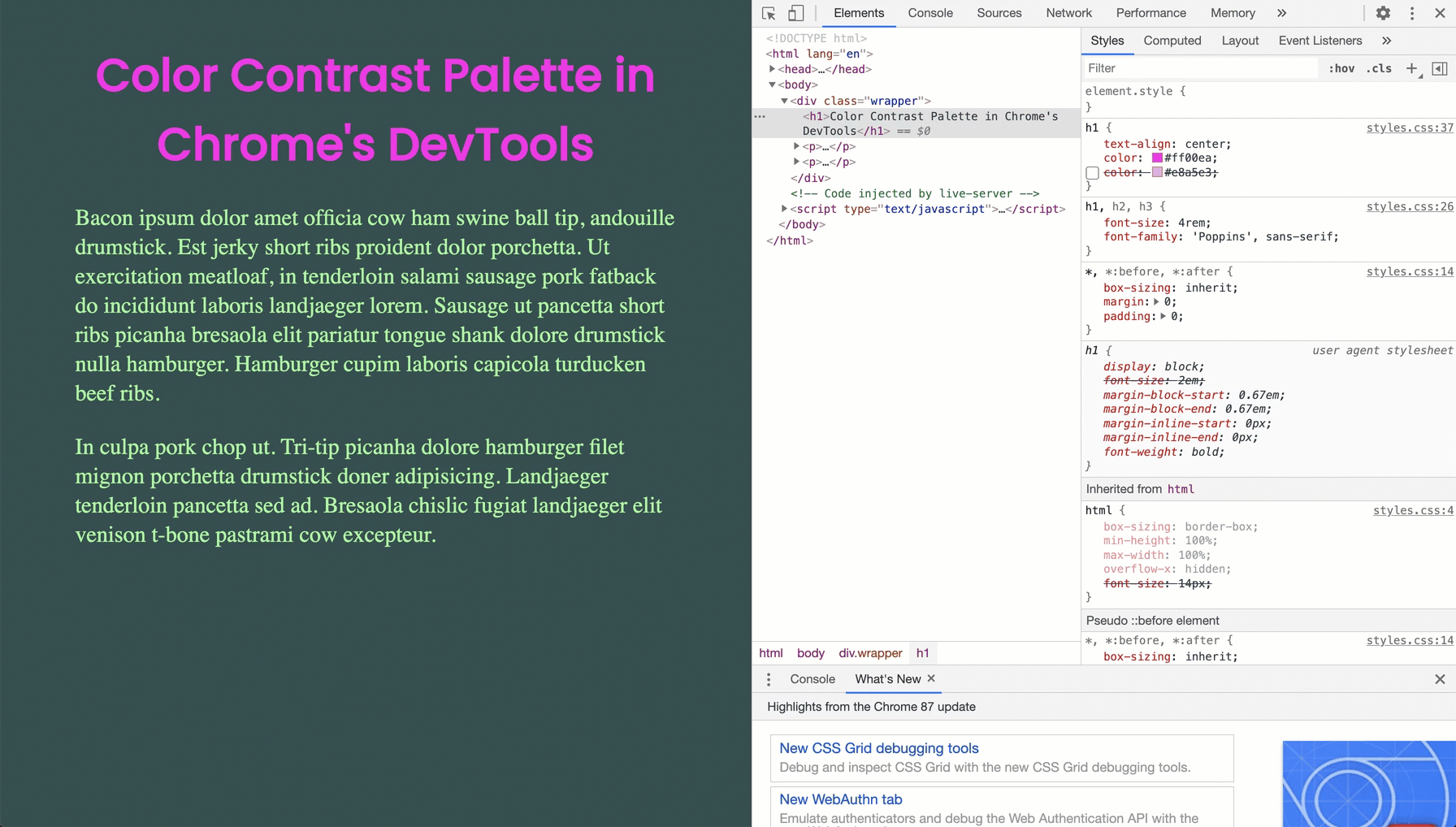
Figure 2 — Contrast Checker In Chrome’s DevTools

- Open DevTools in Chrome. To inspect a color, select an element on the page and in the “Styles” pane look for the color property. Next to the color property, there should be a small color swatch box. When you click on that, the palette will open.
Figure 3 — Opening The Color Palette In Chrome’s DevTools

2. Click on the area labeled “Contrast ratio” in the color picker. It should have one or two green check marks or a red “No” symbol next to it. One check mark means it meets the minimum recommendation for contrast ratio (AA), two check marks means it meets the enhanced recommendation (AAA). Clicking on the “Contrast ratio” drop-down displays a section that shows whether you’re in conformance with level AA or level AAA.
Figure 4 — Example of Contrast That Doesn’t Work

On the color palette, there are two white lines indicating the uppermost threshold to meet AAA compliance and the lowermost threshold to meet AA compliance.
You can use the white circle slider in the color palette to move around and watch the color and contrast ratios change in real-time.
Figure 5 — Using the Contrast Tool
Use this tool to test out your colors experience before moving anything into production. This is a vital step in your testing process.
Educating your marketing and design teams to use this tool also opens up communication and collaboration when working together on products for the web. To arm them with knowledge, share the first article in this series, “The Power of Accessibility,” in which Senior Digital Accessibility Manager Olya Kenney shares six ways designing accessible software and user experiences creates better business outcomes.
Our Technology, Marketing and Product Strategy teams have also collaborated on the Spark Design System, which now has accessibility guidelines. Design systems are a great way to align on these UX standards among any team, big or small.
Wrapping Up
Accessibility isn’t just a requirement; it’s a must. If you develop for the web in any capacity, it’s your job to care about the experiences you’re creating for all populations.
Color contrast is one of the easier ways to make your site as effective as possible. All that is needed to address it is awareness, communication, collaboration and the right tools.
Being cognizant of the colors you choose will help increase ROI and keep your users and clients happy.
We’re still hiring! Even in the midst of a pandemic, we’re reshaping the fintech industry. Interested in joining us? Check out our technology openings.
These opinions are those of the author. Unless noted otherwise in this post, Quicken Loans is not affiliated with, nor is it endorsed by any of the companies mentioned. All trademarks and other intellectual property used or displayed are the ownership of their respective owners. This article is © 2020 Quicken Loans.
Recommend
About Joyk
Aggregate valuable and interesting links.
Joyk means Joy of geeK