
13

H5 移动端 网页端适配(js+rem)
source link: https://blog.csdn.net/weixin_41618917/article/details/113105510
Go to the source link to view the article. You can view the picture content, updated content and better typesetting reading experience. If the link is broken, please click the button below to view the snapshot at that time.

H5 移动端 网页端适配(js+rem)
业务场景:由于需求是适配两端屏幕,所以刚开始想的css用rem写,但
是还是会出现字体和布局不会等比缩放的情况,后来找到一种
js代码针对根元素去做的缩放配置,加上rem和这个js的设置就
能做到等比缩放。
- 下载插件,并修改比例 (如果ui尺寸是750就改50 375改25),修改完重启vscode
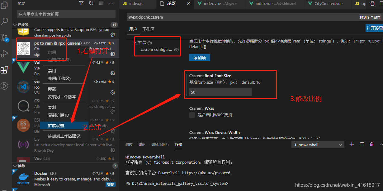
重启,效果图: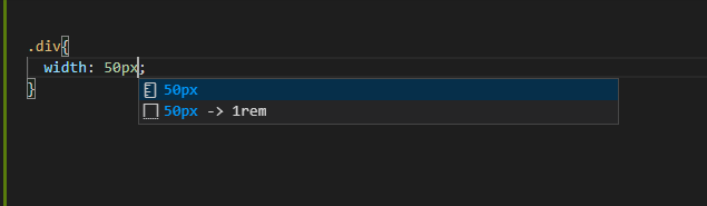
2. 新建一个index.js,把下方代码复制进去,即可使用。
   //适配兼容
   (function (doc, win) {
    console.log(doc, win)
    // var docEle = doc.documentElement;
    const dpr = Math.min(win.devicePixelRatio, 3),
        scale = 1 / dpr,
        resizeEvent = 'orientationchange' in window ? 'orientationchange' : 'resize';

    var recalCulate = function () {
        var docEle = document.documentElement,
            w = docEle.clientWidth,
            num = (w > 750 ? 750 : w) / 750;       // **此时的750就是你设计稿的尺寸
        docEle.style.fontSize = (num * 100).toFixed(1) + 'px';
    };
    recalCulate();
    if (!doc.addEventListener) return;
    win.addEventListener(resizeEvent, recalCulate, false);
})(document, window);
_φ(❐_❐✧ 人丑就要多读书
好用不谢,点个赞哦~
Recommend
About Joyk
Aggregate valuable and interesting links.
Joyk means Joy of geeK