

You want overflow: auto, not overflow: scroll
source link: https://kilianvalkhof.com/2021/css-html/you-want-overflow-auto-not-overflow-scroll/
Go to the source link to view the article. You can view the picture content, updated content and better typesetting reading experience. If the link is broken, please click the button below to view the snapshot at that time.

Kilian Valkhof
Building tools that make developers awesome.
Search termYou want overflow: auto, not overflow: scroll
Every now and then a web developer using a Mac discovers that their beautiful design is littered with scroll bars on other platforms. Either because someone points it out to them or because they attach a mouse to their laptop, both of which make the scroll bars appear.
Often, MacOS hiding scroll bars by default is blamed for this (I know I’ve done that in the past). But the actual culprit is developers using overflow: scroll when they mean overflow: auto.
The difference
It may seem natural to add overflow: scroll to anything you want to be scrollable, but what it actually says is always show a scroll bar.
In most situations however you probably only want to show a scroll bar if one is needed, and hide it when not (you know, like Mac). For that, you need overflow: auto, which lets a browser automatically determine if a scroll bar is needed — or not.
So in short:overflow: scroll: Always show a scroll bar.overflow: auto: Show a scroll bar when needed.
Spotting the issue
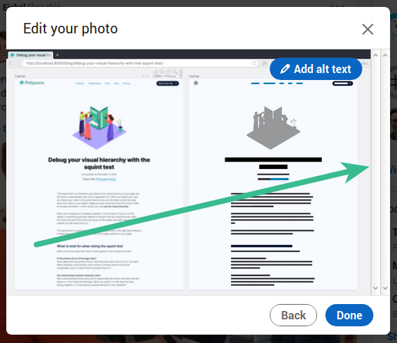
Disabled scroll bars are easy to spot on Windows and Linux, because you’ll have rather ugly inactive scroll bars visible on the page, for example here in the LinkedIn post creator:

A single scroll bar is not the worst that can happen. If add an image to a LinkedIn post, you’re shown not one but two inactive scroll bars next to each other.
Yep, if you have multiple elements with overflow:scroll, the scroll bars will just stack. Yikes.
Showing scroll bars on Mac
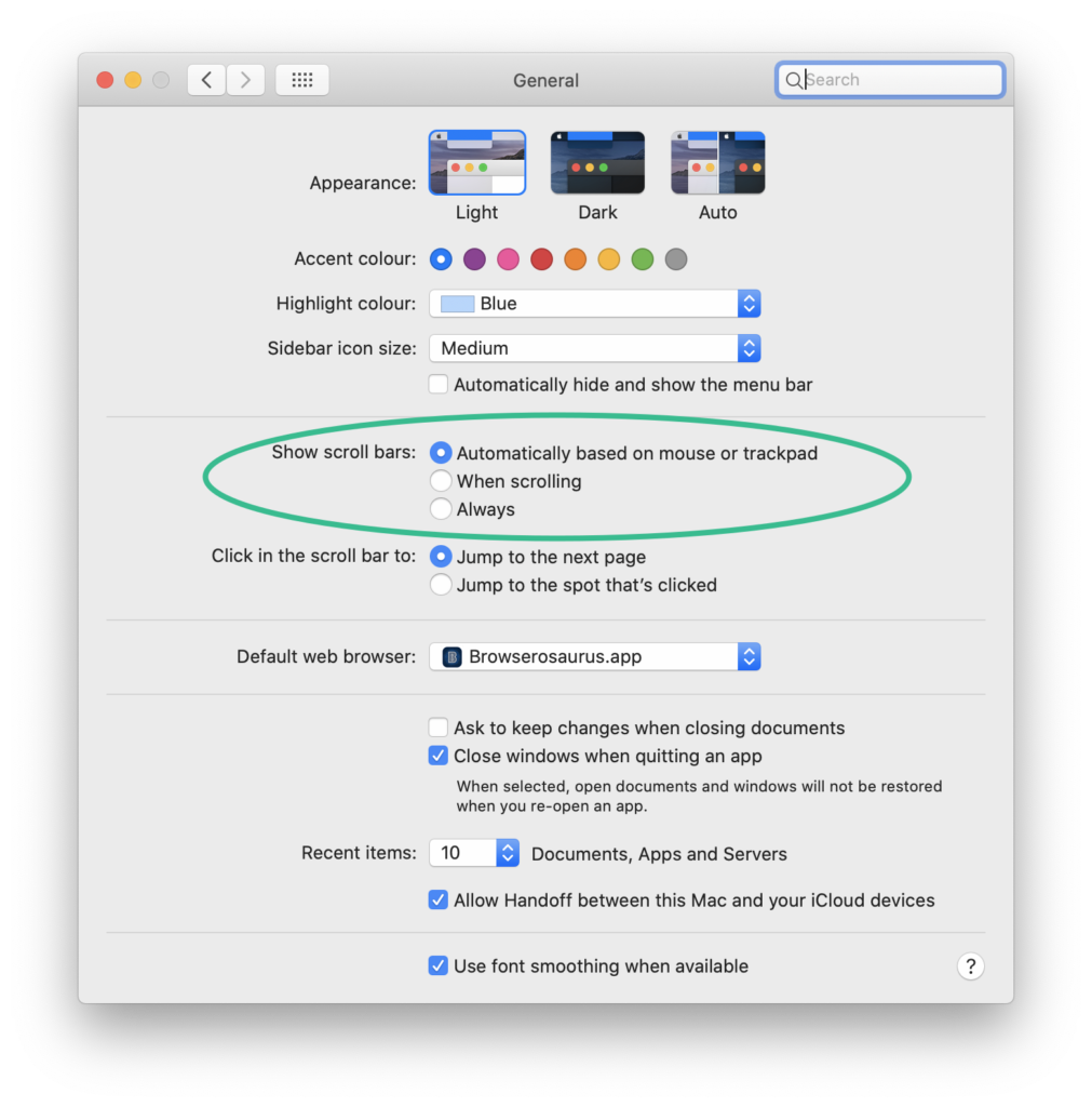
Windows and Linux always show you the scroll bars, but if you’re on Mac you have to change a setting to get them to show. Go to System Preferences, then General and toggle “Show scroll bars” to “Always”.
…but then you’re left with ugly scroll bars just like the rest of us, which you probably don’t want. There’s a reason Mac hides them!
Emulating scroll bars
What if it was easier to detect visible scroll bars without having them enabled across your operating system? I wrote a little bookmarklet that does just that.
It renders scroll bars on your page just like your Mac would if it’s set to always show scroll bars.
Emulate scroll bars on Mac Bookmarklets
Show all overflow: scroll scroll bars Show unneeded scroll bars
The bookmarklet comes in two versions: One shows scroll bars for all elements with overflow: scroll, and the other one only shows scroll bars when they’re not needed: elements that don’t scroll but still have overflow: scroll applied to them. Drag the bookmarklets to your bookmark bar to use them!
The scroll bars look 100% the same as the macOS scroll bars for horizontal, vertical and combined scroll bars, as well as supporting both dark and light mode so they’re a perfect representation of what you would see. This way you can quickly check a single page for scroll bars and move on. (Yes, it’s coming to Polypane too.)
Try it out on this page with the demo below:
If you’re on mac, this box will be empty until you click on one of the bookmarklets. (It already looks bad for us on Windows and Linux!)
The code
The code in the bookmarklet loops over all elements on the page, checks their computedStyle and adds classes to an element where overflow, overflow-x or overflow-y have the value “scroll”.
Then it injects some CSS styling to match those classes for the scroll bars: there’s rendering for just the vertical scrollbar, just the horizontal scrollbar and the vertical and horizontal scrollbar combined, using the ::before and ::after pseudo-elements.
If you want to check out the code and play around with it I created this CodePen:
There are two refactors that I want to do awaiting browser support. Right now the styles are injected as a <style> element but I would prefer to use adoptedStylesheet, and I use window.getComputedStyle() but would prefer to use element.computedStyleMap(). Both of those are for now only available in Chromium.
There you go. An explanation of the difference between overflow: auto and overflow: scroll, a way to always show scroll bars on Mac and a bookmarklet to quickly check your page for hidden scrollbars.
Now lets rid the web of ugly disabled scroll bars!
Related but different: 100vw
A common cause of horizontal scroll bars on websites is the use of 100vw for the body or html element. This works fine on mac, where the scrollbar does not take up any space.
Unfortunately on other platforms it does and the way viewport width is described in the CSS specification means that 100vw includes the width of the scrollbar.
This means that on platforms with visible scroll bars, 100vw causes a horizontal scrollbar if there also is a vertical scrollbar.
The solution is fortunately easy: use 100% instead, which does not include the width of the scrollbar but still makes the element the full width.
Hi, I'm Kilian. I make Polypane, the browser for responsive web development and design. If you're reading this site, that's probably interesting to you. Try it out!
Related articles
Sloped edges with consistent angle in CSS
CSS & HTML Design , 4 January 2017If you look above this text, you can see that the header of this blog has a sloped edge. It’s one of my favorite things about this new design. The technique I used has a consistent angle regardless of screen size, can show background images and only needs one HTML element and no pseudo elements.…
Full bleed layout using simple CSS
CSS & HTML , 6 October 2020There are many different ways to achieve the same layout in CSS and HTML. Some are now frowned upon, like tables or floats, and others tend to overlap somewhat, but have a clear specific purpose, like Flexbox and Grid. But CSS has another layout engine, and it’s one that has been part of CSS since…
I want my own media queries in browsers
CSS & HTML Web , 19 October 2020We’re on the verge of a whole lot of new CSS media queries becoming available. But if you’re a developer that wants to get a head start and try them out, you’re out of luck. Browsers are prototyping them one by one before making them available and we as developers have to wait. Prefers-reduced-data is an…
Recommend
About Joyk
Aggregate valuable and interesting links.
Joyk means Joy of geeK