

2014 Blog stats, and why Blogging >> Articles | Andrew Wheeler
source link: https://andrewpwheeler.com/2015/01/02/2014-blog-stats-and-why-blogging-articles/
Go to the source link to view the article. You can view the picture content, updated content and better typesetting reading experience. If the link is broken, please click the button below to view the snapshot at that time.

2014 Blog stats, and why Blogging >> Articles
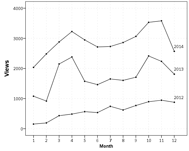
The readership of the blog has continued to grow. Here are the total site views per month since the beginning in December 2011.
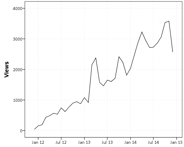
At this point we can start to see some seasonal patterns. I take a big hit in December and January, and increases when school is in session. I get quite a bit of my traffic from SPSS searches, so I presume much of the traffic are students using SPSS.
I do not worry too much about posting regularly, but I like to take some time if I have not published anything in around 2 weeks. I just enjoy taking a break from a specific work projects, and often I blog about something I have dealt with multiple times (or answered peoples questions multiple times) so I like making a blog post for my own and others reference.
Now, one of the more popular posts I have written is Odds Ratios NEED To Be Graphed On Log Scales. This I published in October 2013, recieved around 100 referrals from twitter the day I published it, and since has averaged about 5-10 views per day (it has accumulated a total of near 3,000 total). It is one of the first sites returned for odds ratio graph from a google search.
Certainly not a number of views to write home to my mother about, but I believe it is better outreach of my opinion than a journal article (not that I would be able to publish such a limited point in a journal article anyway). Take for instance Rothman et al.’s 2011 article, Should Graphs of Risk or Rate Ratios be Plotted on a Log Scale? in the American Journal of Epidemiology that has a differing opinion of mine. I can not find any readership stats for AJE, but I highly doubt that article has been viewed by 3,000 people, and according to google scholar it only has 2 citations currently. One is the response by the editor to the article, and the other is likely in error as it was published before the Rothman article. Site views are superficial as well, but I would place a wager my blog post has reached more readers than the Rothman article. 3,000 is way higher than views or downloads for my papers on SSRN, and even the most viewed articles since 2011 on the Cartography and GIS website have not accumulated 3,000 downloads at this point. (My Viz JTC paper has just over 100 downloads so far after being up for close to a year at this point.) AJE articles very likely have a larger readership than CaGIS – but I have no idea how much larger. I would guess the American Statistician has a more comparable (likely larger?) membership via the ASA, and articles from the first issue of 2014 have accumulated mostly between 200 and 1500 downloads currently (the last issue of 2013 is quite a bit lower). I suspect a download is a bit more of an investment than a page view of my blog (so both are over-estimates of those actually reading the article, but page views are likely a larger over-estimate). But in most cases I get so many more views on the blog compared to that I would an article outreach on the blog is clearly the winner. The audience is different as well, not necessarily better or worse, just different.
I don’t take my work as venerable as Ken Rothman’s (obviously he is a well respected and influential epidemiologist or methodologist more generally for his books), but I disagree with his reasoning for using linear scales in some circumstances in the referenced article. My general response to the Rothman example is that if you want to show absolute risk differences then show them. Plotting the ratios on an arithmentic scale is misleading, and while close for his example is still not as accurate as just plotting the risk differences. In Rothman et al.’s example plotting the odds ratios would result in an overestimate of the absolute risk differences by over 10%! (The absolute risk difference is 90 - 1 = 89, whereas the linear difference between the odds is 10 - .01 = 9.99. The former mapped onto a scale from 0 to 10 would result in a length of 8.9, so an over estimate of (9.99 - 8.9)/8.9 ~ 12%.)
I don’t take blogging as a replacement for academic work, more like an open nerd journal. I’m pretty sure this venue has quite a bit more readership than my journal articles ever will though.
Recommend
About Joyk
Aggregate valuable and interesting links.
Joyk means Joy of geeK