

How to Create Materials and Textures for Photogrammetry
source link: https://sketchfab.com/blogs/community/how-to-create-materials-and-textures-for-photogrammetry/
Go to the source link to view the article. You can view the picture content, updated content and better typesetting reading experience. If the link is broken, please click the button below to view the snapshot at that time.

How to Create Materials and Textures for Photogrammetry
Back to overview 15 November 2019Introduction
Hi, my name is Dale Utt, and I am the owner and operator of True Edge Archive. My company offers 3D modeling and animation services with a focus on objects of cultural significance. I do work primarily for museums, universities, and private collectors, but love spending my free time pushing the limits of what can be done with photogrammetry. While I live in Minneapolis, Minnesota, my work takes me around the world, wherever a model needs to be made!
I specialize in antique arms and armor, which has given me quite a bit of experience capturing objects that are highly reflective or have other unique material properties. Today I’m going to go through my materials workflow for one specific scene, hopefully giving a glimpse into how I use Sketchfab to create a more engaging and realistic experience for the viewer. We will begin with a high-resolution model produced in RealityCapture, and a decimated version created using Instant Meshes and MeshLab. For the actual texture generation we will be using a combination of Blender 2.8 and Adobe Photoshop.
In this tutorial, I will be focused on materials and textures, both on producing them, as well as setting them up in Sketchfab. To help illustrate this, we’ll be taking a look at a scene of a table and tea set I made earlier this year. These models were produced for the Cleveland Museum of Art (CMA) to use in their interactive ArtLens space. The photographs used for the photogrammetry were produced by their Chief Photographer Howard Agriesti in his studio at CMA. I, in turn, advised on the photography process, produced photogrammetric models, and did the post-processing and scene setup. Shiny, intricate, and with many different material types, this scene presents excellent examples of unique challenges that may arise when trying to model particularly complex objects.
In order, this tutorial will:
- Try and determine the scope of our project, and who the final viewer will be.
- Make a texture for each of the relevant material channels for our scene.
- Set up lighting and post-processing in Sketchfab.
Once we are done with that, we should have a beautiful model ready for the world!
1. Scope
The first thing we are going to do is establish the scope of our project. This helps to prioritize specific parts of the workflow and to make sure that we are able to stick to a concrete deadline. This was especially important for this scene as there was little more than a week to produce models, polish them, and get them ready for display! We will see later on how this influences our priorities when making textures.
Knowing that these models are going to be viewed in an exhibit where viewers will only interact with them for a short amount of time, we will prioritize the initial impact of the scene, and try to capture the “essence” of the object. We will focus on this rather than trying to make the models super detailed, even at the highest zoom level.
Now that we have a firm idea of where we want to go, it’s time to create each of our textures! For these models, we will be using a Metalness PBR workflow. If you are not familiar with the difference between a Metalness and Specular workflow, take a look at this video for a helpful walkthrough of the major differences.
The Model
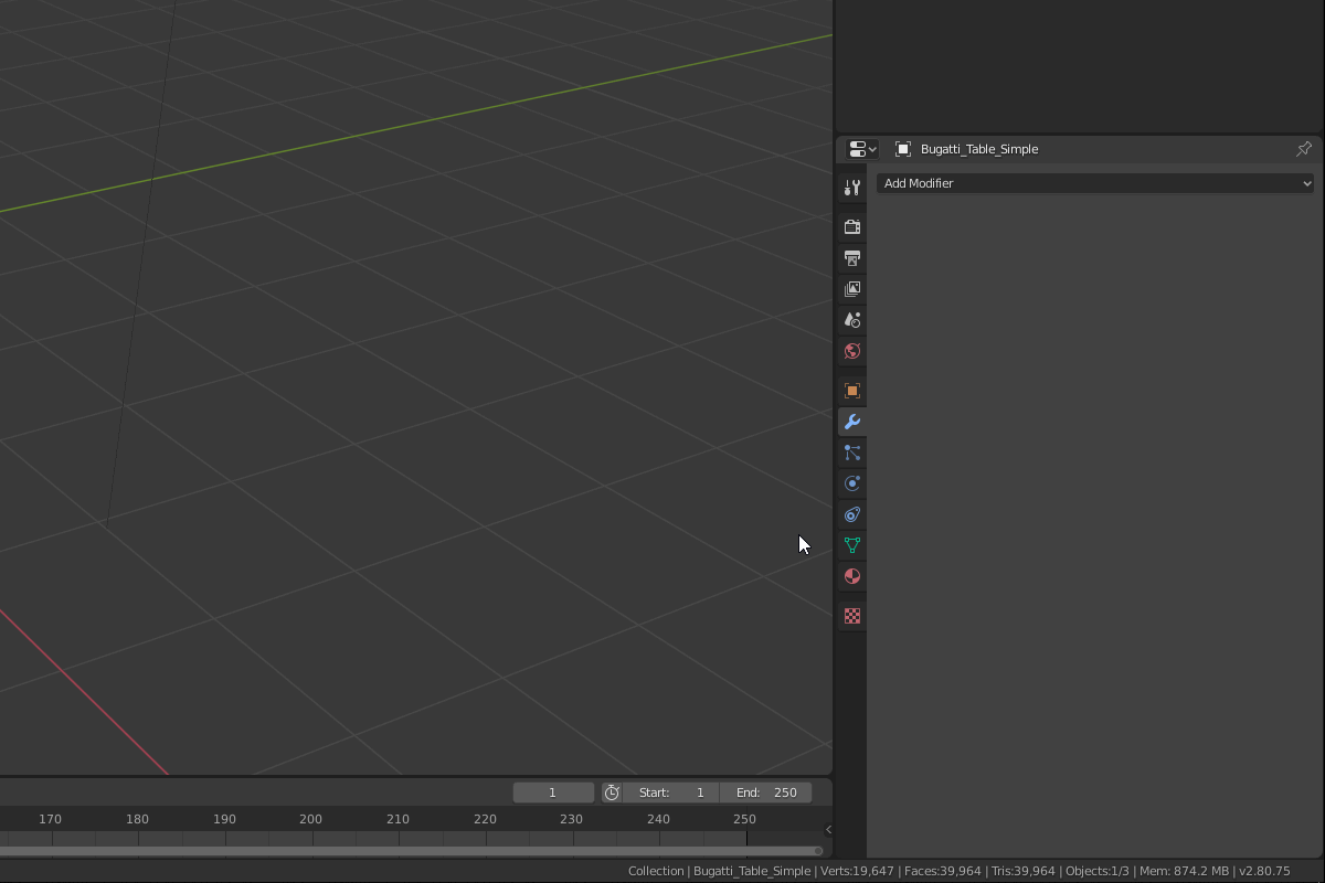
At the texturing stage, it’s assumed that we have already produced two separate models for each object: One high-resolution model with color texture, and one low-resolution model without any texture information. The high-resolution models for this project were produced using RealityCapture, and they range in size from 5M to 50M polygons. The low-resolution models, somewhere between 10k and 100k polygons in size, were produced using a combination of RealityCapture, InstantMeshes, and MeshLab. With our low-resolution model, we will need to produce a UV map before beginning any of the texturing process. This can be done automatically in Blender, but doing it manually allows for more control. Deciding between automated mapping, manual mapping, or some combination of the two is very much a matter of personal preference and is often dependent on the subject itself.
2. Texturing and Materials
Base Color
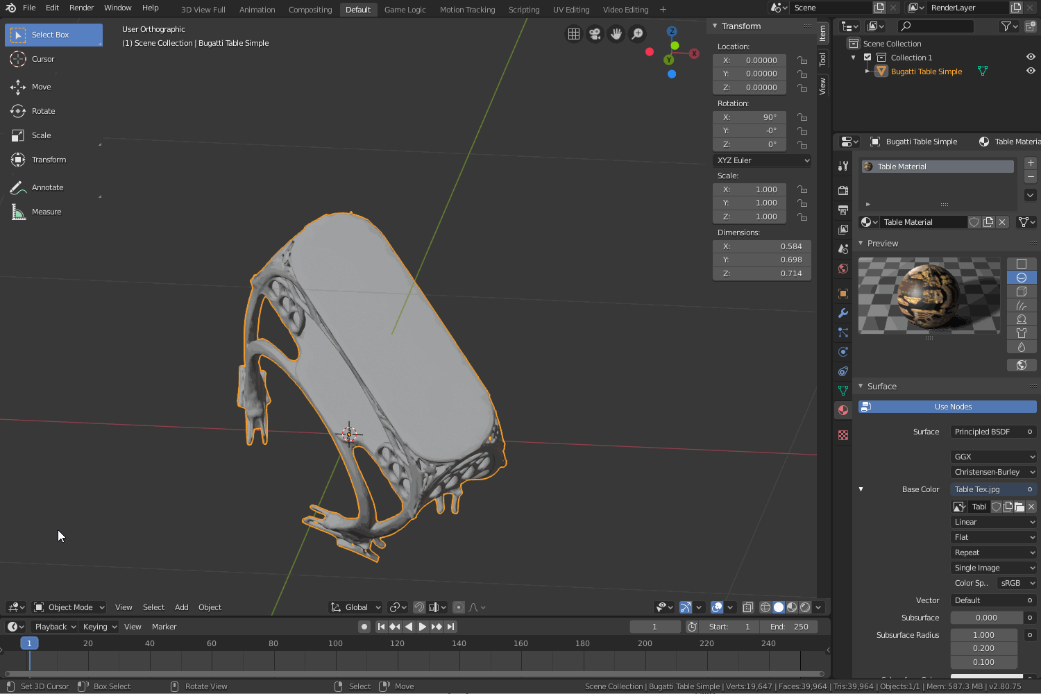
The first and most important of our textures is the Base Color, or Albedo. This should require very few changes, as this is the output texture from our photogrammetry software. If you find that it is not quite matching what you expected the colors to be, you can attempt to make changes in Photoshop, and then upload both the original and this new corrected version into your model viewer (Blender, Sketchfab, etc.) to compare and contrast. To avoid this, we can try to do all our color correction before actually making a model in RealityCapture. We can accomplish this fairly easily by using an X-Rite ColorChecker Passport or comparable color reference in combination with Adobe Lightroom to correct the colors in the initial photographs.
Once we have our high-resolution model and texture, we need to project this color information on to our low-resolution model. To do this in Blender, we do the following:
- Load both high and low-resolution models into the same scene.In our case, we simply do this by going to File > Import > Wavefront (.obj) and selecting the high and low-resolution models.
- Create a new texture for the low-resolution model.To create a new texture, we go to the Materials tab for our model, connect an image texture to our Base Color channel, and choose New.
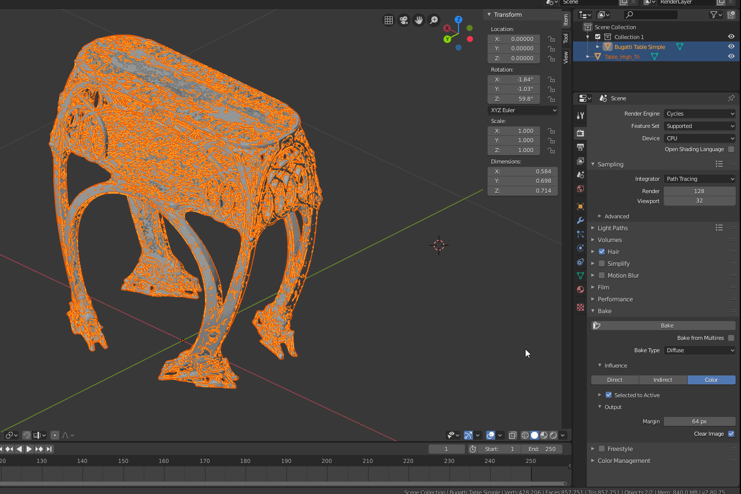
- Bake the texture information from the high-resolution model to the low resolution.In the Outliner panel select the high-resolution model, then shift + click the low-resolution model to select it as well. Switch the Render Engine to Cycles. Under the Bake tab, switch Bake Type to Diffuse. Under Influence make sure you have unselected Direct and Indirect so that only Color remains selected, click Bake, and you’re ready to go!
- Save the resulting image.Once our image has been produced, switch to the Image Editor to save our texture. Go to Image > Save As and choose an appropriate name for the texture file.
Now that we have this color texture for our low-resolution model, we will use this as the basis for the majority of our other textures.
Normal Map
If we’re confident in the quality of our high-resolution model, we will now bake this geometric detail into a normal map. Use the exact same process as above: First, as with the Base Color, create a new image file for our Normal Map. For now, we will still be baking to the Base Color channel, so following the same process exactly as laid out before will work just fine. Select the high-resolution model, then the low-resolution model. Now select Normals instead of Diffuse under Bake Type. Click Bake, and we should have our Normal Map. Again, we must switch to the Image Editor and save our image file, this time labeling it as our Normal Map.
There may be circumstances when you don’t want to use your high-resolution model to make a normal map for your low-resolution model. For instance, if there is a lot of noise present in your original model, the noise may result in an unrealistic surface texture that lessens the perceived realism by the viewer. In this case, we may wish to use methods other than using the geometric data of our high-resolution model to artificially reproduce that sense of detail. These alternate methods allow us to capture the “feel” of the original object, even if we don’t have all of the necessary spatial information to make a perfect replica. We’ll take a deeper look at one such method when generating Bump Maps for the tea set.
Metalness
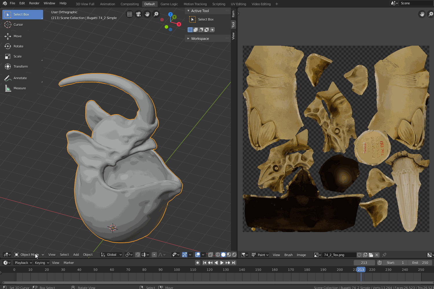
To make the texture for the metalness channel, we need to mask out either the metallic parts of our model or the non-metallic. One may be easier than the other, depending on the object. For the tea set, the only non-metallic part was is ivory handles. That made the handles an ideal candidate for masking. We will make our mask utilizing the texture paint function in Blender. To do this, we will do the following:
- Switch from Object Mode to Texture Paint.

- Paint the non-metallic areas of our model.
When choosing a color, choose one that is solid, bold, and unlikely to be anywhere else on the model. This is the color we will be masking later on. - Save this mask image and open it in Photoshop.
- Select the mask color. This can be done using the Magic Wand Tool.
- Create a new fill layer and fill with either black or white, depending on which is appropriate. Using the opposite color, create a background layer.
N.B. As a general rule of thumb, you should always color metals as pure white, and nonmetals as pure black. This will generate the most realistic and believable results. There are some circumstances, however, where we might use greyscale values to produce interesting effects. One such place was for the mother-of-pearl inlay on the table in this scene. By using greyscale values in combination with other effects, I was able to approximate the iridescence of the mother of pearl.For our mask, we have colored the horn, the only non-metallic material in our model. Therefore, we will fill the horn with black, and the background with white.
- Save the new Metalness Map.
Base Color
Metalness Map
This is hardly the only approach I use to create a metalness map, but this method is quite effective for objects that are composed of large chunks of distinct materials.
Glossiness
To generate a Glossiness map, we will again be working in Photoshop. We will be starting from our Base Color texture, creating a greyscale version, and adjusting the brightness and contrast to create the levels of glossiness we desire. This works well for metallic objects, as they tend to have a brighter base color where the metal is more polished, and darker where the metal is more tarnished or has started to corrode. This is not universally true and is often not the case for non-metallic materials. For example, suede might be lighter when rougher and grow darker as you burnish it. Additionally, different materials may have different reflectivity even if their colors and brightness are the same. All these things must be taken into consideration when generating a Glossiness map.
Our procedure begins as follows:
- Import the Base Color into Photoshop.
- Apply a Black & White adjustment layer across the whole image.
- Apply Levels, Brightness/Contrast, or Invert adjustments where appropriate.
It can be quite useful to utilize masks to only apply adjustments to specific areas. These masks can be made manually using tools in Photoshop or created using the method we utilized for our Metalness map. In fact, our metalness map can be a very useful mask by itself. - Export this new greyscale image.
Just like that, we have our Glossiness map!
Adjustment layers for different materials
Bump Map
Unlike the table, where we could project the high-resolution model onto a low-resolution version, the highly reflective tea set produced noisy surface geometry that visually did not match the original object. We can get around this by artificially reproducing some of the surface features present. Instead of using a Normal map for the tea set, we will produce bump maps to attempt to replicate some of the fine surface details. The creation of our Bump Map is very similar to the process utilized for the Glossiness map. For most objects, small indents and recesses will appear darker, both due to less light reaching inside those cavities, and due to the fact that dirt and corrosion tend to accumulate there as well. Much like the Glossiness, the overall effect can be improved by taking the time to fine-tune separate areas of the map. Just using an unmodified greyscale version of our Base Color results in overly prominent scratches appearing on the surface of the tea vessels. Knowing that much of the body of the tea vessels is almost perfectly smooth, we will want to reduce the intensity of these scratches. We can do this the following way:
- Load our Base Color map into Photoshop.
- Apply a Black & White adjustment layer.
- Select the areas we want to smooth using the Lasso tool.
- Feather the selection by going to Select > Modify > Feather, or by pressing Shift+F6.
This will help to smooth the transition between areas of our object. - Apply a Blur filter to the selection.
We can also selectively adjust sections by utilizing the masks we created when producing our Glossiness map. Once we’ve achieved the level of surface features we desire on our model, our Bump Map is complete.
The Bump Map in practice
Specular
While important, the Specularity channel can often result in the strongest diminishing returns. Because of this, we can reuse some of the work we have already done, and save ourselves a significant amount of time. We will simply use the Glossiness map in the Specularity channel, and adjust the overall strength of the channel until it gives the desired appearance. More work could be done to refine the Specularity, but for our project, it is not necessary. By reusing a texture, we have the added benefit of reducing our textures count, meaning that the final loading time of our scene will also be reduced.
Clear Coat
Sometimes achieving the desired appearance can require a combination of effects across multiple channels. This is the case for the ivory inlay present in the table. Each ivory piece is polished to a perfectly flat surface. Just using the base model and Bump Map, the ivory inlay appears more irregular than it is in real life. To correct for this, and to add a sense of depth to the material, we can mask the ivory inlay and use this mask to create an Intensity map for the Clear Coat channel. This can be done following the same procedure we utilized for making our Metalness map. With the clear coat applied, we can achieve a much more believable surface for the ivory.

Additional Channels
Sketchfab provides a number of other channels to help reproduce complex visual effects. Some of them are more specific in their use, but if used properly, each one can help bring your model to the next level. While none of the others are directly applicable to this scene, taking the time to inspect and experiment with each of them can help us be prepared for when we may wish to use them in the future!
The Opacity Channel Being Utilized to Create Stained Glass
3. The Scene
Now that we have our models all assembled and our textures created, it’s time to bring them all together in Sketchfab. We will be breaking down our workflow in Sketchfab into three parts:
A. Materials
B. Scene Lighting
C. Post Processing
A. Materials
We’ve come to what is probably the most exciting part of our materials workflow. It’s time to see what all our textures look like together! We can begin by uploading our model and all our texture files to Sketchfab and then applying each of them to the appropriate channel. Once done with this, we can adjust the intensity of each channel until we feel the model looks just right. This can often be easier to do with the original object to reference. With the original object beside you, it is much simpler to quickly compare and contrast.
B. Lighting
Once we have our materials to a point we are happy with, we need to set up our lighting. Much like the other steps in this tutorial, this is often an iterative process, with changes being made to lighting followed by changes to the materials, and back to lighting. While it can be tempting to rely heavily on the point lights available, most of the work lighting your scene is going to be done by the Environment channel. Sketchfab has a wide array of environments already available, but others can be downloaded from various websites and then uploaded to your scene to better achieve that perfect lighting. For highly reflective objects, it’s especially important to pick an appropriate environment. We want to make sure that nothing in the environment distracts from the objects themselves. Anything in our environment will be reflected in our objects!
The whole room of our environment reflecting in the tea set
C. Post Processing Effects
Sketchfab offers a range of powerful post-processing effects that can add that little extra spice that brings your models to life. Much like with the texture channels, different effects will be appropriate for different scenes. The trick to using the post-processing effects is to not overdo it. A little goes a long way. For the table and tea set, the best effects for us to use are Screen Space Reflection, Screen Space Ambient Occlusion (SSAO), Sharpness, and Bloom. We should normally shy away from using Screen Space Reflection due to it being computationally expensive. However, because of the highly reflective nature of the tea set and the number of pieces in close proximity, the Screen Space Reflection really makes the whole scene that much more believable.

Just like with the previous settings, the Post Processing effects can be fine-tuned by adjusting intensity alongside a number of different factors, depending on the effect. Just remember to err on the side of too little rather than too much.
Conclusion
Now that our scene is set up, we are all done! It is just a matter of sharing our model with the world.
The approaches we’ve discussed here can be used exactly as described. But, they can also be mixed, modified, added to, or omitted entirely. You should not be afraid to experiment and iterate, tailoring your workflow to the needs of your scene.
I hope that this tutorial has provided a useful look into my personal workflow for materials and modeling with Sketchfab. Hopefully, you now have some insight into my approach for trying to bring objects to life in the digital world!
Recommend
About Joyk
Aggregate valuable and interesting links.
Joyk means Joy of geeK