

Hacker News Design is Ugly
source link: https://neil.computer/notes/hacker-news-design-is-ugly/
Go to the source link to view the article. You can view the picture content, updated content and better typesetting reading experience. If the link is broken, please click the button below to view the snapshot at that time.

Hacker News Design is Ugly
This thing is straight up ugly. It is too simple, useful, pragmatic, dense and practical. Boring. These days the cool things are purple gradients, lots of negative space and loss of contrast. People on HN keep raving about this design thing but boy they are so wrong.
Let's fix it.
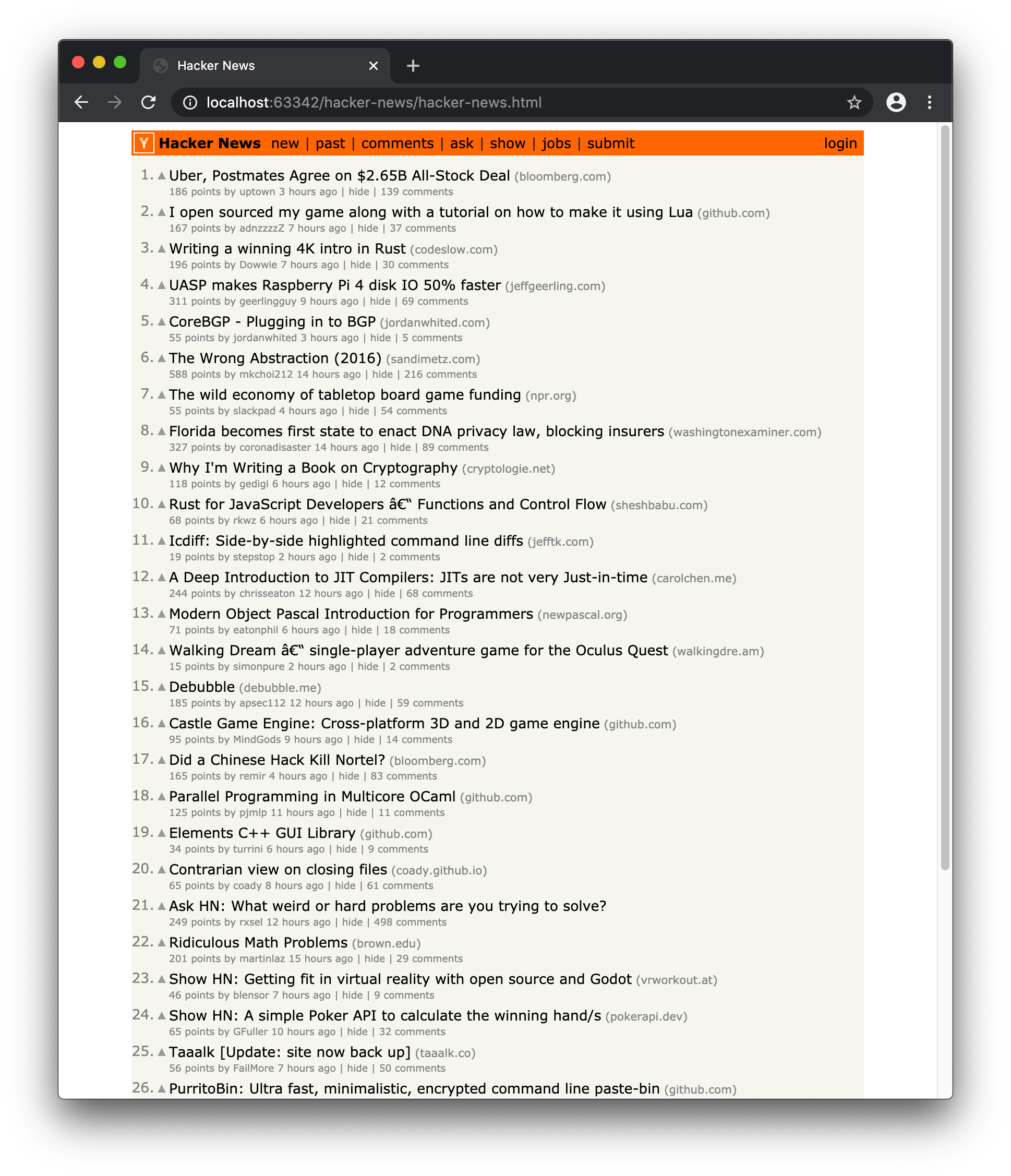
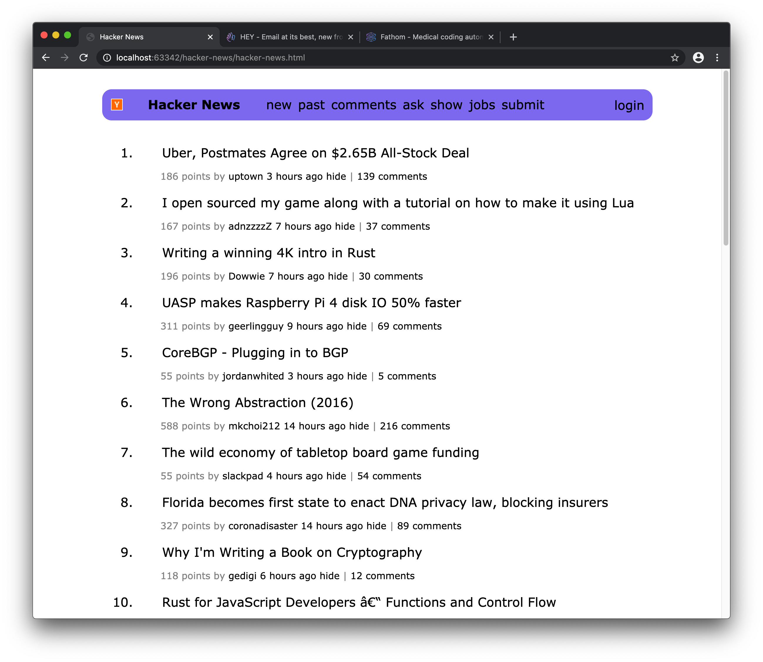
Current State
This is what HN front-page looks like when you login. It has absolutely zero pop. Typical engineers, what do they know about design?
Let's make it pop, shall we?
Fixing HN Design
First things first. Padding. When I am bored, running out of ideas, I like to do one thing that usually makes things 10x better. Padding is like a chef's knife in the kitchen. Know how to use it well and you'll be cutting through information rich UI like butter. It is what sets professional designers from these gray-beard types.
It is difficult to do it right, so please allow me to exemplify the process. First, add padding to the body tag.
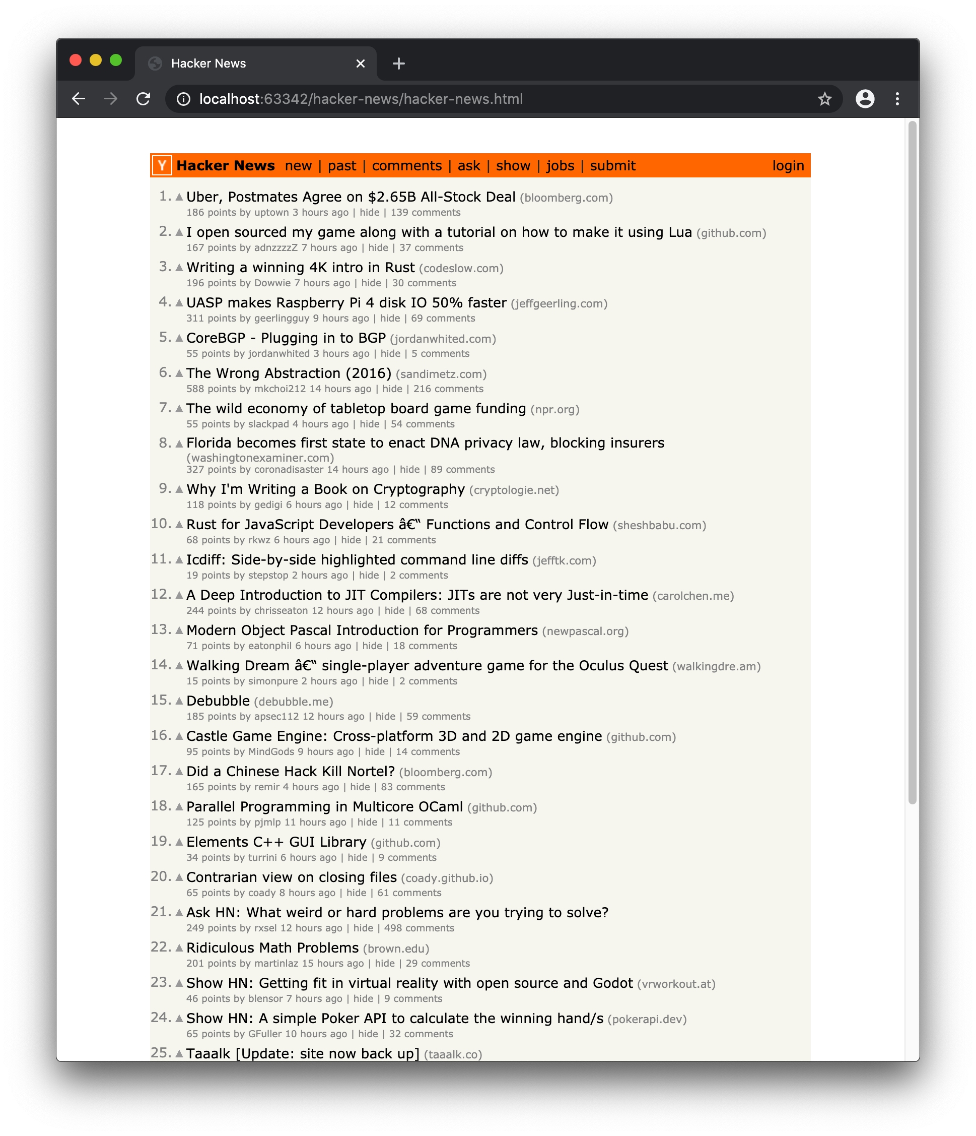
See the difference? Holy crap. The UI just suddenly started breathing.
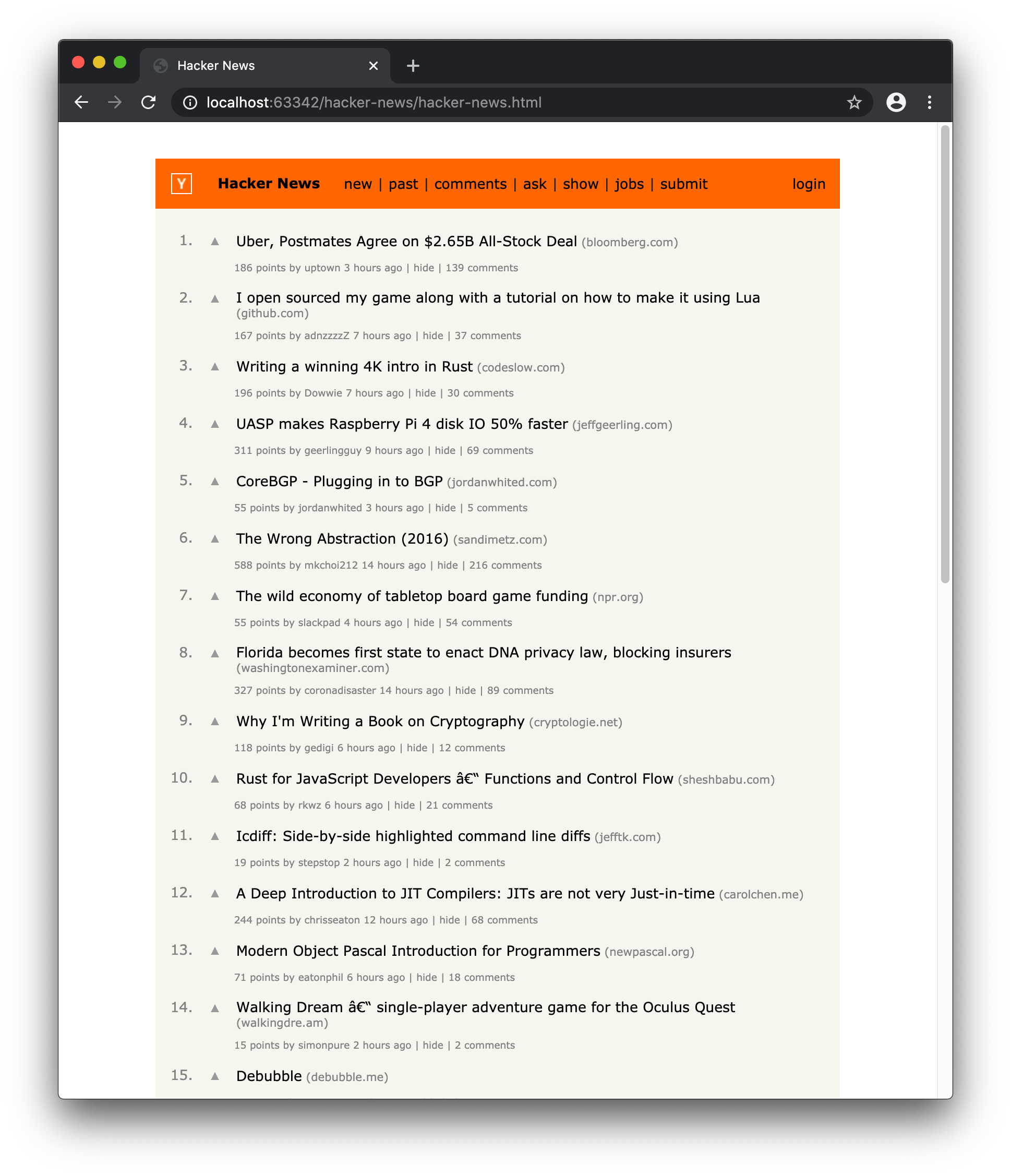
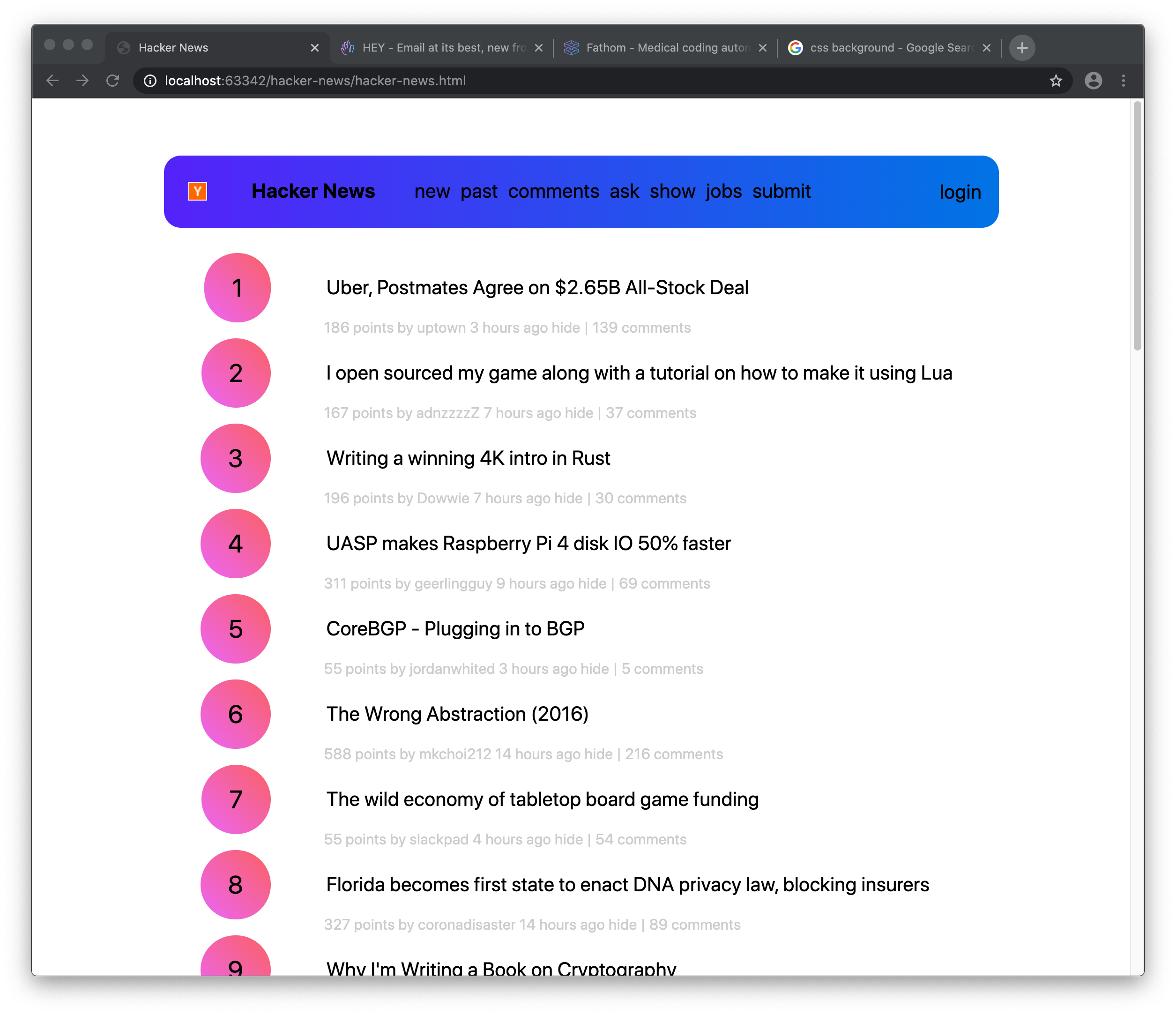
Let's add more spacing between this conjested highly dense information rich piece of shit.
The color orange is fine with me but it is not gonna get you through the design school and into the real world. The world today demands magenta. Magenta/Purple/Cyan all inspired by Stripe UI since 2015 or so and it really set the standard for a modern color palette. Throw your creativity and objectivity away, the trend dictates what we should choose. May be it PANTONE will come up with a color of the year and it will change. But as per current design trends, purple is the safe choice.
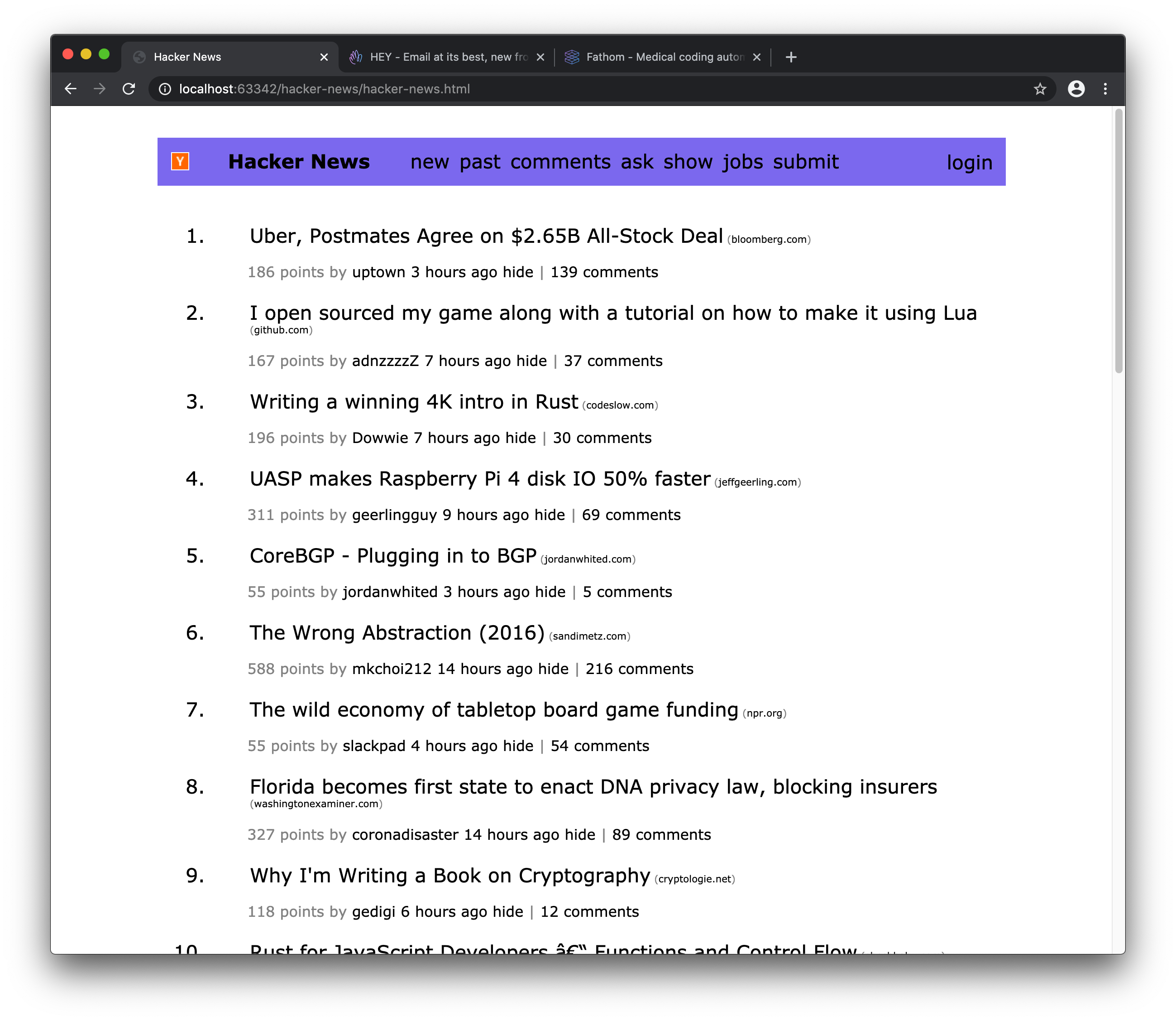
BAM. What you didn't notice is I also got rid of all background colors to flatten things a bit. I hate borders which are a graphical device invented to create logical spatial layouts but those things are for boring websites for techy folks.
Next up. Pro tip: Border-radius. It is not as complicated as it sounds. Simply put, we like to make things rounded as allows us to compete for a one of those web design awwwards and border-radius is a mandatory requirement before creating a dribbble account. So we must comply without the thought of originality.
See? It really ties the web page together.
Those pesky informative sub-titles are jarring as it helps the user too much. Let's make it so that it loses contrast and fades away in the background. As a side effect, it makes the whole thing more minimal. Minimalism at all costs. Try to make things minimal by removing features and neutring functionality - no one will ever notice.
It looks minimal af.
That's all folks. Hacker News redesigned. These are the basics but if there is enough interest, I can probably make another tutorial on how to do this:
Until then, go here and browse some more trends to follow at the cost of authenticity, objectivity, originality, reasoning and fundamental understanding of how to design user interfaces: https://www.google.com/search?q=design+trends+2020
Recommend
About Joyk
Aggregate valuable and interesting links.
Joyk means Joy of geeK