

CSS is hard, Blazor and Tailwind CSS makes it easier
source link: https://jonhilton.net/re-usable-components-with-blazor-and-tailwind-css/
Go to the source link to view the article. You can view the picture content, updated content and better typesetting reading experience. If the link is broken, please click the button below to view the snapshot at that time.

CSS is hard, Blazor and Tailwind CSS makes it easier
April 22, 2020 · 6 minute read · Tags: blazor
I really enjoy full stack web development.
Nothing quite beats that feeling of taking a feature all the way from concept to working software, from airy fairy idea to something you can actually interact with in the browser.
But, for all the good days when I enjoy building software, there are the bad days…
You know these days.
These are the days when you seriously question your life choices, when it feels like you spent the entire day pushing pixels around only to fail, spectacularly, to get anything that vaguely resembles the design brief up and running on the screen.
For me, these are my CSS days.
I hate working with CSS.
OK, maybe “hate” is putting it a bit strong, but it’s crazy frustrating when I know I can build entire features, make them perform miracles technically, and work exactly as they’re supposed to, but the end result looks like something my five year old put together.
Just today I spent longer than I care to admit trying to make a button fit inside a div (it was extending out over the edge for some unfathomable reason!)
And don’t even get me started on flexbox.
But, I’ve experienced something of a revelation in recent weeks.
Considering Blazor for your next project?
Learn my simple, repeatable process for transforming ideas into features using Blazor's component model.
4 days, 4 emails; enter your email in the box below and I'll send you Lesson #1.
When it comes to making things look half decent, even with my sub-standard CSS skills, I’ve found a compelling alternative.
In putting together a new site for my online books and courses using Blazor Server, I suddenly realised I was actually enjoying the process of building the UI; making buttons behave a certain way, getting the layout of the site to work on different screen sizes.
Why I hear you ask? Why fun in place of the usual frustration?
It comes down to the intersection of two technologies…
Blazor and Tailwind CSS.
Blazor is all about components
When you create your UI using Blazor, you’ll find yourself breaking the interface down into smaller pieces (components) which you then build and compose together to make your feature shine.
Here’s a simple example of a re-usable button.
PrimaryButton.razor
<button @attributes="InputAttributes">
    @ChildContent
</button>

@code {
   [Parameter]
   public RenderFragment ChildContent { get; set; }

    [Parameter(CaptureUnmatchedValues = true)]
    public Dictionary<string, object> InputAttributes { get; set; }
}
Now, if you’re new to Blazor there’s a little bit to explain here.
The first bit is fairly standard HTML, where we define our button.
Note how we’ve rendered something called ChildContent.
When we use our button in another component, anything we put between the opening and closing tags will be passed into PrimaryButton as ChildContent.
<PrimaryButton>Click me, go on!</PrimaryButton>
In this case “Click me, go on!” will be rendered in the middle of our button element.
We’ve also defined a parameter called InputAttributes.
Because we’ve set CaptureUnmatchedValues to true on this parameter, when we declare our component and include arbitrary attributes, like name…
<PrimaryButton name="FancyButton">Click me, go on!</PrimaryButton>
They will be captured into this InputAttributes dictionary.
We can then attach those to our button using Blazor’s special @attributes attribute.
<button @attributes="InputAttributes">
    @ChildContent
</button>
Now button will have a name of “FancyButton”.
This is called “Attribute splatting” whereby the additional attributes are captured into a dictionary and then splatted onto the element.
At this point we’re free to use our PrimaryButton component in any of our Blazor components (or pages) and pass any attributes we like to it.
<PrimaryButton class="blue">One</PrimaryButton>
<PrimaryButton name="Two">Two</PrimaryButton>
<PrimaryButton type="submit">Buckle my shoe</PrimaryButton>
So far, so pointless. If we’re just rendering the standard browser styled button, we haven’t really gained anything.
But, we’re just one step away from making PrimaryButton really, really useful.
Come in Tailwind CSS
Let’s say we want all our buttons to look and behave the same way.
We could head over to whichever stylesheet we’re using for our site, you know, the one called site.css which has all your CSS styles in it.
We could scroll, and scroll, and scroll to the bottom of said style sheet, throw a button style in there and be done!
But, what if we want an easy way to play around with this button quickly, iterating until we get it exactly how we want, and in a way which is easy to tweak as we press ahead with the rest of our site.
This is where Tailwind CSS comes into play.
I won’t detail how to set Tailwind CSS up with Blazor because Chris Sainty already did a fantastic job of explaining just that.
But let’s say we want our button to have a purple background. With Tailwind we would use one of their many utility classes to get the job done.
<button class="purple-100" @attributes="InputAttributes">
    @ChildContent
</button>
And here’s what you get…
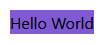
Now, I think we can all agree this is not off to a promising start!
It looks ugly, and you are probably more than a little suspicious about the idea of including lots of css classes in your markup like this.
But if we stick with it, ignoring our reservations for a moment, we can quickly turn this ugly button into something much more respectable.
We’ll start by making the text white, giving it some padding, then make it slightly rounded, before adding a subtle shadow for good measure.
<button class="bg-purple-600 p-4 shadow-md rounded-md text-white"
        @attributes="InputAttributes">
    @ChildContent
</button>
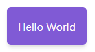
Much nicer.
I’ve found it takes a short time to get used to Tailwind’s conventions, but once you do they’re easy to remember.
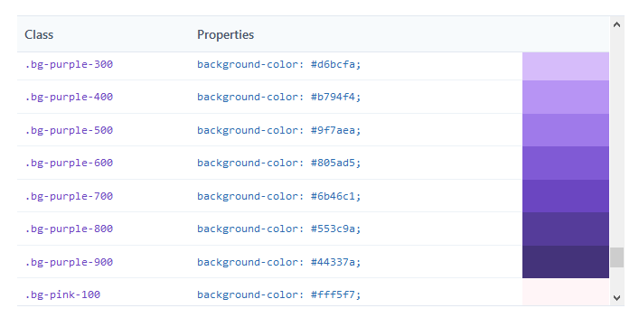
Colours have a number of presets, e.g. bg-purple-600 in our example, but different shades are available!
Here are some of the shades of purple as listed on the Tailwind web site.
Adding padding to all sides of an object can be achieved with p-x where x is a number e.g. p-6.
Alternatively you can just add horizontal padding with px- or vertical with py-.
The same goes for margins e.g. mx-3 or m-6.
We applied a box shadow with shadow-md, we could go more subtle with shadow-sm or less subtle with shadow-xl which would give a much stronger shadow effect.
Even… animation
Finally, if we want to make our button a little more “dynamic” we can apply pseudo-class styles to it, like hover:
In this case starting with a gray button and making it light up on hover.
<button class="bg-gray-500 hover:bg-purple-600 p-4 shadow-md rounded-md text-white">
    Test Button
</button>
This one’s interactive, give it a go!
We can get even more fancy by applying some transitions.
<button class="transition duration-100 bg-gray-500 hover:bg-purple-600 p-4 shadow-md rounded-md text-white transform hover:scale-110">
    Test Button
</button>
We’ve indicated that the transition should take 100ms and the hover:scale-100 class should be applied with an animation when we hover over the button.
In Summary: Re-use those components
Hopefully you’ve now got an idea of how powerful this combination can be.
There are plenty more tricks up Tailwind CSS’s sleeves, including classes to use flexbox (eek) and CSS Grid.
But even sticking to the basics, you can build truly re-usable components using Blazor, which look good in the browser (even if your CSS skills are as under-developed as mine!)
When building re-usable components in Blazor:
- Use Attribute Splatting and
CaptureUnmatchedValuesto accept any and all attributes - Use the special
ChildContentRenderFragment parameter to render the content between the tags - Use Tailwind CSS to make your components spring to life in the browser
Considering Blazor for your next project?
Learn my simple, repeatable process for transforming ideas into features using Blazor's component model.
4 days, 4 emails; enter your email in the box below and I'll send you Lesson #1.
Next up
Dark mode for your web applications (using Blazor and Tailwind CSS)Recommend
About Joyk
Aggregate valuable and interesting links.
Joyk means Joy of geeK