

Extension:Page Forms/Input types
source link: https://www.mediawiki.org/wiki/Extension:Page_Forms/Input_types
Go to the source link to view the article. You can view the picture content, updated content and better typesetting reading experience. If the link is broken, please click the button below to view the snapshot at that time.

This page covers the various input types available within Page Forms, and the parameters and other customizations that can be set for them.
The input types[edit]
text[edit]
The default input type; corresponds to the HTML "text" input.
Special parameters:
size=size - Specifies the width of the input, in characters.maxlength=maximum length - Specifies the maximum allowed length of the input.placeholder=placeholder text - Specifies help text that is displayed in the input until the user clicks on it.
textarea[edit]
Corresponds to the HTML <textarea> tag.
Special parameters:
rows=num rows - Specifies the number of rows.cols=num cols - Specifies the number of columns.maxlength=maximum length - Specifies the maximum allowed length of the input.autogrow- Sets the textarea to "auto-grow" its height to match that of its contents, so that a scrollbar won't be needed.editor=editor type - Adds a JavaScript-based editor to the textarea to make editing its contents more user-friendly. The following values are supported:
wikieditor- uses the WikiEditor extension, which must be installed. Unfortunately, only one input within the form can have WikiEditor associated with it, due to a limitation in the WikiEditor extension. If you want to add any additional custom toolbars to WikiEditor, you will need to add them in the JavaScript to('#free_text').wikiEditor, just as they exist for('#wpTextbox1').wikiEditor.tinymce- uses the TinyMCE extension, which must be installed.visualeditor- uses VisualEditor extension, which must be installed. Another extension, VEForAll, must also be installed. If you would like the toolbar to show up at the top of the edit field rather than at the bottom (default) you will also have to add|class=toolbarOnTop
max height=maximum height - If VisualEditor is being used, specifies a maximum height (in pixels) for the textarea, since VE uses autgrow. By default, this value is 400.placeholder=placeholder text - Specifies help text that is displayed in the input until the user clicks on it.
text with autocomplete, textarea with autocomplete[edit]
These two inputs were turned into aliases for "combobox" and "tokens" in version 5.0. For earlier versions, these are displayed in the same way as the text and textarea input types, and they can be configured in the same way, but they also provide autocompletion - on one or multiple values.
See the "Setting values and mappings" and "Autocompletion" sections below for how to customize the autocompletion.
combobox[edit]
The "combobox" input type provides a combo box interface: an input that functions like a regular autocomplete field, but has an additional down-arrow icon, like that of a dropdown, to let the user see all the available values at once. It is implemented using the Select2 JavaScript library.
Special parameters:
size=size - Specifies the width of the input, in characters.existing values only- Disallows arbitrary values in the field.placeholder=placeholder text - Specifies help text that is displayed in the input until the user clicks on it.namespace=namespace - Prepends the specified namespace to the selected value.
tokens[edit]

This input type "tokenizes" the values in the field, i.e puts a block around each value to make it a single unit instead of just a string of characters. These "tokens" can then also be rearranged. Like "combobox", this input is implemented using the Select2 JavaScript library.
Special parameters:
size=size - Specifies the width of the input, in characters.max values=max values - Specifies the maximum number of allowed values.existing values only- Disallows arbitrary values in the field.placeholder=placeholder text - Specifies help text that is displayed in the input until the user clicks on it.namespace=namespace - Prepends the specified namespace to each selected value.
By default, "tokens" appears as a single-row input, then expands vertically if necessary as more values are added.
In some cases, you may want this input to appear taller than one row when it starts out, to make it clearer to users that it will expand.
To do that for a single input, add a class parameter to the field tag, like "|class=ClassName", then add something like the following to MediaWiki:Common.css:
.ClassName, .ClassName .select2-choices {
        min-height:60px;
}
If you want this to apply to all "tokens" inputs in the wiki, add something like this to MediaWiki:Common.css instead:
#pfForm .select2-container-multi .select2-choices {
        min-height: 60px;
}
radiobutton[edit]
The "radiobutton" input corresponds to the HTML "radio" input. It shows a set of values from which the user can only choose one.
By default, the first radiobutton value is "None", which lets the user choose a blank value. To prevent "None" from showing up, you must make the field "mandatory", as well as making one of the allowed values the field's "default=" value.
dropdown[edit]
The "dropdown" input corresponds to the HTML <select> tag. It shows a dropdown list of values, from which the user can only choose one.
checkboxes[edit]
The "checkboxes" input displays checkboxes to let the user choose any number of values.
If there are more than a certain number of checkboxes, "Select all" and "Select none" links will automatically appear above the set of checkboxes, allowing users to automatically check all or none of them.
This number is dictated by the variable $wgPageFormsCheckboxesSelectAllMinimum, which by default is 10, though it can be changed in LocalSettings.php.
Special parameters:
hide select all- hide the "Select all" and "Select none" links for this input, regardless of the number of valuesshow select all- display the "Select all" and "Select none" links for this input, regardless of the number of values
listbox[edit]
The "listbox" input corresponds to the HTML <select> tag, with the "multiple" attribute added. It shows a vertical list of options, where the user can select any number of values.
Special parameters:
size=size - Specifies the height of the listbox.
tree[edit]
The "tree" input type allows for a hierarchical, tree-style input, where all the values have either radiobuttons or checkboxes next to them, depending on whether the field can hold one item or many. Values can either come from a category tree within the wiki, or be set manually within the form definition.
How does this input know whether it can hold one or multiple values, and should thus display radiobuttons vs. checkboxes? It checks whether the field in the template is defined as holding a list of values (using #arraymap) or not. This check is not perfect, though. If the tree input is showing radiobuttons instead of checkboxes, you just need to add the parameter "|list" to the field tag in the form definition, to establish that this is a list.
Depending on the source of the values, you need to specify one of these two additional parameters:
top category=- sets the name of the category at the top of the "tree".structure=- sets the entire tree structure; should use wikitext-style bullets to set the depth level.
If you use the "structure" parameter, it should look something like this:
{{{field|Location|input type=tree|structure=*Universe
**Milky Way Galaxy
***Solar system
**Andromeda Galaxy
...etc.
}}}
You can also optionally set these parameters:
height=- sets the height, in pixels, of the box in which the tree appears.width=- sets the width, in pixels, of the box in which the tree appears.delimiter=- sets the delimiter when the field can hold a list of values. Default is ','.hideroot- hides the name of the top category.depth=- sets the number of levels of the three that are shown at the beginning. Default is 10.
You can see a sample form that uses this input type here.
For category names[edit]
If you're using the "tree" input type to display a category tree, note that this input will print out only the names of the categories selected, without the "Category:" namespace before it; so if you want that to show up in the page as well, the template will have to add it.
If the field specifies multiple categories, and the template uses #arraymap to do it, the call to #arraymap should look something like:
{{#arraymap:{{{Categories|}}}|,|x|[[Category:x]] |<nowiki> </nowiki>}}
...in other words, you need to specify the final "delimiter" parameter for #arraymap, and make it a space, blank or something similar, to avoid printing commas between the category tags.
checkbox[edit]
A single checkbox, used for boolean values.
Special parameters:
label=- specifies a "label" for this checkbox, which would go into a <label> tag.
date[edit]
This input contains three separate entries, for the year, month and day.
datetime[edit]
The "datetime" input is similar to the "date" input, but includes additional entries for hours, minutes, seconds and AM/PM.
Special parameters:
include timezone- specifies that a time zone entry should also be included.
year[edit]
"year" is a simple text input that is used to get a year-only value for a date field.
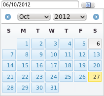
datepicker[edit]
"datepicker" lets the user pick a date with the help of a JavaScript-based popup calendar. This input has many optional parameters; see here for the complete list.
datetimepicker[edit]
"datetimepicker" is a JavaScript-based input type very similar to "datepicker", but it includes popups for selecting both the date and time.
It defaults to yyyy/mm/dd hh:mm.
Its set of parameters includes all of those "datepicker" as well as the following:
mintime- the minimum allowed timemaxtime- the maximum allowed timeinterval- the interval (in minutes) between options shown to the user
rating[edit]
The "rating" input type displays a set of stars to let the user enter a rating.
Special parameters:
star width- specifies the width (and height) of each star. Default is 24px.num stars- specifies the number of stars to display. Default is 5.allow half stars- allow users to select half a star. Default is false; set to 'yes' (or any other value) to make true.
googlemaps, leaflet, openlayers[edit]
The "googlemaps", "leaflet" and "openlayers" input types let you display a map to get a coordinate value, using the Google Maps, Leaflet or OpenLayers services, respectively.
If you are using the "googlemaps" input, you may need to get a Google Maps API key, then set it in LocalSettings.php via the $wgPageFormsGoogleMapsKey setting, for the input to display.
You can also optionally set these parameters for these input types:
height=- sets the height, in pixels, of the map.width=- sets the width, in pixels, of the map.starting bounds=- takes in a pair of coordinates to set the bounds of the map displayed; this parameter only applies if the input does not have a value. (Example value for this parameter: "-20,-15;50,55".)
The "leaflet" input type allows one additional parameter:
image=- sets the specified image (which must be an image that was uploaded to the wiki) as the background for the map, instead of a geographical map.
The "googlemaps" input lets you enter an address to locate the coordinates more easily. But if the form already contains one or more fields to enter the address, then the user may have to enter it twice - once to actually store the data, and the second to locate the coordinates. To avoid users having to do this double work, you can have the address field(s) feed their values directly to the map when locating the point. You can do that using the "feeds to map=" parameter - look for "feeds to map" here.
All of these formats, by default, rely on external JavaScript code. However, you can have the "openlayers" format use local JavaScript code instead, by just installing the OpenLayers extension.
Disabling[edit]
Note that these input types all send your wiki's data (that is, the data contained in the query results) to external services. They are the only part of the Page Forms code that sends data externally, other than autocompleting on outside values, though that one requires additional configuration to run. If you have a private wiki and are very concerned about no data getting out, you may want to add the following to LocalSettings.php:
$wgPageFormsDisableOutsideServices = true;
This will disallow the use of any outside services by Page Forms - which at the moment means disabling these three input types.
regexp[edit]
The "regexp" input type is not a true input type, but rather the ability to display another input (most often "text") with additional, regular-expression-based validation. See here for a more detailed explanation of this input type and its parameters.
Allowed input types for data types[edit]
Each defined data type, when using either Cargo or Semantic MediaWiki, has a default input type, and, when applicable, a default input size as well. Additionally, some data types have special handling if the field holds a delimited list of values, instead of just a single value.
Here are the defaults and the other allowed input types for each data type, for single values:
Cargo data type
SMW data type
Default input type
Default size
Other allowed input types Page Page combobox 35 text, dropdown, textarea, tree String String (deprecated) text 35 combobox, textarea Text Text, Code textarea 5 x 30 text URL URL text 100 textarea Integer, Float Number text 10 textarea Date, Start date, End date Date date
datetime, year, datepicker Datetime, Start datetime, End datetime N/A datetime
datetimepicker, date, year Boolean Boolean checkbox
dropdown, radiobutton Coordinates Geographic coordinate openlayers
googlemaps, leaflet Rating N/A rating
Enumeration (any Cargo field with a list of allowed values) Enumeration (any SMW property with defined "allowed values") dropdown
radiobutton Hierarchy (any Cargo field with a hierarchical set of allowed values) N/A tree
And here are the default and other allowed input types for delimited lists of a certain data type:
Cargo data type
SMW date type
Default input type
Default size
Other allowed input types Page Page tokens 100 text, textarea, tree, checkboxes String Text text 100 textarea, tokens Enumeration Enumeration checkboxes
listbox Hierarchy N/A tree
Setting values and mappings[edit]
Some input types provide the user with pre-defined values.
These can be values that the user is required to choose among (like with the dropdown input type), or values that are only meant to serve as a guide to the user (like with combobox, although there too these options can be made mandatory, if you add the existing values only parameter).
For both cases, the set of parameters for specifying the values shown to the user is nearly the same. Here are the parameters for the "field" tag that can be used in all cases:
cargo table=+cargo field=– If you have Cargo installed on the wiki, this set of parameters will be automatically used if the input type uses autocompletion, likecomboboxdoes. The code will find the Cargo table and field that this template/form field corresponds to, and use all the values that have been set for that field. Or you can use these parameters to specify any combination of table and field you want.property=– If you have Semantic MediaWiki installed, this parameter will be automatically used if the input type uses autocompletion. The code will find the relevant property and use all of its values, or you can use this parameter to specify a different property.values from property=– Functionally, this parameter works the same asproperty=, above, though it lacks some of the side effects:property=can also impact the size and even input type of the field.values from category=– Gets its values from the names of all pages belonging to a specific category.values from namespace=– Gets its values from the names of all pages belonging to one or more specific namespaces. To get values from more than one namespace, separate the names with commas. To get values from the main namespace, use "Main", or just leave it blank.values from concept=– Gets its values from the names of all pages belonging to a specific SMW concept.values=– Finally, you can simply manually specify the set of values shown to the user; an example would bevalues=Red,Yellow,Blue. This set of values should be separated by commas by default, but the delimiter can be modified using thedelimiter=parameter.
There are several more options for the autocompletion-based inputs; see "Autocompletion", below.
Mapping[edit]
You can have the set of values displayed to the user be different from the set of values that actually show up in the page's wikitext. If the values are page names, and those pages have a "display title" set that is different from their real page name, then by default the form will display the display title instead of the page name. If you want, you can have the page name itself displayed, by adding the following to LocalSettings.php:
$wgPageFormsUseDisplayTitle = false;
You can enable other such mappings using the following parameters:
mapping template=template name - Takes in the name of a "mapping template" (a template that takes in a single, unnamed parameter, i.e. {{{1|}}}, and displays a "mapped" string as a result), and uses that template to map every potential value, so that the values' "aliases" appear on the screen, and not the values themselves.mapping property=property name - Used for fields that select pages with 'combobox', 'tokens', 'listbox', and 'dropdown' input types. For each possible value, displays a SMW property from that page rather than the title of the page, but saves the title of the selected page(s) as the field value. Used in conjunction with thevalues...parameters to get the list of possible values.mapping cargo table=table name/mapping cargo field=field name - Similar tomapping property=except it is used for Cargo fields. Used in conjunction withvalues=,values from namespace=,values from category=, andcargo table=/cargo field=.mapping using translate- If the Translate extension is installed, calls Translate's {{int:}} magic word on each value to get the mapped value.
For example, a form could contain a field tag like this:
{{{field|status|values=Prospective,Live,Retired|mapping template=StatusLabel }}}
The template at Template:StatusLabel could then contain something like:
{{#switch: {{{1}}} | Retired=Label for Retired |Live=Label for Live | Prospective=Label for Prospective }}
You could then use that same "mapping template" to display the label of the value on regular, non-form pages. Within the template that contains the field "status", you could have the following:
{{StatusLabel|{{{status|}}} }}
Autocompletion[edit]
Four of the input types (tokens, combobox, plus text with autocomplete and textarea with autocomplete for versions before 5.0) use autocompletion — as the user starts typing, the input shows a dropdown list of possible completions.
If a field represents a Semantic MediaWiki property, or Cargo field, of type "Page", autocompletion will be enabled by default — the field will autocomplete on the names of all pages that are already pointed to by that property or field.
For any other type, there is no default autocompletion, but you can achieve this same effect simply by setting the input type to one of the four types that have autocompletion.
You can manually set a field to autocomplete on the set of values from an SMW property, a Cargo field, a category, a namespace, a "concept", or a manually-set list, by using one of the "values ..." parameters - see "Setting values and mappings", above.
You can also autocomplete based on values outside the wiki, contained in web pages, databases, files, etc.; see "Autocompleting on outside values" below for the various ways to do this.
If a field is specified to hold multiple values, autocompletion will, by default, support multiple values: after a value is entered, and a delimiter placed, a new autocompletion will start for the next value. You can manually specify that a field should have multiple-value autocompletion, by adding the "list" parameter to the field's definition. You can also specify the delimiter for this list of values, using the "delimiter=..." parameter (the default is a comma).
By default, the maximum number of autocompletion possibilities that a field will offer is 1,000; this is for performance reasons.
To change this number, change the value of $wgPageFormsMaxAutocompleteValues in LocalSettings.php.
Disabling[edit]
You can disable autocompletion, if it's enabled by default for a field, by setting the input type to be simply "text" or "textarea".
Remote autocompletion[edit]
The set of a field's possible values for autocompletion is, by default, contained right within the form's HTML page, in a JavaScript declaration. For performance reasons, there is a limit to how many values can be placed in the page; by default the limit is set to 100. After that number is reached, remote autocompletion is done instead, where autocompletion happens through an Ajax call to the server, based on what the user has typed. This type of autocompletion is slower, but allows for many more autocompletion results.
You can change the default by adding something like the following to LocalSettings.php:
$wgPageFormsMaxLocalAutocompleteValues = 200;
Matching on every character[edit]
By default, Page Forms autocompletion matches on the beginning of every word in the set of possible values. However, you can change autocompletion to instead match on every character, by adding the following line to LocalSettings.php:
$wgPageFormsAutocompleteOnAllChars = true;
This feature is especially important for wikis that have values with non-ASCII characters, such as wikis in languages with non-Roman alphabets; since the default, word-based autocompletion doesn't yet work with non-ASCII characters.
Autocompletion on characters with accents[edit]
Flexible autocompletion for characters with accents is supported by the combobox and tokens input type.
Accent-folding has its limitations but it can help make some important yet overlooked user interactions work better. An accent-folding function essentially maps Unicode characters to ASCII equivalents. With accent-folding, it doesn’t matter whether users search for cafe, café or even çåFé; the results will be the same.
Autocompleting on outside values[edit]
There are two ways to have a field autocomplete using data from outside the wiki - one is from a URL that takes in a substring and returns data in JSON format similar to JSON returned by MediaWiki API and the other is to use External Data extension to fetch data from some external/internal source.
From an outside URL[edit]
You can have a field autocomplete on values from outside the wiki,using the following parameter:
values from url=URL identifier
To do so, take the following steps:
- Create a page/web service that takes in a substring via the query string, and displays a set of completion values. Page Forms expects to get a JSON format response with a toplevel key of "pfautocomplete" and an array of objects with the "title" key marking the values of possible completions. You can see a brief example of this from this API call on semantic-mediawiki.org.
For example, if you had a list of three countries -- Uruguay, Germany, and Japan -- and were asked for a list of possible completions for "an", you would return:
{"pfautocomplete":[{"title":"Germany"},{"title":"Japan"}]}This also makes it easy to autocomplete on the values from another wiki. - Decide on a short string to represent this URL.
For example, the service providing lookups in our list of countries could be called "
countryLookup". - Add the short string to the array in
$wgPageFormsAutocompletionURLsin your LocalSettings.php file to configure Page Forms to use your URL when it sees the string. Put "<substr>" where you want the user's input will go. In our example, if we want Page Forms to feed the user's keystrokes to the urlhttp://example.dom/countryLookup.phpvia the url parameter "c", we'd put:$wgPageFormsAutocompletionURLs['countryLookup'] = 'http://example.dom/countryLookup.php?c=<substr>';
- Add the parameter "values from url=URL-identifier-string" to the relevant field in the form definition.
For our country example, we might have a field that looks like:
{{{field|country|input type=tokens|values from url=countryLookup}}}
Using the External Data extension[edit]
The External Data extension (ED) supports retrieving data from a number of sources which include external URLs, regular wiki pages, uploaded files, files on the local server, databases and LDAP directories.
To autocomplete using ED, you need to first call any of ED's "#get_..._data" parser functions within the form definition (preferably at the bottom of the form definition, to avoid unnecessary line breaks). This will fetch data that can then be used in the field tags. (See the External Data documentation for how to call these.) The field tag may then use these parameters:
values from external data=ED variable name (mandatory)image=ED variable name (optional)description=ED variable name (optional)
Here is a sample call to #get_web_data to fetch data from some URL:
{{#get_web_data:url=URL |format=csv with header |data=title_variable_name=external_variable_name1,image_variable_name=external_variable_name2, description_variable_name=external_variable_name3}}
Assuming a form definition contains a call like that, a field tag can then use the values retrieved for autocompletion - not just to set the autocomplete values themselves, but also, if the input type is "combobox" or "tokens", to set a corresponding thumbnail image and description for each one.
Assuming our External Data call retrieved three "columns" of values, as the one above does, the field tag using this data could look like:
{{{field|...|values from external data=title_variable_name|image=image_variable_name|description=description_variable_name}}}
Dependent autocompletion[edit]
You can set a field's autocompletion values to be based on the value a user has already set of another field in the form.
This is done with the parameter values dependent on=, which has this syntax:
 {{{field
  ...
  |values dependent on=<var>template name</var>[<var>field name</var>]
It specifies that the current set of allowed values for this field are all the values taken by this same field from pages where 'field name' is equal to the value selected for 'field name' in the current form.
Is that confusing?
Well, this example may help: if a template is called "Restaurant" and it has template fields (not properties) named "Country" and "City", and you want the set of cities that are used for autocompletion to be only those cities in the country that the user selected, then the field tag for the City field should look something like:
{{{field|City|input type=combobox|values dependent on=Restaurant[Country]}}}
Uploading files[edit]
If a field in the form is meant to hold the name of an uploaded file (say, an image), you can allow users to upload this file directly through the form. This is done simply by adding the parameter "uploadable" to that field's declaration in the form definition. This will add a link reading "Upload file" next to this field in the form; if the user clicks on this link, it will pop up a "lightbox"-style window (using the FancyBox JavaScript library) that lets the user upload a file. Once the user has done so, the window will close, and the field will contain the name of the uploaded file. If the field is configured to contain a list of values, the new file name will be appended to whatever was there before; otherwise, the file name will overwrite whatever the field contained before.
Note that the "uploadable" parameter can only be used in fields of type "text", "text with autocomplete", "combobox" or "tokens".
For uploadable fields, you can also set the default filename of the uploaded files, by setting the "default filename=" parameter in the field definition. The value of this parameter can include parser functions, magic words and the like. It can also include the variable "<page name>", which gets substituted with the name of the page being added or edited. So adding to the field definition the parameter "default filename=Image for <page name>", for instance, for a page called "Abc", would set the default name of any uploaded file to "Image for Abc". Note that if you simply want to specify a default file to use such as "Imageneeded.png" the regular "default=Imageneeded.png" parameter will do.
You can see a demonstration of file uploading here.
Note that the upload window will not work if $wgBreakFrames is set to true in your LocalSettings.php file.
You can also set uploadable fields to use the operating system's own uploading directly, instead of using MediaWiki's uploading system - this gives the user fewer options, but it is a simpler process, and on mobile devices it can present some interesting options, like uploading photos right after they are taken. To do this, add the following line to LocalSettings.php file:
$wgPageFormsSimpleUpload = true;
The special parameters for uploadable fields are:
uploadable- Specifies that this is an uploadable field.image preview- Specifies that a thumbnail of the uploaded image should be placed under the field in the form.default filename=filename - Specifies the default filename for files uploaded with this field.
Parameter show on select[edit]
For inputs of type 'checkbox', 'checkboxes', 'radiobutton', 'dropdown' and 'listbox', the parameter show on select= specifies that one or more elements on the page should only be displayed if and when certain value(s) are selected within that input.
The syntax for this parameter is:
show on select=value 1=>element ID 1;value 2=>element ID 2;value 3=>element ID 3;etc.
A value can be provided with more than one element-id:
show on select=value A=>element ID 1;value B=>element ID 1;value B=>element ID 2;value C=>element ID 3;etc.
For inputs of type 'checkbox', simply "show on select=element ID" should be used.
Note that the element IDs cannot contain spaces and/or multibyte characters and cannot start with a number.
For an example of this feature in use, see this form, and observe what happens when you select different values for the "Publication type" dropdown. You can see how that was implemented in this form definition.
Recommend
About Joyk
Aggregate valuable and interesting links.
Joyk means Joy of geeK