

Color: From Hexcodes to Eyeballs
source link: http://jamie-wong.com/post/color/
Go to the source link to view the article. You can view the picture content, updated content and better typesetting reading experience. If the link is broken, please click the button below to view the snapshot at that time.

Color: From Hexcodes to Eyeballs
This post is also available in Russian: Цвет: от шестнадцатеричных кодов до глаза, and Japanese: 色:ヘキサコードから眼球まで.
Why do we perceive background-color: #9B51E0 as this particular purple?

This is one of those questions where I thought I’d known the answer for a long time, but as I inspected my understanding, I realized there were pretty significant gaps.
Through an exploration of electromagnetic radiation, optical biology, colorimetry, and display hardware, I hope to start filling in some of these gaps. If you want to skip ahead, here’s the lay of the land we’ll be covering:
Otherwise, let’s start with the physics.
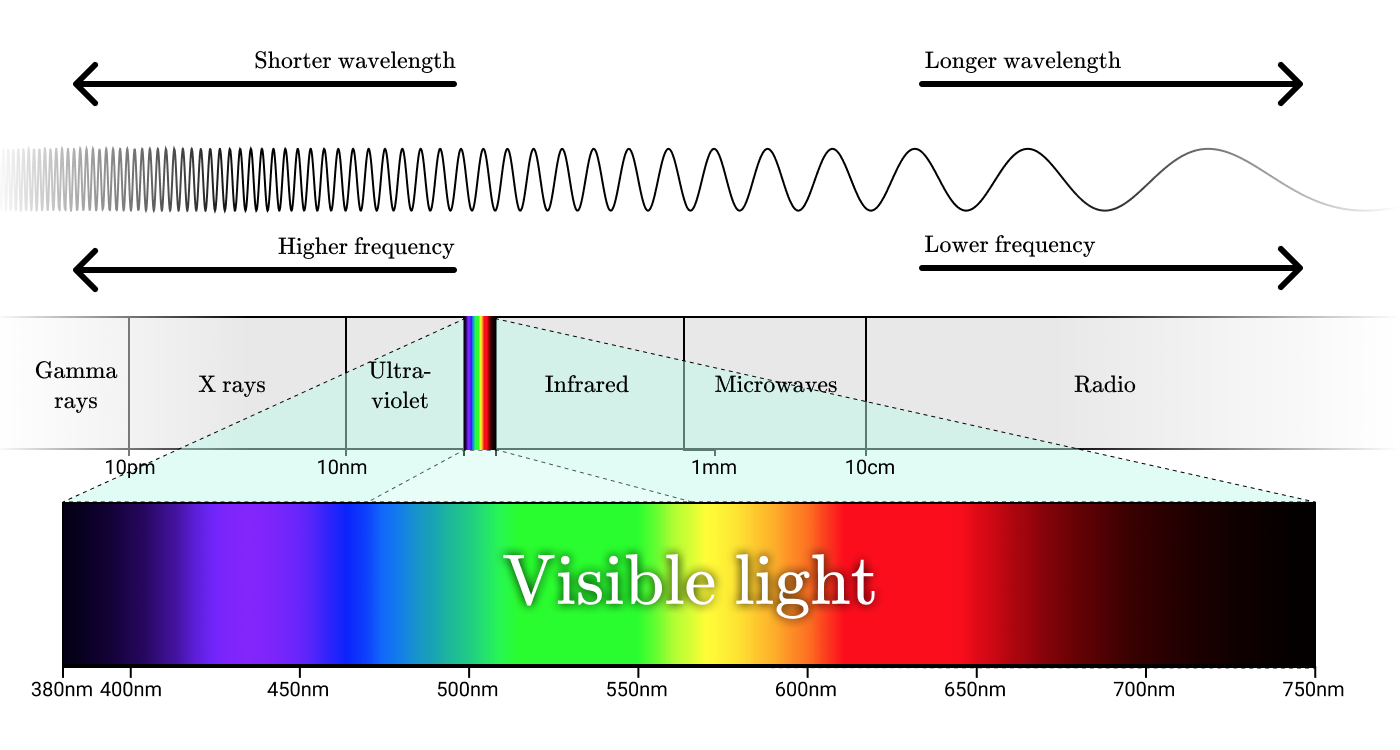
Electromagnetic radiation
Radio waves, microwaves, infrared, visible light, ultraviolet, x-rays, and gamma rays are all forms of electromagnetic radiation. While these things all go by different names, these names really only label different ranges of wavelengths within the electromagnetic spectrum.
The smallest unit of electromagnetic radiation is a photon. The energy contained within a photon is proportional to the frequency of its corresponding wave, with high energy photons corresponding with high frequency waves.
To really understand color, we need to first understand radiation. Let’s take a closer look at the radiation of an incandescent light bulb.

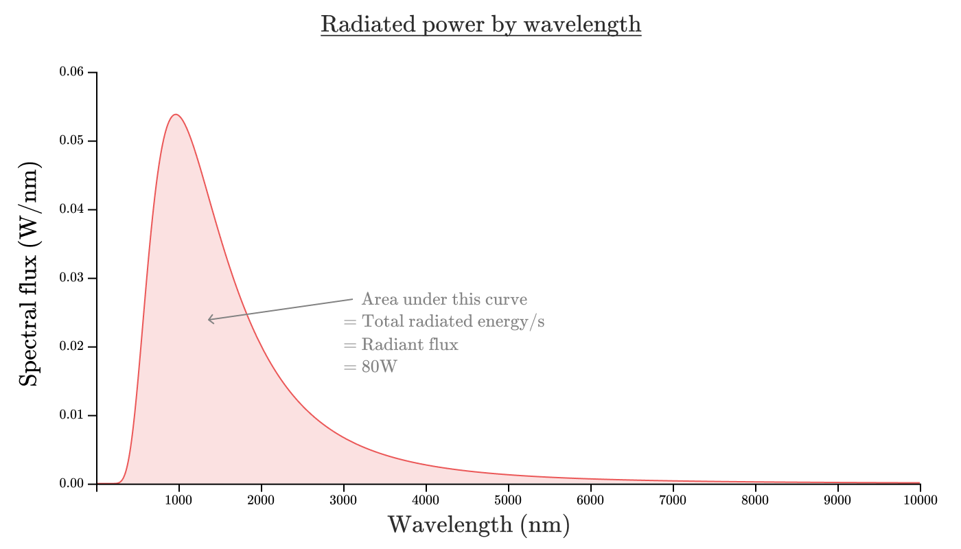
We might want to know how much energy the bulb is radiating. The radiant flux (Φe\Phi_eΦe) of an object is the total energy emitted per second, and is measured in Watts. The radiant flux of a 100W incandescent lightbulb is about 80W, with the remaining 20W being converted directly to non-radiated heat.
If we want to know how much of that energy comes from each wavelength, we can look at the spectral flux. The spectral flux (Φe,λ\Phi_{e,\lambda}Φe,λ) of an object is radiant flux per unit wavelength, and is typically measured in Watts/nanometer.
If we were to graph the spectral flux of our incandescent lightbulb as a function of wavelength, it might look something like this:
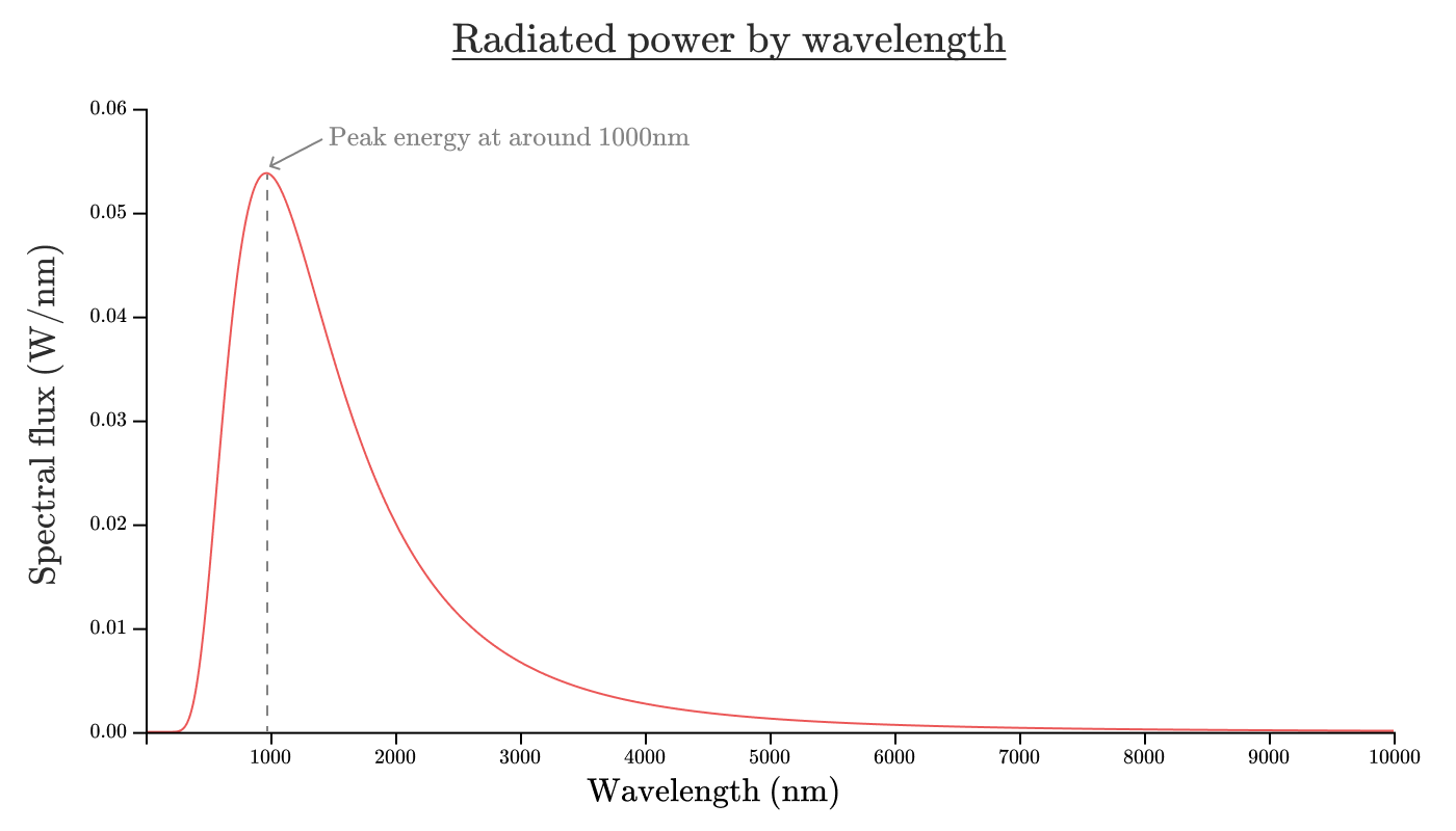
The area under this curve will give the radiant flux. As an equation, Φe=∫0∞Φe,λ(λ)dλ\Phi_e = \int_0^\infty \Phi_{e,\lambda}(\lambda) d\lambdaΦe=∫0∞Φe,λ(λ)dλ. In this case, the area under the curve will be about 80W.
Now you might’ve heard from eco-friendly campaigns that incandescent lightbulbs are brutally inefficient, and might be thinking to yourself, “well, 80% doesn’t seem so bad”.
And it’s true — an incandescent lightbulb is a pretty efficient way to convert electricity into radiation. Unfortunately, it’s a terrible way to convert electricity into human visible radiation.
Visible light
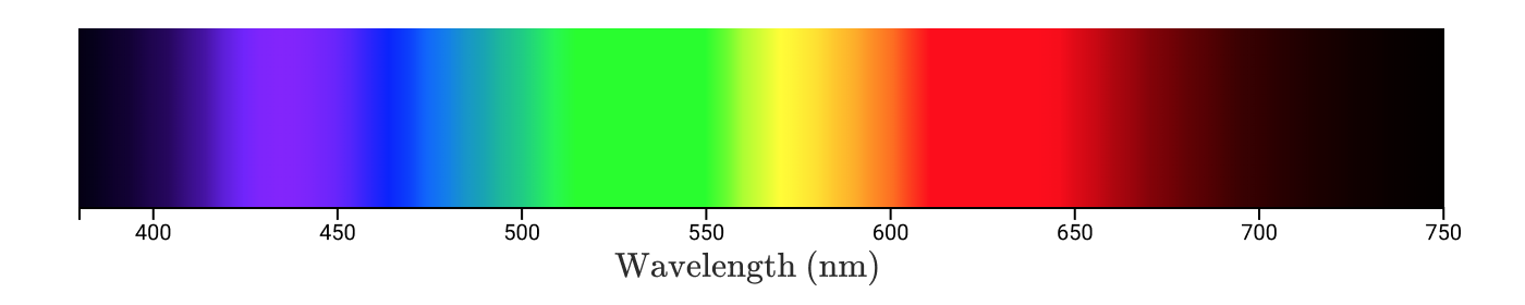
Visible light is the wavelength range of electromagnetic radiation from λ=380nm\lambda = 380\text{nm}λ=380nm to λ=750nm\lambda = 750\text{nm}λ=750nm. On our graph of an incandescent bulb, that’s the shaded region below.
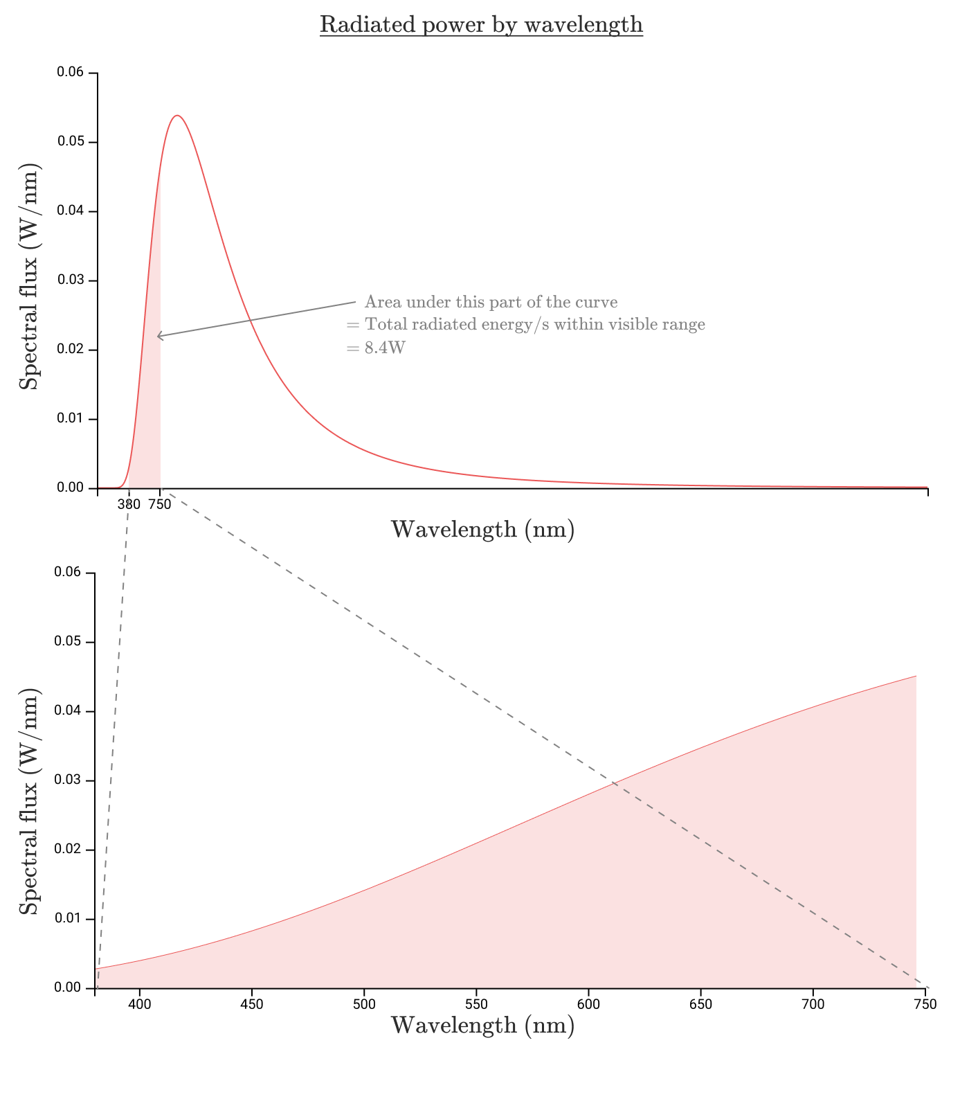
Okay, so the energy radiated within the visible spectrum is 8.7W8.7W8.7W for an efficiency of 8.7%8.7\%8.7%. That seems pretty awful. But it gets worse.
To understand why, let’s consider why visible light is, well, visible.
Human perceived brightness

Just as we saw that an incandescent light bulb doesn’t radiate equally at all wavelengths, our eyes aren’t equally sensitive to radiation at all wavelengths. If we measure a human eye’s sensitivity to every wavelength, we get a luminosity function. The standard luminosity function, yˉ(λ)\bar y(\lambda)yˉ(λ) looks like this:
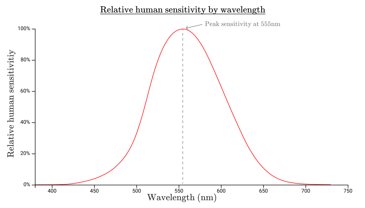
The bounds of this luminosity function define the range of visible light. Anything outside this range isn’t visible because, well, our eyes aren’t sensitive to it!
This curve also shows that our eyes are much more sensitive to radiation at 550nm than they are to radiation at either 650nm or 450nm.
Other animals have eyes that are sensitive to a different range of wavelengths, and therefore different luminosity functions. Birds can see ultraviolet radiation in the range between λ=300nm\lambda=300\text{nm}λ=300nm to λ=400nm\lambda=400\text{nm}λ=400nm, so if scholarly birds had defined the electromagnetic spectrum, that would’ve been part of the “visible light” range for them!

By multiplying the graph of spectral flux with the luminosity function yˉ(λ)\bar y(\lambda)yˉ(λ), we get a function which describes the contributions to human perceived brightness for each wavelength emitted by a light source.
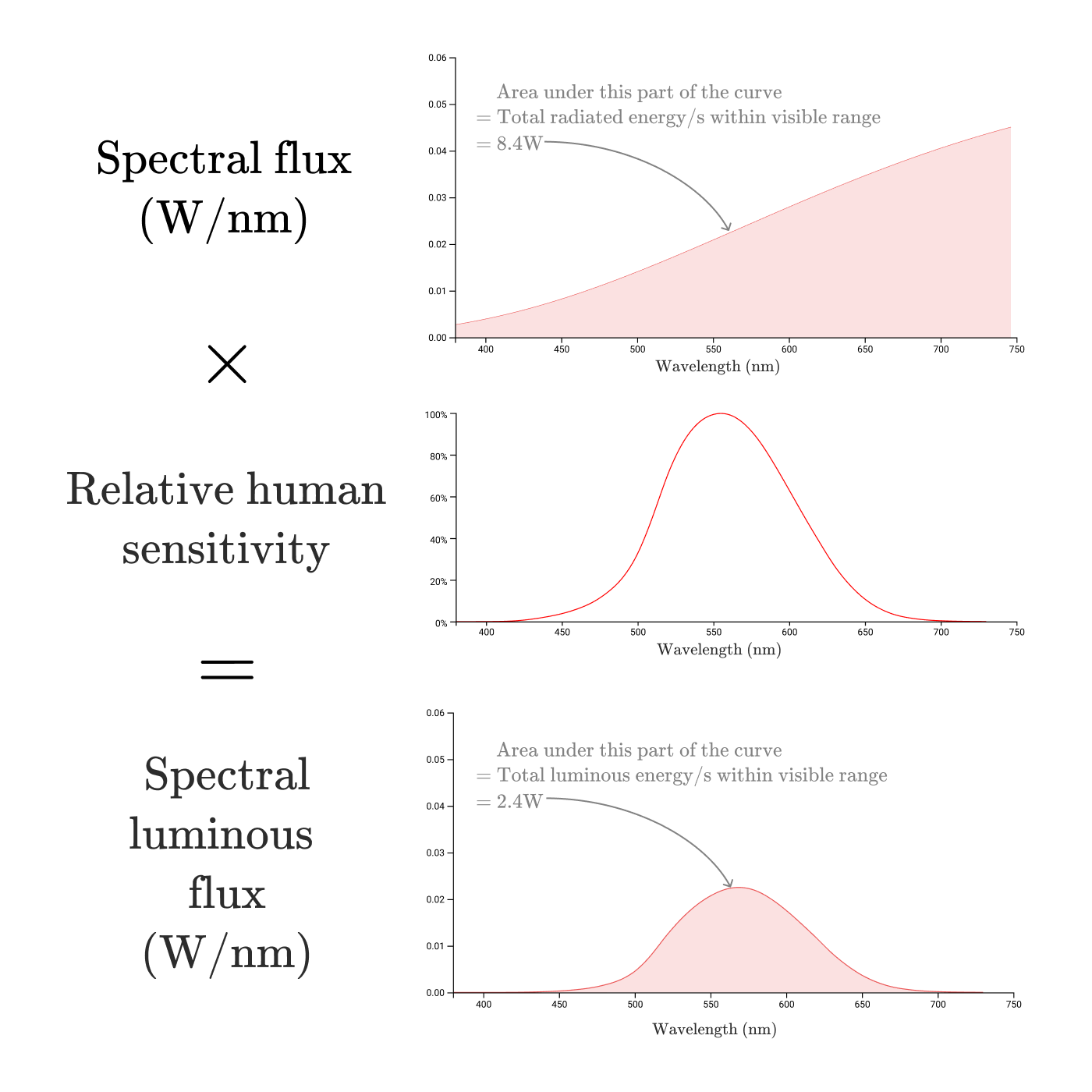
This is the spectral luminous flux (Φv,λ\Phi_{v,\lambda}Φv,λ). To acknowledge this is about human perception rather than objective power, the luminous flux is typically measured in lumens rather than Watts using a conversion ratio of 683.002 lm/W.
The luminous flux (Φv\Phi_vΦv) of a light source is the total human perceived power of the light.
Just as we calculated the radiant flux by taking the area under the spectral flux curve, we can find the luminous flux by taking the area under the spectral luminous flux curve, with a constant conversion from perceived watts to lumens:
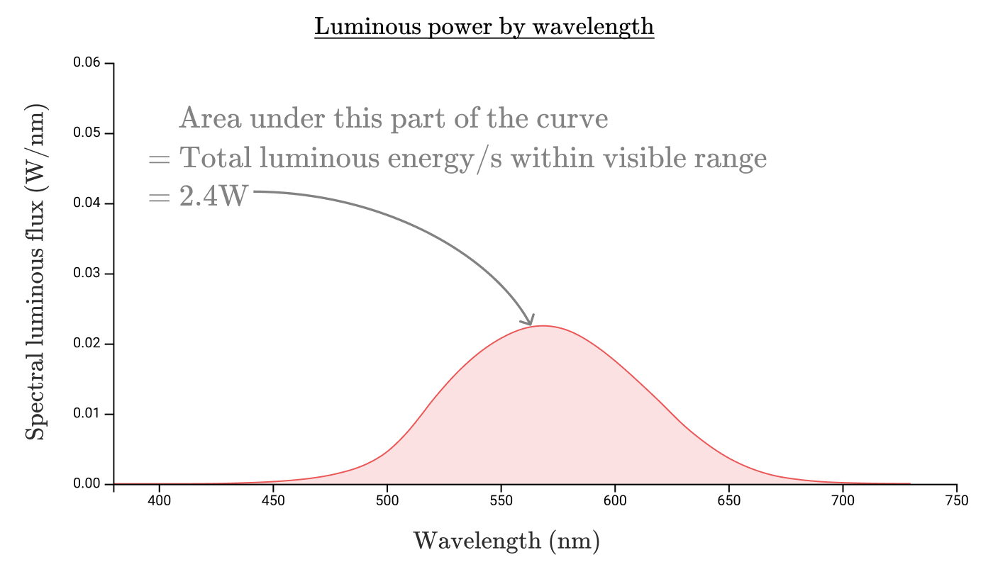
So the luminous flux of our 100W incandescent lightbulb is a measly 2.4W or 1600lm! The bulb has a luminous efficiency of 2.4%, a far cry from the 80% efficiency converting electricity into radiation.
Perhaps if we had a light source that concentrated its emission into the visible range, we’d be able to get more efficient lighting. Let’s compare the spectra of incandescent, fluorescent, and LED bulbs:
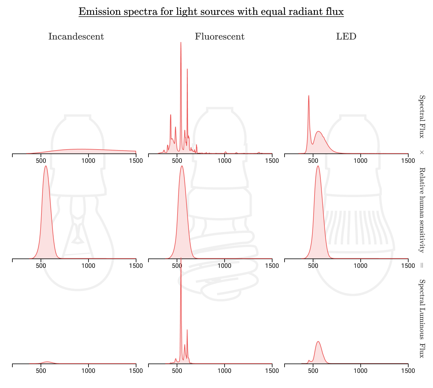
And indeed, we can see that far less of the radiation in fluorescent or led bulbs is wasted on wavelengths that humans can’t see. Where incandescent bulbs might have an efficiency of 1-3%, fluorescent bulbs can be around 10% efficient, and LED bulbs can achieve up to 20% efficiency!
Enough about brightness, let’s return to the focus of this post: color!
Quantifying color

How might we identify a given color? If I have a lemon in front of me, how can I tell you over the phone what color it is? I might tell you “the lemon is yellow”, but which yellow? How would you precisely identify each of these yellows?

Armed with the knowledge that color is humans’ interpretation of electromagnetic radiation, we might be tempted to define color mathematically via spectral flux. Any human visible color will be some weighted combination of the monochromatic (single wavelength) colors. Monochromatic colors are also known as spectral colors.
For any given object, we can measure its emission (or reflectance) spectrum, and use that to precisely identify a color. If we can reproduce the spectrum, we can certainly reproduce the color!
The sunlight reflected from a point on a lemon might have a reflectance spectrum that looks like this:
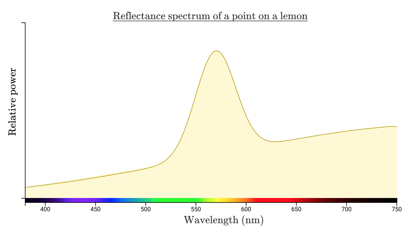
Note: the power and spectral distribution of radiation that reaches your eye is going to depend upon the power & emission spectrum of the light source, the distance of the light source from the illuminated object, the size and shape of the object, the absorption spectrum of the object, and your distance from the object. That’s a lot to think about, so let’s focus just on what happens when that light hits your eye. Let’s also disregard units for now to focus on concepts.
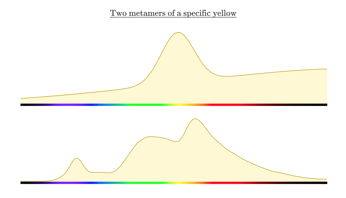
When energy with this spectral distribution hits our eyes, we perceive it as “yellow”. Now let’s say I take a photo of the lemon and upload it to my computer. Next, I carefully adjust the colors on my screen until a particular point of the on-screen lemon is imperceptibly different from the color of the actual lemon in my actual hand.
If you were to measure the spectral power distribution coming off of the screen, what would you expect the distribution to look like? You might reasonably expect it to look similar to the reflectance spectrum of the lemon above. But it would actually look something like this:
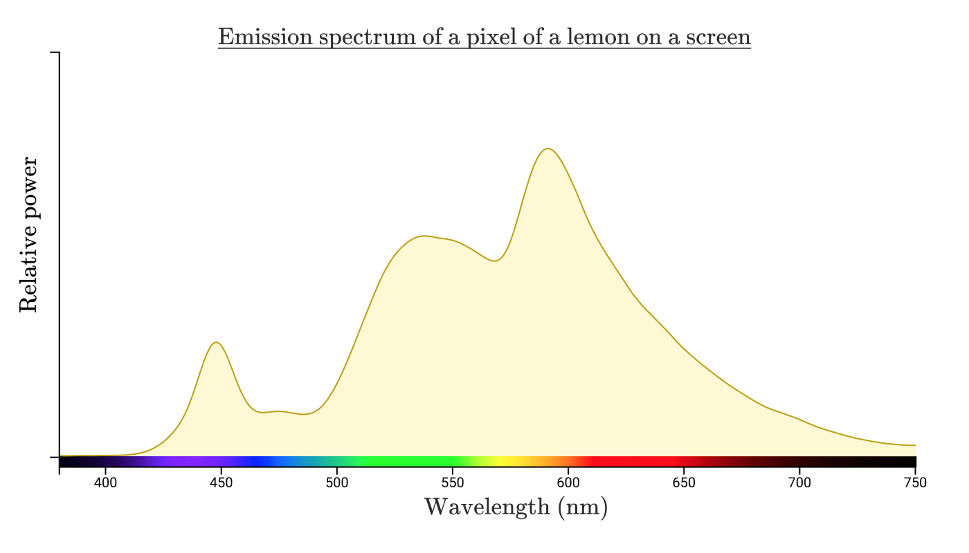
Two different spectral power distributions that look the same to human observers are called metamers.
To understand how this is possible, let’s take a look at the biology of the eye.
Optical biology

Our perception of light is the responsibility of specialized cells in our eyes called “rods” and “cones”. Rods are predominately important in low-light settings, and don’t play much role in color vision, so we’ll focus on the cones.
Humans typically have 3 kinds of cones. Having three different kinds of cones makes humans “trichromats”. There is, however, at least one confirmed case of a tetrochromat human! Other animals have even more cone categories. Mantis shrimp have sixteen different kinds of cones.
Each kind of cone is labelled by the range of wavelengths of light they are excited by. The standard labelling is “S”, “M”, and “L” (short, medium, long).
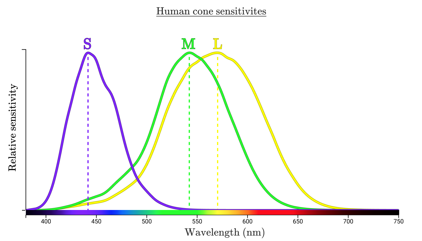
These three curves indicate how sensitive the corresponding cone is to each wavelength. The highest point on each curve is called the “peak wavelength”, indicating the wavelength of radiation that the cone is most sensitive to.
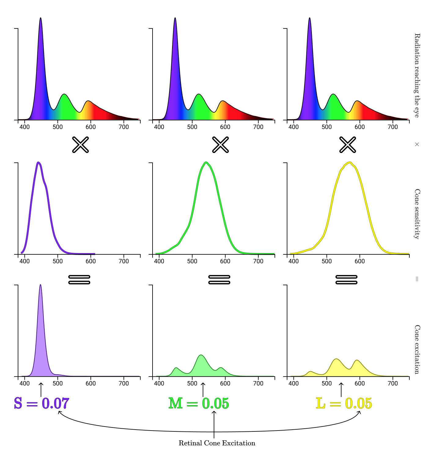
Let’s see how our cones process the light bouncing off the lemon in my hand.
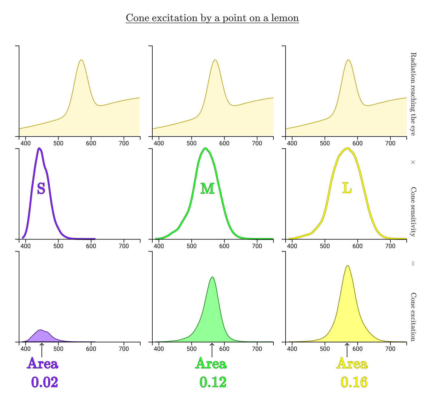
By looking at the normalized areas under the curves, we can see how much the radiation reflected from the real lemon excites each of cones. In this case, the normalized excitations of the S, M, and L cones are 0.02, 0.12, and 0.16 respectively. Now let’s repeat the process for the on-screen lemon.
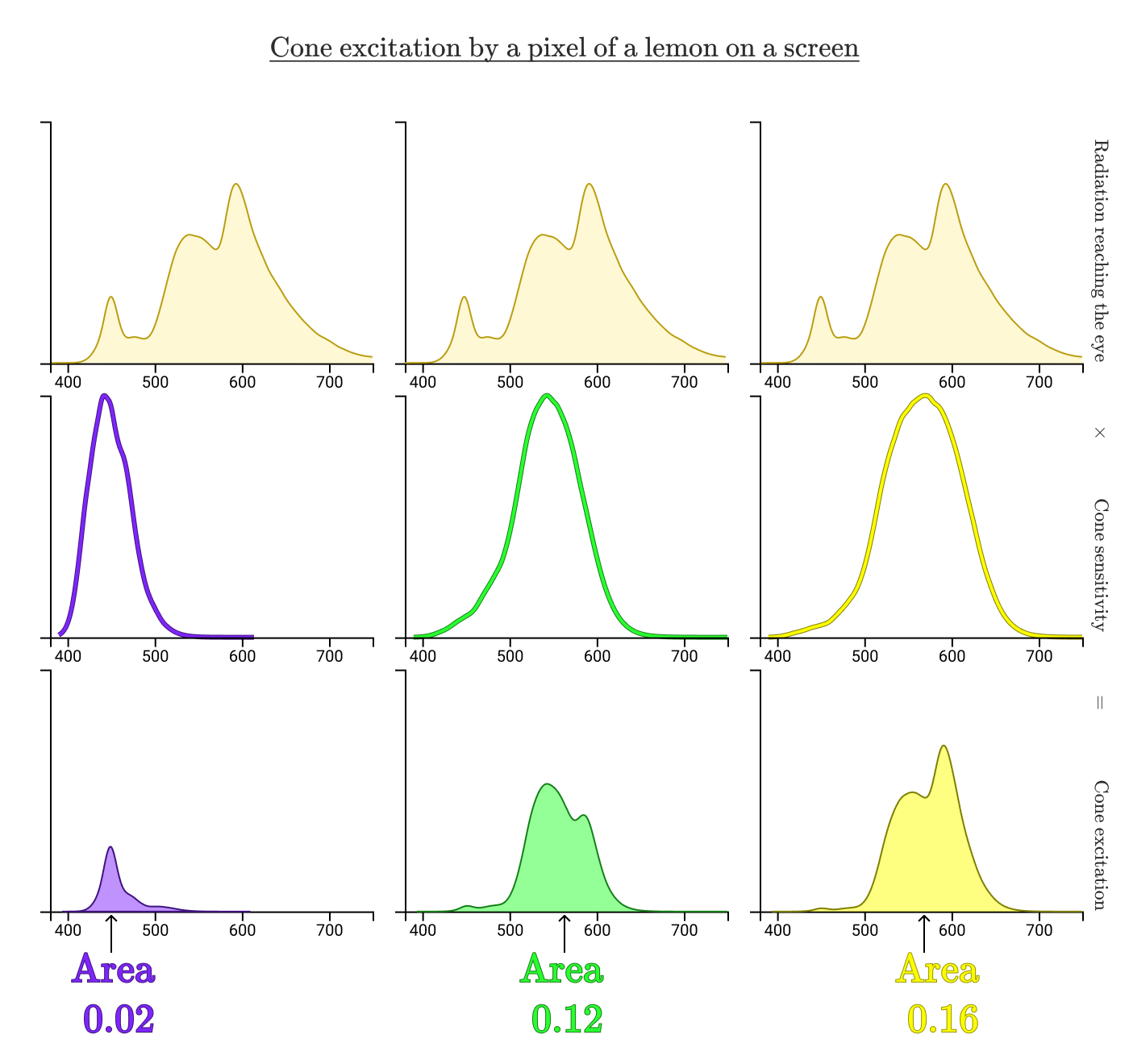
Despite having totally different radiation spectra reaching the eye, the cone excitations are the same (S=0.02, M=0.12, L=0.16). That’s why the point on the real lemon and the point on the digital lemon look the same to us!
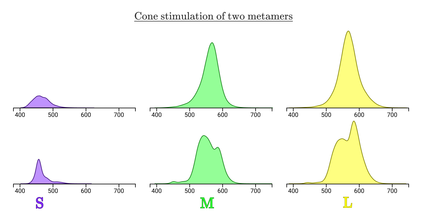
The normalized cone area under the stimulation curves will always be equal for all 3 cone types in the case of metamers.
Our 3 sets of cones reduce any spectral flux curve Φe(λ)\Phi_e(\lambda)Φe(λ) down to a triplet of three numbers (S,M,L)(S, M, L)(S,M,L), and every distinct (S,M,L)(S, M, L)(S,M,L) triplet will be a distinct color! This is pretty convenient, because (0.02, 0.12, 0.16) is much easier to communicate than a complicated continuous function. For the mathematically inclined, our eyes are doing a dimensional reduction from an infinite dimensional space into 3 dimensions, which is a pretty damn cool thing to be able to do subconsciously.
This (S,M,L)(S, M, L)(S,M,L) triplet is, in fact, our first example of a color space.
Color spaces
Color spaces allow us to define with numeric precision what color we’re talking about. In the previous section, we saw that a specific yellow could be represented as (0.02, 0.12, 0.16) in the SML color space, which is more commonly known as the LMS color space.
Since this color space is describing the stimulation of cones, by definition any human visible color can be represented by positive LMS coordinates (excluding the extremely rare tetrachromat humans, who would need four coordinates instead of three).
But, alas, this color space has some unhelpful properties.
For one, not all triplet values (also called tristimulus values) are physically possible. Consider the LMS coordinates (0, 1, 0). To physically achieve this coordinate, we would need to find some way of stimulating the M cones without stimulating the L or S cones at all. Because the M cone’s sensitivity curve significantly overlaps at least one of L or S at all wavelengths, this is impossible!
Any wavelength which stimulates the M cone will also stimulate either the L or S cone (or both!)
A problematic side effect of this fact is that it’s really difficult to increase stimulation of only one of the cones. This, in particular, would make it not a great candidate for building display hardware.
Another historical, pragmatic problem was that the cone sensitivities weren’t accurately known until the 1990’s, and a need to develop a mathematically precise model of color significantly predates that. The first significant progress on that front came about in the late 1920’s.
Wright & Guild’s color matching experiments
In the late 1920’s, William David Wright and John Guild conducted experiments to precisely define color in terms of contributions from 3 specific wavelengths of light.
Even though they may not have known about the three classes of cones in the eye, the idea that all visible colors could be created as the combination of three colors had been proposed at least a hundred years earlier.
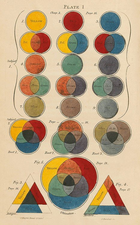
An example of a tricolor theory by Charles Hayter, 1826
Wright & Guild had the idea to construct an apparatus that would allow test subjects to reconstruct a test color as the combination of three fixed wavelength light sources. The setup would’ve looked something like this:
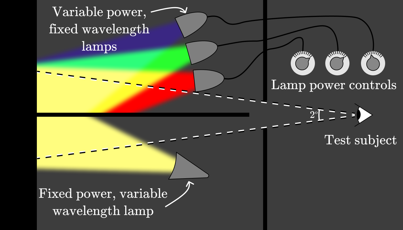
The experimenter would set the lamp on the bottom to a target wavelength, (for instance, 600nm) then ask the test subject to adjust the three lamp power controls until the colors they were seeing matched.
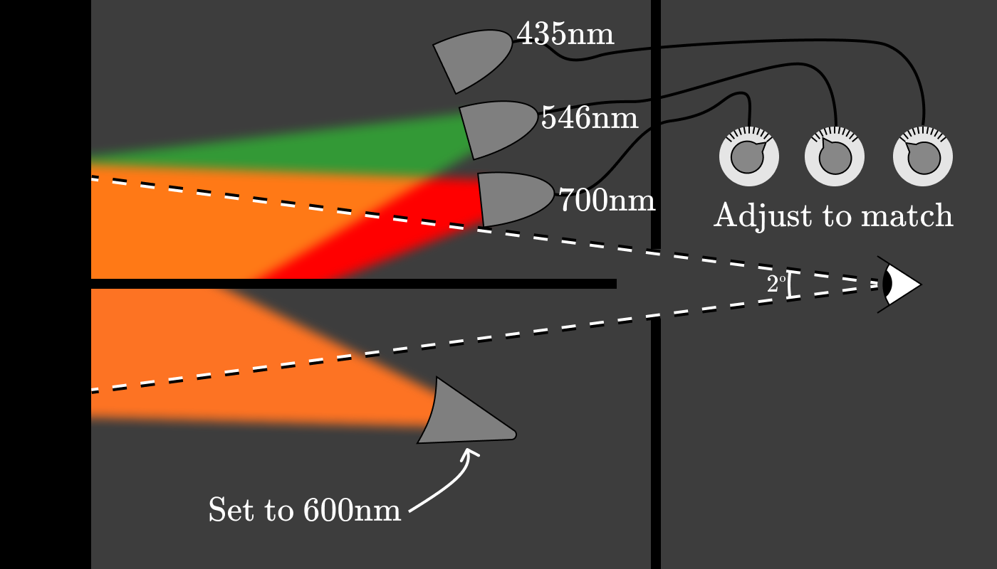
The power settings of the three dials give us a (red, green, blue) triplet identifying the pure spectral color associated with 600nm. Repeating this process every 5nm with about 10 test subjects, a graph emerges showing the amounts of red (700nm), green (546nm), and blue (435nm) light needed to reconstruct the appearance of a given wavelength. These functions are known as color matching function (CMFs).
These particular color matching functions are known as rˉ(λ)\bar r(\lambda)rˉ(λ), gˉ(λ)\bar g(\lambda)gˉ(λ), and bˉ(λ)\bar b (\lambda)bˉ(λ).
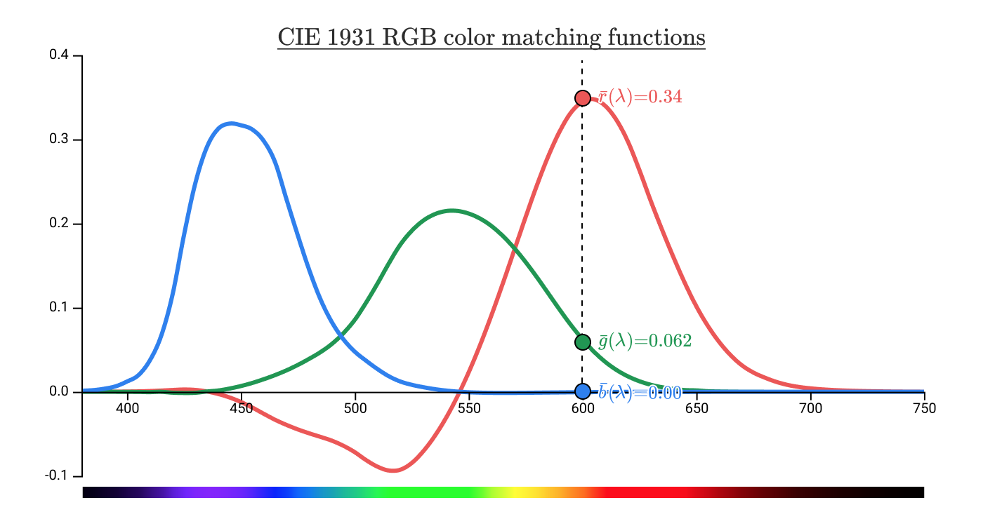
This gives the pure spectral color associated with 600nm an (R,G,B)(R, G, B)(R,G,B) coordinate of (0.34, 0.062, 0.00). This is a value in the CIE 1931 RGB color space.
Hold on though — what does it mean when the functions go negative, like here?
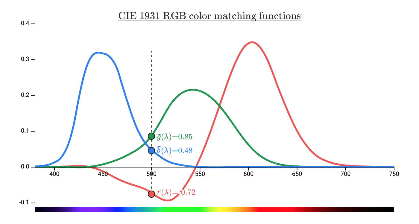
The pure spectral color associated with 500nm has an (R,G,B)(R, G, B)(R,G,B) coordinate of (-0.72, 0.85, 0.48). So what exactly does that -0.72 mean?
It turns out that no matter what you set the red (700nm) dial to, it will be impossible to match a light outputting at 500nm, regardless of the values of blue and green dials. You can, however, make the two sides match by adding red light to the bottom side.
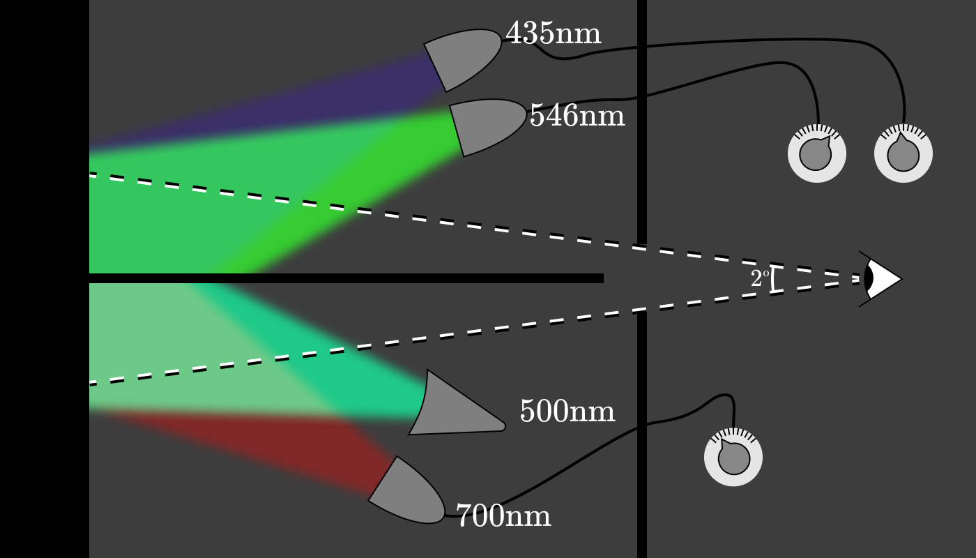
The actual setup probably would’ve had a full set of 3 variable power, fixed wavelength lights on either side of the divider to allow any of them to be adjusted to go negative.
Using our color matching functions, we can match any monochromatic light using a combination of (possibly negative) amounts of red (700nm), green (546nm), and blue (435nm) light.
Just as we were able to use our L, M, and S cone sensitivity functions to determine cone excitation for any spectral distribution, we can do the same thing with our color matching functions. Let’s apply that to the lemon color from before:
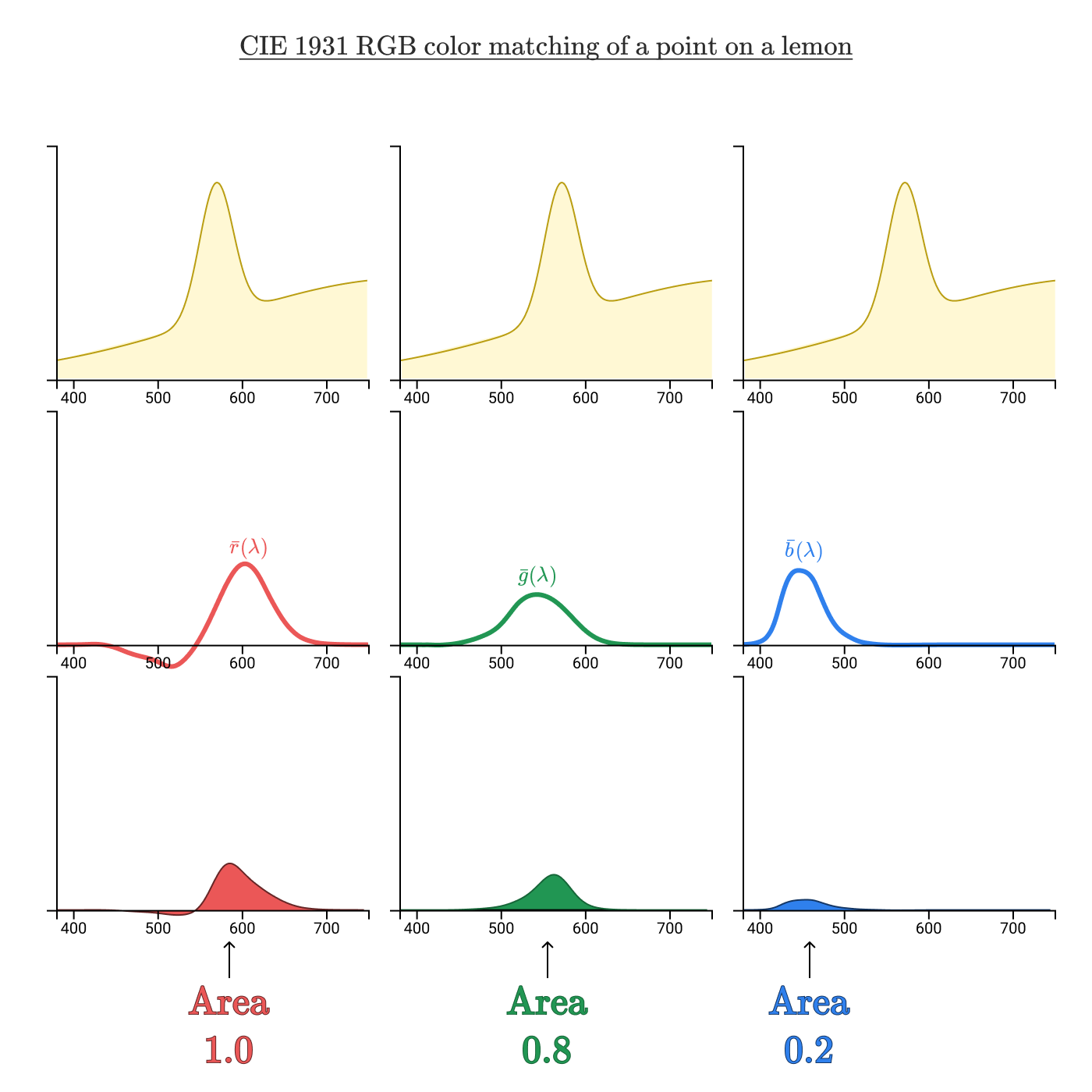
By taking the area under the curve of the product of the spectral curve and the color matching functions, we’re left with an (R,G,B)(R, G, B)(R,G,B) triplet (1.0, 0.8, 0.2) uniquely identifying this color.
While the (L,M,S)(L, M, S)(L,M,S) color space gave us a precise way to identify colors, this (R,G,B)(R, G, B)(R,G,B) color space gives us a precise way to reproduce colors. But, as we saw in the color matching functions, any colors with a negative (R,G,B)(R, G, B)(R,G,B) coordinate can’t actually be reproduced.
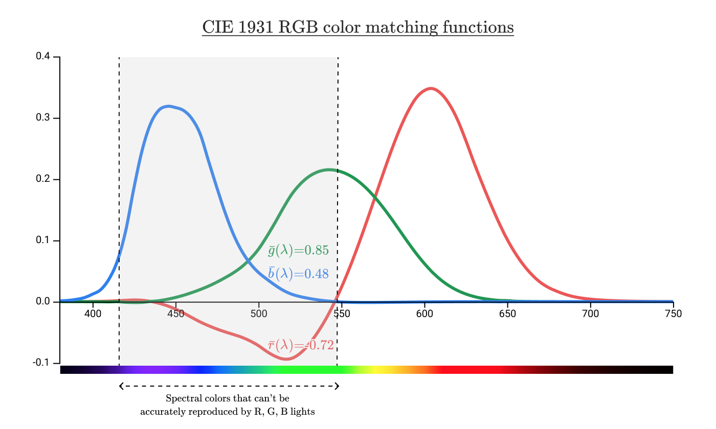
But this graph only shows which spectral colors can’t be reproduced. What about non-spectral colors? Can I produce pink with an R, G, B combination? What about teal?
To answer these questions, we’ll need a better way of visualizing color space.
Visualizing color spaces & chromaticity
So far most of our graphs have put wavelength on the horizontal axis, and we’ve plotted multiple series to represent the other values of interest.

Instead, we could plot color as a function of (R,G,B)(R, G, B)(R,G,B) or (L,M,S)(L, M, S)(L,M,S). Let’s see what color plotted in 3D (R,G,B)(R, G, B)(R,G,B) space looks like.
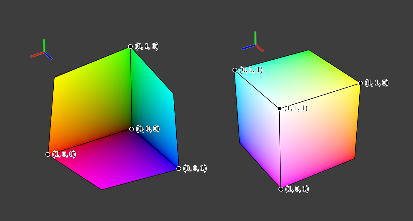
Cool! This gives us a visualization of a broader set of colors, not just the spectral colors of the rainbow.
A simple way to reduce this down to two dimensions would be to have a separate plot for each pair of values, like so:
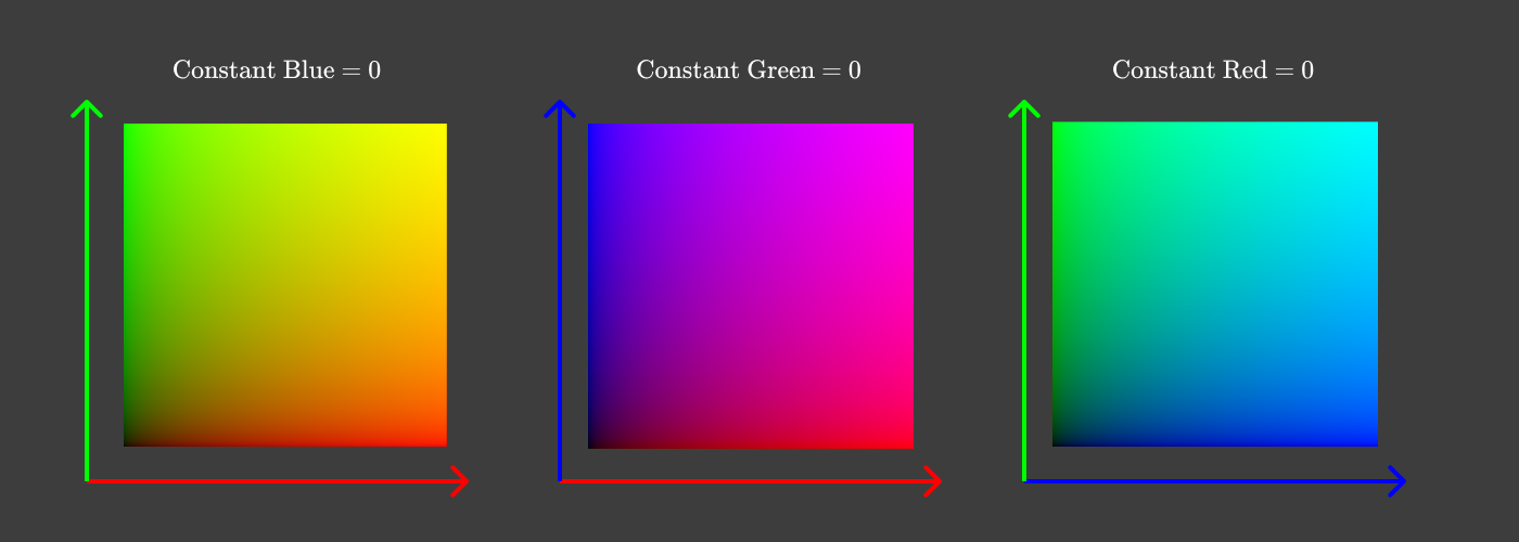
In each of these plots, we discard one dimension by holding one thing constant. Rather than holding one of red, green, and blue constant, it would be really nice to have a plot showing all the colors of the rainbow & their combinations, while holding lightness constant.
Looking at the cube pictures again, we can see that (0, 0, 0) is black, and (1, 1, 1) is white.
What happens if we slice the cube diagonally across the plane containing (1,0,0)(1, 0, 0)(1,0,0), (0,1,0)(0, 1, 0)(0,1,0), and (0,0,1)(0, 0, 1)(0,0,1)?
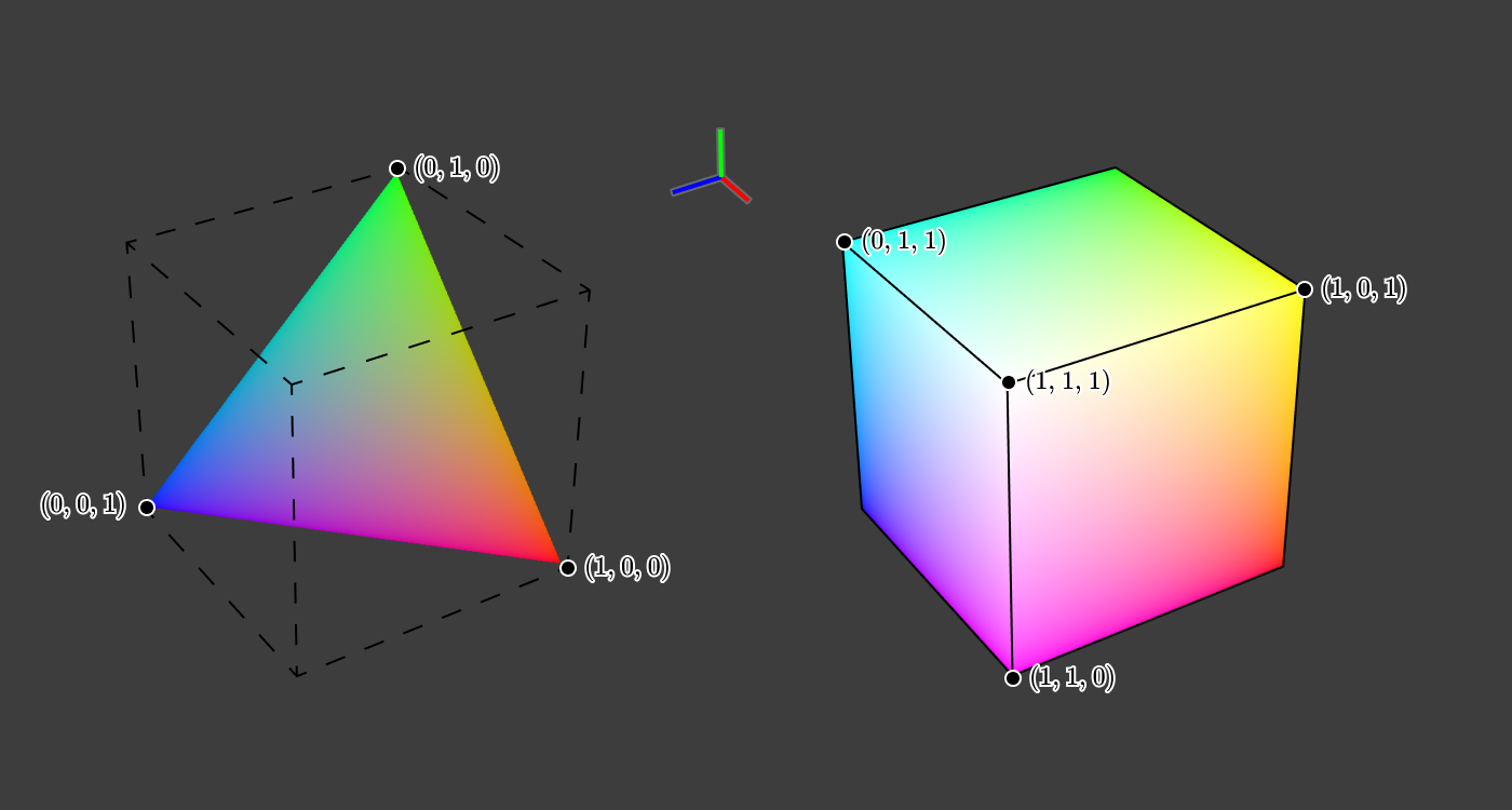
This triangle slice of the cube has the property that R+G+B=1R + G + B = 1R+G+B=1, and we can use R+G+BR + G + BR+G+B as a crude approximation of lightness. If we take a top-down view of this triangular slice, then we get this:
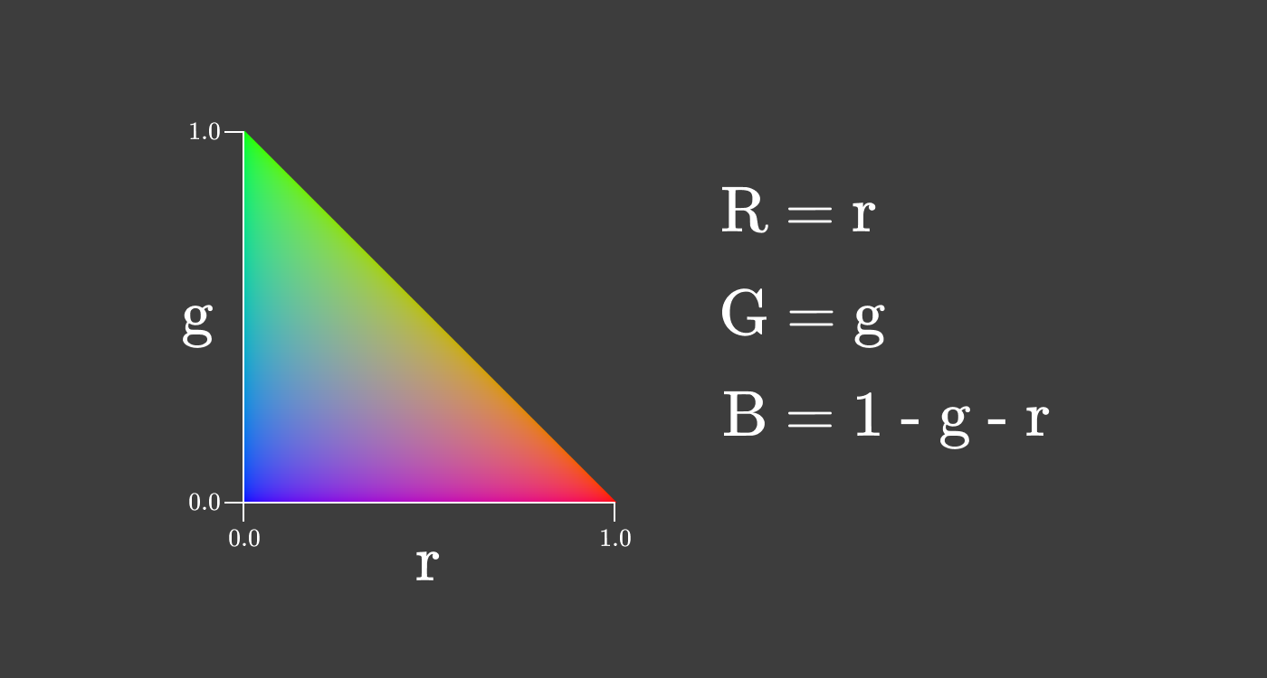
This two dimensional representation of color is called chromaticity. This particular kind is called rg chromaticity. Chromaticity gives us information about the ratio of the primary colors independent of the lightness.
This means we can have the same chromaticity at many different intensities.
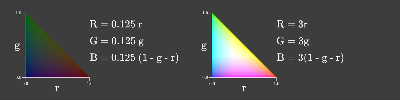
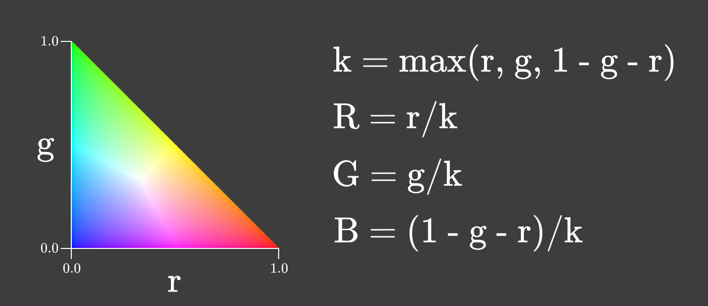
We can even make a chromaticity graph where the intensity varies with r & g in order to maximize intensity while preserving the ratio between RRR, GGG, and BBB.
Chromaticity is a useful property of a color to consider because it stays constant as the intensity of a light source changes, so long as the light source retains the same spectral distribution. As you change the brightness of your screen, chromaticity is the thing that stays constant!
There are many different ways of dividing chromaticity into two dimensions. One of the common methods is used in both the HSL and HSV color spaces. Both color spaces split chromaticity into “hue” and “saturation”, like so:
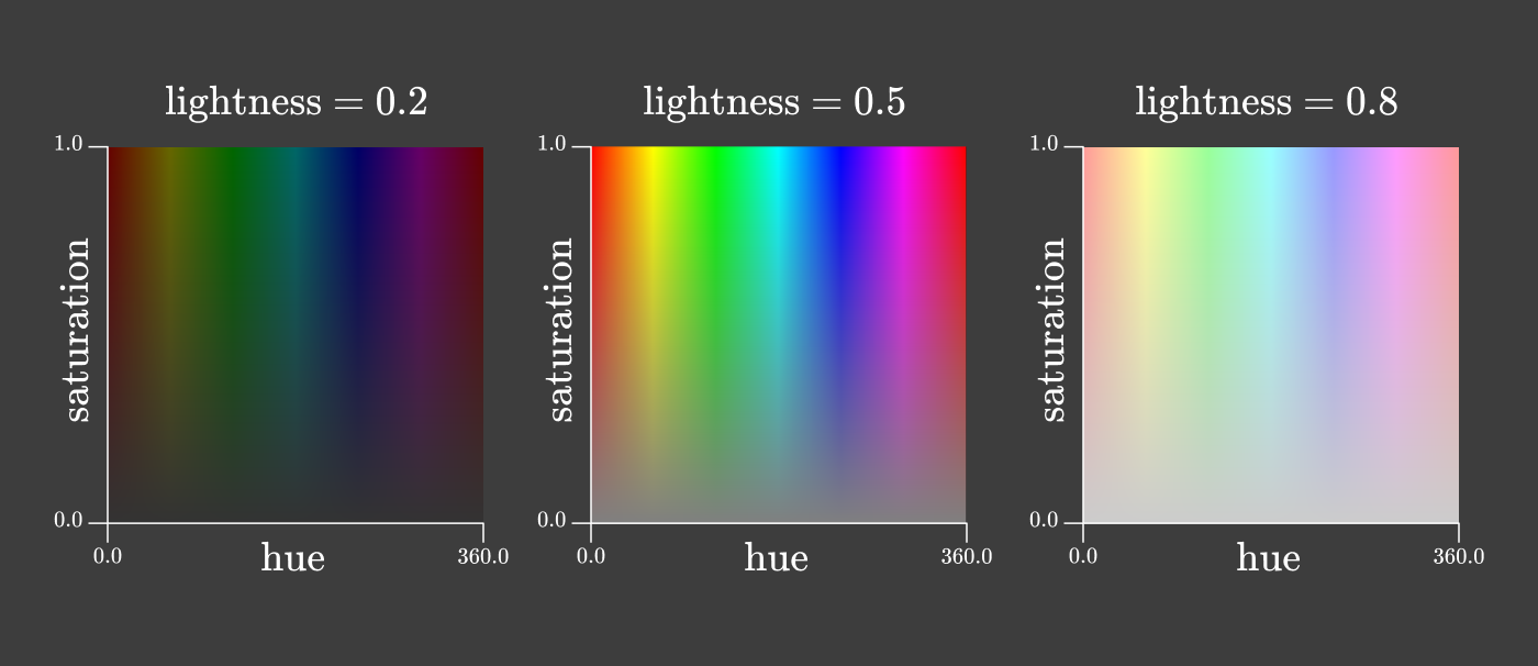
It might appear at a glance that the rg chromaticity triangle and these hue vs. saturation squares contains every color of the rainbow. It’s time to revisit those pesky negative values in our color matching functions.
Gamuts and the spectral locus
If we take our color matching functions rˉ(λ)\bar r(\lambda)rˉ(λ), gˉ(λ)\bar g(\lambda)gˉ(λ), and bˉ(λ)\bar b(\lambda)bˉ(λ) and use them to plot the rg chromaticities of the spectral colors, we end up with a plot like this:
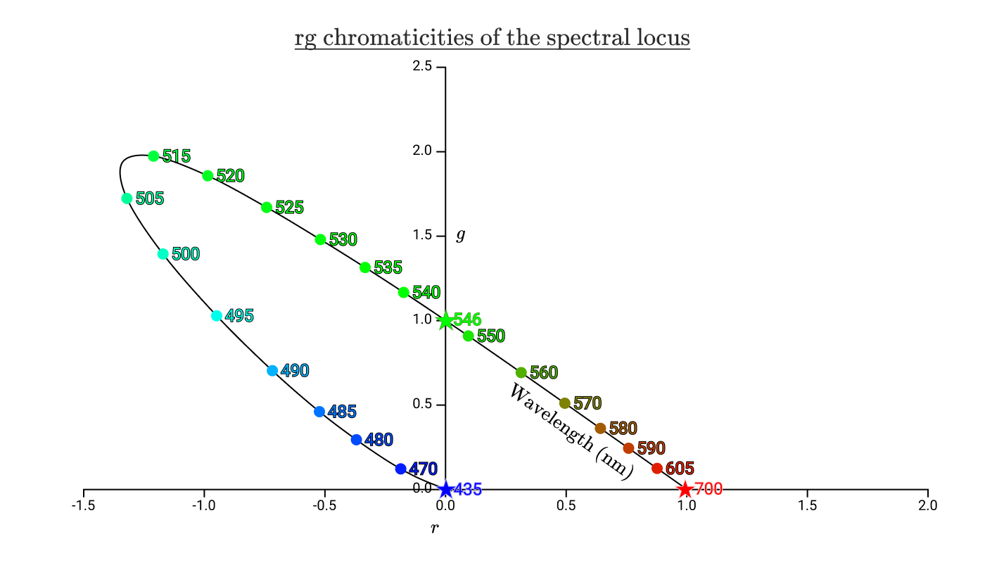
The black curve with the colorful dots on it shows the chromaticities of all the pure spectral colors. The curve is called the spectral locus. The stars mark the wavelengths of the variable power test lamps used in the color matching experiments.
If we overlay our previous chromaticity triangles onto this chart, we’re left with this:
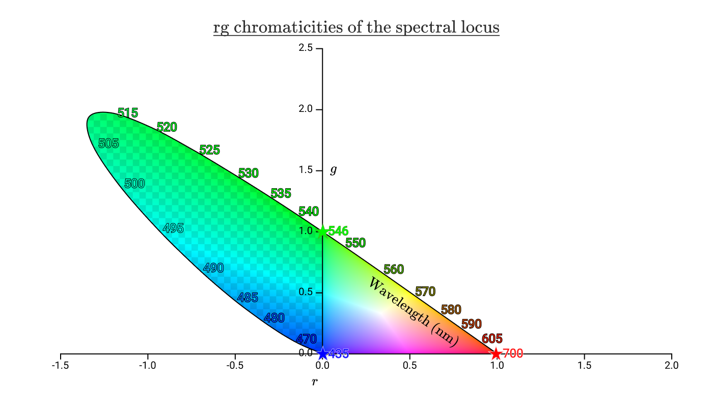
The area inside the spectral locus represents all of the chromaticities that are visible to humans. The checkerboard area represents chromaticities that humans can recognize, but that cannot be reproduced by any positive combination of 435nm, 546nm, and 700nm lights. From this diagram, we can see that we’re unable to reproduce any of the spectral colors between 435nm and 546 nm, which includes pure cyan.
The triangle on the right without the checkerboard is all of the chromaticities that can be reproduced by a positive combination. We call the area that can be reproduced the gamut of the color space.
Before we can finally return to hexcodes, we have one more color space we need to cover.
CIE XYZ color space
In 1931, the International Comission on Illumination convened and created two color spaces. The first was the RGB color space we’ve already discussed, which was created based on the results of Wright & Guild’s color matching experiments. The second was the XYZ color space.
One of the goals of the XYZ color space was to have positive values for all human visible colors, and therefore have all chromaticities fit in the range [0, 1] on both axes. To achieve this, a linear transformation of RGB space was carefully selected.
The analog of rg chromaticity for XYZ space is xy chromaticity and is the more standard coordinate system used for chromaticities diagrams.
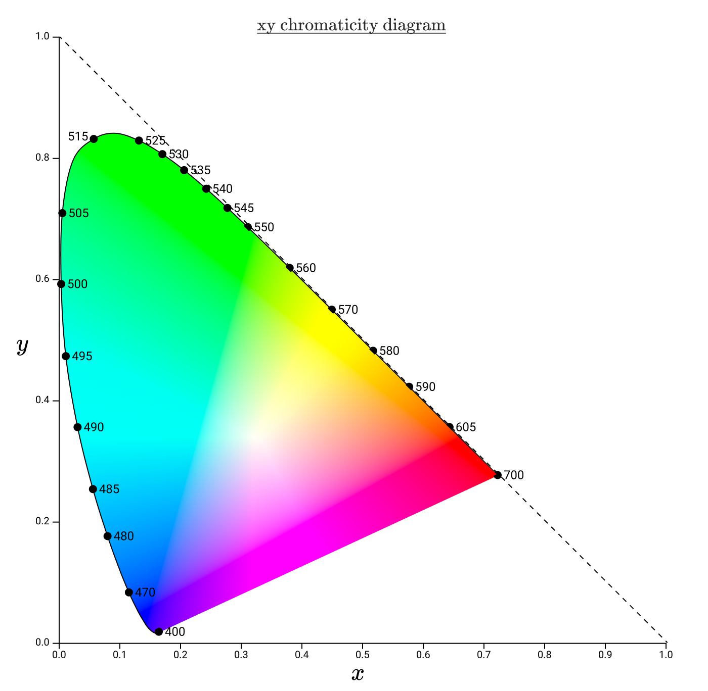
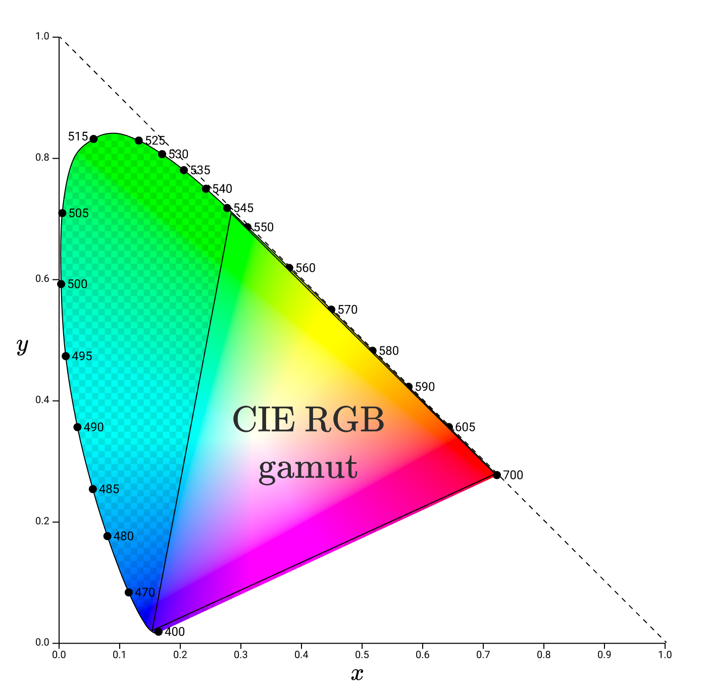
Gamuts are typically represented by a triangle placed into an xy chromaticity diagram. For instance, here’s the gamut of CIE RGB again, this time in xy space.
With an understanding of gamuts & chromaticity, we can finally start to discuss how digital displays are able to display an intended color.
Screen subpixels
Regardless of the manufacturer of your display, if you took a powerful magnifying glass to your display, you would find a grid of pixels, where each pixel is composed of 3 types of subpixels: one type emitting red, one green, and one blue. It might look something like this:
Unlike the test lamps used in the color matching experiments, the subpixels do not emit monochromatic light. Each type of subpixel has its own spectral distribution, and these will vary from device to device.
Using ColorSync Utility on my Macbook Pro, I was able to determine the xy space gamut of my screen.
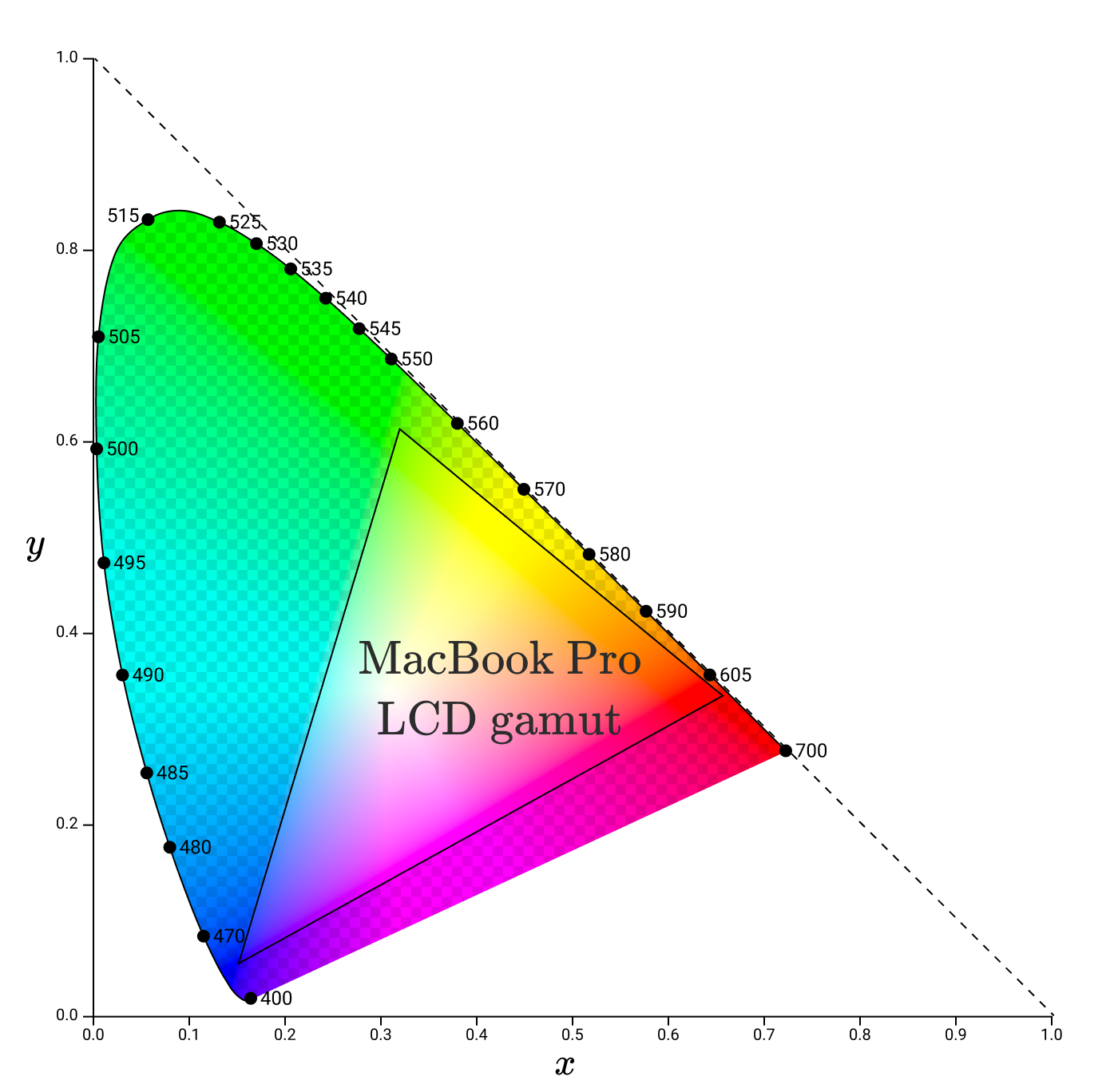
Notice that the corners of the gamut no longer lie along the spectral locus. This makes sense, since the subpixels do not emit pure monochromatic light. This gamut represents the full range of chromaticities that this monitor can faithfully reproduce.
While gamuts of monitors will vary, modern monitors should try to enclose a specific other gamut: sRGB.
sRGB (“standard Red Green Blue”) is a color space created by HP and Microsoft in 1996 to help ensure that color data was being transferred faithfully between mediums.
The standard specifies the chromaticities of the red, green, and blue primaries.
Chromaticity Red Green Bluex 0.6400 0.3000 0.1500y 0.3300 0.6000 0.0600Y 0.2126 0.751 0.0722
If we plot these, we wind up with a gamut similar to, but slightly smaller than, the MacBook LCD screen.

There are parts of the official sRGB gamut that aren’t within the MacBook Pro LCD gamut, meaning that the LCD can’t faithfully reproduce them. To accommodate for that, my MacBook seems to use a modified sRGB gamut.

sRGB is the default color space used almost everywhere, and is the standard color space used by browsers (specified in the CSS standard). All of the diagrams in this blog post are in sRGB color space. That means that all colors outside of the sRGB gamut aren’t accurately reproduced in the diagrams in this post!
Which brings us, finally, to how colors are specified on the web.
sRGB hexcodes
#9B51E0 specifies a color in sRGB space. To convert it to its associated (R, G, B) coordinate, we divide each of the three components by 0xFF aka 255. In this case:
0x9B/0xFF = 0.61
0x51/0xFF = 0.32
0xE0/0xFF = 0.88
So the coordinate associated with #9BE1E0 is (0.61,0.32,0.88)(0.61, 0.32, 0.88)(0.61,0.32,0.88).
Before we send these values to the display hardware to set subpixel intensities, there’s one more step: gamma correction.
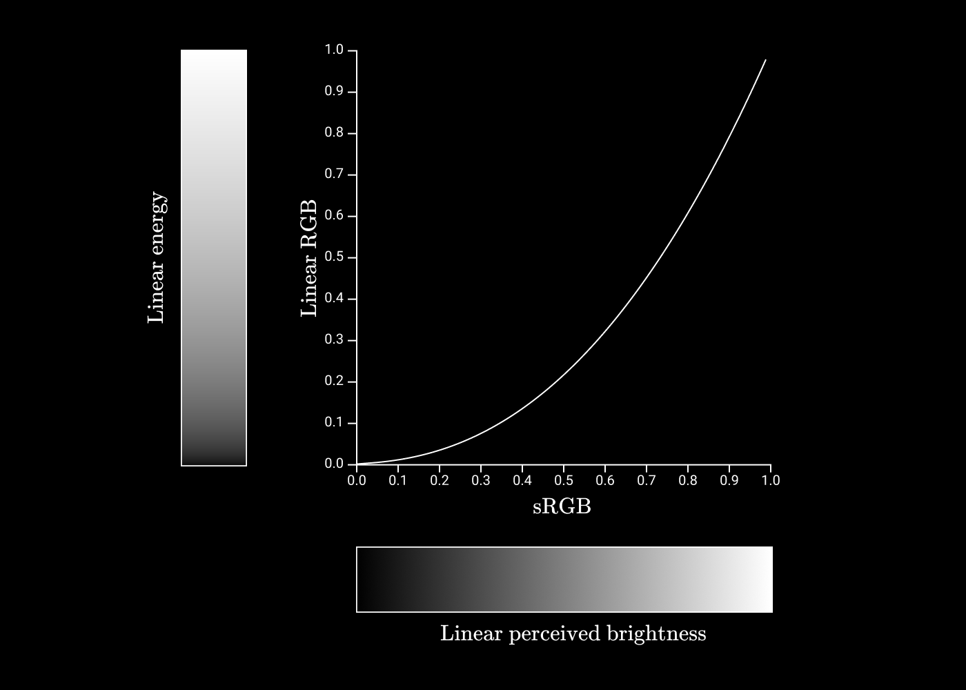
Gamma correction
With each coordinate in RGB space being given 256 possible values, we want to ensure that each adjacent pair is as different as possible. For example, we want #030000 to be as different from #040000 as #F40000 is from #F50000.
Human vision is much more sensitive to small changes in low energy lights than small changes to high energy lights, so we want to allocate more of the 256 values to representing low energy values.
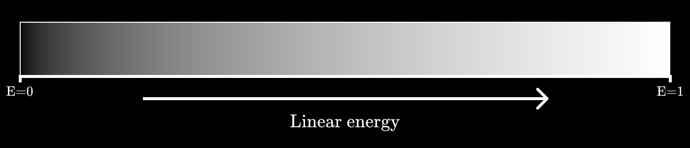
To see how, let’s imagine we wanted to encode greyscale values, and only had 3 bits to do it, giving us 8 possible values.
If we plot grey values as a linear function of energy, it would look something like this:
We’ll call our 3 bit encoded value YYY. If our encoding scheme spaces out each value we encode evenly (Y=⌊8E⌋8Y = \frac{\left\lfloor8E\right\rfloor}{8}Y=8⌊8E⌋), then it would look like this:
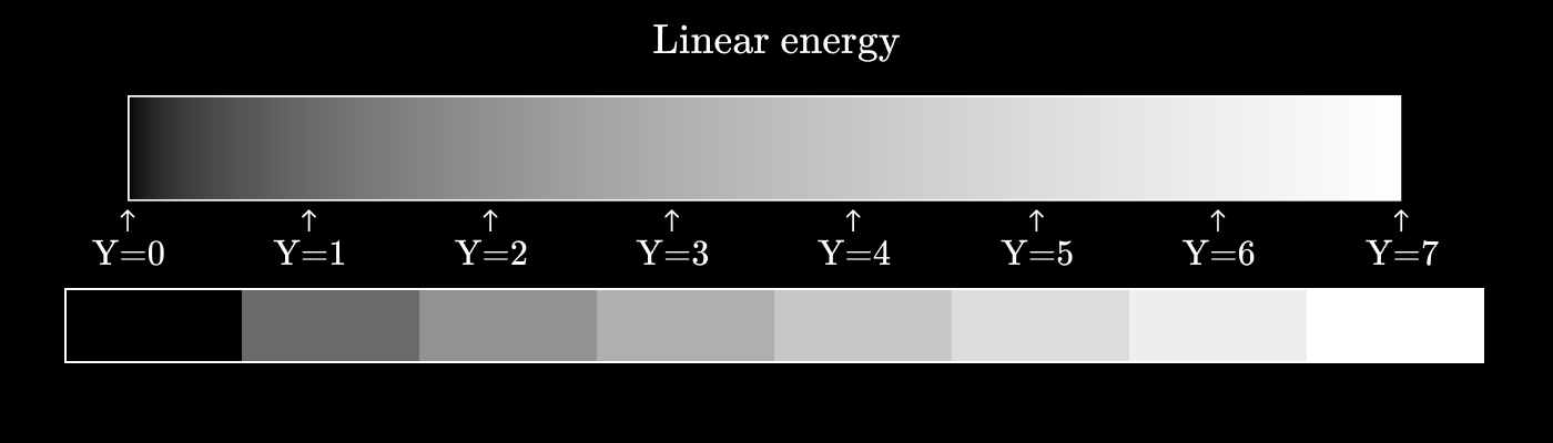
You can see that the perceptual difference between Y=0Y=0Y=0 and Y=1Y=1Y=1 is significantly greater than the difference between Y=6Y=6Y=6 and Y=7Y=7Y=7.
Now let’s see what happens if we use a power function instead. Let’s try Y=(⌊8E⌋8)2Y = \left(\frac{\left\lfloor8E\right\rfloor}{8}\right)^2Y=(8⌊8E⌋)2.
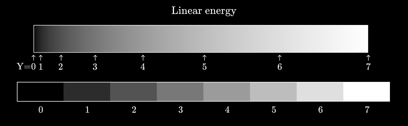
We’re getting much closer to perceptual uniformity here, where each adjacent pair of values is as different as any other adjacent pair.
This process of taking energy values and mapping them to discrete values is called gamma encoding. The inverse operations (converting discrete values to energy values) is called gamma decoding.
In general form, gamma correction has the equation Vout=AVinγV_{out} = A V_{in}^\gammaVout=AVinγ. The exponent is the greek letter “gamma”, hence the name.
The encoding & decoding rules for sRGB use a similar idea, but slightly more complex.
If we plot sRGB values against linear values, it would look like this:
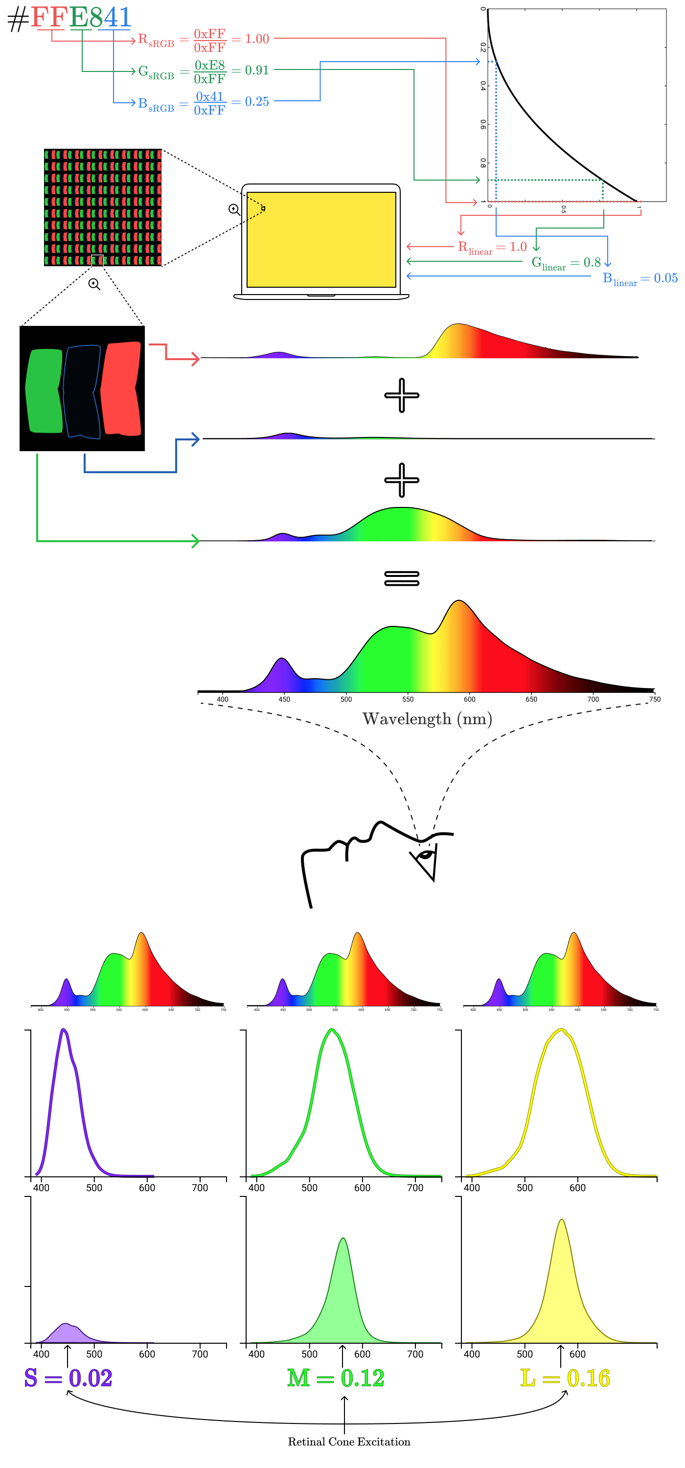
Okay! That was the last piece we needed to understand to see how we get from hex codes to eyeballs! Let’s do the walkthrough 😀
From Hexcodes to Eyeballs
First, we take #9B51E0, split it up into its R, G, B components, and normalize those components to be the range [0,1][0, 1][0,1].

This gives us a coordinate of (0.61,0.32,0.88)(0.61, 0.32, 0.88)(0.61,0.32,0.88) in sRGB space. Next, we take our sRGB components and convert them to linear values.
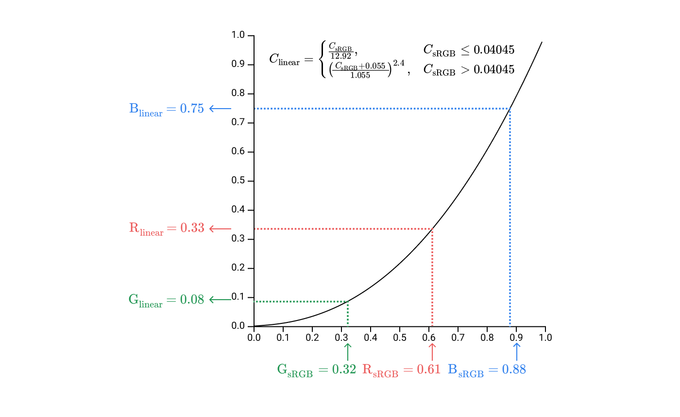
This gives us a coordinate (0.33,0.08,0.10)(0.33, 0.08, 0.10)(0.33,0.08,0.10) in linear RGB space. These values are used to set the intensity of the subpixels on the screen.
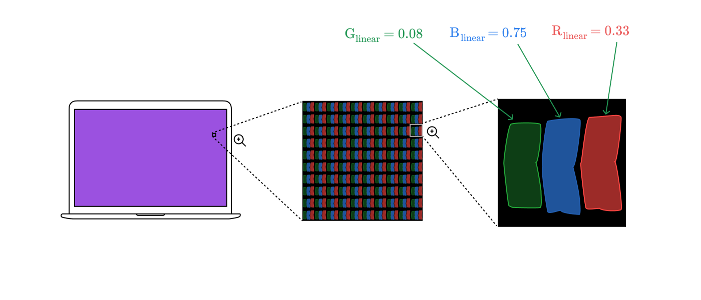
The spectral distributions of the subpixels combine to a single spectral distribution for the whole pixel.
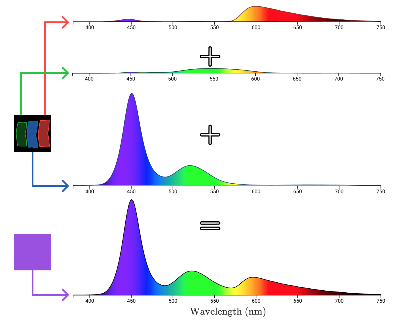
The electromagnetic radiation travels from the pixel through your cornea and hits your retina, exciting your 3 kinds of cones.
Putting it all together for a different color, we’re left with the image that opens this post!
A brief note about brightness setting

Before sRGB values are converted into subpixel brightness, they’ll be attenuated by the device’s brightness setting. So the 0xFF0000 on a display at 50% brightness might match the 0x7F0000 on the same display at 100% brightness.
In an ideal screen, this would mean that regardless of the brightness setting, black pixels (0,0,0)(0, 0, 0)(0,0,0) would emit no light. Most phone & laptop screens are LCD screens, however, where each subpixel is a filter acting upon white light. This video is a great teardown of how LCDs work:
The filter is imperfect, so as brightness is increased, black pixels will emit light as the backlight bleeds through. OLED screens (like on the iPhone X and Pixel 2) don’t use a backlight, allowing them to have a consistent black independent of screen brightness.
Stuff I left out
This post intentionally glosses over many facets of color reproduction and recognition. For instance, we didn’t talk about what your brain does with the cone excitation information in the opponent-process theory or the effects of color constancy. We didn’t talk about additive color vs. subtractive color. We didn’t talk about color blindness. We didn’t talk about the difference between luminous flux, luminous intensity, luminance, illuminance, and luminous emittance. We didn’t talk about ICC device color profiles or what programs like f.lux do to color perception.
I left them out because this post is already way too long! As a friend of mine said: even if you’re a person who understands that most things are deeper than they look, color is way deeper than you would reasonably expect.
References
I spent an unusually large portion of the time writing this post just reading because I kept discovering that I was missing something I needed to explain as completely as I’d like.
Here’s a short list of the more helpful ones:
I also needed to draw upon many data tables to produce the charts in this post:
Special thanks to Chris Cooper and Ryan Kaplan for providing feedback on the draft of this post.
Recommend
About Joyk
Aggregate valuable and interesting links.
Joyk means Joy of geeK