

The Mad Magazine Fold-In Effect in CSS
source link: https://thomaspark.co/2020/06/the-mad-magazine-fold-in-effect-in-css/
Go to the source link to view the article. You can view the picture content, updated content and better typesetting reading experience. If the link is broken, please click the button below to view the snapshot at that time.

The Mad Magazine Fold-In Effect in CSS
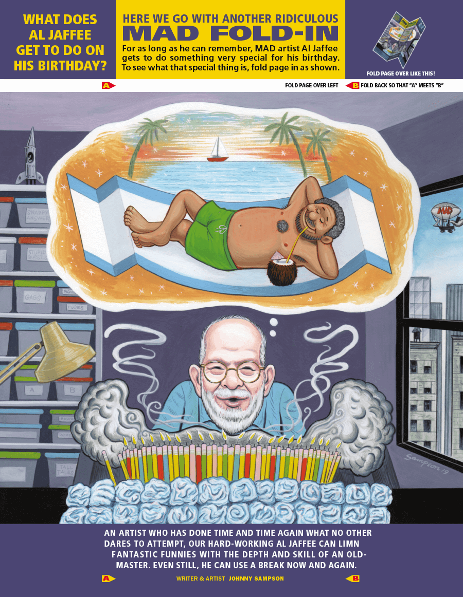
After 65 years at Mad Magazine, comic artist Al Jaffee announced his retirement. Jaffee was best known for his Mad Fold-Ins, where folding the page would reveal a hidden message in the artwork. Plenty of examples can be found on the web. The problem is, they all show the before and after statically, side by side, which diminishes the magic (see here and here). There’s a whole generation who may have only seen the fold-ins in this format.
Of course I had to create the paper folding effect for the web. There’s many different ways to achieve this, but this approach is nice because:
- It’s CSS only, relying on no JavaScript.
- Uses a single image instead of requiring the image to be sliced up in Photoshop.
- Can be configured with just HTML by setting CSS variables in a style attribute.
Here’s a demo of it in action, using artwork by Johnny Sampson in an issue that celebrated Jaffee’s 98th birthday. Hover or tap to fold.
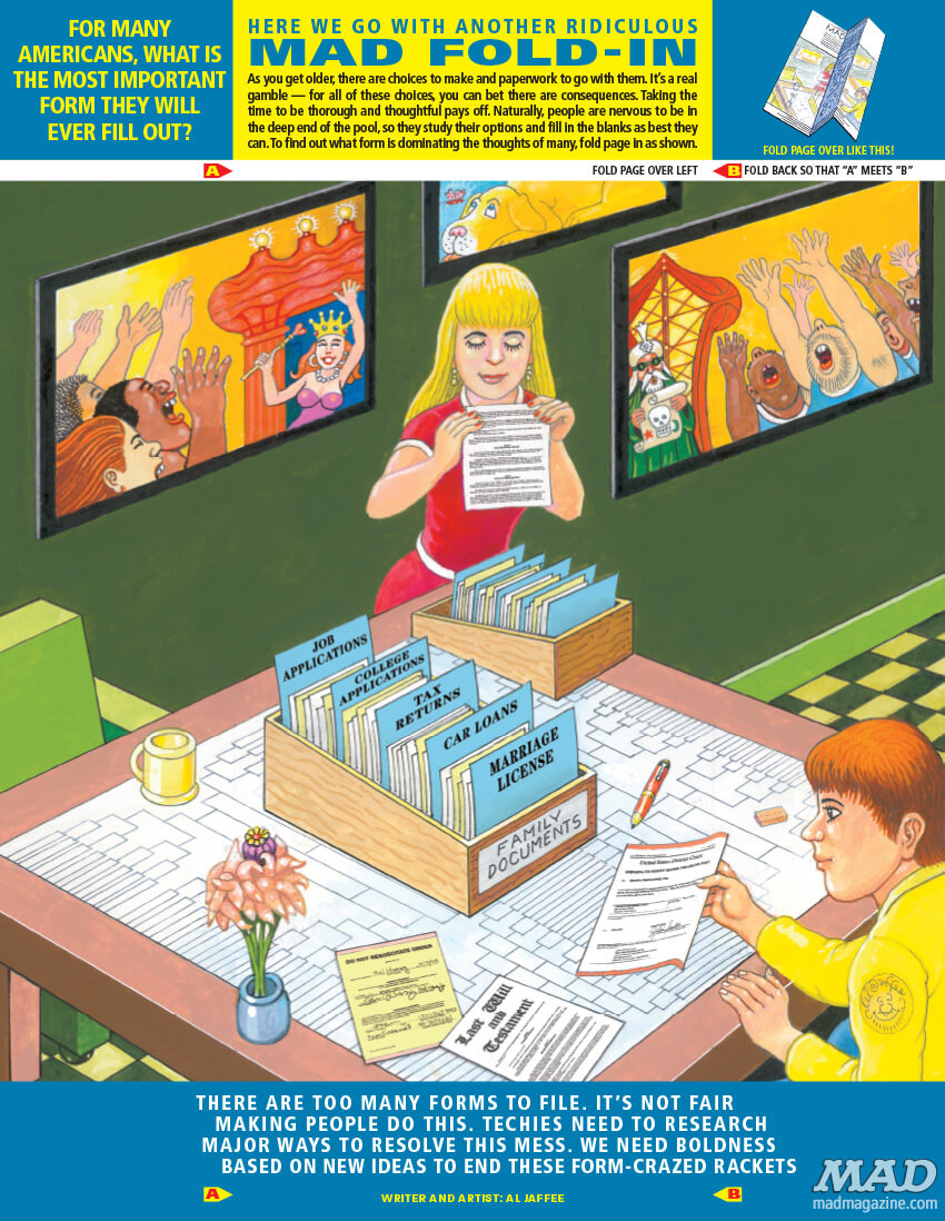
And another by Jaffee himself.
The Code
The HTML for the effect is fairly straightforward. You might be wondering about the standalone image element — it’s hidden but used to set the size and aspect ratio of the component. The image path is specified there and once again as a CSS variable to set the background image of the other elements.
<span class="jaffee" style="--bg: url('path/to/image.png');">
  <span class="a"></span>
  <span class="bc">
    <span class="b"></span>
    <span class="c"></span>
  </span>
  <img src="path/to/image.png">
</span>
And here is the CSS used to set the positioning, 3D transforms, and transitions.
.jaffee {
  position: relative;
  display: inline-flex;
  transform: rotateX(10deg);
  transform-style: preserve-3d;
  cursor: grab;
}

.jaffee img {
  width: auto;
  height: auto;
  max-width: 100%;
  max-height: 56vh;
  opacity: 0;
}

.jaffee .a,
.jaffee .b,
.jaffee .c {
  top: 0;
  display: inline-block;
  height: 100%;
  background-image: var(--bg);
  background-size: cover;
  background-repeat: no-repeat;
}

.jaffee .a {
  position: absolute;
  left: 0;
  width: 50%;
  background-position: 0 0;
}

.jaffee .bc {
  position: absolute;
  display: inline-flex;
  width: 50%;
  height: 100%;
  left: 50%;
  transform-origin: left;
  transition: transform 3s;
  transform-style: preserve-3d;
}

.jaffee .b,
.jaffee .c {
  position: relative;
  width: 50%;
  backface-visibility: hidden;
}

.jaffee .b {
  background-position: 66.666667% 0;
  transform-style: preserve-3d;
}

.jaffee .b:after {
  content: "";
  position: absolute;
  top: 0;
  left: 0;
  width: 100%;
  height: 100%;
  background-color: #000;
  transform: rotateY(180deg) translateZ(1px);
  transform-style: preserve-3d;
  backface-visibility: hidden;
}

.jaffee .c {
  background-position: 100% 0;
  transform-origin: left;
  transition: transform 2s;
}

.jaffee:hover .bc,
.jaffee:active .bc {
  transform: rotateY(-180deg) translateZ(-1px);
  transition: transform 2s;
}

.jaffee:hover .c,
.jaffee:active .c {
  transform: rotateY(180deg) translateZ(2px);
  transition: transform 3s;
}
Recommend
About Joyk
Aggregate valuable and interesting links.
Joyk means Joy of geeK