

Animating CSS Width and Height Without the Squish Effect
source link: https://pqina.nl/blog/animating-width-and-height-without-the-squish-effect/
Go to the source link to view the article. You can view the picture content, updated content and better typesetting reading experience. If the link is broken, please click the button below to view the snapshot at that time.

Being able to animate the CSS width
and height
properties would be super useful. Unfortunately at the moment it’s a sure-fire way to get your browser to scream in agony. In this 5 minute tutorial we’ll explore using the transform
property to simulate animating the width of an element.
Don’t Animate the Width and Height Properties
Browsers don’t like it when they have to calculate the positions and sizes of elements on the webpage. Most elements in some way impact the rendering other elements. Modifying the dimensions of one element can have lots of unforeseen consequences.
Modifying the width
and/or height
of an element will require the browser to calculate which other elements (children, siblings, or parent) are impacted by this change and how those elements should be updated. This process is called a reflow
and will be followed by a repaint.
These are expensive operations and we should avoid triggering them as much as possible.
Using Transform Instead
To do performant animations we need to use the CSS transform
or opacity
properties. In this article we’ll focus on
transform
.
The transform property instructs the GPU to make some last minute updates to the texture of an element before drawing it to the screen. These last minute updates can for instance be rotating, moving, and scaling of the element.
You can compare the GPU texure of an element with a picture you took of the element with your mobile phone. The picture only consists of pixels, the child elements and other information about the element is no longer there.
The GPU only has to deal with the pixels that present the element. And because GPUs are very good at dealing with pixels. These transform operations are super performant.
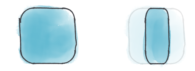
This also has a downside. We can only manipulate the pixels, not the contents of the element (we only have the picture of the element). You can see below how this difference impacts the border-radius
property. In the transform
example the radius is not redrawn (like in the width
example), it is simply scaled. Redrawing would require a repaint, the GPU cannot do that, it only deals with pixels.
Original
width: 100px
transform: scaleX(.5)
.square {
    width: 200px;
    height: 200px;
    border-radius: 40px;
}

.square-resized { width: 100px }

.square-transformed { transform: scaleX(.5) }
Animating the transform
property is a million times faster than animating width
, height
, or any of the other properties that impact layout and will trigger a reflow
.
But if we animate it, the result will be that weirdly stretched shape. It might be fast, but it doesn’t look great. It always reminds me of those aliens in Duke Nukem 3D getting squished by a door.
Stretched corners
9-Slice Scaling To The Rescue
Before border-radius
was a thing we had to create an image for each corner (and sometimes edge) of an element to “fake” border radius. Depending on the design that could yield up to 8 images for a single element, these images would be layed out like this.
This is called the 9-slice scaling method .
1
2
3
4
5
6
7
8
9
This method allows you to scale the element and stretch image 2, 4, 6, and 8, while linking 1, 3, 7, and 9 to their respective corners using absolute positioning. This results in corners that aren’t stretched when scaled. See below.
1
2
3
4
5
6
7
8
9
Luckily we now live in a day and age where browsers support border-radius
so we no longer have to rely on this technique for drawing rounded corners.
We can however use this technique to resize elements using the transform
property.
We’ll start with a structure like this:
1
2
3
Let’s apply this to our square. It will mean we need one container and three child elements to represent the square left (1), center (2), and right (3) parts.
<div class="square">
    <div class="left"></div>
    <div class="center"></div>
    <div class="right"></div>
</div>
Let’s look at the CSS
/* children will be positioned relativly to this element */
.square {
    position: relative;
    height: 100px;
}

.left,
.center,
.right {
    position: absolute;
    top: 0;
    bottom: 0;
}

.left { background: red }
.center { background: yellow }
.right { background: blue }


/* we need room for a 20 pixel border radius (on one side) */
.left,
.right { width: 20px }

.left { border-radius: 20px 0 0 20px }
.right { border-radius: 0 20px 20px 0 }


/* child layout definitions */
.center {
    /* center needs to be 20 pixels from the left,
    so it doesn't overlap with the .left element */
    left: 20px;

    /* needs a width of 1 pixel, this causes
    scaleX(60) is equal to 60 pixels */
    width: 1px;
    transform: scaleX(60);

    /* we need to scale the texture from the left side
    for it to align correctly, default is center */
    transform-origin: left;
}

.right {
    /* we need to move the right element to align with
    the right side of the .center element
    20px + 60px = 80px */
    transform: translateX(80px);
}
The result is a nicely colored square.
I’ve colored to element parts to make them individually recognizeable.
Now for our next trick, we can animate the .center
and .right
elements of the square.
.center {
    animation: center-animate 1s ease infinite alternate;
}

.right {
    animation: right-animate 1s ease infinite alternate;
}

@keyframes right-animate {
    0% { transform: translateX(140px) }
    100% { transform: translateX(20px) }
}

@keyframes center-animate {
    0% { transform: scaleX(120) }
    100% { transform: scaleX(0) }
}
Looks good to me, let’s set the background color back to black.
If you’re on Firefox, this should look great. If you’re using Safari or Chrome you might notice a slight flickering of the edge between the center and right part.
I’m not sure why this happens. It’s either a problem with alpha blending OR rounding of pixels. Anyway. By slightly overlapping the center element with the right element we can resolve this render issue. We’ll make sure the element is atleast 1
pixel wide and scales to 121
pixels.
@keyframes center-animate {
    0% { transform: scaleX(121) }
    100% { transform: scaleX(1) }
}
Huray! We got ourselves an animatable non-squishy square!
We could take this further and make it more flexible by moving the animation to JavaScript, creating a web component, or by using CSS variables, but for the purpose of this article this example should suffice.
View a demo of end result on CodePen
Hold Your Horses
Before you run of and start using this technique, please note that:
box-shadow
overflow: hidden
That said, with a bit of trickery you can use this to create some awesome effects. The file items and the drop area of the FilePond file upload library all use this technique to smoothly animate their height.
A previous version ofDoka Image Editor used this technique on both the width and height to render and animate the white crop rectangle on top of the image. This has since been partly replaced with WebGL.
Conclusion
The default width
and height
CSS properties are (along with most other properties) not suitable for animation. They impact render performance too much.
We switched to the transform
property and animated our square on the GPU to greatly improve performance but ended up with some other limitations (squishy square corners).
By applying the 9-slice technique in a smart way we worked around some of these limitations to create an element that we can animate while not impacting performance.
Recommend
About Joyk
Aggregate valuable and interesting links.
Joyk means Joy of geeK